> ## Documentation Index
> Fetch the complete documentation index at: https://notes.kodekloud.com/llms.txt
> Use this file to discover all available pages before exploring further.
# Common Visualizations
> This article discusses various data visualization techniques used in analytics to convey insights effectively.
Data visualization plays a crucial role in turning raw numbers into actionable insights. Depending on the story you want to tell, you can choose from four reporting styles:
* **Descriptive**: Record what happened.
* **Diagnostic**: Explain why it happened.
* **Predictive**: Forecast what will happen next.
* **Prescriptive**: Recommend actions to influence future outcomes.

***
## 1. Descriptive Visualization: Tables
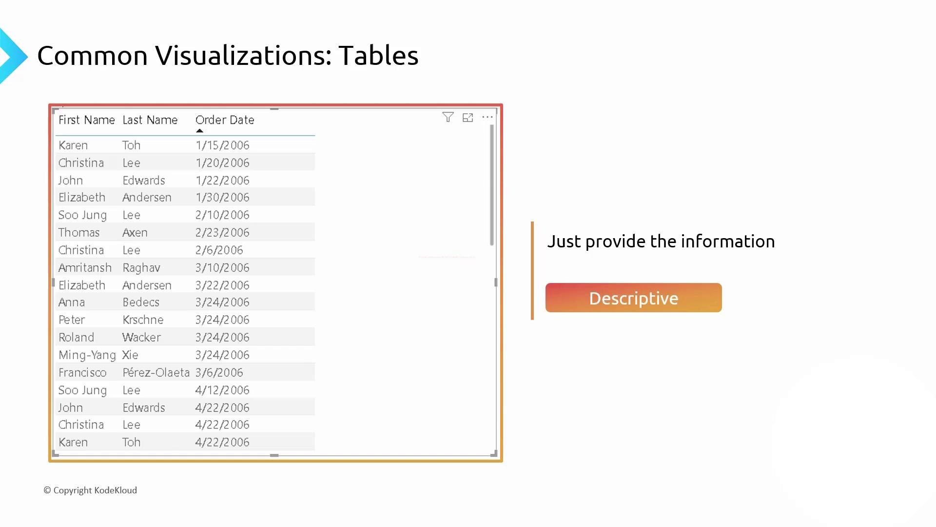
A table is the simplest way to display raw data. It lists exact values in rows and columns, making it ideal for descriptive analytics.
***
## 2. Diagnostic Visualization: Bar & Column Charts
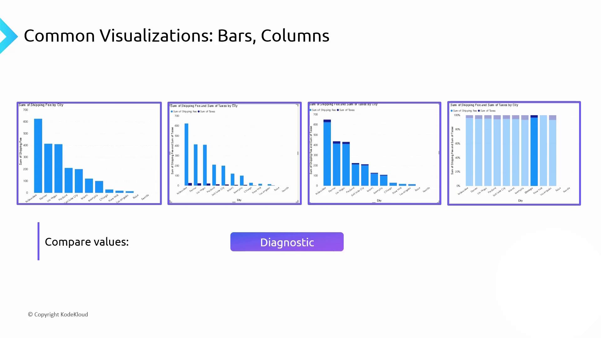
Bar and column charts excel at comparing categories side by side, helping you spot patterns and outliers quickly.
| Chart Type | Use Case | Example |
| ------------------------- | --------------------------------------------- | ------------------------------- |
| Bar Chart (Horizontal) | Compare single measure across categories | Shipping fees by city |
| Column Chart (Vertical) | Track changes over time or categories | Monthly sales |
| Clustered Column Chart | Compare two measures in each category | Shipping fees vs. taxes by city |
| Stacked Column Chart | Show part-to-whole across categories | Expense breakdown by department |
| 100% Stacked Column Chart | Normalize categories to 100% for contribution | Market share by region |
***
## 3. Trends Over Time: Line & Waterfall Charts
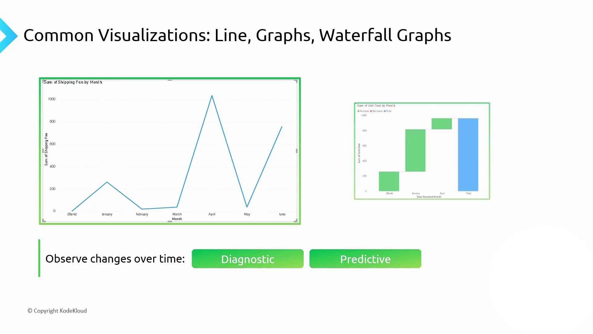
* **Line Graph**: Tracks continuous data points over time to reveal trends and seasonality.
* **Waterfall Chart**: Illustrates incremental changes, highlighting contributions to overall growth or decline.
***
## 4. Geographic Distribution: Map Visualizations
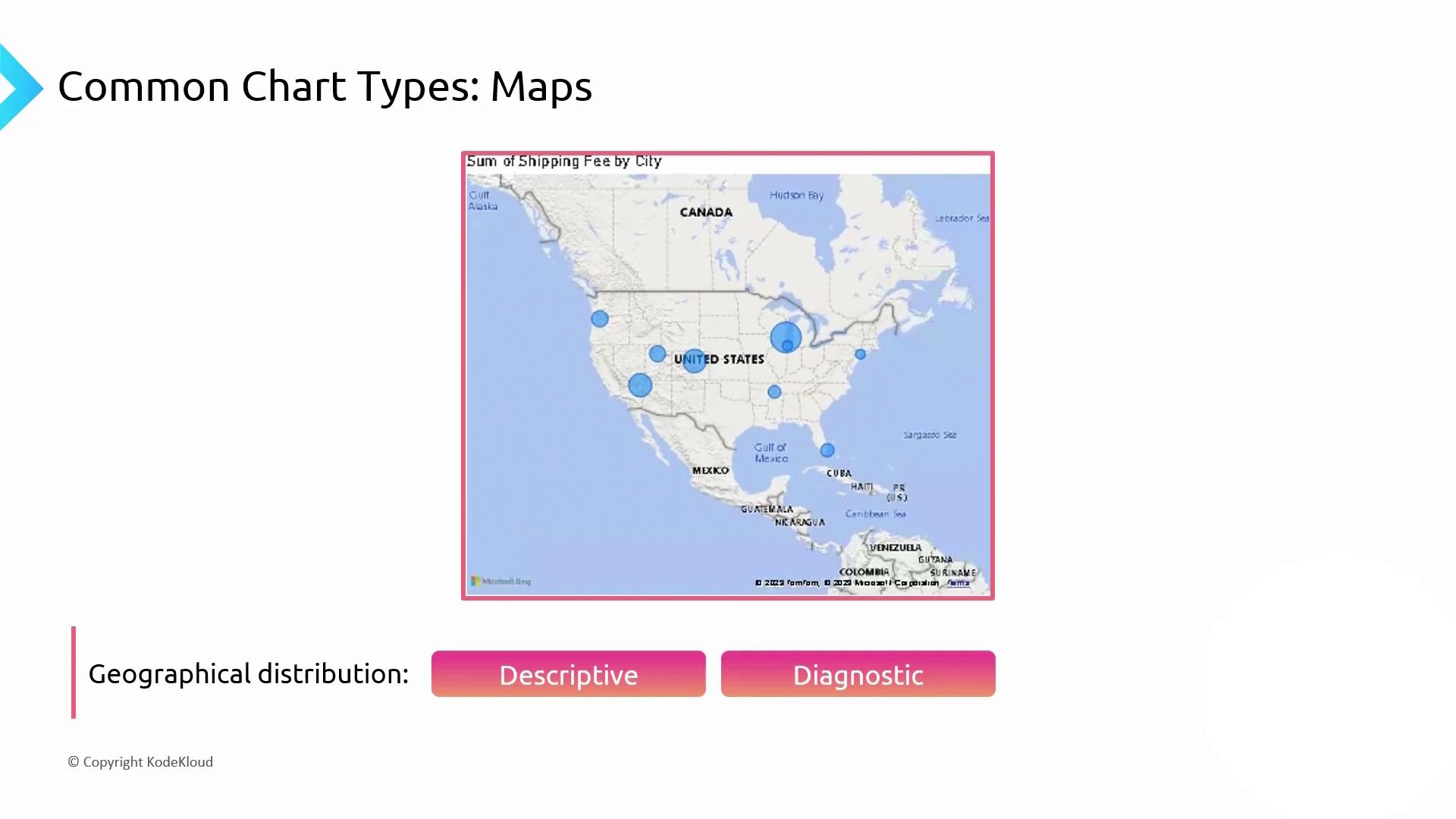
Map charts combine spatial data with metrics (bubble size or color intensity) to reveal regional patterns. They start as descriptive but can become diagnostic when clusters emerge.
***
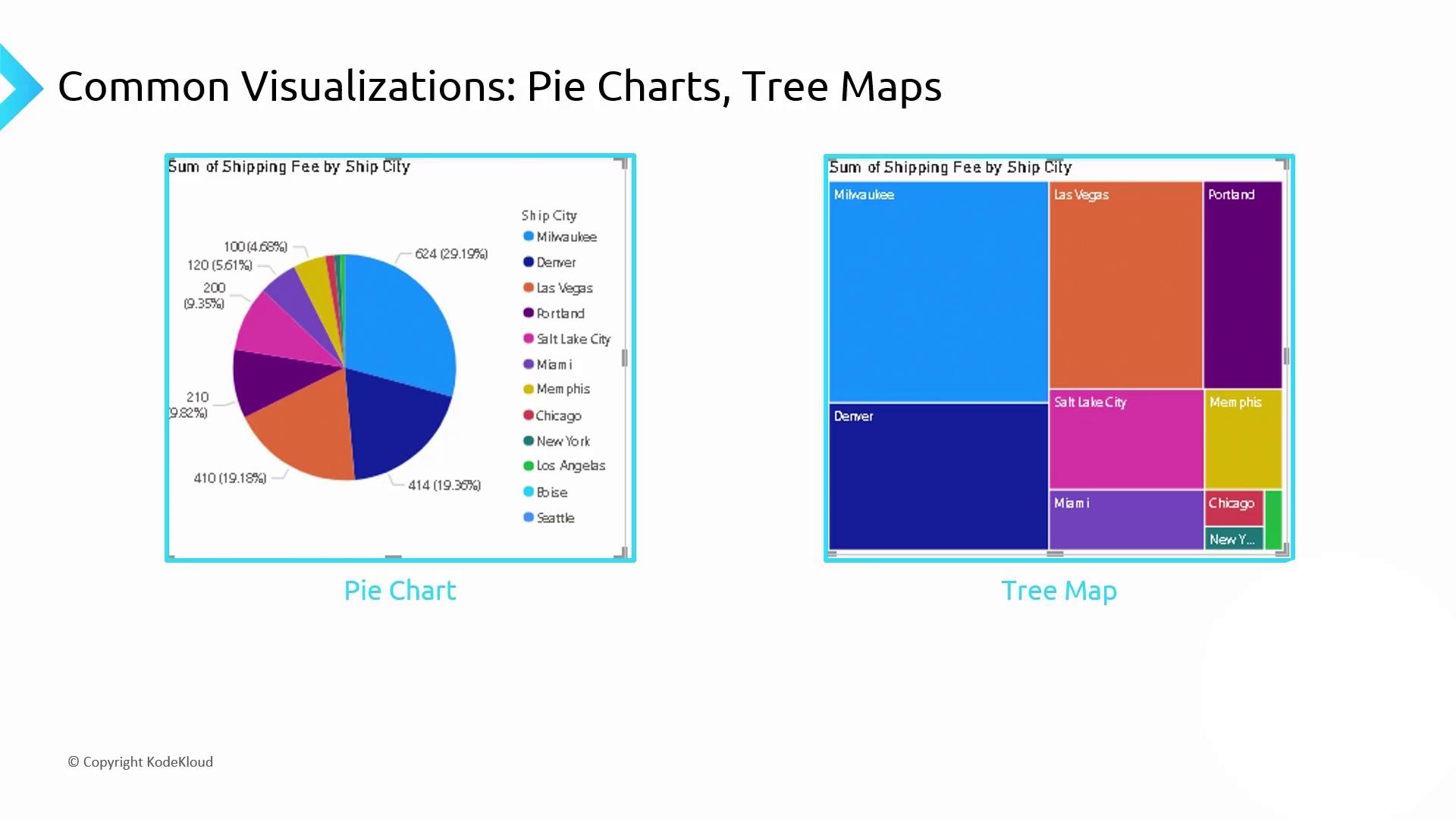
## 5. Proportional Analysis: Pie Charts & Tree Maps
* **Pie Chart**: Compares parts to a whole.
* **Tree Map**: Uses nested rectangles to represent hierarchical proportions, making it easier to see smaller segments.
Limit pie charts to 5–7 slices for clarity. Too many segments make the chart hard to read.
***
## 6. Relationship Analysis: Scatter Charts
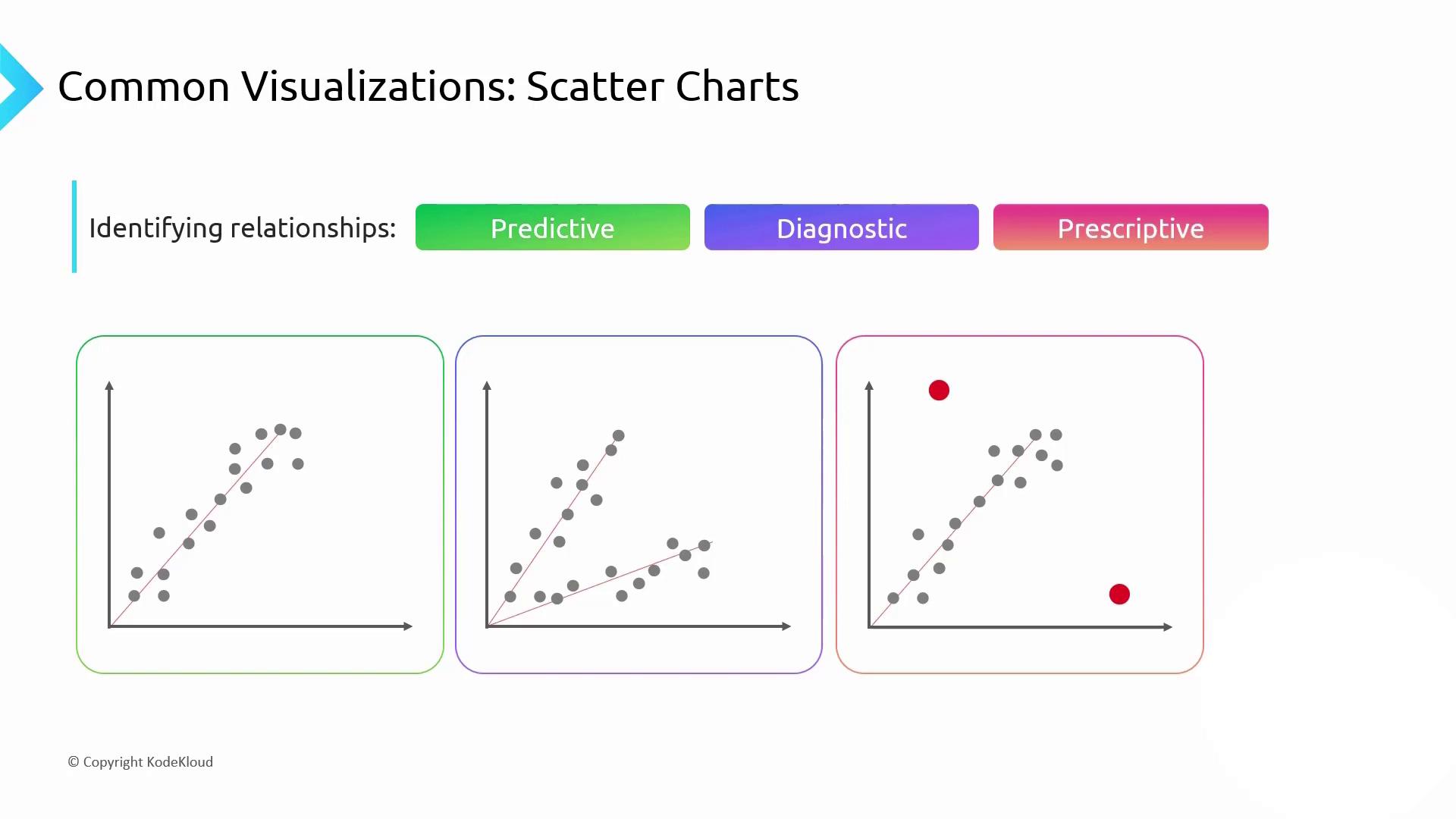
Scatter plots reveal correlations, clusters, and outliers across two measures:
1. **Predictive**: A tight cluster along a trend line enables accurate forecasting.
2. **Diagnostic**: Multiple clusters point to distinct subgroups—compare slopes to understand their behavior.
3. **Prescriptive**: Outliers highlight risks or opportunities that warrant further action.
Watch out for overplotting when you have many points—consider transparency or binning to preserve insight.
***
## Links and References
* [Data Visualization Best Practices](https://www.tableau.com/learn/articles/data-visualization)
* [Understanding Chart Types](https://www.datavizcatalogue.com/)
* [Microsoft Azure Data Fundamentals](https://docs.microsoft.com/learn/certifications/exams/dp-900)