> ## Documentation Index
> Fetch the complete documentation index at: https://notes.kodekloud.com/llms.txt
> Use this file to discover all available pages before exploring further.
# Project Insights
> Explains how GitHub Projects transforms issue and PR metadata into current and historical charts for workload analysis, velocity tracking, bottleneck spotting, and forecasting
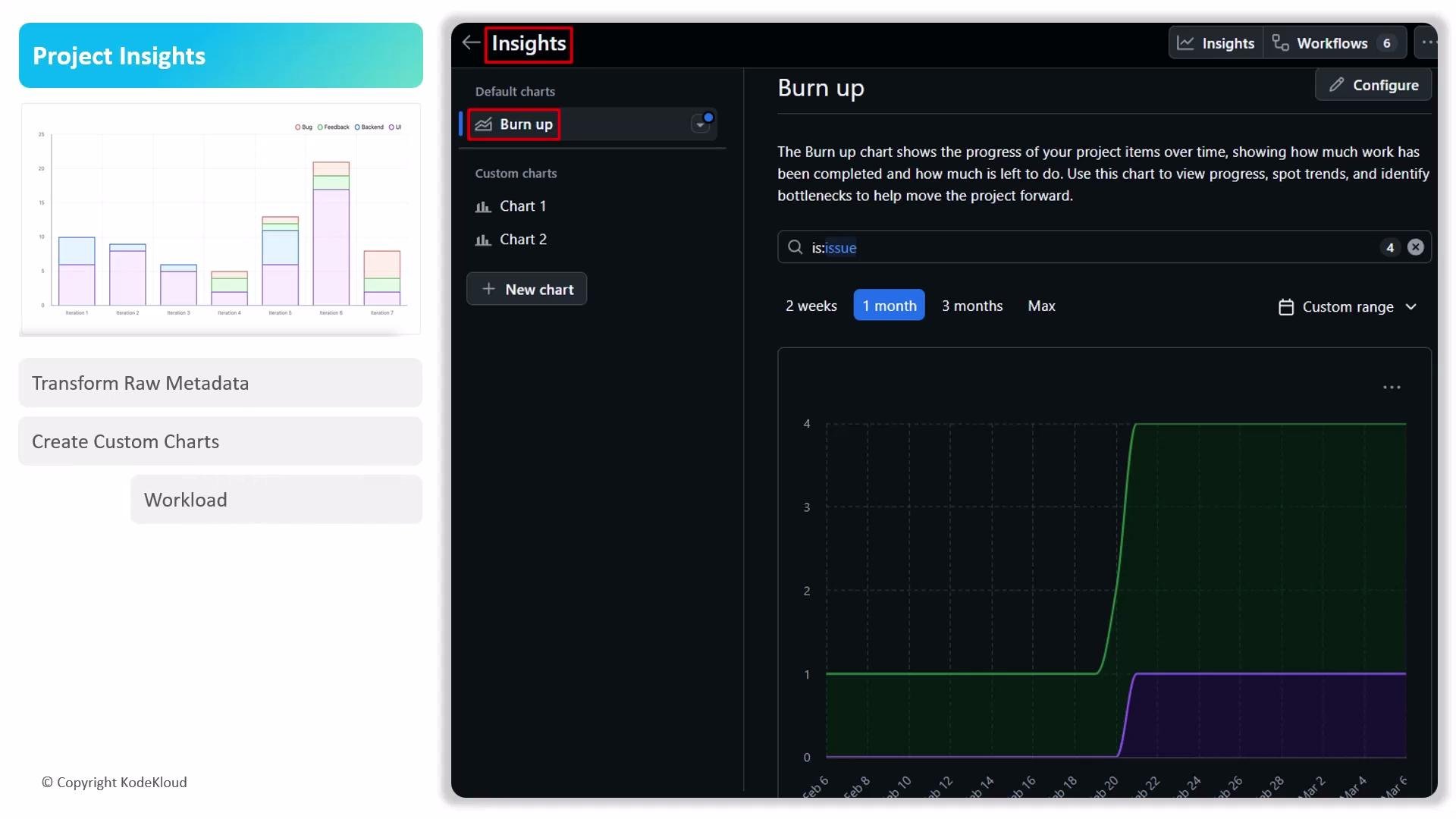
Project Insights turns raw metadata from issues and pull requests into visual reports. By building custom charts, teams can move beyond lists to perform data-driven analysis of workload, resource allocation, and overall project health—helping you spot bottlenecks, measure velocity, and forecast delivery.
 Key capabilities
* Transform issue and pull request metadata into custom charts and dashboards.
* Create both snapshot and time-series visualizations to answer operational and strategic questions.
* Filter and group by labels, assignees, milestones, and custom fields for targeted analysis.
* Use charts to analyze workload distribution, progress over time, and predict likely completion dates.
What kinds of charts are available
GitHub Projects exposes two primary charting approaches to cover both operational and historical analysis:
* Current charts — for real-time snapshots of your project state.
* Historical charts — for time-based trend analysis and progress tracking.
Current charts
* Primary focus: present-state insights and immediate workload distribution.
* Typical uses: balancing assignments, triage, and short-term capacity planning.
* Common visuals: items per assignee, work by label, status distributions, and other single-point-in-time metrics.
* Filtering: fine-grained filters by label, assignee, milestone, or custom field to quickly locate bottlenecks.
* Availability: included for all users by default.
Current charts are best when you need to make operational decisions about who should do what next.
Historical charts
* Primary focus: time-series analysis to reveal progress, velocity, and trends.
* Typical uses: tracking burnup/burndown, measuring velocity, spotting long-term patterns, and forecasting delivery dates.
* Common visuals: completions over time, cumulative flow diagrams, and grouped trend lines by status or custom fields.
* Grouping: examine how status, assignees, or custom fields evolved throughout the project lifecycle.
* Availability: requires a Team plan or Enterprise Cloud license.
Key capabilities
* Transform issue and pull request metadata into custom charts and dashboards.
* Create both snapshot and time-series visualizations to answer operational and strategic questions.
* Filter and group by labels, assignees, milestones, and custom fields for targeted analysis.
* Use charts to analyze workload distribution, progress over time, and predict likely completion dates.
What kinds of charts are available
GitHub Projects exposes two primary charting approaches to cover both operational and historical analysis:
* Current charts — for real-time snapshots of your project state.
* Historical charts — for time-based trend analysis and progress tracking.
Current charts
* Primary focus: present-state insights and immediate workload distribution.
* Typical uses: balancing assignments, triage, and short-term capacity planning.
* Common visuals: items per assignee, work by label, status distributions, and other single-point-in-time metrics.
* Filtering: fine-grained filters by label, assignee, milestone, or custom field to quickly locate bottlenecks.
* Availability: included for all users by default.
Current charts are best when you need to make operational decisions about who should do what next.
Historical charts
* Primary focus: time-series analysis to reveal progress, velocity, and trends.
* Typical uses: tracking burnup/burndown, measuring velocity, spotting long-term patterns, and forecasting delivery dates.
* Common visuals: completions over time, cumulative flow diagrams, and grouped trend lines by status or custom fields.
* Grouping: examine how status, assignees, or custom fields evolved throughout the project lifecycle.
* Availability: requires a Team plan or Enterprise Cloud license.
 Comparison at a glance
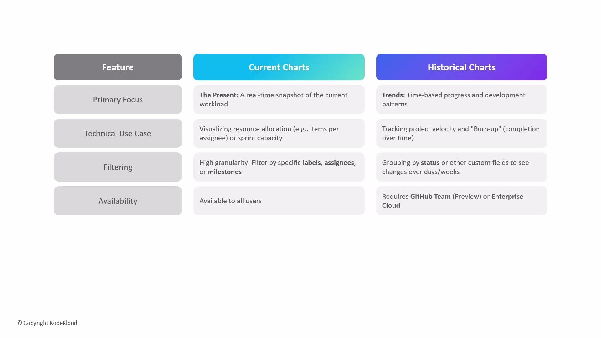
| Feature | Current charts | Historical charts |
| -----------------: | -------------------------------------------- | ------------------------------------------------ |
| Primary goal | Real-time snapshot of current workload | Time-based trends and progress analysis |
| Best for | Immediate capacity planning, triage | Velocity tracking, forecasting, trend analysis |
| Visual types | Items per assignee, status distributions | Burnup/burndown, cumulative flows, trend lines |
| Filters & grouping | Labels, assignees, milestones, custom fields | Group by status/assignee/custom fields over time |
| Availability | Included for all users | `Team` plan or `Enterprise Cloud` required |
Use current charts for day-to-day operational decisions and switch to historical charts when you need to analyze trends, measure velocity, or forecast delivery. Both chart types support custom filtering and grouping to focus on the metrics that matter to your team.
Historical charts require a paid plan (Team or Enterprise Cloud). Check your organization’s subscription or contact your account admin to enable historical insights. See the [GitHub Projects documentation](https://docs.github.com/en/issues/organizing-your-work-with-projects) for plan details and feature availability.
Getting started (quick checklist)
* Define the questions you need answered (e.g., "Are workloads balanced?" or "How fast are we closing issues?").
* Choose current charts for immediate workload and resource questions.
* Choose historical charts to measure progress over days, sprints, or months.
* Apply filters and groupings (labels, assignees, milestones, custom fields) to narrow focus.
* If needed, upgrade your plan to enable historical charts for time-series analysis.
Further reading and resources
* [GitHub Projects documentation](https://docs.github.com/en/issues/organizing-your-work-with-projects)
* [GitHub pricing and plans](https://github.com/pricing)
* Best practices for chart-driven project management: measure small, iterate often, and use trends to inform planning.
To conclude, use current charts for immediate operational management and historical charts for long-term trend analysis, velocity tracking, and forecasting—each serving complementary roles in a healthy project analytics workflow.
Comparison at a glance
| Feature | Current charts | Historical charts |
| -----------------: | -------------------------------------------- | ------------------------------------------------ |
| Primary goal | Real-time snapshot of current workload | Time-based trends and progress analysis |
| Best for | Immediate capacity planning, triage | Velocity tracking, forecasting, trend analysis |
| Visual types | Items per assignee, status distributions | Burnup/burndown, cumulative flows, trend lines |
| Filters & grouping | Labels, assignees, milestones, custom fields | Group by status/assignee/custom fields over time |
| Availability | Included for all users | `Team` plan or `Enterprise Cloud` required |
Use current charts for day-to-day operational decisions and switch to historical charts when you need to analyze trends, measure velocity, or forecast delivery. Both chart types support custom filtering and grouping to focus on the metrics that matter to your team.
Historical charts require a paid plan (Team or Enterprise Cloud). Check your organization’s subscription or contact your account admin to enable historical insights. See the [GitHub Projects documentation](https://docs.github.com/en/issues/organizing-your-work-with-projects) for plan details and feature availability.
Getting started (quick checklist)
* Define the questions you need answered (e.g., "Are workloads balanced?" or "How fast are we closing issues?").
* Choose current charts for immediate workload and resource questions.
* Choose historical charts to measure progress over days, sprints, or months.
* Apply filters and groupings (labels, assignees, milestones, custom fields) to narrow focus.
* If needed, upgrade your plan to enable historical charts for time-series analysis.
Further reading and resources
* [GitHub Projects documentation](https://docs.github.com/en/issues/organizing-your-work-with-projects)
* [GitHub pricing and plans](https://github.com/pricing)
* Best practices for chart-driven project management: measure small, iterate often, and use trends to inform planning.
To conclude, use current charts for immediate operational management and historical charts for long-term trend analysis, velocity tracking, and forecasting—each serving complementary roles in a healthy project analytics workflow.