> ## Documentation Index
> Fetch the complete documentation index at: https://notes.kodekloud.com/llms.txt
> Use this file to discover all available pages before exploring further.
# Visualizing Correlations Between LLM Evaluation Metrics
> Explains using correlation matrix heat maps to reveal pairwise relationships and redundancy among LLM evaluation metrics, with comparisons to other visualization techniques and interpretation tips
Question 6.
Which visualization technique would be most effective for identifying correlations between different evaluation metrics when assessing LLM performance?
Options: correlation matrix with heat map, pie chart, waterfall chart, or area chart?
Answer: correlation matrix with heat map.
A correlation matrix rendered as a heat map is the most effective visualization for quickly identifying relationships among multiple LLM evaluation metrics. It displays pairwise correlation strengths and directions for every metric combination simultaneously, making it easy to spot highly correlated (potentially redundant) metrics and metrics that provide complementary insights into model behavior.
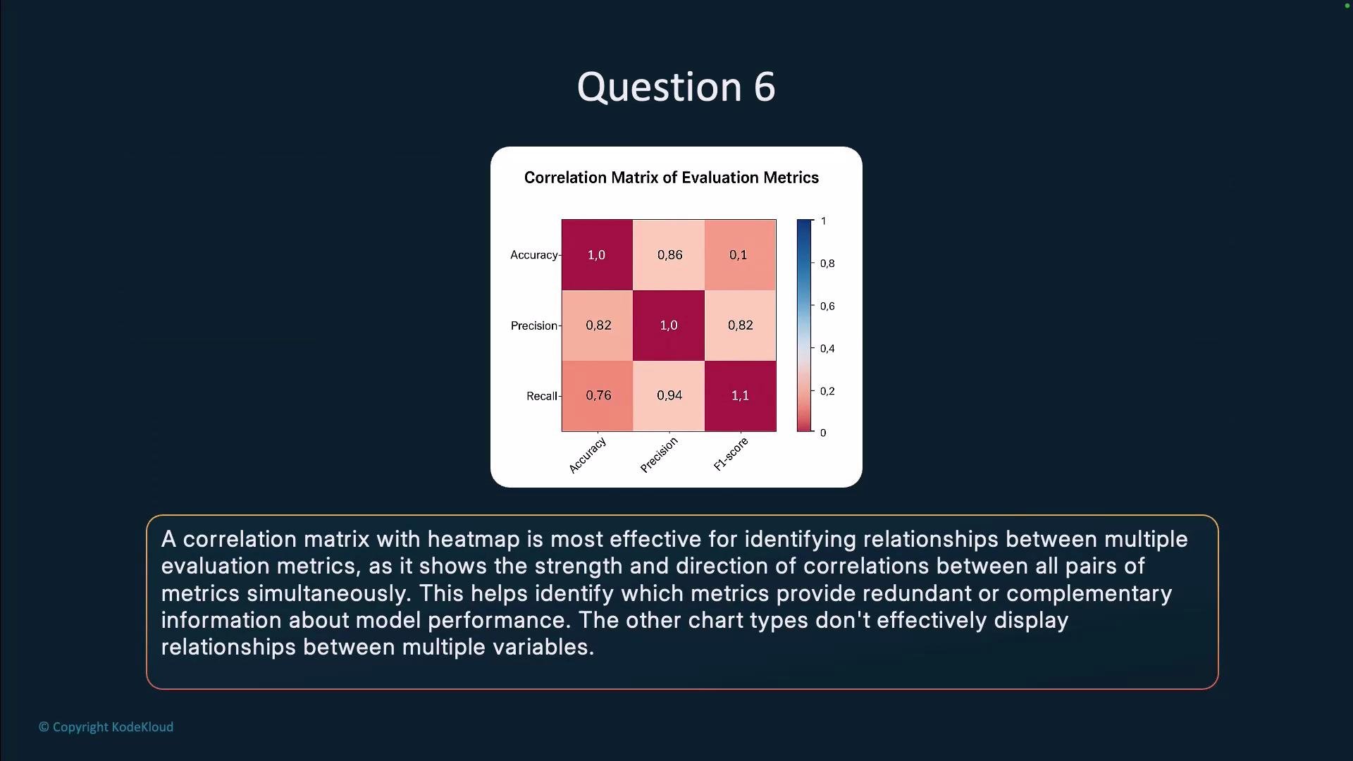 Why this works well:
* Shows every pairwise relationship at once so global patterns and outliers are immediately visible.
* Uses color intensity (and optional numeric annotations) to convey both magnitude and sign of correlations.
* Supports clustering or reordering of metrics to reveal groups of similarly behaving metrics.
* Helps decide which metrics are redundant and which combinations give a fuller view of LLM performance.
Why the other options are less suitable:
* Pie chart: illustrates part-to-whole composition, not pairwise relationships between metrics.
* Waterfall chart: highlights incremental contributions to a total value, not correlations.
* Area chart: suited for trends or stacked contributions over time, not for displaying pairwise correlation structure.
Comparison of visualization techniques
| Visualization | Best use for LLM evaluation | Limitations | Recommendation |
| ----------------------------- | -------------------------------------------------------------------------: | ------------------------------------------------------------------ | ---------------------------------------------- |
| Correlation matrix (heat map) | Identify pairwise correlations, redundancy, and complementary metrics | Can be overwhelming with many metrics unless clustered or filtered | Best choice for metric correlation analysis |
| Pie chart | Showing distribution of a single aggregated value across categories | Not applicable for pairwise relationships | Avoid for correlation tasks |
| Waterfall chart | Visualizing how components add/subtract to a total (e.g., error breakdown) | Not designed for metric correlations | Use for contribution analyses, not correlation |
| Area chart | Trend visualization over time or stacked contributions | Poor for comparing pairwise relationships across metrics | Use for time-series performance trends |
Links and references
* [Correlation and dependence — Wikipedia](https://en.wikipedia.org/wiki/Correlation_and_dependence)
* [Seaborn heatmap documentation](https://seaborn.pydata.org/generated/seaborn.heatmap.html)
Use a correlation matrix with a heat map to quickly identify redundant or complementary evaluation metrics when comparing LLM performance. Consider clustering or reordering metrics to surface meaningful groups and improve interpretability.
Why this works well:
* Shows every pairwise relationship at once so global patterns and outliers are immediately visible.
* Uses color intensity (and optional numeric annotations) to convey both magnitude and sign of correlations.
* Supports clustering or reordering of metrics to reveal groups of similarly behaving metrics.
* Helps decide which metrics are redundant and which combinations give a fuller view of LLM performance.
Why the other options are less suitable:
* Pie chart: illustrates part-to-whole composition, not pairwise relationships between metrics.
* Waterfall chart: highlights incremental contributions to a total value, not correlations.
* Area chart: suited for trends or stacked contributions over time, not for displaying pairwise correlation structure.
Comparison of visualization techniques
| Visualization | Best use for LLM evaluation | Limitations | Recommendation |
| ----------------------------- | -------------------------------------------------------------------------: | ------------------------------------------------------------------ | ---------------------------------------------- |
| Correlation matrix (heat map) | Identify pairwise correlations, redundancy, and complementary metrics | Can be overwhelming with many metrics unless clustered or filtered | Best choice for metric correlation analysis |
| Pie chart | Showing distribution of a single aggregated value across categories | Not applicable for pairwise relationships | Avoid for correlation tasks |
| Waterfall chart | Visualizing how components add/subtract to a total (e.g., error breakdown) | Not designed for metric correlations | Use for contribution analyses, not correlation |
| Area chart | Trend visualization over time or stacked contributions | Poor for comparing pairwise relationships across metrics | Use for time-series performance trends |
Links and references
* [Correlation and dependence — Wikipedia](https://en.wikipedia.org/wiki/Correlation_and_dependence)
* [Seaborn heatmap documentation](https://seaborn.pydata.org/generated/seaborn.heatmap.html)
Use a correlation matrix with a heat map to quickly identify redundant or complementary evaluation metrics when comparing LLM performance. Consider clustering or reordering metrics to surface meaningful groups and improve interpretability.