> ## Documentation Index
> Fetch the complete documentation index at: https://notes.kodekloud.com/llms.txt
> Use this file to discover all available pages before exploring further.
# Visualizing Demographic Bias in Training Data
> Analyzing demographic bias in LLM training data and recommending stacked bar charts and best practices to identify underrepresented groups and visualize categorical distributions
Question 3.
A data scientist analyzes the training data for bias in an LLM project.\
Which visualization would be most effective for identifying underrepresented demographic groups in the text corpus?
Options:
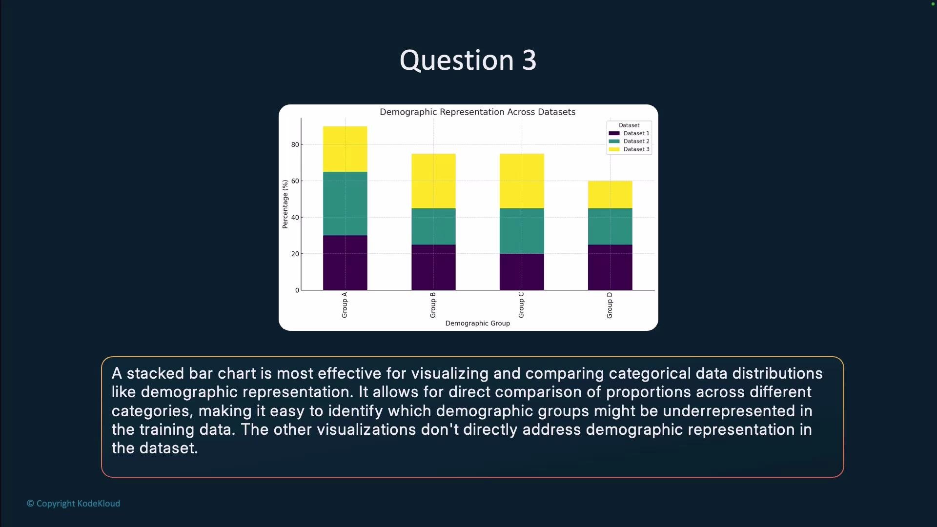
* Stacked bar chart of demographic distribution
* Scatter plot of word embeddings
* Line chart of training loss over time
* Heatmap of token co-occurrences
Answer: Stacked bar chart of demographic distribution.
Why a stacked bar chart is the best choice
* A stacked bar chart directly represents categorical composition and makes it easy to compare counts or proportions of demographic groups across dataset slices (e.g., by source, time period, or split).
* When bars are normalized to proportions (100% stacked bars), differences in dataset size are controlled for, revealing relative underrepresentation more clearly.
* You can also use grouped (side-by-side) bars or facet the charts to preserve readability when there are many categories.
Comparison of visualization options
| Visualization | Purpose | Suitability for identifying underrepresented demographic groups |
| ------------------------------- | -------------------------------------------------------- | ------------------------------------------------------------------- |
| Stacked bar chart | Compare categorical compositions across groups or slices | High — shows counts or proportions per demographic category clearly |
| Scatter plot of word embeddings | Inspect semantic clusters and lexical relationships | Low — useful for semantics, not for measuring group proportions |
| Line chart of training loss | Track model optimization metrics over time | None — unrelated to dataset composition or demographic coverage |
| Heatmap of token co-occurrences | Reveal token collocations and contextual relationships | Low — shows token relationships, not demographic representation |
Why the other visualizations are less suitable
* Scatter plot of word embeddings: Good for exploring semantics and clustering of words or phrases, but it does not quantify how many instances belong to each demographic category.
* Line chart of training loss: Useful for monitoring model convergence and overfitting, but it provides no information about dataset composition or representation.
* Heatmap of token co-occurrences: Helps find collocated tokens and linguistic patterns, but it doesn’t reveal demographic group counts or proportions.
Best practices for using stacked bar charts to detect underrepresentation
* Normalize bars to percentages when comparing datasets of different sizes to avoid misleading conclusions from raw counts.
* Use color palettes with clear contrast and accessible color choices for each demographic category.
* Limit the number of categories shown in a single chart or use faceting/grouped bars if many categories are present.
* Combine visual inspection with summary statistics (e.g., proportions, confidence intervals, and group-wise sample sizes) to validate impressions from the chart.
* Consider drill-downs and filters (e.g., by source, time, or document type) to locate which slices exhibit the strongest biases.
* Supplement charts with tables summarizing absolute counts and relative proportions so stakeholders can see both raw and normalized perspectives.
Tools and references
* Visualization libraries: [Seaborn](https://seaborn.pydata.org/), [Altair](https://altair-viz.github.io/), [Matplotlib](https://matplotlib.org/)
* Practical guidance: “Effective Data Visualization” and tutorials on comparing categorical distributions
* Responsible AI and fairness resources: follow best practices for dataset audits and bias reporting to pair visual findings with documentation and mitigation steps
When comparing datasets with different total sizes, display proportions (percent of the dataset) rather than raw counts to accurately identify underrepresentation.