> ## Documentation Index
> Fetch the complete documentation index at: https://notes.kodekloud.com/llms.txt
> Use this file to discover all available pages before exploring further.
# Visualizing Impact of Context Length on LLM Accuracy
> Analyzing how context length affects LLM accuracy and recommending scatterplots with trendlines and smoothing to reveal relationships, outliers, and diminishing returns
Question 7.
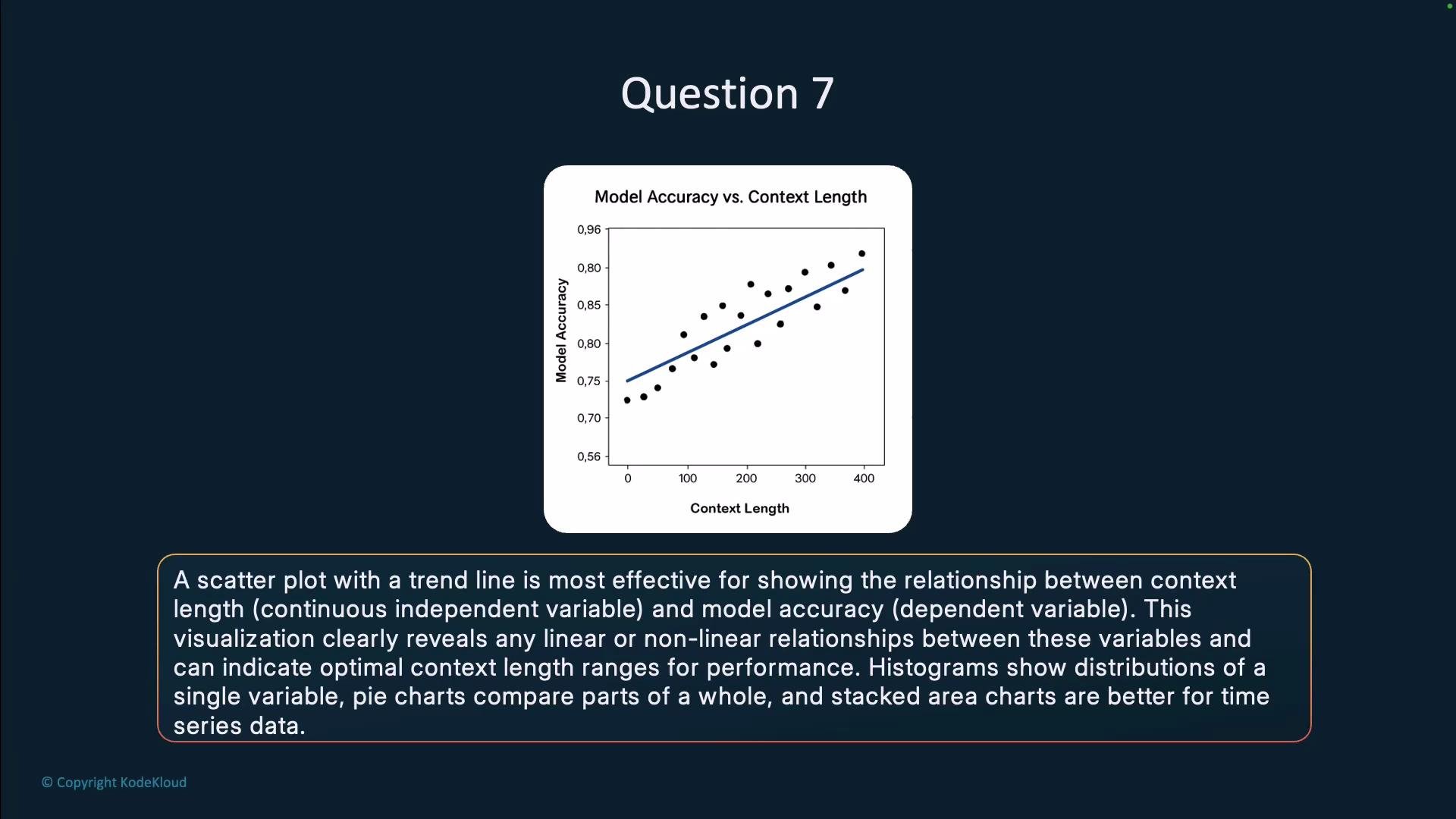
When analyzing the impact of context length on an LLM's performance, which visualization would most effectively show the relationship between context length and model accuracy? A histogram, scatterplot with a trendline, pie chart, or stacked area chart?
Answer: a scatterplot with a trendline.
A scatterplot with a trendline is the best choice for this analysis because it directly represents the continuous relationship between context length (independent variable) and model accuracy (dependent variable). This visualization enables you to:
* Observe the overall shape of the relationship (e.g., linear, saturating, or nonmonotonic).
* Detect outliers and clusters of observations across context-length values.
* Inspect heteroscedasticity (changes in variance of accuracy across context lengths).
* Identify regions where additional context yields diminishing returns or clear gains.
* Summarize the central tendency using a fitted trendline (linear regression, LOESS/LOWESS smoothing, or a GAM) and optionally plot confidence intervals to show uncertainty.
 Why other chart types are less suitable
| Visualization | Best used for | Why it's not ideal for context length vs. accuracy |
| ------------------ | ----------------------------------------------------------------------- | --------------------------------------------------------------------------- |
| Histogram | Distribution of a single variable (e.g., context lengths or accuracies) | Shows only marginal distributions, not pairwise relationships |
| Pie chart | Proportional breakdown of categorical parts of a whole | Not meaningful for continuous variables like context length or accuracy |
| Stacked area chart | Composition changes across an ordered dimension (often time) | Designed for stacked components, obscures pairwise continuous relationships |
Practical tips for building an effective scatterplot for LLM context-length analysis
* Axis choices: Put context length on the x-axis and model accuracy (or error metric) on the y-axis. Consider log-scaling the x-axis if context lengths span orders of magnitude.
* Trendline selection: Use linear regression for approximate linear relationships; use LOESS/LOWESS or a GAM for nonlinear trends.
* Uncertainty: Overlay confidence bands around the trendline (e.g., 95% CI) to communicate estimate reliability.
* Point encoding: Size or color points by a third variable (e.g., dataset size, prompt type, or model family) to reveal conditional effects.
* Binning: If data are extremely dense, consider hexbin plots or alpha transparency to reduce overplotting.
* Annotation: Label notable outliers or regions (e.g., "diminishing returns beyond 4k tokens") to guide interpretation.
* Statistical checks: Complement visuals with tests for heteroscedasticity or segmented regression if you suspect regime changes.
Use a scatterplot with an appropriate smoothing or regression curve (choose LOESS/GAM for nonlinear trends) and include confidence intervals to better assess uncertainty around the trend.
Further reading and tools
* Seaborn scatter + regression examples: [https://seaborn.pydata.org/tutorial/regression.html](https://seaborn.pydata.org/tutorial/regression.html)
* Matplotlib scatter plotting: [https://matplotlib.org/stable/api/\_as\_gen/matplotlib.pyplot.scatter.html](https://matplotlib.org/stable/api/_as_gen/matplotlib.pyplot.scatter.html)
* LOESS/LOWESS reference: [https://en.wikipedia.org/wiki/Local\_regression](https://en.wikipedia.org/wiki/Local_regression)
* Generalized Additive Models (GAMs): [https://en.wikipedia.org/wiki/Generalized\_additive\_model](https://en.wikipedia.org/wiki/Generalized_additive_model)
And that concludes this section on data analysis.
Why other chart types are less suitable
| Visualization | Best used for | Why it's not ideal for context length vs. accuracy |
| ------------------ | ----------------------------------------------------------------------- | --------------------------------------------------------------------------- |
| Histogram | Distribution of a single variable (e.g., context lengths or accuracies) | Shows only marginal distributions, not pairwise relationships |
| Pie chart | Proportional breakdown of categorical parts of a whole | Not meaningful for continuous variables like context length or accuracy |
| Stacked area chart | Composition changes across an ordered dimension (often time) | Designed for stacked components, obscures pairwise continuous relationships |
Practical tips for building an effective scatterplot for LLM context-length analysis
* Axis choices: Put context length on the x-axis and model accuracy (or error metric) on the y-axis. Consider log-scaling the x-axis if context lengths span orders of magnitude.
* Trendline selection: Use linear regression for approximate linear relationships; use LOESS/LOWESS or a GAM for nonlinear trends.
* Uncertainty: Overlay confidence bands around the trendline (e.g., 95% CI) to communicate estimate reliability.
* Point encoding: Size or color points by a third variable (e.g., dataset size, prompt type, or model family) to reveal conditional effects.
* Binning: If data are extremely dense, consider hexbin plots or alpha transparency to reduce overplotting.
* Annotation: Label notable outliers or regions (e.g., "diminishing returns beyond 4k tokens") to guide interpretation.
* Statistical checks: Complement visuals with tests for heteroscedasticity or segmented regression if you suspect regime changes.
Use a scatterplot with an appropriate smoothing or regression curve (choose LOESS/GAM for nonlinear trends) and include confidence intervals to better assess uncertainty around the trend.
Further reading and tools
* Seaborn scatter + regression examples: [https://seaborn.pydata.org/tutorial/regression.html](https://seaborn.pydata.org/tutorial/regression.html)
* Matplotlib scatter plotting: [https://matplotlib.org/stable/api/\_as\_gen/matplotlib.pyplot.scatter.html](https://matplotlib.org/stable/api/_as_gen/matplotlib.pyplot.scatter.html)
* LOESS/LOWESS reference: [https://en.wikipedia.org/wiki/Local\_regression](https://en.wikipedia.org/wiki/Local_regression)
* Generalized Additive Models (GAMs): [https://en.wikipedia.org/wiki/Generalized\_additive\_model](https://en.wikipedia.org/wiki/Generalized_additive_model)
And that concludes this section on data analysis.