> ## Documentation Index
> Fetch the complete documentation index at: https://notes.kodekloud.com/llms.txt
> Use this file to discover all available pages before exploring further.
# Creating Your Own Plugin
> Guide to creating a reusable Backstage frontend plugin that fetches advice and provides an embeddable AdviceCard component.
In this guide you'll build a small frontend plugin for Backstage that fetches a random piece of advice from the Advice API (`https://api.adviceslip.com/advice`) and renders it as a compact card on an entity page.
This practical example demonstrates:
* How to scaffold a frontend plugin in a Backstage repository
* How Backstage plugins declare routes and expose extensions
* How to implement a React component that fetches data using Backstage APIs
* How to register a component extension so it can be embedded in the app
Prerequisites: a working Backstage repository and basic familiarity with React.
Make sure your development environment can run the Backstage frontend (Node.js, Yarn) and that you understand basic React hooks (`useState`, `useEffect`). This example focuses on frontend plugin development and using Backstage APIs like `useApi` and `fetchApiRef`.
***
## 1) Scaffolding a frontend plugin
Backstage includes a generator to add new packages to a monorepo. From the project root run:
```bash theme={null}
yarn new
```
When prompted:
```bash theme={null}
? What do you want to create? plugin - A new frontend plugin
? Enter the ID of the plugin [required] advice
```
Choose "plugin - A new frontend plugin" and enter an ID such as `advice`. The generator will create the plugin under `plugins/advice` and update the root frontend package dependencies (for example, adding `"@internal/backstage-plugin-advice": "^0.1.0"` to the root `package.json`).
Expected output includes messages like:
```bash theme={null}
Creating frontend plugin @internal/backstage-plugin-advice
...
Successfully created plugin
```
***
## 2) What the generator creates (important files)
Open `plugins/advice/src`. The generator provides several files you will use:
| File | Purpose | Notes / Example |
| --------------------------------- | ------------------------------------------------------------ | ----------------------------------------------------------- |
| `routes.ts` | Defines route references used for navigation | See example below |
| `plugin.ts` | Registers the plugin and exposes page/extension entry points | Exposes routable and component extensions |
| `components/ExampleComponent.tsx` | Example full-page React component | Useful as a reference for page routing |
| `index.ts` | Re-exports the plugin's public exports | e.g. `export { advicePlugin, AdvicePage } from './plugin';` |
routes.ts
```ts theme={null}
// plugins/advice/src/routes.ts
import { createRouteRef } from '@backstage/core-plugin-api';
export const rootRouteRef = createRouteRef({
id: 'advice',
});
```
plugin.ts (routable page example)
```ts theme={null}
// plugins/advice/src/plugin.ts
import {
createPlugin,
createRoutableExtension,
} from '@backstage/core-plugin-api';
import { rootRouteRef } from './routes';
export const advicePlugin = createPlugin({
id: 'advice',
routes: {
root: rootRouteRef,
},
});
export const AdvicePage = advicePlugin.provide(
createRoutableExtension({
name: 'AdvicePage',
component: () =>
import('./components/ExampleComponent').then(m => m.ExampleComponent),
mountPoint: rootRouteRef,
}),
);
```
The generator also adds tests and a basic Storybook setup for the plugin.
***
## 3) Creating a reusable component extension (AdviceCard)
For this lesson we want a small, embeddable component — an AdviceCard — that can be placed on an entity overview page. To make it reusable across the app we will export it as a component extension.
Create the component file:
```tsx theme={null}
// plugins/advice/src/components/AdviceCard.tsx
import React, { useEffect, useState } from 'react';
import { InfoCard } from '@backstage/core-components';
import { fetchApiRef, useApi } from '@backstage/core-plugin-api';
export const AdviceCard = () => {
const fetchApi = useApi(fetchApiRef);
const [advice, setAdvice] = useState(null);
useEffect(() => {
let mounted = true;
fetchApi
.fetch('https://api.adviceslip.com/advice')
.then(res => res.json())
.then(data => {
if (!mounted) return;
// data shape: { slip: { id: number, advice: string } }
setAdvice(data?.slip?.advice ?? 'No advice available');
})
.catch(() => {
if (!mounted) return;
setAdvice('Could not fetch advice');
});
return () => {
mounted = false;
};
}, [fetchApi]);
return {advice};
};
```
Add a small index file that re-exports the component:
```ts theme={null}
// plugins/advice/src/components/index.ts
export { AdviceCard } from './AdviceCard';
```
Now expose the component from `plugin.ts` using `createComponentExtension` (so other parts of the app can import and render it):
```ts theme={null}
// plugins/advice/src/plugin.ts
import {
createPlugin,
createComponentExtension,
createRoutableExtension,
} from '@backstage/core-plugin-api';
import { rootRouteRef } from './routes';
export const advicePlugin = createPlugin({
id: 'advice',
routes: {
root: rootRouteRef,
},
});
export const AdvicePage = advicePlugin.provide(
createRoutableExtension({
name: 'AdvicePage',
component: () =>
import('./components/ExampleComponent').then(m => m.ExampleComponent),
mountPoint: rootRouteRef,
}),
);
export const AdviceCardExtension = advicePlugin.provide(
createComponentExtension({
component: {
lazy: () => import('./components/AdviceCard').then(m => m.AdviceCard),
},
}),
);
```
Finally, export the plugin and its extensions from `src/index.ts`:
```ts theme={null}
// plugins/advice/src/index.ts
export { advicePlugin, AdvicePage, AdviceCardExtension } from './plugin';
```
Note: The export name you choose (for example `AdviceCardExtension`) is the identifier other packages will import.
***
## 4) Using the plugin in the app
The generator wires the routable AdvicePage into the app router. In `packages/app/src/App.tsx` you might see:
```ts theme={null}
import { AdvicePage } from '@internal/backstage-plugin-advice';
```
and a router entry such as:
```tsx theme={null}
{/* inside the app routing */}
} />
```
To embed the Advice card on an entity overview, import the provided component extension into the file that composes the entity "Overview". For example:
```tsx theme={null}
// packages/app/src/components/catalog/EntityPage.tsx (excerpt)
import { AdviceCardExtension } from '@internal/backstage-plugin-advice';
// ... inside the Overview grid JSX
{/* other Grid items */}
```
Important: when referencing JSX tags in MDX text, wrap them in backticks to avoid MDX parsing (for example `AdviceCardExtension`).
***
## 5) Styling with Backstage UI components
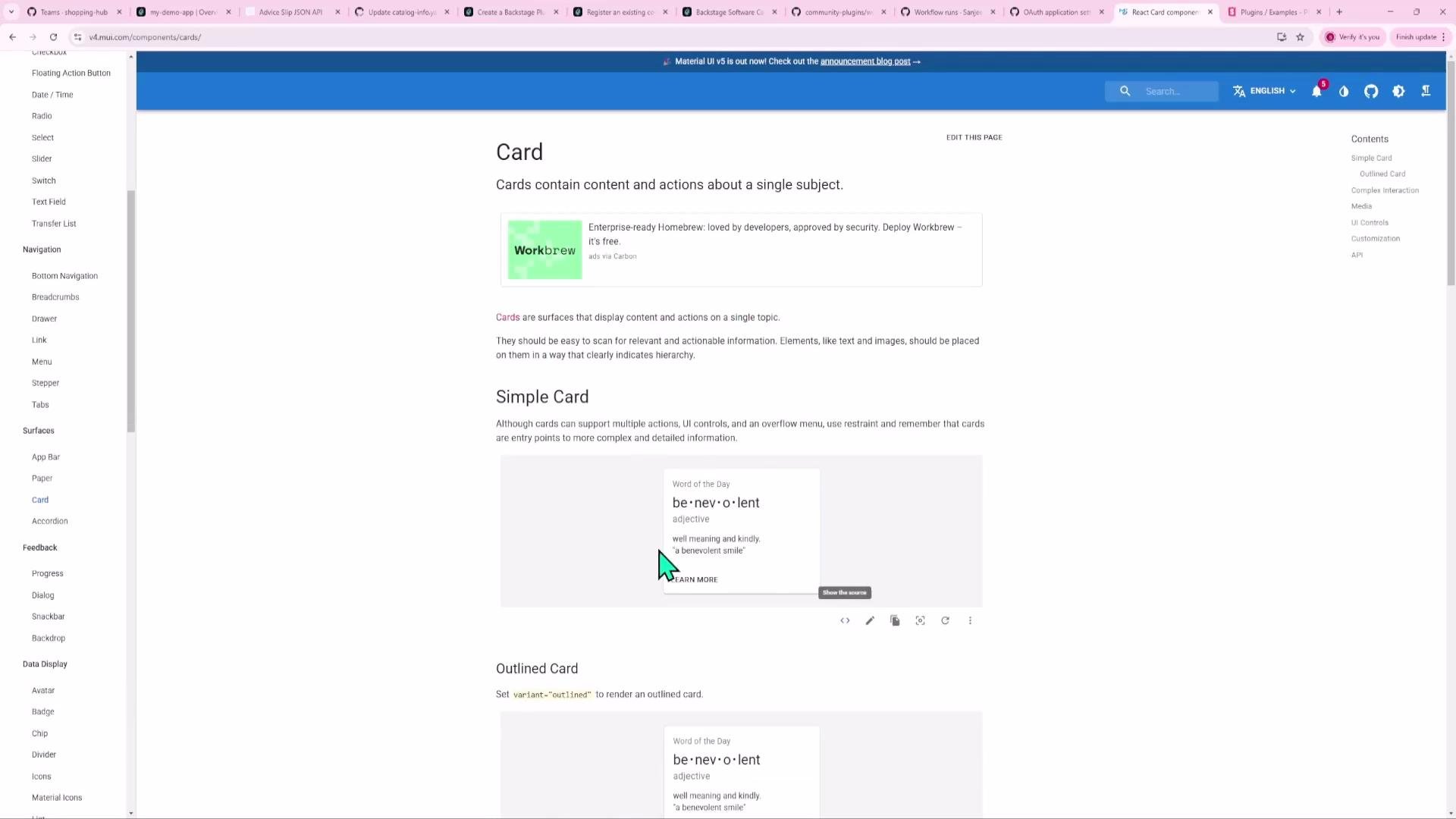
Backstage uses Material-UI and provides curated UI primitives in `@backstage/core-components`. Use these building blocks for a consistent look-and-feel rather than custom CSS.
Common components:
| Component | Use case |
| --------------------------- | ------------------------------------------------------------------ |
| `InfoCard` | Compact card for summaries and small widgets (used for AdviceCard) |
| `Page`, `Header`, `Content` | Page layout and top-level structure |
| `Grid` | Responsive layout for arranging cards and widgets |
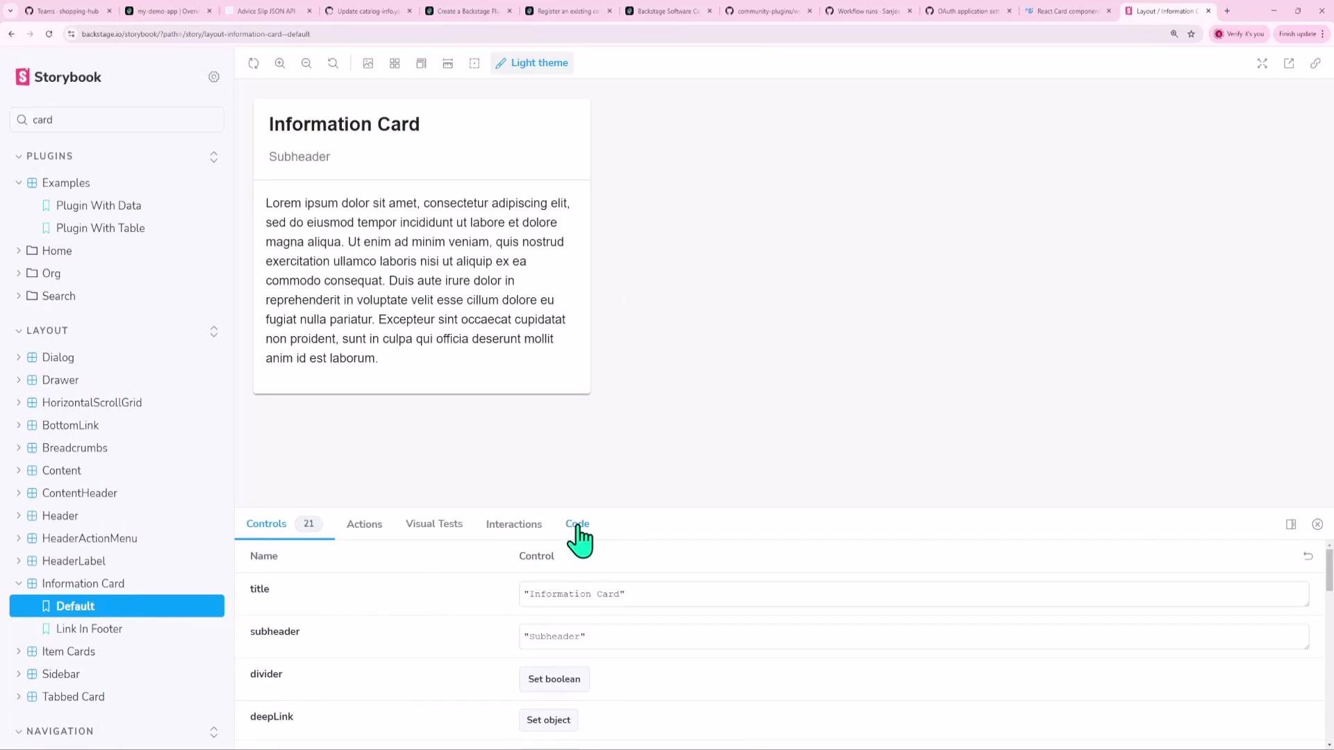
We used `InfoCard` in the AdviceCard to inherit Backstage styling and accessibility defaults.
 Backstage also publishes a Storybook with component examples — a helpful resource to discover available components and copy working snippets.
 ***
## 6) Why use Backstage APIs for fetch (`useApi` + `fetchApiRef`)
Prefer Backstage's injectable fetch API over the global `fetch`. Benefits:
* Centralized configuration (proxying, auth headers, base URLs)
* Consistent logging and error handling across plugins
* Easier testability and mocking in unit tests
We used them like this in AdviceCard:
```ts theme={null}
import { fetchApiRef, useApi } from '@backstage/core-plugin-api';
const fetchApi = useApi(fetchApiRef);
fetchApi.fetch('https://api.adviceslip.com/advice')
```
This integrates your requests with the app's HTTP pipeline and makes it simpler to add auth, retries, or proxy rules later.
***
## 7) Running and developing the plugin independently
Develop plugins without booting the entire Backstage app. Common ways:
* From the plugin folder:
```bash theme={null}
cd plugins/advice
yarn start
```
* From the repo root using Yarn workspaces:
```bash theme={null}
yarn workspace @internal/backstage-plugin-advice start
```
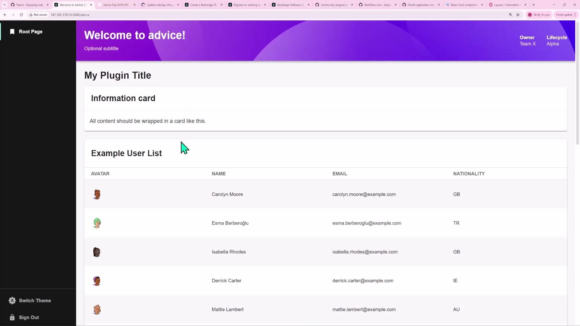
Either command runs a local dev server for the plugin so you can iterate quickly. The server prints the URL, e.g. `http://localhost:3000/`, where you can preview the plugin UI.
***
## 6) Why use Backstage APIs for fetch (`useApi` + `fetchApiRef`)
Prefer Backstage's injectable fetch API over the global `fetch`. Benefits:
* Centralized configuration (proxying, auth headers, base URLs)
* Consistent logging and error handling across plugins
* Easier testability and mocking in unit tests
We used them like this in AdviceCard:
```ts theme={null}
import { fetchApiRef, useApi } from '@backstage/core-plugin-api';
const fetchApi = useApi(fetchApiRef);
fetchApi.fetch('https://api.adviceslip.com/advice')
```
This integrates your requests with the app's HTTP pipeline and makes it simpler to add auth, retries, or proxy rules later.
***
## 7) Running and developing the plugin independently
Develop plugins without booting the entire Backstage app. Common ways:
* From the plugin folder:
```bash theme={null}
cd plugins/advice
yarn start
```
* From the repo root using Yarn workspaces:
```bash theme={null}
yarn workspace @internal/backstage-plugin-advice start
```
Either command runs a local dev server for the plugin so you can iterate quickly. The server prints the URL, e.g. `http://localhost:3000/`, where you can preview the plugin UI.
 ***
## 8) Recap — complete AdviceCard component
For convenience, here is the final `AdviceCard.tsx`:
```tsx theme={null}
// plugins/advice/src/components/AdviceCard.tsx
import React, { useEffect, useState } from 'react';
import { InfoCard } from '@backstage/core-components';
import { fetchApiRef, useApi } from '@backstage/core-plugin-api';
export const AdviceCard = () => {
const fetchApi = useApi(fetchApiRef);
const [advice, setAdvice] = useState(null);
useEffect(() => {
let mounted = true;
fetchApi
.fetch('https://api.adviceslip.com/advice')
.then(res => res.json())
.then(data => {
if (!mounted) return;
setAdvice(data?.slip?.advice ?? 'No advice available');
})
.catch(() => {
if (!mounted) return;
setAdvice('Could not fetch advice');
});
return () => {
mounted = false;
};
}, [fetchApi]);
return {advice};
};
```
***
That covers creating a simple, reusable frontend plugin in Backstage: scaffolding, registering a component extension, using Backstage UI primitives, and performing API requests through the Backstage fetch API. From here you can extend the plugin with caching, explicit loading/error states, tests, configuration via the Backstage config system, or a backend proxy if you need to avoid CORS or rate limits.
Links and references
* [Backstage documentation](https://backstage.io/docs)
* [Backstage Storybook](https://backstage.io/storybook)
***
## 8) Recap — complete AdviceCard component
For convenience, here is the final `AdviceCard.tsx`:
```tsx theme={null}
// plugins/advice/src/components/AdviceCard.tsx
import React, { useEffect, useState } from 'react';
import { InfoCard } from '@backstage/core-components';
import { fetchApiRef, useApi } from '@backstage/core-plugin-api';
export const AdviceCard = () => {
const fetchApi = useApi(fetchApiRef);
const [advice, setAdvice] = useState(null);
useEffect(() => {
let mounted = true;
fetchApi
.fetch('https://api.adviceslip.com/advice')
.then(res => res.json())
.then(data => {
if (!mounted) return;
setAdvice(data?.slip?.advice ?? 'No advice available');
})
.catch(() => {
if (!mounted) return;
setAdvice('Could not fetch advice');
});
return () => {
mounted = false;
};
}, [fetchApi]);
return {advice};
};
```
***
That covers creating a simple, reusable frontend plugin in Backstage: scaffolding, registering a component extension, using Backstage UI primitives, and performing API requests through the Backstage fetch API. From here you can extend the plugin with caching, explicit loading/error states, tests, configuration via the Backstage config system, or a backend proxy if you need to avoid CORS or rate limits.
Links and references
* [Backstage documentation](https://backstage.io/docs)
* [Backstage Storybook](https://backstage.io/storybook)