> ## Documentation Index
> Fetch the complete documentation index at: https://notes.kodekloud.com/llms.txt
> Use this file to discover all available pages before exploring further.
# Customizing UI
> Guide to customizing Backstage UI using Material UI and Backstage themes, creating and applying themes, adjusting colors typography spacing and wrapping the app with a ThemeProvider
In this lesson you'll learn how to customize the Backstage UI by leveraging Material UI and Backstage's own design primitives. We'll cover where to add themes in a Backstage project, how to construct a theme, and how to apply it across your app.
Why customize the UI?
* Align Backstage with your company's brand and visual identity.
* Improve usability by tuning color contrast, typography, and spacing.
* Provide alternate modes (light/dark) or themed experiences for different audiences.
What Backstage uses for UI
* Backstage builds on top of Material UI (MUI) and provides additional components and helpers that integrate with MUI.
* You can use any MUI components alongside Backstage components; they are designed to work together.
Install Material UI (if not already present)
```bash theme={null}
npm install @mui/material @emotion/react @emotion/styled @mui/icons-material
```
A simple Material UI example
```tsx theme={null}
import React from 'react';
import Button from '@mui/material/Button';
import ShoppingCartRounded from '@mui/icons-material/ShoppingCartRounded';
export const ExampleButtons = () => (
<>
}>
Add item
}>
Add item
}>
Add item
);
```
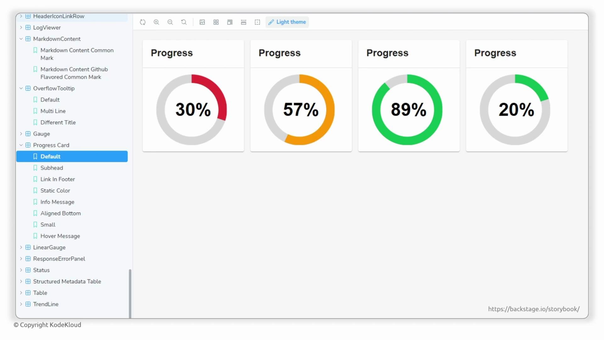
Backstage also publishes its component set and a Storybook that demonstrates those components and patterns. Browse examples and component docs at backstage.io/storybook.
What does "theming" mean?
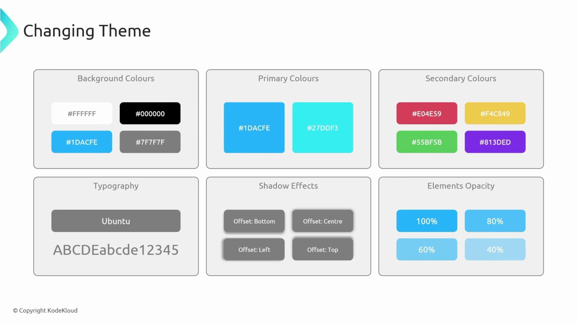
A theme controls the visual design system used by components. Typical theme properties include:
* Colors (primary, secondary, background, surface)
* Brightness / mode (light or dark)
* Typography (font family, sizes, weights)
* Elevation and shadow depth
* Opacity and spacing scale
Themes let you define consistent styles and switch between them (for example, light vs dark). When a component reads `theme.palette.primary.main` or `theme.typography.h6`, it will adapt to the values you provide.
Theme properties at a glance
| Theme area | Affects |
| --------------------- | ----------------------------------------------------- |
| Colors / Palette | Buttons, links, selection indicators, diagram accents |
| Mode (`light`/`dark`) | Backgrounds, surface contrast, default text colors |
| Typography | Headings, body text, component labels |
| Elevation / Shadows | Cards, dialogs, popovers |
| Spacing / Opacity | Layouts, hover/focus states |
Where to add a custom theme in a Backstage app
Place front-end customizations under the app package. In a typical Backstage monorepo the frontend package is `packages/app`. Create a `theme` folder in `packages/app/src` and add your theme files (for example, `myTheme.ts`).
Example project tree:
```text theme={null}
packages
├── README.md
├── app
│ ├── package.json
│ ├── public
│ └── src
│ ├── App.test.tsx
│ ├── App.tsx
│ ├── apis.ts
│ ├── components
│ ├── index.tsx
│ ├── setupTests.ts
│ └── theme
│ └── myTheme.ts
└── backend
├── Dockerfile
├── README.md
├── node_modules
│ └── app -> ../../app
├── package.json
└── src
└── index.ts
```
Creating a theme file (example)
Backstage provides helpers to construct themes that play nicely with its components. The example below shows a minimal theme export from `packages/app/src/theme/myTheme.ts`. Adjust imports and utilities according to your Backstage version.
```typescript theme={null}
// packages/app/src/theme/myTheme.ts
import { createUnifiedTheme, createBaseThemeOptions, palettes } from '@backstage/theme';
export const myTheme = createUnifiedTheme({
...createBaseThemeOptions({
palette: palettes.light,
}),
fontFamily: 'Comic Sans MS',
defaultPageTheme: 'home',
});
```
Customizing primary/secondary colors
Change `primary.main` and `secondary.main` to alter the main accent colors used across components. Components that rely on `theme.palette.primary.main` or `theme.palette.secondary.main` (buttons, links, highlights) will pick up these values automatically.
```typescript theme={null}
// packages/app/src/theme/funTheme.ts
import { createUnifiedTheme, createBaseThemeOptions, palettes } from '@backstage/theme';
export const funTheme = createUnifiedTheme({
...createBaseThemeOptions({
palette: {
...palettes.light,
mode: 'light',
primary: {
main: '#e03077',
},
secondary: {
main: '#f50057',
},
},
}),
});
```
Quick tips
* Try to keep contrast and accessibility in mind when choosing colors.
* Use Backstage Storybook to preview components with your theme.
Example plugin or config metadata (for reference)
```yaml theme={null}
metadata:
name: example
links:
- url: https://dashboard.example.com
title: My Dashboard
icon: dashboard
```
How themes are shared across the React component tree
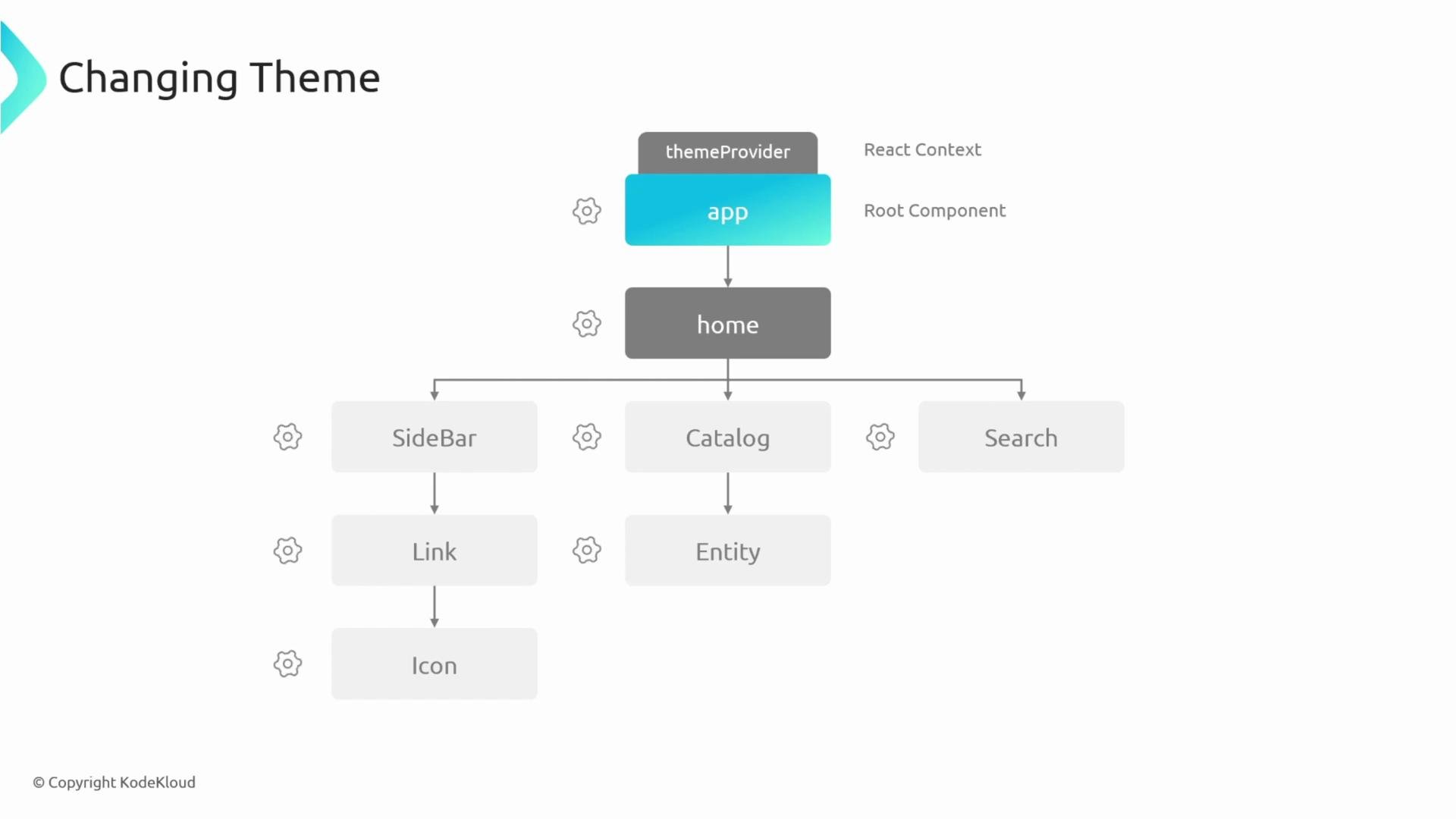
The React app is a tree of components. To make one theme available to every nested component, wrap the app with a theme provider (React Context). The ThemeProvider from MUI is commonly used; Backstage theme objects can be passed into it so all components read the same theme values.
Minimal example — wrapping the app with ThemeProvider
```tsx theme={null}
// packages/app/src/index.tsx
import React from 'react';
import ReactDOM from 'react-dom';
import { ThemeProvider, StyledEngineProvider } from '@mui/material/styles';
import App from './App';
import { myTheme } from './theme/myTheme';
ReactDOM.render(
,
document.getElementById('root'),
);
```
Notes on Backstage theming specifics
* Backstage's design system extends Material UI; both are used together.
* Theme propagation relies on React context and a ThemeProvider (see MUI docs).
* Backstage Storybook is a useful companion to preview changes and discover components: [https://backstage.io/storybook](https://backstage.io/storybook)
When overriding fonts or colors, double-check accessibility (contrast ratios) and cross-browser rendering. Large global font overrides can affect layout and third-party components.
Use ThemeProvider (React context) to share your theme across all components. When working with theming, look for keywords like `Material UI`, `ThemeProvider`, and `React context`.
Links and references
* Backstage Storybook: [https://backstage.io/storybook](https://backstage.io/storybook)
* Material UI theming docs: [https://mui.com/material-ui/customization/theming/](https://mui.com/material-ui/customization/theming/)
* Backstage theming utilities: check `@backstage/theme` in your project or Backstage docs for the version-specific helpers
 What does "theming" mean?
A theme controls the visual design system used by components. Typical theme properties include:
* Colors (primary, secondary, background, surface)
* Brightness / mode (light or dark)
* Typography (font family, sizes, weights)
* Elevation and shadow depth
* Opacity and spacing scale
Themes let you define consistent styles and switch between them (for example, light vs dark). When a component reads `theme.palette.primary.main` or `theme.typography.h6`, it will adapt to the values you provide.
What does "theming" mean?
A theme controls the visual design system used by components. Typical theme properties include:
* Colors (primary, secondary, background, surface)
* Brightness / mode (light or dark)
* Typography (font family, sizes, weights)
* Elevation and shadow depth
* Opacity and spacing scale
Themes let you define consistent styles and switch between them (for example, light vs dark). When a component reads `theme.palette.primary.main` or `theme.typography.h6`, it will adapt to the values you provide.
 Theme properties at a glance
| Theme area | Affects |
| --------------------- | ----------------------------------------------------- |
| Colors / Palette | Buttons, links, selection indicators, diagram accents |
| Mode (`light`/`dark`) | Backgrounds, surface contrast, default text colors |
| Typography | Headings, body text, component labels |
| Elevation / Shadows | Cards, dialogs, popovers |
| Spacing / Opacity | Layouts, hover/focus states |
Where to add a custom theme in a Backstage app
Place front-end customizations under the app package. In a typical Backstage monorepo the frontend package is `packages/app`. Create a `theme` folder in `packages/app/src` and add your theme files (for example, `myTheme.ts`).
Example project tree:
```text theme={null}
packages
├── README.md
├── app
│ ├── package.json
│ ├── public
│ └── src
│ ├── App.test.tsx
│ ├── App.tsx
│ ├── apis.ts
│ ├── components
│ ├── index.tsx
│ ├── setupTests.ts
│ └── theme
│ └── myTheme.ts
└── backend
├── Dockerfile
├── README.md
├── node_modules
│ └── app -> ../../app
├── package.json
└── src
└── index.ts
```
Creating a theme file (example)
Backstage provides helpers to construct themes that play nicely with its components. The example below shows a minimal theme export from `packages/app/src/theme/myTheme.ts`. Adjust imports and utilities according to your Backstage version.
```typescript theme={null}
// packages/app/src/theme/myTheme.ts
import { createUnifiedTheme, createBaseThemeOptions, palettes } from '@backstage/theme';
export const myTheme = createUnifiedTheme({
...createBaseThemeOptions({
palette: palettes.light,
}),
fontFamily: 'Comic Sans MS',
defaultPageTheme: 'home',
});
```
Customizing primary/secondary colors
Change `primary.main` and `secondary.main` to alter the main accent colors used across components. Components that rely on `theme.palette.primary.main` or `theme.palette.secondary.main` (buttons, links, highlights) will pick up these values automatically.
```typescript theme={null}
// packages/app/src/theme/funTheme.ts
import { createUnifiedTheme, createBaseThemeOptions, palettes } from '@backstage/theme';
export const funTheme = createUnifiedTheme({
...createBaseThemeOptions({
palette: {
...palettes.light,
mode: 'light',
primary: {
main: '#e03077',
},
secondary: {
main: '#f50057',
},
},
}),
});
```
Quick tips
* Try to keep contrast and accessibility in mind when choosing colors.
* Use Backstage Storybook to preview components with your theme.
Example plugin or config metadata (for reference)
```yaml theme={null}
metadata:
name: example
links:
- url: https://dashboard.example.com
title: My Dashboard
icon: dashboard
```
How themes are shared across the React component tree
The React app is a tree of components. To make one theme available to every nested component, wrap the app with a theme provider (React Context). The ThemeProvider from MUI is commonly used; Backstage theme objects can be passed into it so all components read the same theme values.
Theme properties at a glance
| Theme area | Affects |
| --------------------- | ----------------------------------------------------- |
| Colors / Palette | Buttons, links, selection indicators, diagram accents |
| Mode (`light`/`dark`) | Backgrounds, surface contrast, default text colors |
| Typography | Headings, body text, component labels |
| Elevation / Shadows | Cards, dialogs, popovers |
| Spacing / Opacity | Layouts, hover/focus states |
Where to add a custom theme in a Backstage app
Place front-end customizations under the app package. In a typical Backstage monorepo the frontend package is `packages/app`. Create a `theme` folder in `packages/app/src` and add your theme files (for example, `myTheme.ts`).
Example project tree:
```text theme={null}
packages
├── README.md
├── app
│ ├── package.json
│ ├── public
│ └── src
│ ├── App.test.tsx
│ ├── App.tsx
│ ├── apis.ts
│ ├── components
│ ├── index.tsx
│ ├── setupTests.ts
│ └── theme
│ └── myTheme.ts
└── backend
├── Dockerfile
├── README.md
├── node_modules
│ └── app -> ../../app
├── package.json
└── src
└── index.ts
```
Creating a theme file (example)
Backstage provides helpers to construct themes that play nicely with its components. The example below shows a minimal theme export from `packages/app/src/theme/myTheme.ts`. Adjust imports and utilities according to your Backstage version.
```typescript theme={null}
// packages/app/src/theme/myTheme.ts
import { createUnifiedTheme, createBaseThemeOptions, palettes } from '@backstage/theme';
export const myTheme = createUnifiedTheme({
...createBaseThemeOptions({
palette: palettes.light,
}),
fontFamily: 'Comic Sans MS',
defaultPageTheme: 'home',
});
```
Customizing primary/secondary colors
Change `primary.main` and `secondary.main` to alter the main accent colors used across components. Components that rely on `theme.palette.primary.main` or `theme.palette.secondary.main` (buttons, links, highlights) will pick up these values automatically.
```typescript theme={null}
// packages/app/src/theme/funTheme.ts
import { createUnifiedTheme, createBaseThemeOptions, palettes } from '@backstage/theme';
export const funTheme = createUnifiedTheme({
...createBaseThemeOptions({
palette: {
...palettes.light,
mode: 'light',
primary: {
main: '#e03077',
},
secondary: {
main: '#f50057',
},
},
}),
});
```
Quick tips
* Try to keep contrast and accessibility in mind when choosing colors.
* Use Backstage Storybook to preview components with your theme.
Example plugin or config metadata (for reference)
```yaml theme={null}
metadata:
name: example
links:
- url: https://dashboard.example.com
title: My Dashboard
icon: dashboard
```
How themes are shared across the React component tree
The React app is a tree of components. To make one theme available to every nested component, wrap the app with a theme provider (React Context). The ThemeProvider from MUI is commonly used; Backstage theme objects can be passed into it so all components read the same theme values.
 Minimal example — wrapping the app with ThemeProvider
```tsx theme={null}
// packages/app/src/index.tsx
import React from 'react';
import ReactDOM from 'react-dom';
import { ThemeProvider, StyledEngineProvider } from '@mui/material/styles';
import App from './App';
import { myTheme } from './theme/myTheme';
ReactDOM.render(
Minimal example — wrapping the app with ThemeProvider
```tsx theme={null}
// packages/app/src/index.tsx
import React from 'react';
import ReactDOM from 'react-dom';
import { ThemeProvider, StyledEngineProvider } from '@mui/material/styles';
import App from './App';
import { myTheme } from './theme/myTheme';
ReactDOM.render(