> ## Documentation Index
> Fetch the complete documentation index at: https://notes.kodekloud.com/llms.txt
> Use this file to discover all available pages before exploring further.
# Demo Customizing UI Part 2
> Shows how to add a SidebarItem to Backstage Root.tsx linking to /catalog-import and explains routes, permissions, and sidebar customization.
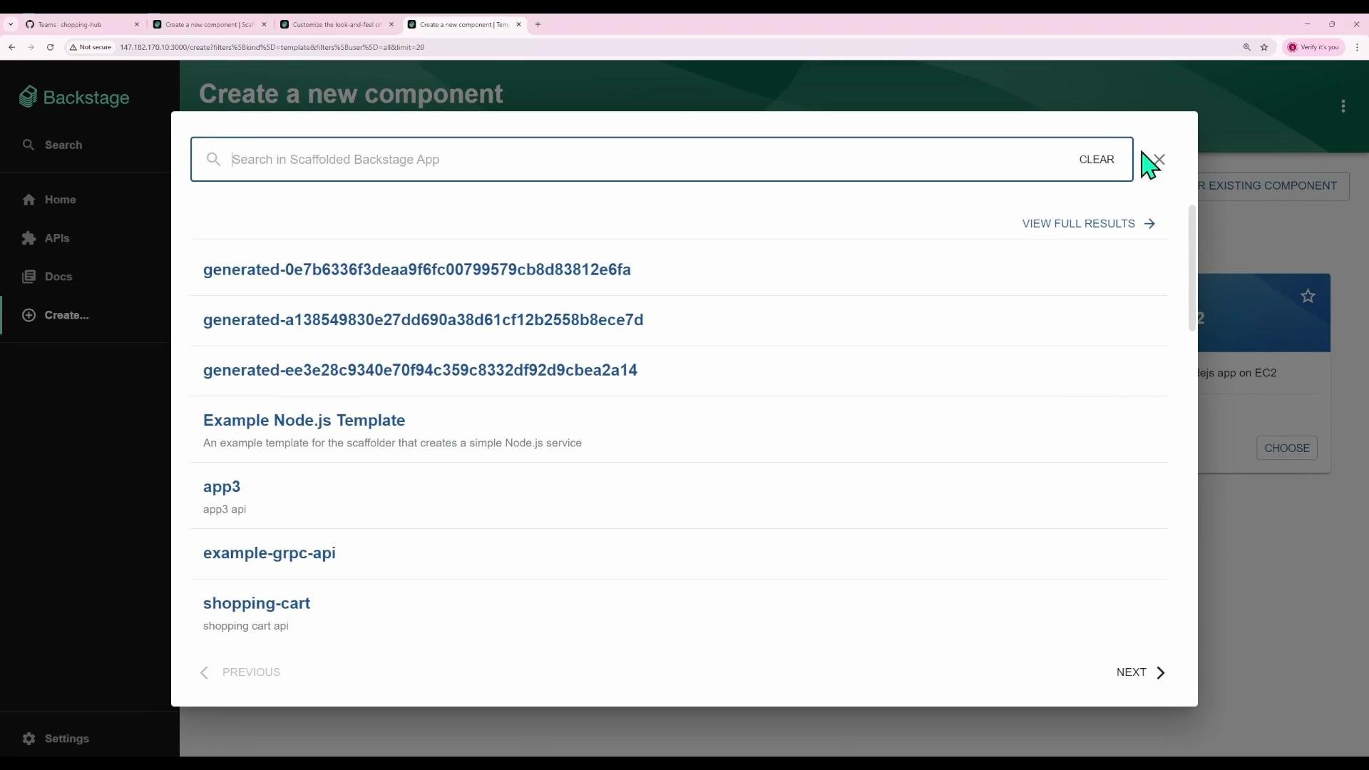
In this lesson you'll add a direct sidebar link in Backstage that navigates straight to the "Register existing component" page. The goal is to illustrate how Backstage pages map to routes and how to modify the sidebar (Root.tsx) to add a new `SidebarItem` that points to `/catalog-import`.
 Overview
* Backstage renders each page as a React component.
* Navigation is implemented by mapping URL paths to components using React Router.
* The left sidebar is defined in `Root.tsx` — add or update `SidebarItem` entries there.
How Backstage routes map to pages
Every page in Backstage has a unique URL path. When the browser navigates to a path, React Router renders the corresponding React component. Use `FlatRoutes` / `Route` elements to wire a path to a page component.
Common page paths in this example:
| Page | Path |
| -------------------------------------------- | ------------------------------------------- |
| Home (Catalog index) | `/catalog` |
| APIs (API docs) | `/api-docs` |
| Docs (TechDocs index/reader) | `/docs` or `/docs/:namespace/:kind/:name/*` |
| Create (Scaffolder) | `/create` |
| Register existing component (Catalog Import) | `/catalog-import` |
Example route configuration (from `App.tsx`)
```tsx theme={null}
// App.tsx (relevant parts)
import React from 'react';
import { Navigate, Route } from 'react-router-dom';
import { FlatRoutes } from '@backstage/core-app-api';
import {
CatalogIndexPage,
CatalogEntityPage,
} from '@backstage/plugin-catalog';
import { TechDocsIndexPage, TechDocsReaderPage } from '@backstage/plugin-techdocs';
import { ScaffolderPage } from '@backstage/plugin-scaffolder';
import { ApiExplorerPage } from '@backstage/plugin-api-docs';
import { CatalogImportPage } from '@backstage/plugin-catalog-import';
import { RequirePermission } from '@backstage/core-components';
import { catalogEntityCreatePermission } from '@backstage/plugin-catalog';
const routes = (
} />
} />
}>
{/* entityPage routes / sub-routes go here */}
} />
} />
} />
} />
}
/>
);
export default routes;
```
Notes
* A `Navigate` at `/` commonly redirects users to a landing page (here `/catalog`).
* Protect sensitive pages (like `catalog-import`) with permission checks (`RequirePermission`).
Where to update the sidebar: Root.tsx
The sidebar lives in `src/components/Root/Root.tsx`. Sidebar navigation is built with components such as `SidebarGroup` and `SidebarItem`. Each `SidebarItem` accepts props like `icon`, `to`, and `text` to control where it navigates and how it appears.
Example excerpt from `Root.tsx` showing the existing menu:
```tsx theme={null}
// src/components/Root/Root.tsx (excerpt)
import React, { PropsWithChildren } from 'react';
import { Link } from 'react-router-dom';
import { makeStyles } from '@material-ui/core';
import HomeIcon from '@material-ui/icons/Home';
import ExtensionIcon from '@material-ui/icons/Extension';
import LibraryBooksIcon from '@material-ui/icons/LibraryBooks';
import CreateComponentIcon from '@material-ui/icons/AddCircleOutline';
import {
SidebarPage,
Sidebar,
SidebarLogo,
SidebarGroup,
SidebarItem,
SidebarDivider,
SidebarScrollWrapper,
} from '@backstage/core-components';
import LogoFull from './LogoFull';
import LogoIcon from './LogoIcon';
import { SidebarSearchModal } from '@backstage/plugin-search';
import SearchIcon from '@material-ui/icons/Search';
import GroupIcon from '@material-ui/icons/Group';
export const Root = ({ children }: PropsWithChildren<{}>) => (
} to="/search">
}>
{/* Global nav, not org-specific */}
} to="/catalog" text="Home" />
}
/>
} to="/api-docs" text="APIs" />
} to="/docs" text="Docs" />
} to="/create" text="Create..." />
{children}
);
```
Add a direct link to "Register existing component"
To add a sidebar link that navigates directly to the Catalog Import page (`/catalog-import`):
1. Import an icon (e.g., Material UI's `AssignmentReturned`):
```tsx theme={null}
import AssignmentReturnedIcon from '@material-ui/icons/AssignmentReturned';
```
2. Add a `SidebarItem` inside the "Menu" `SidebarGroup` near the other top-level items:
```tsx theme={null}
}
to="/catalog-import"
text="Register"
/>
```
Complete snippet in context:
```tsx theme={null}
// inside the SidebarGroup labeled "Menu"
} to="/api-docs" text="APIs" />
} to="/docs" text="Docs" />
} to="/create" text="Create..." />
} to="/catalog-import" text="Register" />
```
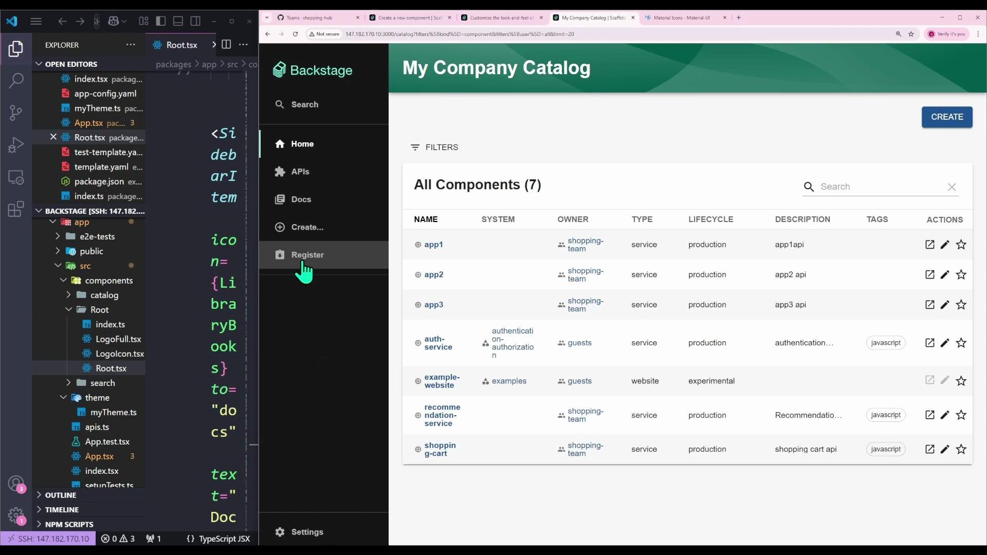
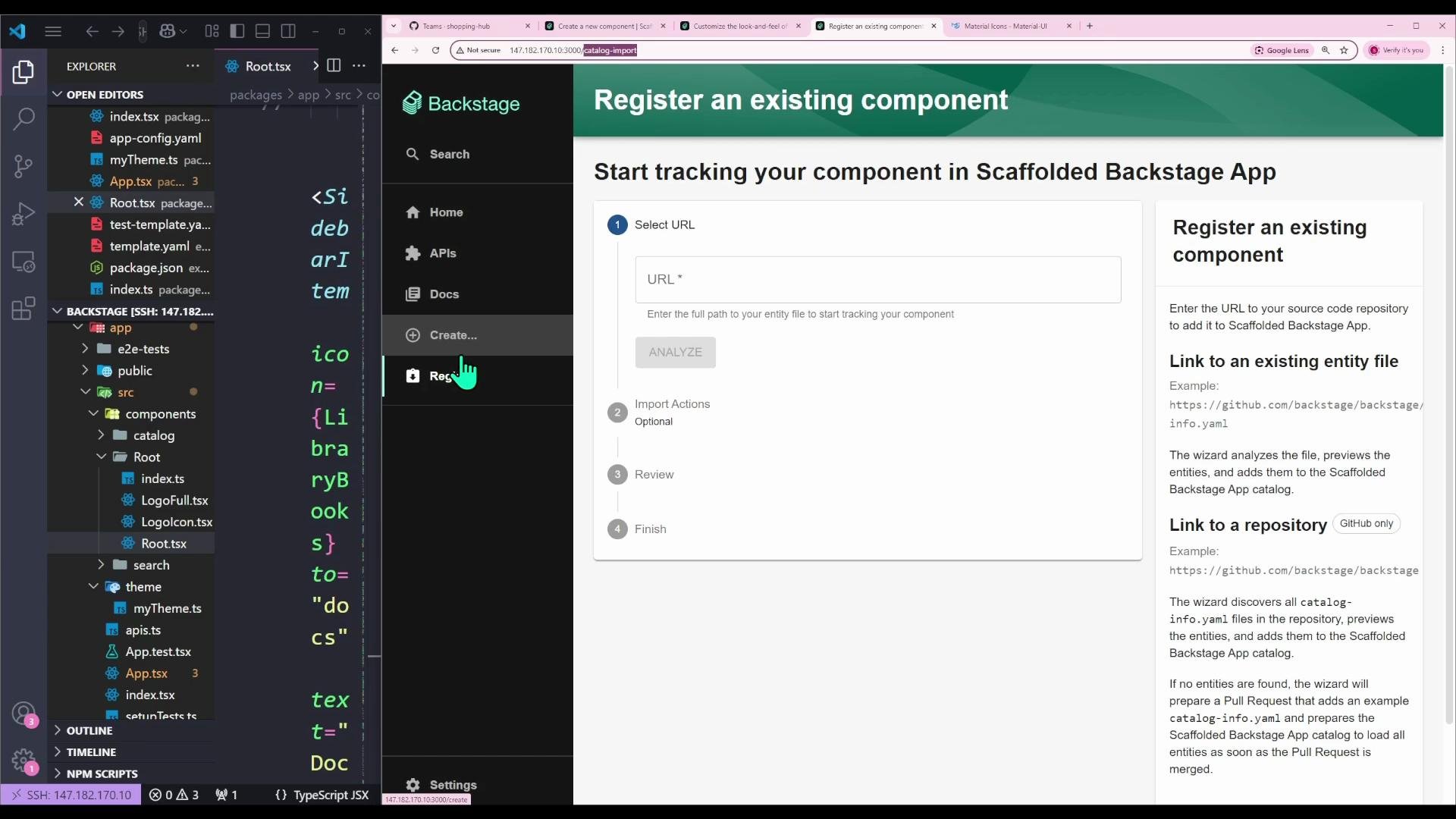
After saving and restarting (or rebuilding) your Backstage app, the new "Register" sidebar link will appear and navigate directly to `/catalog-import`, streamlining the Create → Register flow.
Overview
* Backstage renders each page as a React component.
* Navigation is implemented by mapping URL paths to components using React Router.
* The left sidebar is defined in `Root.tsx` — add or update `SidebarItem` entries there.
How Backstage routes map to pages
Every page in Backstage has a unique URL path. When the browser navigates to a path, React Router renders the corresponding React component. Use `FlatRoutes` / `Route` elements to wire a path to a page component.
Common page paths in this example:
| Page | Path |
| -------------------------------------------- | ------------------------------------------- |
| Home (Catalog index) | `/catalog` |
| APIs (API docs) | `/api-docs` |
| Docs (TechDocs index/reader) | `/docs` or `/docs/:namespace/:kind/:name/*` |
| Create (Scaffolder) | `/create` |
| Register existing component (Catalog Import) | `/catalog-import` |
Example route configuration (from `App.tsx`)
```tsx theme={null}
// App.tsx (relevant parts)
import React from 'react';
import { Navigate, Route } from 'react-router-dom';
import { FlatRoutes } from '@backstage/core-app-api';
import {
CatalogIndexPage,
CatalogEntityPage,
} from '@backstage/plugin-catalog';
import { TechDocsIndexPage, TechDocsReaderPage } from '@backstage/plugin-techdocs';
import { ScaffolderPage } from '@backstage/plugin-scaffolder';
import { ApiExplorerPage } from '@backstage/plugin-api-docs';
import { CatalogImportPage } from '@backstage/plugin-catalog-import';
import { RequirePermission } from '@backstage/core-components';
import { catalogEntityCreatePermission } from '@backstage/plugin-catalog';
const routes = (
} />
} />
}>
{/* entityPage routes / sub-routes go here */}
} />
} />
} />
} />
}
/>
);
export default routes;
```
Notes
* A `Navigate` at `/` commonly redirects users to a landing page (here `/catalog`).
* Protect sensitive pages (like `catalog-import`) with permission checks (`RequirePermission`).
Where to update the sidebar: Root.tsx
The sidebar lives in `src/components/Root/Root.tsx`. Sidebar navigation is built with components such as `SidebarGroup` and `SidebarItem`. Each `SidebarItem` accepts props like `icon`, `to`, and `text` to control where it navigates and how it appears.
Example excerpt from `Root.tsx` showing the existing menu:
```tsx theme={null}
// src/components/Root/Root.tsx (excerpt)
import React, { PropsWithChildren } from 'react';
import { Link } from 'react-router-dom';
import { makeStyles } from '@material-ui/core';
import HomeIcon from '@material-ui/icons/Home';
import ExtensionIcon from '@material-ui/icons/Extension';
import LibraryBooksIcon from '@material-ui/icons/LibraryBooks';
import CreateComponentIcon from '@material-ui/icons/AddCircleOutline';
import {
SidebarPage,
Sidebar,
SidebarLogo,
SidebarGroup,
SidebarItem,
SidebarDivider,
SidebarScrollWrapper,
} from '@backstage/core-components';
import LogoFull from './LogoFull';
import LogoIcon from './LogoIcon';
import { SidebarSearchModal } from '@backstage/plugin-search';
import SearchIcon from '@material-ui/icons/Search';
import GroupIcon from '@material-ui/icons/Group';
export const Root = ({ children }: PropsWithChildren<{}>) => (
} to="/search">
}>
{/* Global nav, not org-specific */}
} to="/catalog" text="Home" />
}
/>
} to="/api-docs" text="APIs" />
} to="/docs" text="Docs" />
} to="/create" text="Create..." />
{children}
);
```
Add a direct link to "Register existing component"
To add a sidebar link that navigates directly to the Catalog Import page (`/catalog-import`):
1. Import an icon (e.g., Material UI's `AssignmentReturned`):
```tsx theme={null}
import AssignmentReturnedIcon from '@material-ui/icons/AssignmentReturned';
```
2. Add a `SidebarItem` inside the "Menu" `SidebarGroup` near the other top-level items:
```tsx theme={null}
}
to="/catalog-import"
text="Register"
/>
```
Complete snippet in context:
```tsx theme={null}
// inside the SidebarGroup labeled "Menu"
} to="/api-docs" text="APIs" />
} to="/docs" text="Docs" />
} to="/create" text="Create..." />
} to="/catalog-import" text="Register" />
```
After saving and restarting (or rebuilding) your Backstage app, the new "Register" sidebar link will appear and navigate directly to `/catalog-import`, streamlining the Create → Register flow.
 Tip: Use a distinct icon and clear label to make the new link discoverable. Keep `SidebarItem` placement near related items so users learn the menu layout quickly.
Permission considerations
* The Catalog Import page (`/catalog-import`) typically requires a permission check such as `catalogEntityCreatePermission`. If you add the sidebar link but users lack permission, they’ll be prevented from accessing the page.
* Wrap the target page in `RequirePermission` (as shown in the routes example) to enforce access control.
Important: If you add a `SidebarItem` that points to a protected route, ensure the route itself enforces permissions. The sidebar link does not implicitly grant access.
Visual confirmation of the change
The screenshots below demonstrate the code edits in VS Code and the resulting direct navigation to the "Register an existing component" page.
Tip: Use a distinct icon and clear label to make the new link discoverable. Keep `SidebarItem` placement near related items so users learn the menu layout quickly.
Permission considerations
* The Catalog Import page (`/catalog-import`) typically requires a permission check such as `catalogEntityCreatePermission`. If you add the sidebar link but users lack permission, they’ll be prevented from accessing the page.
* Wrap the target page in `RequirePermission` (as shown in the routes example) to enforce access control.
Important: If you add a `SidebarItem` that points to a protected route, ensure the route itself enforces permissions. The sidebar link does not implicitly grant access.
Visual confirmation of the change
The screenshots below demonstrate the code edits in VS Code and the resulting direct navigation to the "Register an existing component" page.
 Summary & next steps
* Backstage pages are React components mapped to routes — update `App.tsx` (or equivalent) to wire new pages.
* Modify `Root.tsx` to change or add sidebar entries using `SidebarItem`, `SidebarGroup`, and `SidebarDivider`.
* Use the `to` prop to point `SidebarItem` at the route you want (e.g., `/catalog-import`).
* Choose distinct icons and labels to improve usability.
* Ensure protected pages enforce permissions using `RequirePermission`.
References
* Backstage docs: [https://backstage.io/docs](https://backstage.io/docs)
* React Router: [https://reactrouter.com/](https://reactrouter.com/)
* Backstage core components: [https://backstage.io/docs/components/core-features](https://backstage.io/docs/components/core-features)
This change is standard React work inside a Backstage app — once you understand routes and `Root.tsx` you can customize the UI to match your team's workflows.
Summary & next steps
* Backstage pages are React components mapped to routes — update `App.tsx` (or equivalent) to wire new pages.
* Modify `Root.tsx` to change or add sidebar entries using `SidebarItem`, `SidebarGroup`, and `SidebarDivider`.
* Use the `to` prop to point `SidebarItem` at the route you want (e.g., `/catalog-import`).
* Choose distinct icons and labels to improve usability.
* Ensure protected pages enforce permissions using `RequirePermission`.
References
* Backstage docs: [https://backstage.io/docs](https://backstage.io/docs)
* React Router: [https://reactrouter.com/](https://reactrouter.com/)
* Backstage core components: [https://backstage.io/docs/components/core-features](https://backstage.io/docs/components/core-features)
This change is standard React work inside a Backstage app — once you understand routes and `Root.tsx` you can customize the UI to match your team's workflows.