> ## Documentation Index
> Fetch the complete documentation index at: https://notes.kodekloud.com/llms.txt
> Use this file to discover all available pages before exploring further.
# Demo Building Dashboards in Grafana
> Guide to building a compact Grafana platform dashboard using Prometheus metrics with Time series, Stat, Gauge, and Pie chart panels for monitoring and troubleshooting
So much telemetry goes unused without effective visualization. Grafana turns Prometheus metrics into dashboards that make platform health visible at a glance. In this lesson we'll build a compact "Platform Dashboard" with four panel types—each chosen for a specific class of metric.
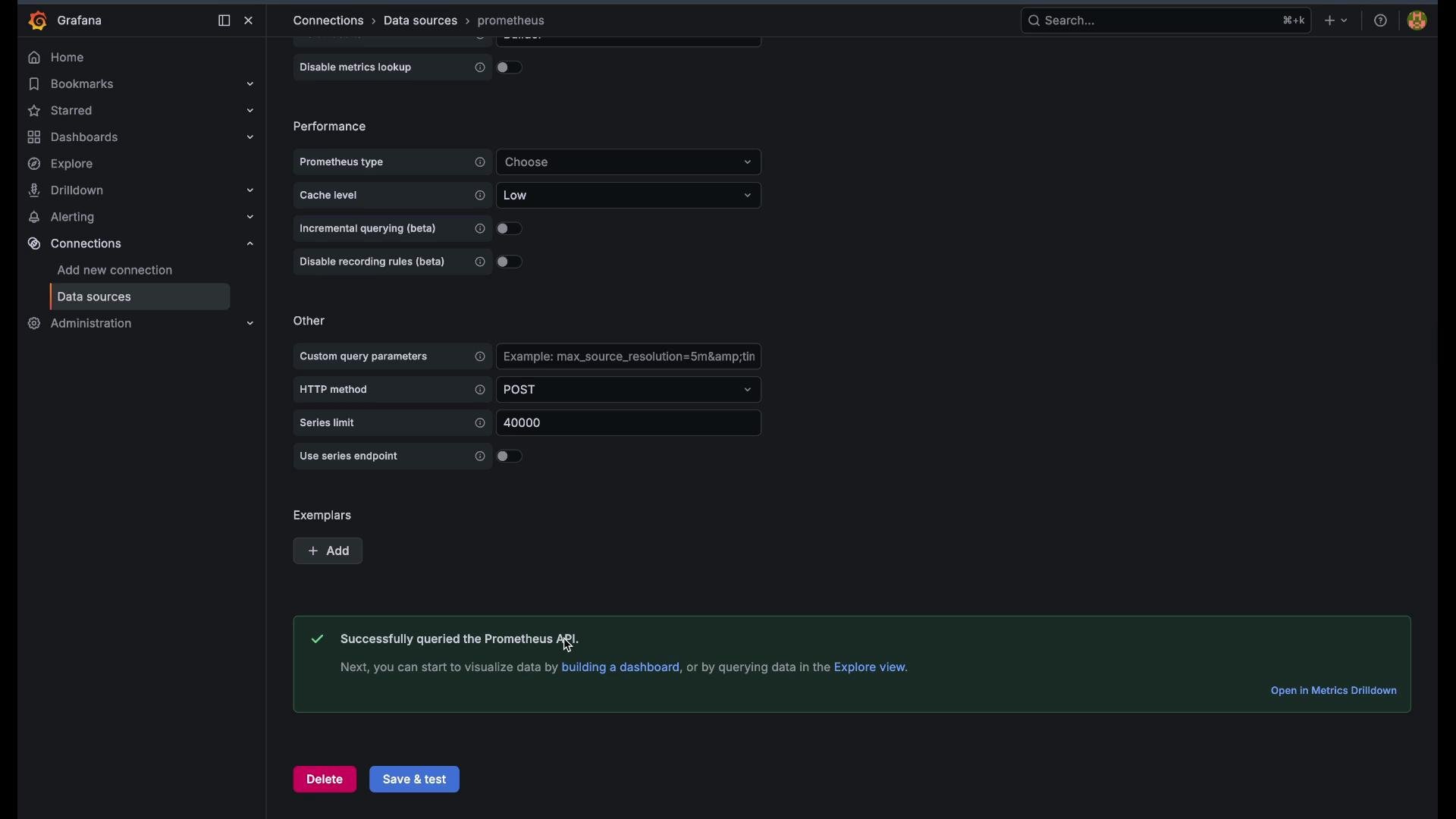
Before you begin, make sure a Prometheus data source is configured in Grafana. If you need setup guidance, see the [Grafana data source docs](https://grafana.com/docs/grafana/latest/datasources/prometheus/).
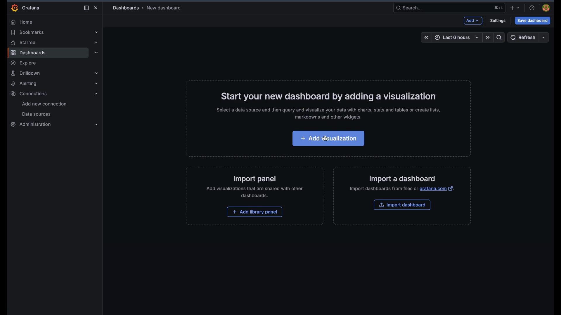
Start by opening Grafana, then go to the left-hand menu and click Dashboards.
 Create a new dashboard and add a visualization.
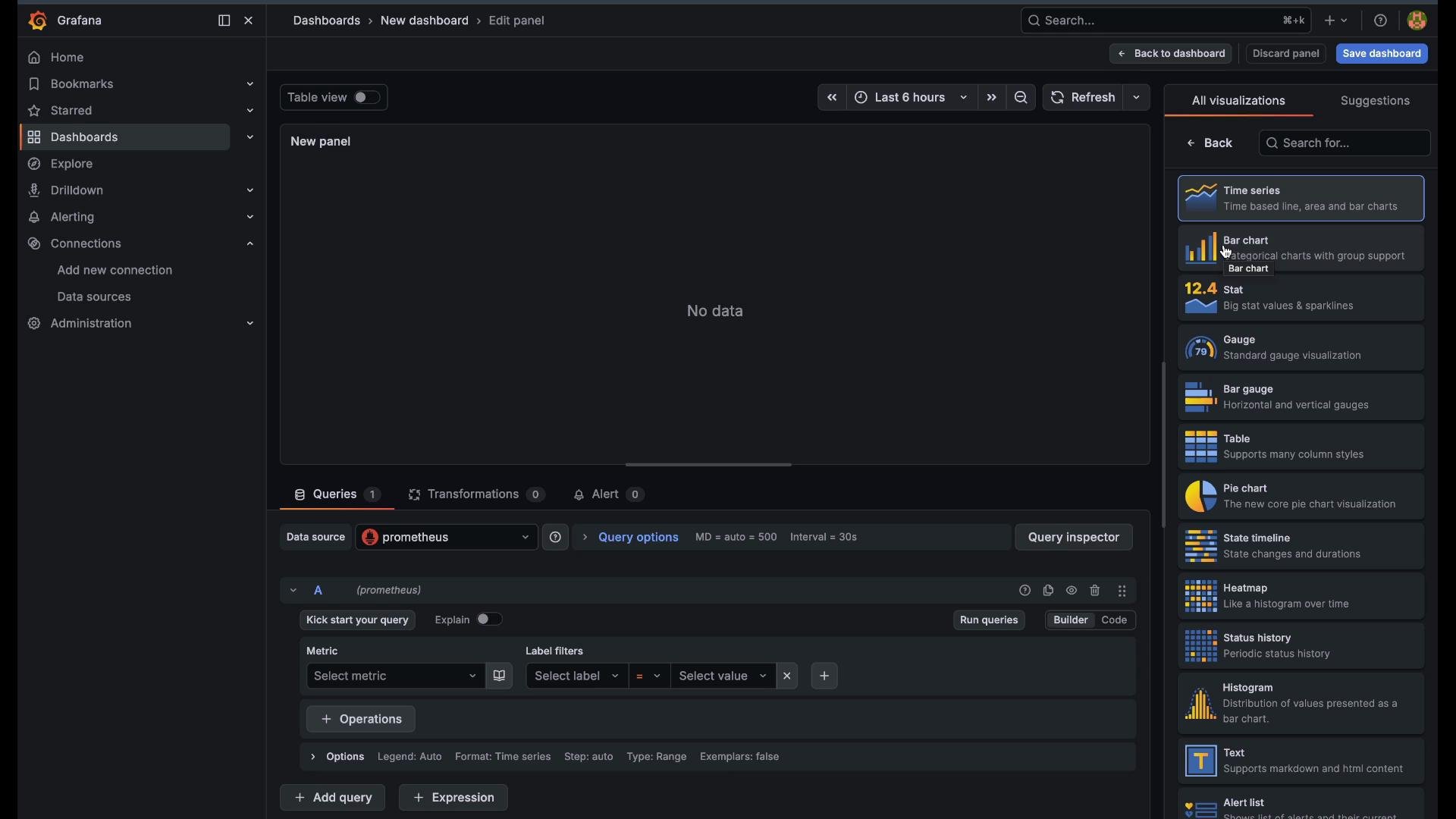
 Below are step-by-step instructions for adding four common panels: Time series, Stat, Gauge, and Pie chart. Follow the sequence to build an actionable dashboard.
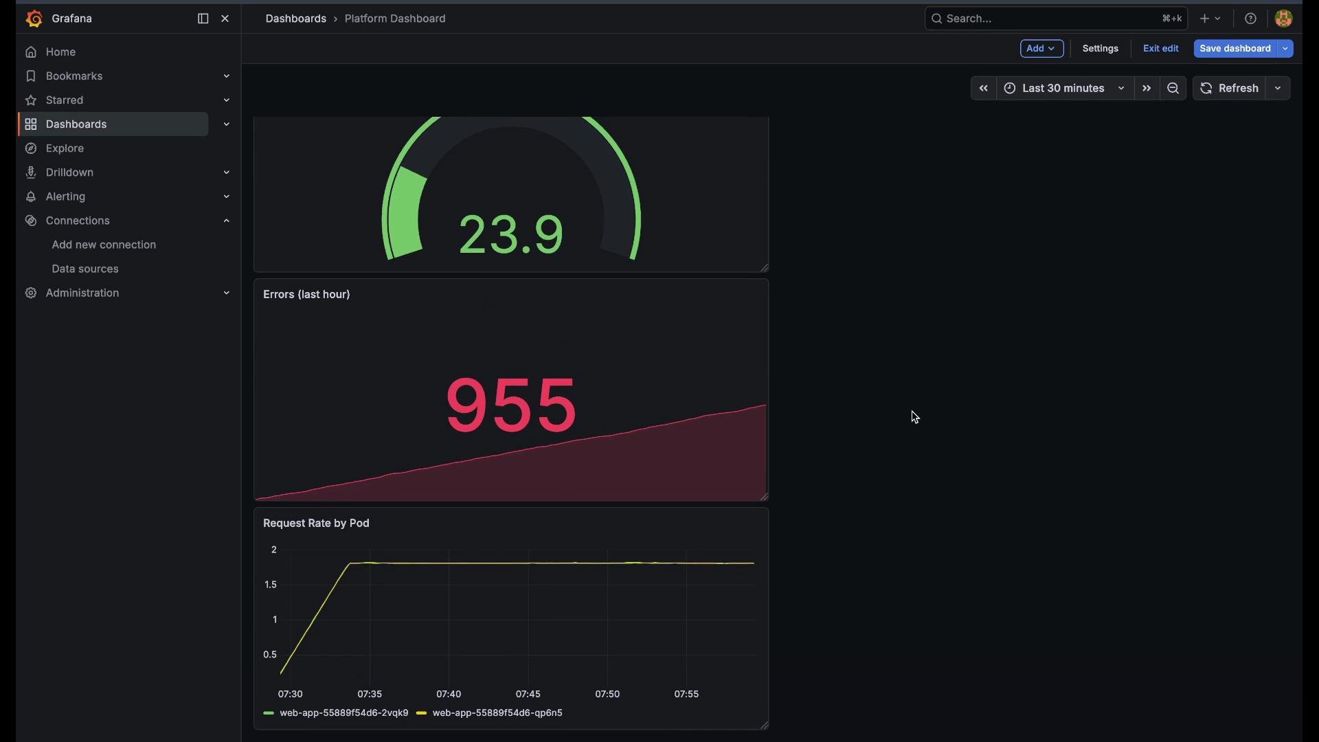
1. Time series — Request rate per pod
* Use a Time series panel for trend analysis and per-entity lines.
* Select the Time series visualization and choose your Prometheus data source.
* Enter this PromQL to show request rate per pod over the last 5 minutes. `sum by (pod)` yields one line per pod:
```promql theme={null}
sum(rate(http_requests_total{namespace="workloads"}[5m])) by (pod)
```
* Set the panel title to "Request Rate by Pod".
* Adjust the dashboard time range (e.g., last 30 minutes) so the chart reflects the desired window.
* Save the panel and then save the dashboard as "Platform Dashboard".
This helps you identify which pods receive the most traffic and whether load is well-distributed.
Below are step-by-step instructions for adding four common panels: Time series, Stat, Gauge, and Pie chart. Follow the sequence to build an actionable dashboard.
1. Time series — Request rate per pod
* Use a Time series panel for trend analysis and per-entity lines.
* Select the Time series visualization and choose your Prometheus data source.
* Enter this PromQL to show request rate per pod over the last 5 minutes. `sum by (pod)` yields one line per pod:
```promql theme={null}
sum(rate(http_requests_total{namespace="workloads"}[5m])) by (pod)
```
* Set the panel title to "Request Rate by Pod".
* Adjust the dashboard time range (e.g., last 30 minutes) so the chart reflects the desired window.
* Save the panel and then save the dashboard as "Platform Dashboard".
This helps you identify which pods receive the most traffic and whether load is well-distributed.
 2. Stat — Errors in the last hour
* Use a Stat panel when you need one prominent current value.
* Query total application errors over the past hour with:
```promql theme={null}
sum(increase(app_errors_total{namespace="workloads"}[1h]))
```
* Title the panel "Errors — Last Hour".
* Add thresholds to color the stat (for example, green/yellow/red) and show a sparkline if you want a mini trend.
* Save the panel to include it on the dashboard.
Use `increase()` when you want total counts over a window (e.g., errors during the last hour). Use `rate()` for per-second throughput or when plotting time-series rates.
3. Gauge — Memory Used (%)
* Gauges are ideal for capacity metrics and clear thresholding.
* Compute used memory percentage with this PromQL:
```promql theme={null}
(1 - (sum(node_memory_MemAvailable_bytes) / sum(node_memory_MemTotal_bytes))) * 100
```
* Title the panel "Memory Used (%)" or a descriptive variant.
* Configure thresholds, for example:
* 0–70: green
* 70–90: yellow
* 90+: red
* Save the panel. The gauge needle changes color as thresholds are crossed, giving an immediate view of capacity pressure.
2. Stat — Errors in the last hour
* Use a Stat panel when you need one prominent current value.
* Query total application errors over the past hour with:
```promql theme={null}
sum(increase(app_errors_total{namespace="workloads"}[1h]))
```
* Title the panel "Errors — Last Hour".
* Add thresholds to color the stat (for example, green/yellow/red) and show a sparkline if you want a mini trend.
* Save the panel to include it on the dashboard.
Use `increase()` when you want total counts over a window (e.g., errors during the last hour). Use `rate()` for per-second throughput or when plotting time-series rates.
3. Gauge — Memory Used (%)
* Gauges are ideal for capacity metrics and clear thresholding.
* Compute used memory percentage with this PromQL:
```promql theme={null}
(1 - (sum(node_memory_MemAvailable_bytes) / sum(node_memory_MemTotal_bytes))) * 100
```
* Title the panel "Memory Used (%)" or a descriptive variant.
* Configure thresholds, for example:
* 0–70: green
* 70–90: yellow
* 90+: red
* Save the panel. The gauge needle changes color as thresholds are crossed, giving an immediate view of capacity pressure.
 4. Pie chart — Request distribution by HTTP status
* Use a Pie chart for proportional breakdowns across categories.
* Use `increase()` so each slice represents total counts during the chosen window (not instant rates):
```promql theme={null}
sum(increase(http_requests_total{namespace="workloads"}[1h])) by (code)
```
* Title the panel (for example, "Requests by HTTP Status — Last Hour").
* Enable legend and show values so slices are clearly labeled with counts and percentages.
* Save the panel and refresh the dashboard.
4. Pie chart — Request distribution by HTTP status
* Use a Pie chart for proportional breakdowns across categories.
* Use `increase()` so each slice represents total counts during the chosen window (not instant rates):
```promql theme={null}
sum(increase(http_requests_total{namespace="workloads"}[1h])) by (code)
```
* Title the panel (for example, "Requests by HTTP Status — Last Hour").
* Enable legend and show values so slices are clearly labeled with counts and percentages.
* Save the panel and refresh the dashboard.
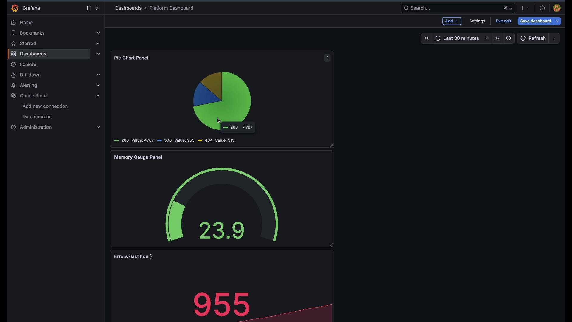 Summary — What these panels cover
* Trend analysis: Time series (request patterns over time).
* Immediate health: Stat (current error count).
* Thresholded resource usage: Gauge (memory utilization with thresholds).
* Distribution: Pie chart (categorical splits like HTTP status codes).
Panel reference table
| Panel Type | Best for | Example query |
| ----------- | ----------------------------- | ------------------------------------------------------------------------------------- |
| Time series | Trends and per-entity lines | `sum(rate(http_requests_total{namespace="workloads"}[5m])) by (pod)` |
| Stat | Single high-visibility metric | `sum(increase(app_errors_total{namespace="workloads"}[1h]))` |
| Gauge | Percentages and thresholds | `(1 - (sum(node_memory_MemAvailable_bytes) / sum(node_memory_MemTotal_bytes))) * 100` |
| Pie chart | Proportional distribution | `sum(increase(http_requests_total{namespace="workloads"}[1h])) by (code)` |
Further reading and references
* Grafana: [https://grafana.com/docs/](https://grafana.com/docs/)
* Prometheus: [https://prometheus.io/docs/](https://prometheus.io/docs/)
* PromQL basics: [https://prometheus.io/docs/prometheus/latest/querying/basics/](https://prometheus.io/docs/prometheus/latest/querying/basics/)
Save your dashboard once more to commit all panels. You now have a concise Platform Dashboard that supports troubleshooting, capacity planning, and traffic analysis.
Summary — What these panels cover
* Trend analysis: Time series (request patterns over time).
* Immediate health: Stat (current error count).
* Thresholded resource usage: Gauge (memory utilization with thresholds).
* Distribution: Pie chart (categorical splits like HTTP status codes).
Panel reference table
| Panel Type | Best for | Example query |
| ----------- | ----------------------------- | ------------------------------------------------------------------------------------- |
| Time series | Trends and per-entity lines | `sum(rate(http_requests_total{namespace="workloads"}[5m])) by (pod)` |
| Stat | Single high-visibility metric | `sum(increase(app_errors_total{namespace="workloads"}[1h]))` |
| Gauge | Percentages and thresholds | `(1 - (sum(node_memory_MemAvailable_bytes) / sum(node_memory_MemTotal_bytes))) * 100` |
| Pie chart | Proportional distribution | `sum(increase(http_requests_total{namespace="workloads"}[1h])) by (code)` |
Further reading and references
* Grafana: [https://grafana.com/docs/](https://grafana.com/docs/)
* Prometheus: [https://prometheus.io/docs/](https://prometheus.io/docs/)
* PromQL basics: [https://prometheus.io/docs/prometheus/latest/querying/basics/](https://prometheus.io/docs/prometheus/latest/querying/basics/)
Save your dashboard once more to commit all panels. You now have a concise Platform Dashboard that supports troubleshooting, capacity planning, and traffic analysis.