In this guide, you’ll learn how to build a simple Backstage frontend plugin called advice that fetches random tips from an external API and displays them on an entity page. This pattern applies equally well to any REST or GraphQL API, GitHub integrations, or custom backends.
Overview The advice plugin will:
Provide a full-page route at /advice
Expose a reusable AdviceCard component
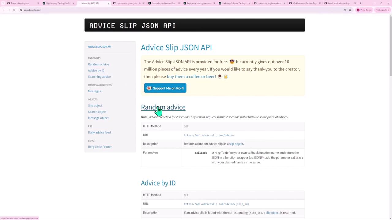
Fetch random advice from the Advice Slip JSON API and render it inside an InfoCard
Every time you open or refresh an entity page, the AdviceCard will display a fresh nugget of wisdom.
1. Scaffold the Plugin Backstage’s CLI can generate all the boilerplate for you. In your Backstage root directory, run:
When prompted, choose:
? What do you want to create? › plugin - A new frontend plugin ? Enter the ID of the plugin [required] advice
Once complete, you’ll have a directory structure like this:
Path Purpose plugins/advice/src/componentsReact components plugins/advice/src/index.tsEntry point re-exports plugins/advice/src/plugin.tsPlugin definition and extensions plugins/advice/src/routes.tsRoute references for routing plugins/advice/package.jsonPlugin dependencies and metadata
The plugin ID (advice) is used for routing, packaging, and yarn workspace commands.
2. Inspect Generated Files package.json { "name" : "@internal/backstage-plugin-advice" , "version" : "0.1.0" , "backstage" : { "role" : "frontend-plugin" }, "dependencies" : { "@backstage/core-components" : "^0.16.3" , "@backstage/core-plugin-api" : "^1.10.3" , "@material-ui/core" : "^4.9.13" , "react-use" : "17.2.4" } }
routes.ts Defines a route reference for full-page navigation:
import { createRouteRef } from '@backstage/core-plugin-api' ; export const rootRouteRef = createRouteRef ({ id: 'advice-root' , });
plugin.ts Registers the plugin and its full-page extension:
import { createPlugin , createRoutableExtension , } from '@backstage/core-plugin-api' ; import { rootRouteRef } from './routes' ; export const advicePlugin = createPlugin ({ id: 'advice' , routes: { root: rootRouteRef }, }); export const AdvicePage = advicePlugin . provide ( createRoutableExtension ({ name: 'AdvicePage' , component : () => import ( './components/ExampleComponent' ). then ( m => m . ExampleComponent ), mountPoint: rootRouteRef , }), );
ExampleComponent (Placeholder) Located at plugins/advice/src/components/ExampleComponent.tsx:
import { Page , Header , HeaderLabel , Content , ContentHeader , SupportButton , } from '@backstage/core-components' ; import { Grid , InfoCard , Typography } from '@material-ui/core' ; export const ExampleComponent = () => ( < Page themeId = "tool" > < Header title = "Welcome to advice!" subtitle = "Your daily tip" > < HeaderLabel label = "Owner" value = "Team X" /> < HeaderLabel label = "Lifecycle" value = "Alpha" /> </ Header > < Content > < ContentHeader title = "Plugin overview" > < SupportButton > A description of your plugin goes here . </ SupportButton > </ ContentHeader > < Grid container spacing = { 3 } direction = "column" > < Grid item > < InfoCard title = "Info" > < Typography variant = "body1" > Replace this with real functionality . </ Typography > </ InfoCard > </ Grid > </ Grid > </ Content > </ Page > );
3. Register the /advice Route In your application’s main routing file (e.g. packages/app/src/App.tsx), import and add the AdvicePage:
import { AdvicePage } from '@internal/backstage-plugin-advice' ; const routes = ( < FlatRoutes > { /* ...other routes */ } < Route path = "/advice" element = {<AdvicePage />} /> </ FlatRoutes > );
Now, visiting http://localhost:3000/advice shows your placeholder page.
4. Create the AdviceCard Component We’ll build a compact card that can be embedded in any entity page.
4.1 Define the Component Create plugins/advice/src/components/AdviceCard.tsx:
import React from 'react' ; export const AdviceCard = () => { return < div > This is my advice for the day </ div > ; };
Add an index.ts for easy imports:
export { AdviceCard } from './AdviceCard' ;
4.2 Expose the Extension In plugins/advice/src/plugin.ts, add:
import { createComponentExtension } from '@backstage/core-plugin-api' ; import { advicePlugin } from './plugin' ; export const AdviceCard = advicePlugin . provide ( createComponentExtension ({ name: 'AdviceCard' , component: { lazy : () => import ( './components/AdviceCard' ). then ( m => m . AdviceCard ), }, }), );
Update plugins/advice/src/index.ts to re-export:
export { advicePlugin , AdvicePage , AdviceCard } from './plugin' ;
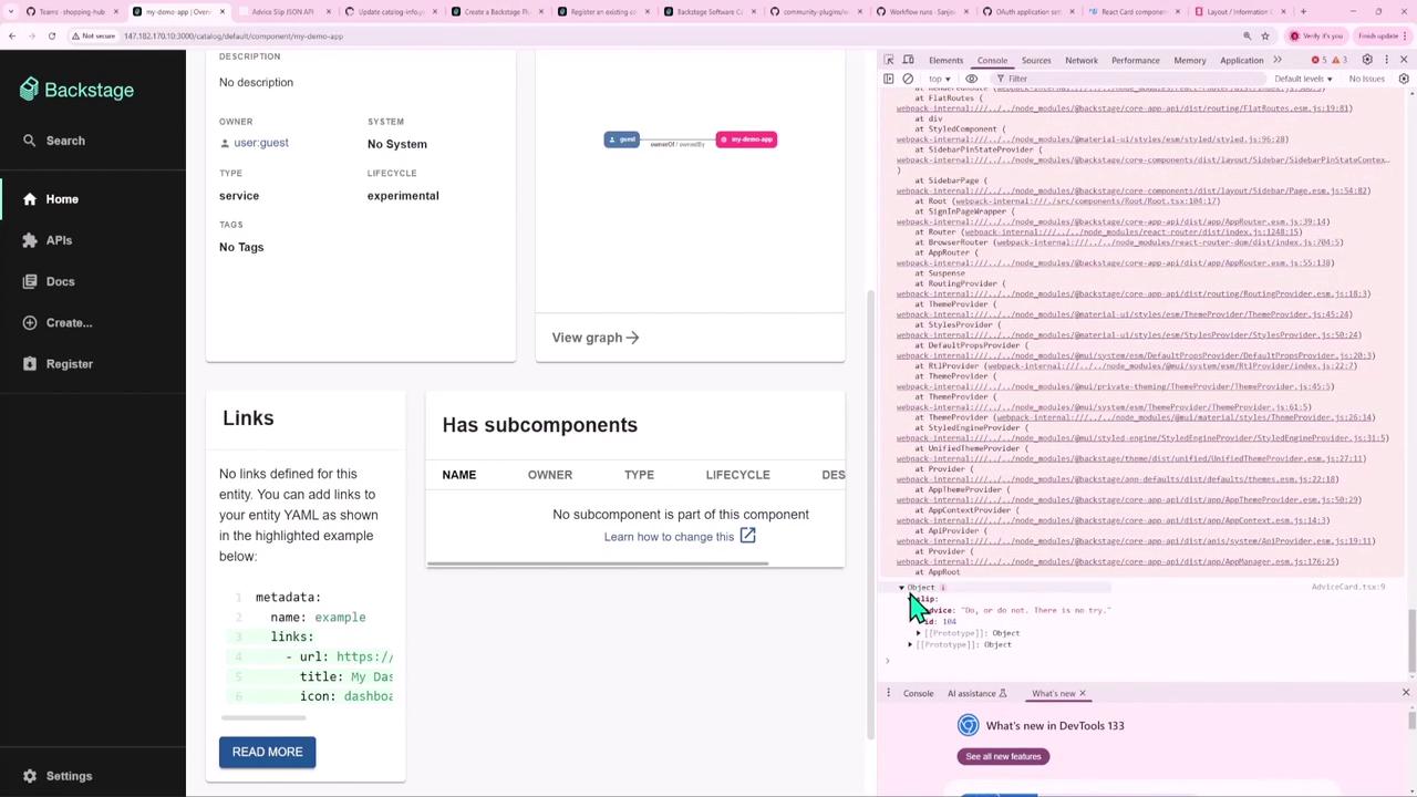
5. Embed on an Entity Page Open packages/app/src/components/catalog/EntityPage.tsx (or your custom entity page) and add:
import { AdviceCard } from '@internal/backstage-plugin-advice' ; // ... const overviewContent = ( < Grid container spacing = { 3 } alignItems = "stretch" > { /* existing cards */ } < Grid item md = { 3 } xs = { 12 } > < AdviceCard /> </ Grid > </ Grid > );
Reload your app—AdviceCard now appears alongside other overview cards.
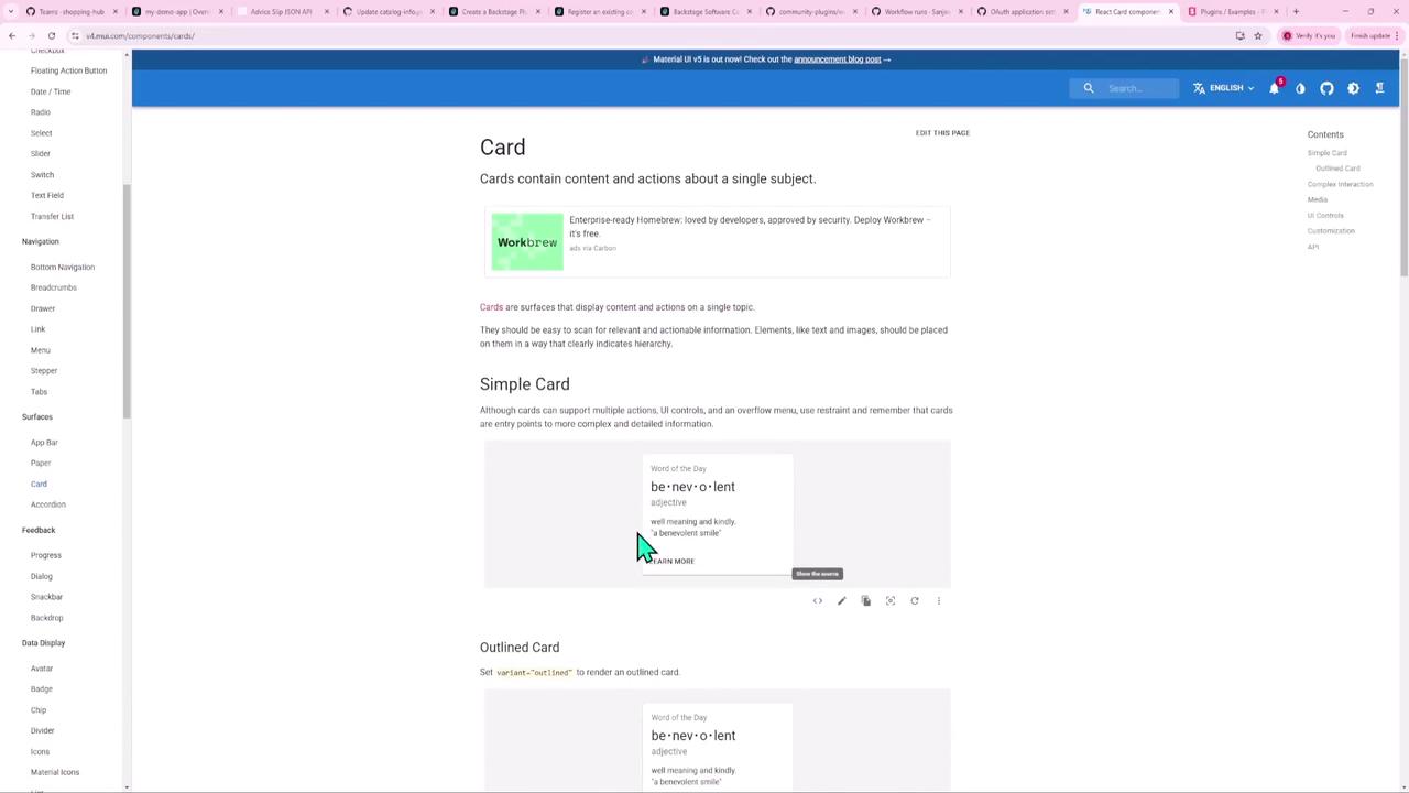
6. Style with InfoCard Swap the <div> for Backstage’s InfoCard for a polished look:
import React from 'react' ; import { InfoCard } from '@backstage/core-components' ; export const AdviceCard = () => ( < InfoCard title = "Random Advice" > This is my advice for the day </ InfoCard > );
Explore Backstage Storybook for pre-built layouts:
7. Fetch Live Advice Integrate Backstage’s API abstraction using useApi and fetchApiRef:
import React , { useEffect , useState } from 'react' ; import { InfoCard } from '@backstage/core-components' ; import { fetchApiRef , useApi } from '@backstage/core-plugin-api' ; export const AdviceCard = () => { const fetchApi = useApi ( fetchApiRef ); const [ advice , setAdvice ] = useState < string >(); useEffect (() => { fetchApi . fetch ( 'https://api.adviceslip.com/advice' ) . then ( res => res . json ()) . then ( data => setAdvice ( data . slip . advice )) . catch (() => setAdvice ( 'Failed to load advice' )); }, [ fetchApi ]); return ( < InfoCard title = "Random Advice" > { advice ?? ' Loading advice ...'} </ InfoCard > ); };
The Advice Slip API may cache responses. To force fresh data on each request, consider appending a timestamp query (e.g. ?timestamp=${Date.now()}).
8. Run the Plugin Independently You can develop the plugin without running the entire Backstage app:
# From the plugin folder cd plugins/advice yarn start # Or from the monorepo root yarn workspace @internal/backstage-plugin-advice start
A minimal dev server will launch:
[webpack-dev-server] Project is running at http://localhost:3000/
Conclusion You have successfully:
Scaffolded a Backstage frontend plugin
Exposed both a full-page route and a reusable card extension
Styled the component with InfoCard
Fetched live data using useApi and fetchApiRef
Embedded the card on an entity overview page
Ran the plugin independently in development mode
Use this blueprint to build data-driven, reusable components in your Backstage ecosystem. Happy coding!
Links and References 