Overview
Imagine you want to analyze website visits over the past two years. With Kibana, you can effortlessly see where your users are coming from by plotting geographic coordinates obtained from your logs. This capability is invaluable for identifying traffic hotspots and making informed strategic decisions.Step 1: Uploading Your Data
Begin by opening the Kibana UI and navigating to the Upload a file option. Drag and drop your sample data file containing website visit information from around the world.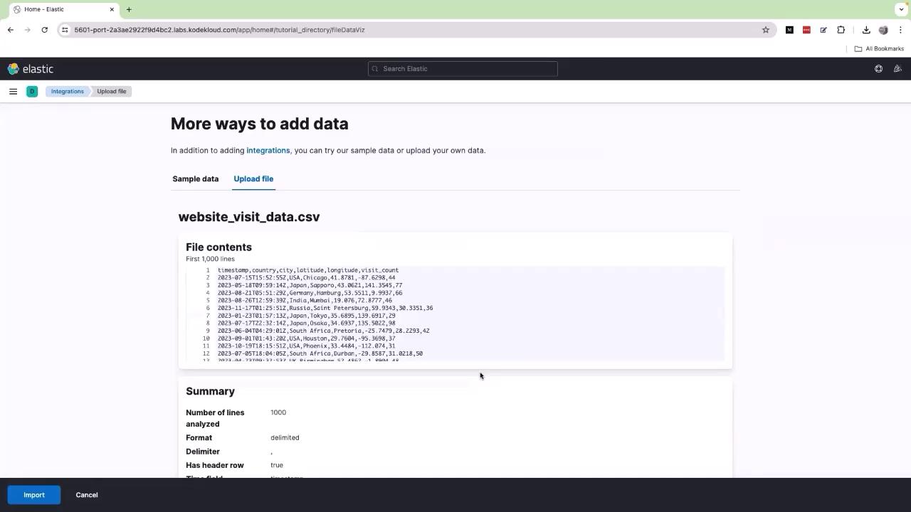
Ensure that the logs include geographical coordinates or location data. Without this, Kibana cannot plot the information on maps. If needed, consult with your development team to include these details in your logging system.
Step 2: Creating a Dashboard Map
- Click on the navigation menu (represented by three horizontal lines).
- Go to Dashboard and click Create Dashboard.
- Choose All types and select Lens.
- If you see multiple indexes, select website traffic from the dropdown menu.
- Drag and drop the location available field into the designated area.
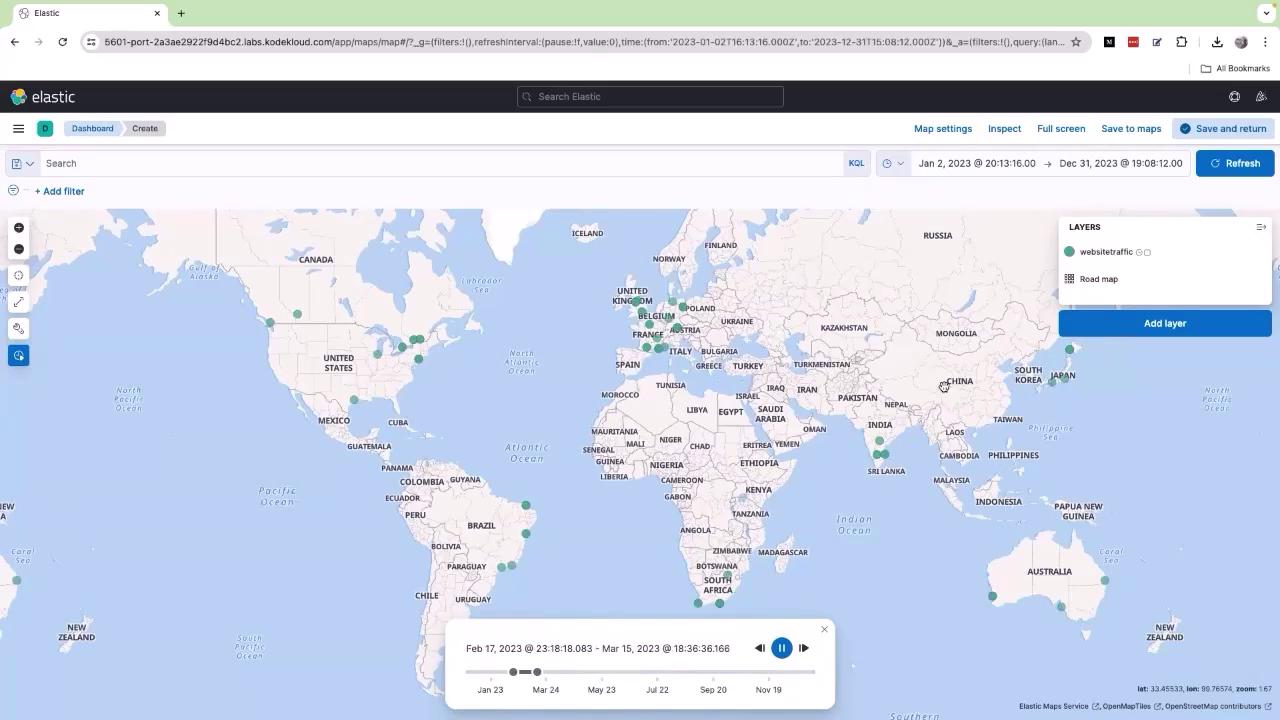
Step 3: Analyzing the Map Data
The generated map displays data for the period from January 2, 2023, to December 31, 2023. Each dot on the map corresponds to current traffic records based on your logs. To explore these trends further, click on the time slider (depicted by a clock icon). Adjust the slider by moving the bar toward the end, shift it slightly to the left, and press the Run or Play button. As the timeline plays, observe how the data points move to reflect changes over time. For example, new traffic points in Japan indicate increased activity, while points that were missing may reappear as conditions change.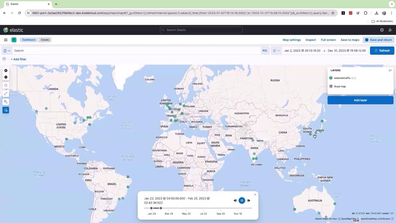
Strategic Insights
This interactive dashboard is not only useful for visualizing data but also for strategic planning. By analyzing the geographic distribution of your traffic, you can make decisions like deploying your application closer to your end users for enhanced performance. For instance, a clustering of users in the European region, especially around the UK, might indicate the benefits of hosting parts of your application in that region to reduce latency.