Backstage Design System
Backstage’s design system builds on top of Material-UI and Backstage’s own component library. All Material-UI components work seamlessly alongside Backstage’s custom elements—giving you a consistent look and feel.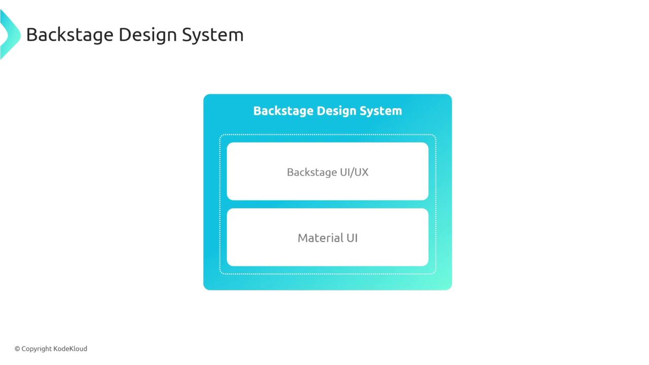
Material-UI Integration
Material-UI provides prebuilt React components—buttons, cards, sliders, etc.—that you can drop right into your Backstage frontend. Install the core packages:Browse the full list of Backstage and Material-UI components in the Backstage Storybook.
Exploring Backstage Components
Backstage publishes its components in Storybook. You’ll find cards, progress bars, navigation elements, and more—all ready to customize.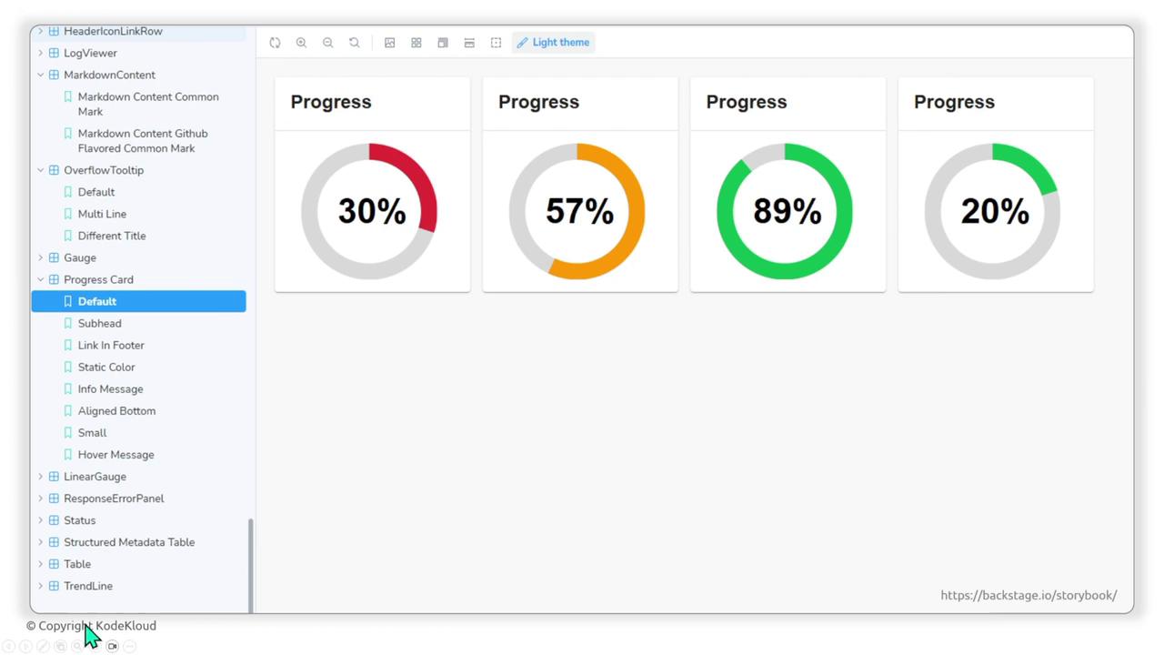
| Component Type | Description | Example Usage |
|---|---|---|
| Card | Container for grouped content | <Card><CardContent>...</CardContent></Card> |
| Progress Circle | Visualize task completion percentage | <CircularProgress variant="determinate" value={50} /> |
| Sidebar | Navigation wrapper for main sections | <Sidebar><SidebarItem to="/">Home</SidebarItem></Sidebar> |
Theming in Backstage
A theme defines colors, typography, shadows, and opacity. Backstage supports multiple themes (light/dark) so you can match your brand or user preferences.
Creating a Custom Theme
- In your frontend app directory, navigate to
packages/apps/<your-app>/src. - Create a
theme/folder and addmyTheme.ts.
Custom Color Overrides
Override specific palette values for a unique look:Using a nonstandard font like
Comic Sans MS may impact readability. Choose a web-safe or hosted font for production.Applying the Theme with React Context
Backstage uses React Context to make the theme available to all components. Wrap your root app withThemeProvider:
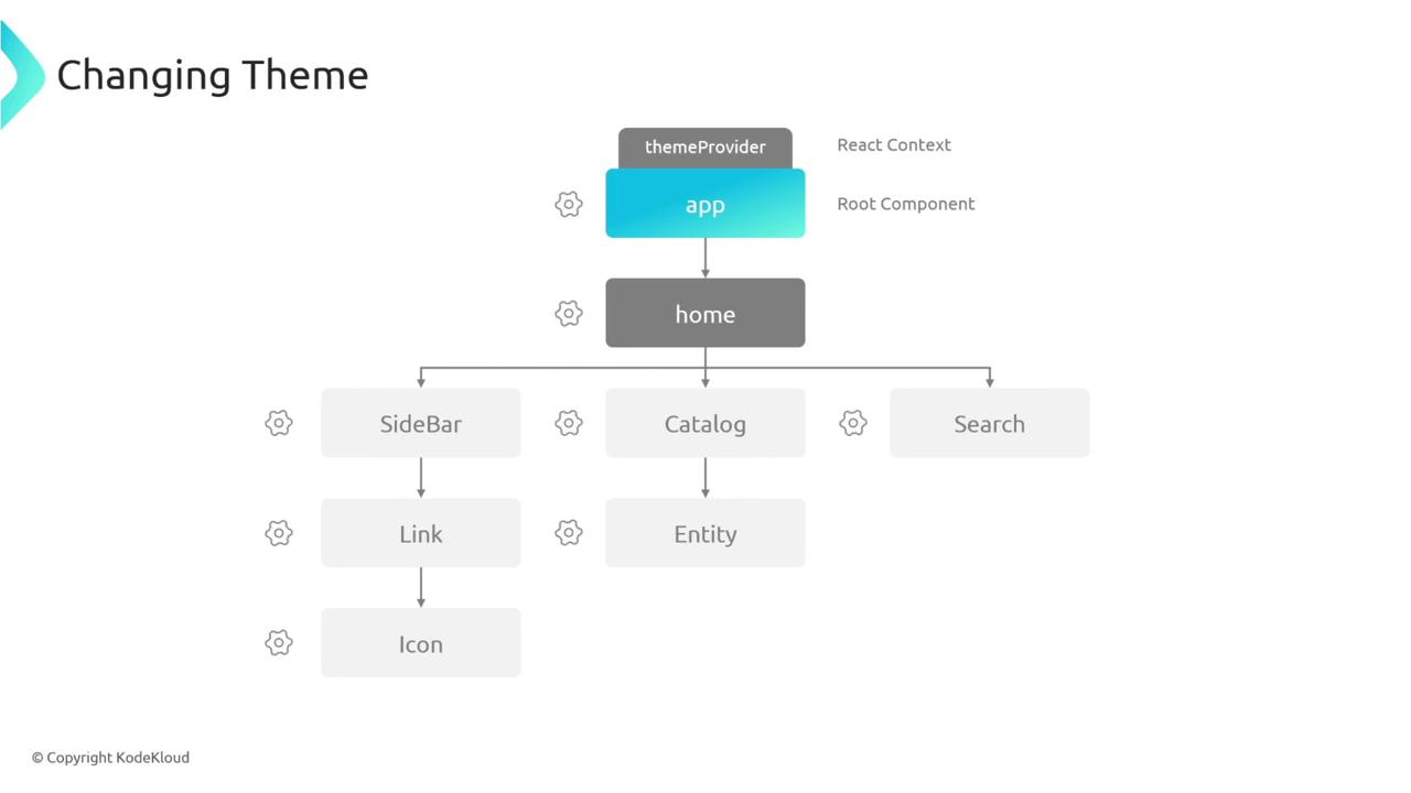
AppRoutes in ThemeProvider, the myTheme object is shared throughout your component tree—allowing consistent styling based on your custom theme.
Next Steps
Now you’re ready to:- Integrate Material-UI components into Backstage.
- Browse and customize Backstage Storybook components.
- Define custom themes that match your brand.
- Apply them across your app using React Context.