Certified Backstage Associate (CBA)
Customization Plugins
Demo Customizing UI Part 2
In this tutorial, you’ll learn how to extend Backstage’s default sidebar by injecting a Register link that points directly to the catalog import page (/catalog-import). This simplifies the flow for onboarding existing components, letting users skip the template picker and go straight to registration.
Backstage Sidebar Overview
By default, Backstage’s global navigation includes these items:

Clicking Create opens the template picker, where users choose to scaffold a new component or register an existing one:
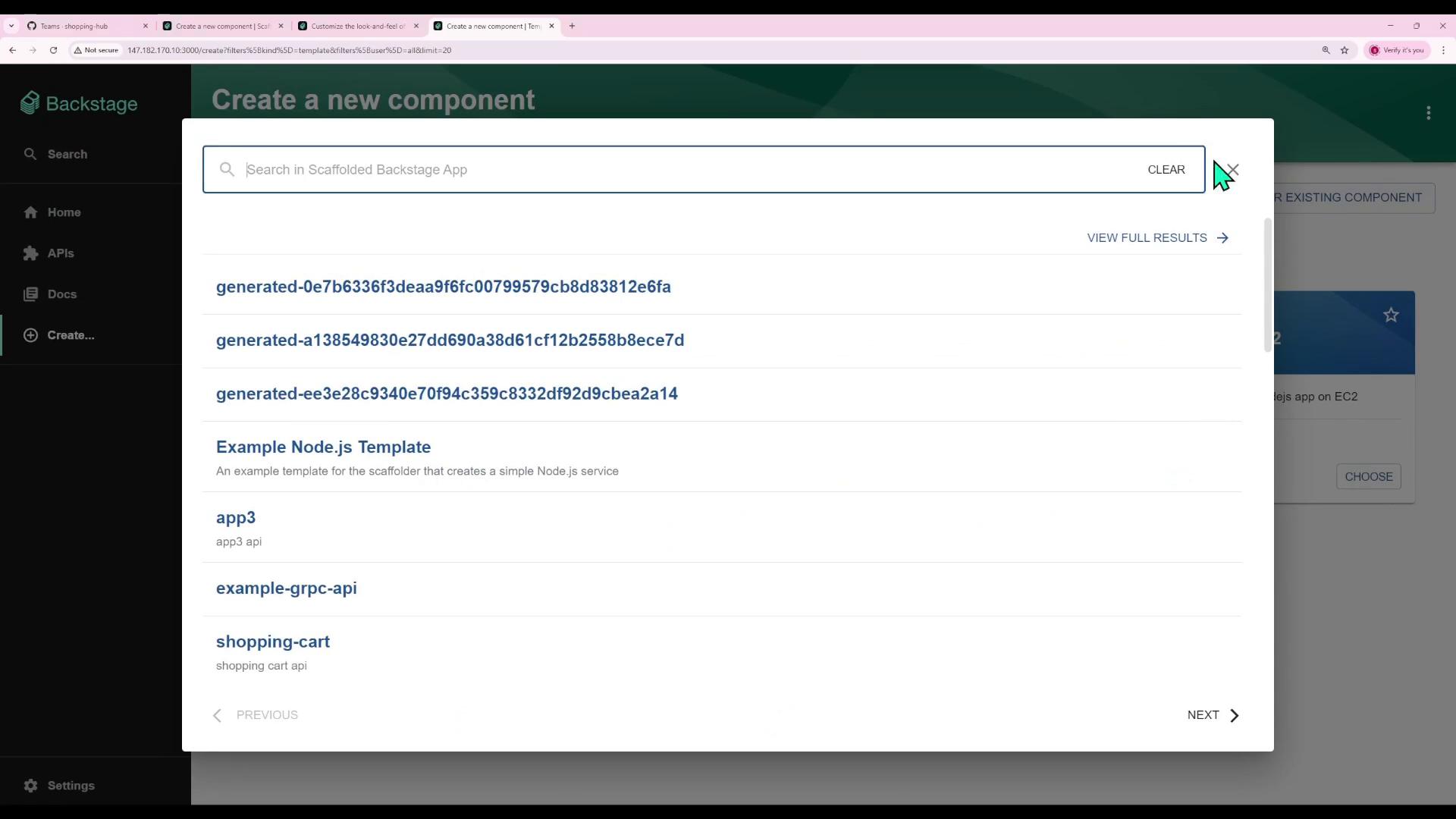
Our goal is to add a Register link directly under Create in the sidebar, pointing to the catalog import workflow.
Understanding Routing in Backstage
Backstage is built on React Router. Each view is tied to a URL path using <Route> definitions in src/App.tsx. When a user navigates to a path, the corresponding plugin page renders.
Note
Routes are wrapped in <FlatRoutes> from @backstage/core-components, which integrates with React Router v6 under the hood.
| Path | Component | Description |
|---|---|---|
/catalog | CatalogIndexPage | Catalog overview |
/catalog/:ns/:kind/:name | CatalogEntityPage | Entity detail view |
/docs | TechDocsIndexPage | TechDocs index |
/docs/:ns/:kind/:name/* | TechDocsReaderPage | TechDocs content reader |
/create | ScaffoldFolderPage | Create or scaffold component |
/api-docs | ApiExplorerPage | API Explorer |
/catalog-import | CatalogImportPage | Register existing component |
Here’s the relevant snippet from src/App.tsx:
import React from 'react';
import { Navigate, Route } from 'react-router-dom';
import { FlatRoutes } from '@backstage/core-components';
import { CatalogIndexPage, CatalogEntityPage } from '@backstage/plugin-catalog';
import { TechDocsIndexPage, TechDocsReaderPage } from '@backstage/plugin-techdocs';
import { ScaffoldFolderPage } from '@backstage/plugin-scaffolder';
import { ApiExplorerPage } from '@backstage/plugin-explorer';
import { CatalogImportPage } from '@backstage/plugin-catalog-import';
import { RequirePermission } from '@backstage/plugin-permission';
import { catalogEntityCreatePermission } from '@backstage/plugin-catalog';

const routes = (
  <FlatRoutes>
    <Route path="/" element={<Navigate to="catalog" replace />} />
    <Route path="/catalog" element={<CatalogIndexPage />} />
    <Route path="/catalog/:namespace/:kind/:name" element={<CatalogEntityPage />} />
    <Route path="/docs" element={<TechDocsIndexPage />} />
    <Route path="/docs/:namespace/:kind/:name/*" element={<TechDocsReaderPage />} />
    <Route path="/create" element={<ScaffoldFolderPage />} />
    <Route path="/api-docs" element={<ApiExplorerPage />} />
    <Route
      path="/catalog-import"
      element={
        <RequirePermission permission={catalogEntityCreatePermission}>
          <CatalogImportPage />
        </RequirePermission>
      }
    />
  </FlatRoutes>
);
Modifying the Sidebar
The sidebar items live in src/components/Root.tsx. Locate the <SidebarGroup label="Menu"> section and insert your new item:
// src/components/Root.tsx
import React, { PropsWithChildren } from 'react';
import {
  SidebarPage,
  Sidebar,
  SidebarGroup,
  SidebarItem,
  SidebarDivider,
  SidebarSearchModal,
} from '@backstage/core-components';
import HomeIcon from '@material-ui/icons/Home';
import ExtensionIcon from '@material-ui/icons/Extension';
import LibraryBooksIcon from '@material-ui/icons/LibraryBooks';
import CreateIcon from '@material-ui/icons/AddCircleOutline';
import MenuIcon from '@material-ui/icons/Menu';
import SearchIcon from '@material-ui/icons/Search';
import LogoFull from './LogoFull';
import LogoIcon from './LogoIcon';
// 1. Import the new icon
import AssignmentReturnedIcon from '@material-ui/icons/AssignmentReturned';

export const Root = ({ children }: PropsWithChildren<{}>) => (
  <SidebarPage>
    <Sidebar>
      <SidebarLogo />
      <SidebarGroup label="Search" icon={<SearchIcon />} to="/search">
        <SidebarSearchModal />
      </SidebarGroup>
      <SidebarDivider />
      <SidebarGroup label="Menu" icon={<MenuIcon />}>
        <SidebarItem icon={HomeIcon} to="catalog" text="Home" />
        <SidebarItem icon={ExtensionIcon} to="api-docs" text="APIs" />
        <SidebarItem icon={LibraryBooksIcon} to="docs" text="Docs" />
        <SidebarItem icon={CreateIcon} to="create" text="Create..." />
        {/* 2. Add the Register link */}
        <SidebarItem
          icon={AssignmentReturnedIcon}
          to="catalog-import"
          text="Register"
        />
      </SidebarGroup>
      {/* ...other sidebar sections... */}
    </Sidebar>
    {children}
  </SidebarPage>
);
Warning
Ensure @material-ui/icons is installed and the icon import path matches your version. Run:
npm install @material-ui/icons
or
yarn add @material-ui/icons
Save and reload your Backstage app. You’ll now see the Register link in the sidebar:

Clicking Register takes you directly to /catalog-import, where you can provide metadata and complete the registration of existing components.
With this enhancement, you’ve:
- Reviewed routing setup in Backstage via React Router.
- Updated the sidebar UI layout using
<SidebarItem>components. - Installed and applied a Material-UI icon for your new link.
Now you can apply these patterns across your Backstage instance to provide tailored navigation for your development teams.
Links and References
Watch Video
Watch video content