Creating a Dashboard and Visualization
Start by opening your Kibana dashboard. Follow these steps:- Click on the three horizontal lines (menu) and select Dashboard.
- Click Create Dashboard and then Create Visualization. This navigates you directly to the Lens console where you see a list of available fields.
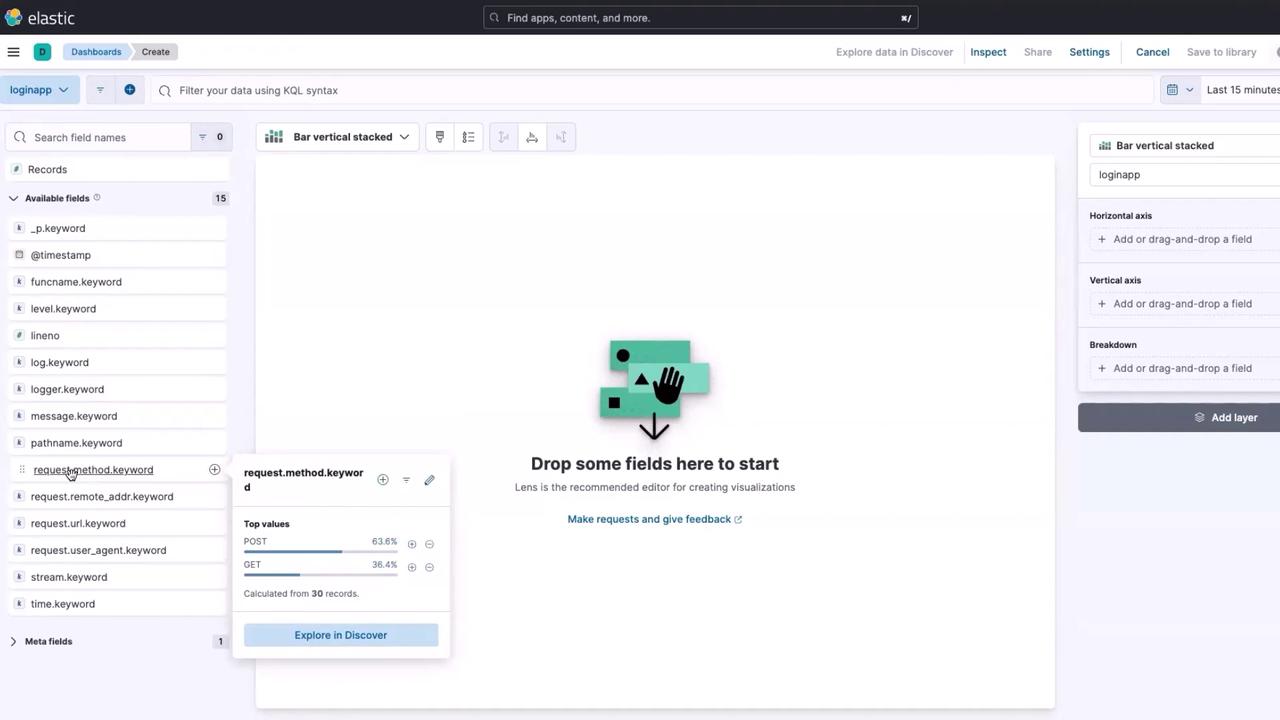
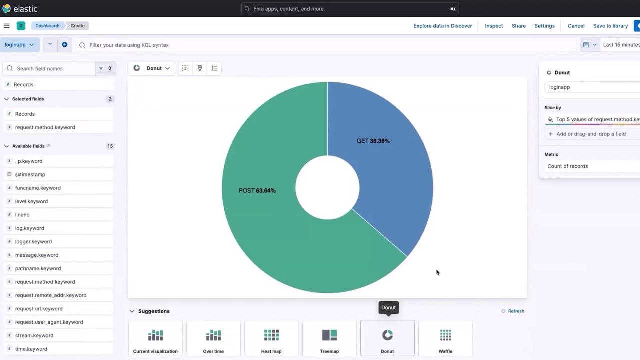
request method.keyword. Click it to confirm that it contains GET and POST request details.
Adding More Log Information
Your application generates additional log information, which can help monitor its health. For example, tracking the number of logs entering Elasticsearch can differentiate between normal operations and potential issues. To inspect these logs:- Click on the field
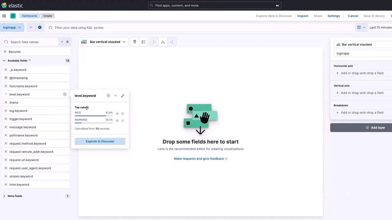
level.keywordto see entries like info and warning messages. - Drag and drop the
level.keywordfield into the workspace. - Change the visualization type to an area chart and choose the “area over time” option to visualize log levels chronologically.
- Click the time range button.
- Select “30 minutes ago” and click update.
If no data appears, it might indicate an issue with the application, Fluent Bit, or Elasticsearch. Further investigation is required.
Monitoring Endpoints
Monitoring endpoint traffic is crucial for load distribution insights. Follow these steps to track endpoint requests:- Locate the field
requesturl.keywordto view endpoints (e.g., login, second-level authentication, welcome page). - Drag and drop
requesturl.keywordinto the Lens workspace. - Switch the visualization to an “overtime” chart to see the number of requests hitting each endpoint over time.
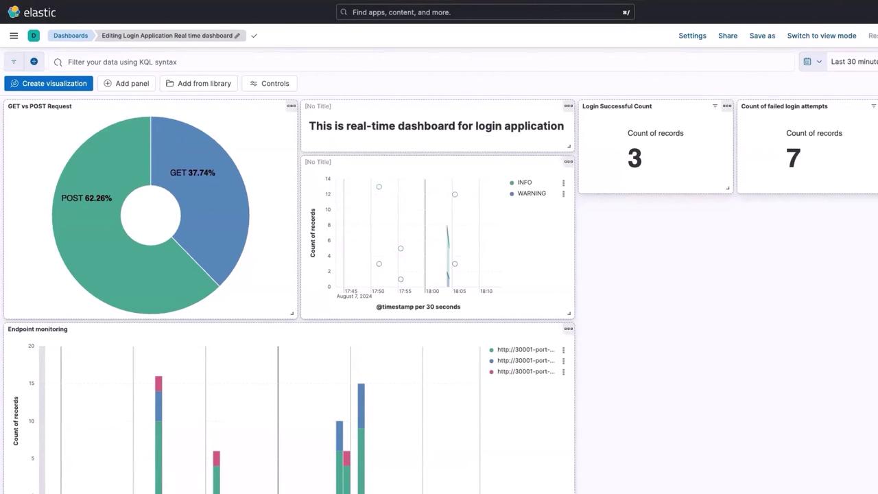
/login, 4 for second-level authentication, and 2 for the welcome endpoint. Save this visualization as “endpoint monitoring.”
Tracking Successful and Failed Logins
To monitor login success and failures:Successful Logins
- Click the three horizontal lines and navigate to Discover.
-
In the search bar, enter the following KQL query:
- Update the results and then click the Lens button to transform these results into a visualization.
- Choose Count Overall to display the data as a single numerical value.
- Save the visualization as “login successful count” and add it to your dashboard at the top.
Failed Logins
- Again navigate to Discover.
-
Modify the query to:
- Click update and then the Lens button.
- Select Count Overall to visualize the count of failed login attempts.
- Save this visualization as “count for failed login attempts,” and position it alongside the successful login count on the dashboard.
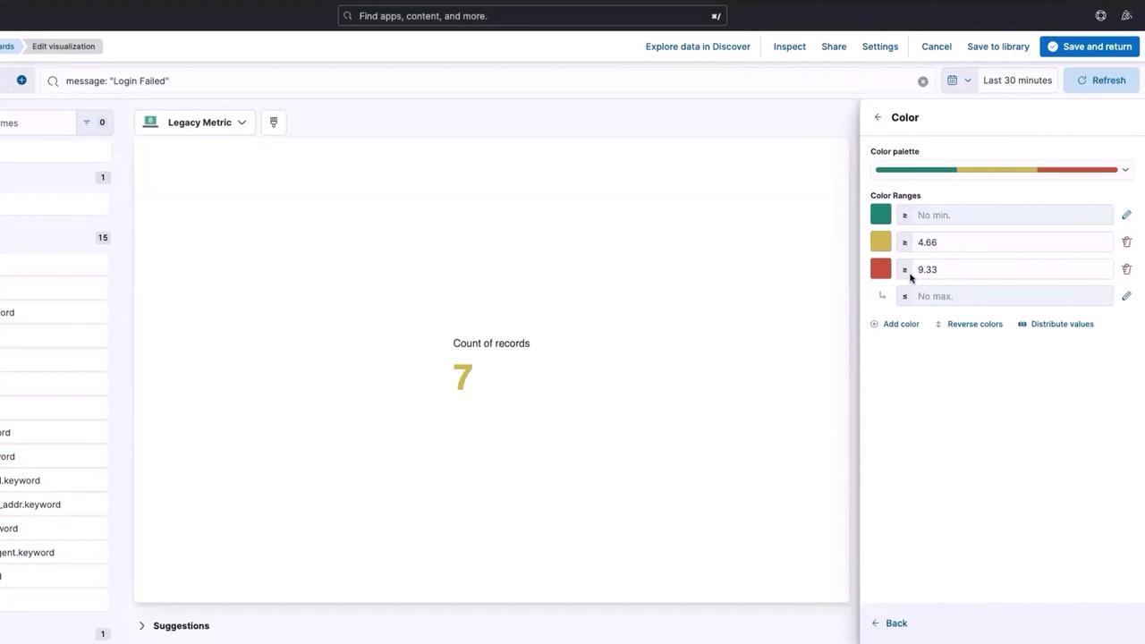
Enhancing Visual Cues with Color Coding
To make the dashboard more intuitive, you can highlight when the number of failed logins exceeds a certain threshold. For example, if there are more than 10 failed login attempts in the last 30 minutes, the number can appear in red to signal a potential issue. Follow these steps to adjust the failed logins visualization:- Click the three dots and select Edit Visualization.
- Choose Edit in Lens and click on the Count of Records series.
- Scroll down to the “Color by value” option.
- Toggle the color settings and set thresholds—define a lower threshold (for example, 4.66 with yellow) and a higher threshold (10 with red).
If the color coding does not reflect the expected thresholds, double-check your settings and ensure that the data is being ingested correctly.