Uploading the CSV File
Begin by opening the Kibana UI and selecting the “Upload a file” option. Drag and drop a CSV file containing log data from an Ecommerce Application. Kibana automatically analyzes the CSV file and displays key metadata including the number of lines analyzed, the delimiter, and header information. Kibana also presents a snapshot of the file statistics, helping you understand which fields will be available for your dashboard. For example: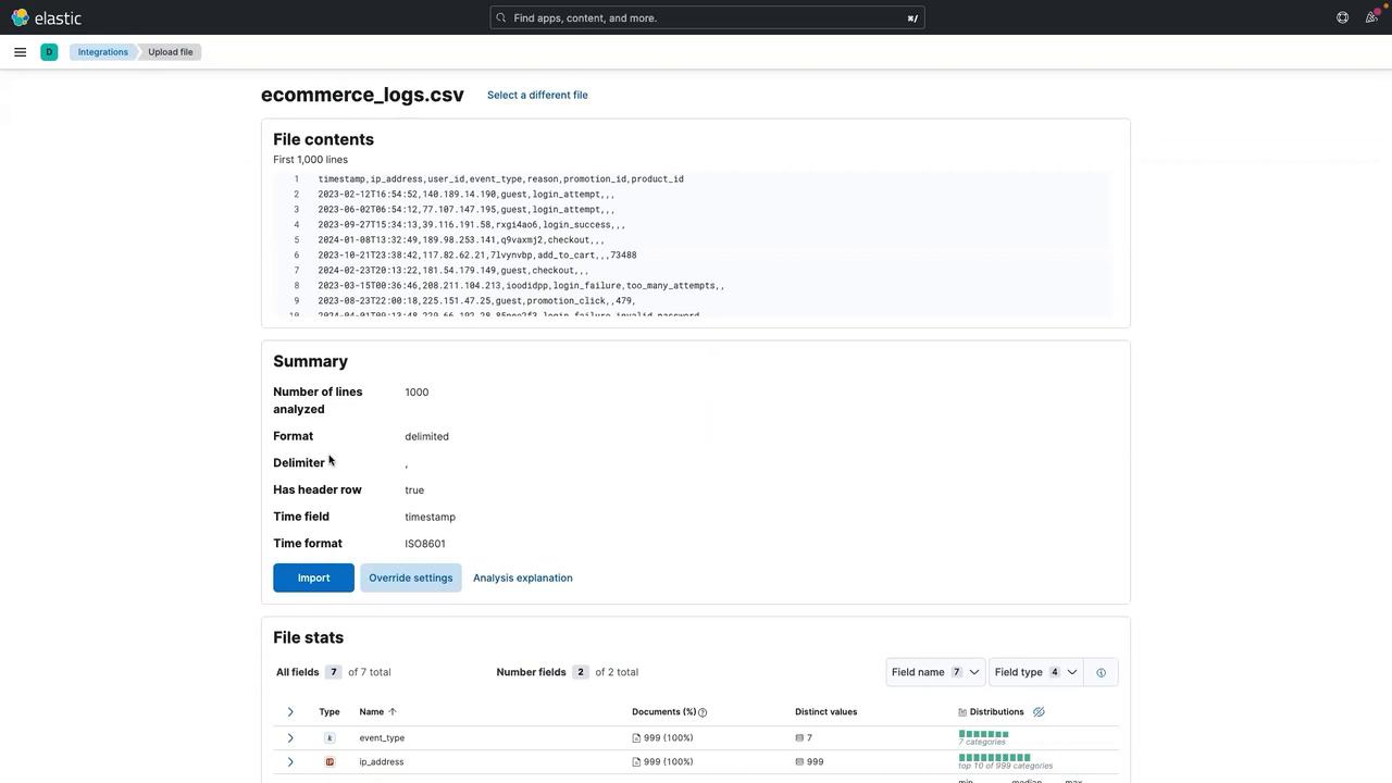
Creating the First Visualization
To start building your dashboard, follow these steps:- Click the three-line menu.
- Select Dashboard.
- Click on Create a dashboard.
- Choose Create Visualization to open the Lens UI.
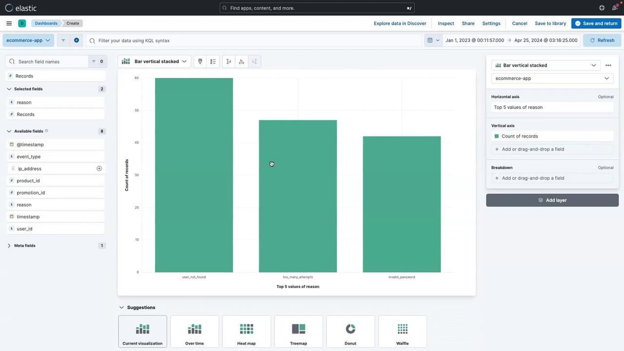
Visualizing “Reason” Data
- Select the reason field and drag it to the center.
- Kibana Lens will suggest a bar chart that displays the count of records for each value in the “reason” field for the selected date range.
- Click Save and return.
- Enter a title (e.g., “Count of Reason Type”).
- Click Apply.
- Save the dashboard (e.g., “eCommerce App Dashboard”).
Adding an Image to the Dashboard
Personalize your dashboard by adding an image, such as a team logo:- Click Add panel, then select Image.
- Drag and drop your local image file into the panel.
- Once the image is displayed, click Save and adjust its size if necessary.
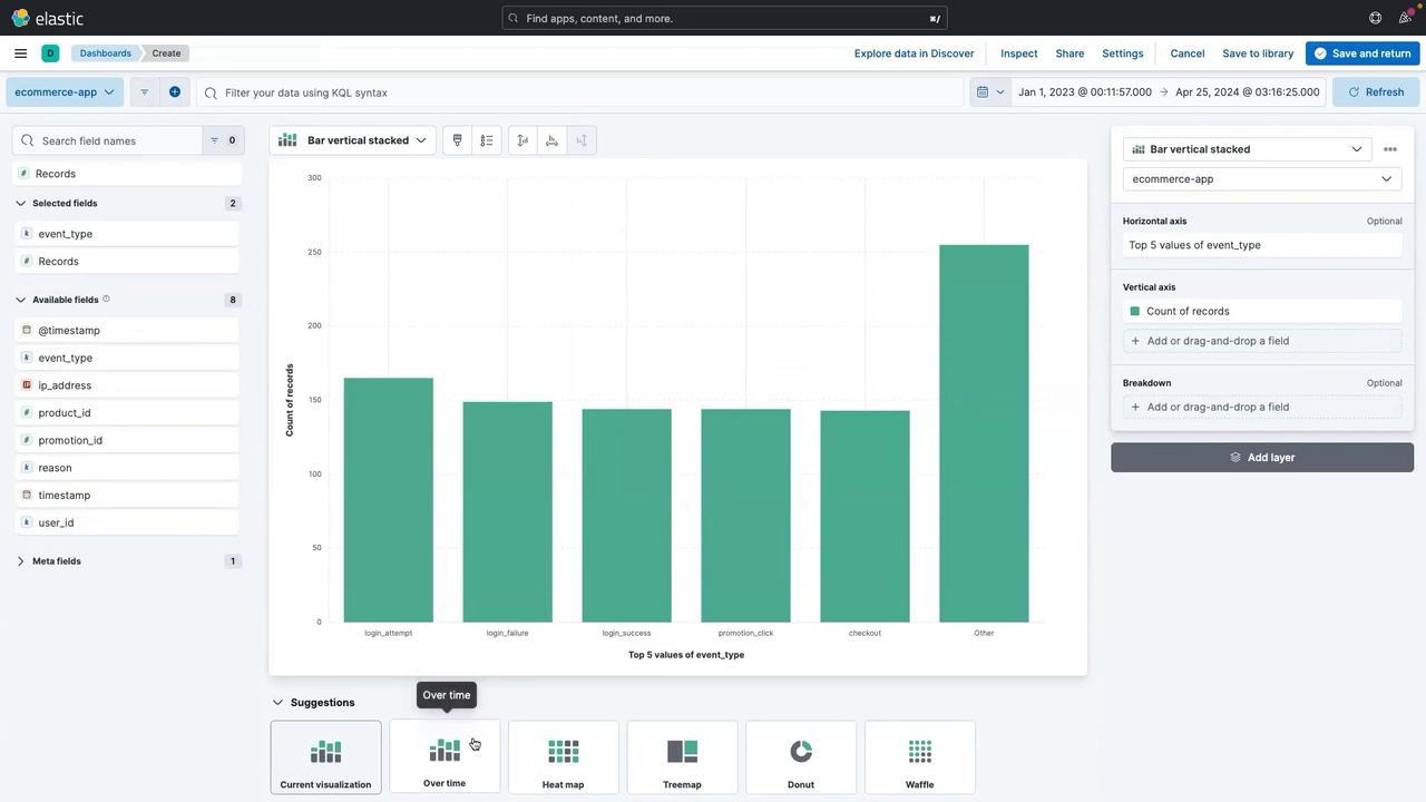
Visualizing Event Types Over Time
Analyze the event types captured from your ecommerce application to gain insights on user activity. For example, events such as “login_attempt” and “product_view” can help track user behavior.- Drag the event type field to the center.
- Click on the Overtime option to visualize event types over various dates.
- Click Save and return.
- Provide a title (e.g., “Event Type”).
- Click Apply to update the dashboard.
Visualizing User ID Distribution
Gain insights into user engagement by creating a visualization for the user ID field:- Select the user ID field.
- Drag it to the center and choose a donut or pie chart as the visualization style.
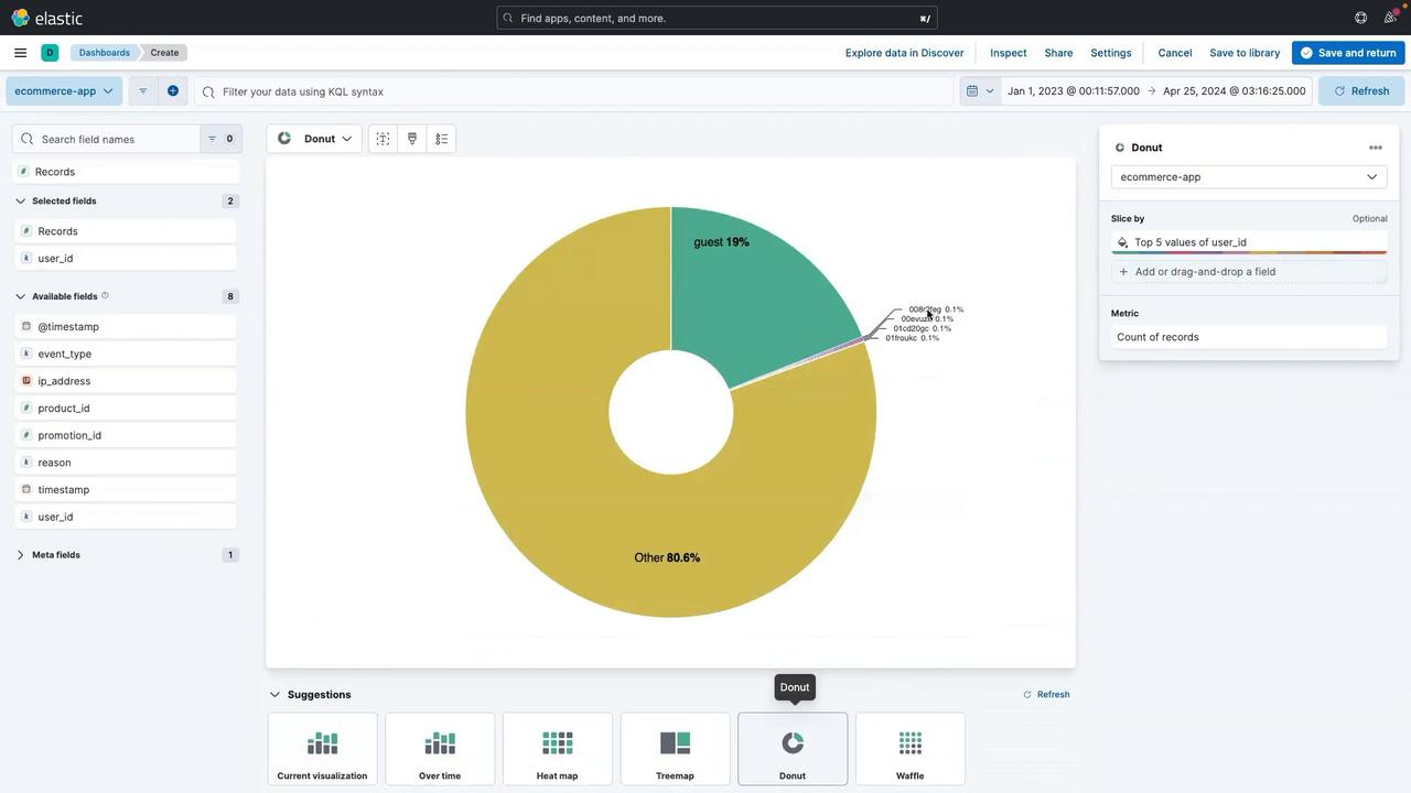
- Click Save and return.
- Enter a title (e.g., “User ID Distribution”).
- Click Apply.
- Reposition the panel as needed (then click Save to finalize the dashboard).
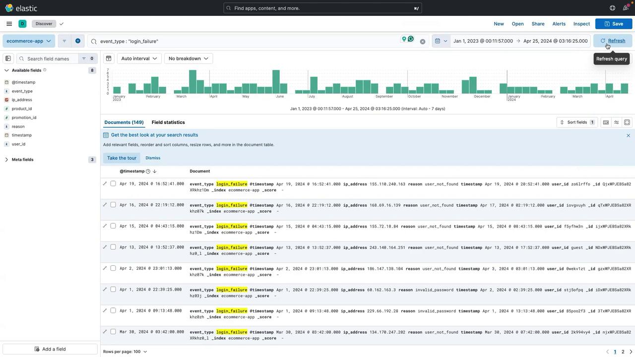
Filtering and Drilling Down with KQL
Focus on specific events, such as login failures, using Kibana Query Language (KQL):- Navigate to the Discover section by clicking the three-line menu and selecting Discover.
- If prompted, click Discard changes.
- In the search bar, enter the following KQL syntax:
- Click Update to filter the logs, displaying only entries that match the search criteria.

- Click Save.
- Provide a chart name (e.g., “Count of Login Failures”).
- Choose your existing dashboard.
- Click Save and go to dashboard.
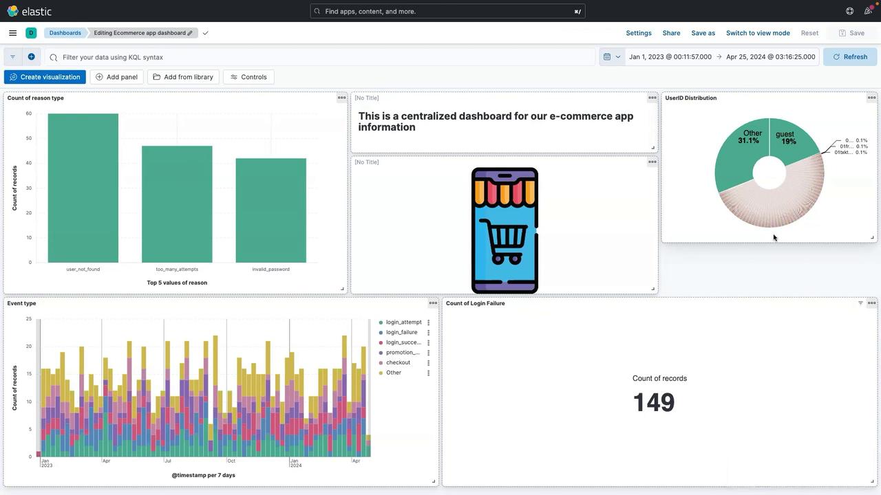
Interacting with the Dashboard
Your fully interactive dashboard now includes multiple panels featuring visualizations and images, each representing different aspects of your ecommerce application’s logs. For example, clicking on a chart segment such as “invalid password” triggers a drilldown, filtering the entire dashboard to focus on that specific event. To adjust your view:- Remove any applied filters by clicking the clear (cross) button.
- Refresh the dashboard to restore the normal view.
- Modify the date range by selecting new start and end dates (e.g., displaying logs from April 1, 2023 to April 25, 2024).
Conclusion
In this lesson, you learned how to build an end-to-end dashboard for an ecommerce application using Kibana. By integrating various tools such as Lens for visualization, KQL for filtering, and interactive drilldowns, you are now equipped to monitor and debug your application effectively.For more information on Kibana and other Elastic Stack components, check out the Elastic Documentation.