EFK Stack: Enterprise-Grade Logging and Monitoring
Understanding Kibana
Introduction to Kibana
Hello, and welcome to this lesson on understanding Kibana. Kibana is a powerful visualization tool that sits atop the Elasticsearch stack, enabling you to interact with your data through dynamic visualizations and dashboards. In this lesson, we'll explore why Kibana is indispensable for data visualization and how you can leverage it to extract actionable insights from your data.
Key Takeaway
Transforming raw data into visual representations, such as pie charts and graphs, can accelerate your decision-making process.
The Power of Visual Data
When data is presented as a simple table, making swift, informed decisions can be challenging. However, when that same data is transformed into a visual format—such as a pie chart—it becomes much easier to quickly identify trends and focus on important segments.
For instance, consider a dataset where approximately 40% of customers are "Very Satisfied." A pie chart representation helps determine which customer segment to target. Instead of expending resources on the mere 5% who are "Very Dissatisfied," focusing on the "Somewhat Satisfied" group may yield more significant improvements in overall satisfaction.
Visual Example
The image below illustrates customer satisfaction ratings with both a table and a pie chart representation. It highlights that 40% of customers are "Very Satisfied," while 30% fall into the "Somewhat Satisfied" category.
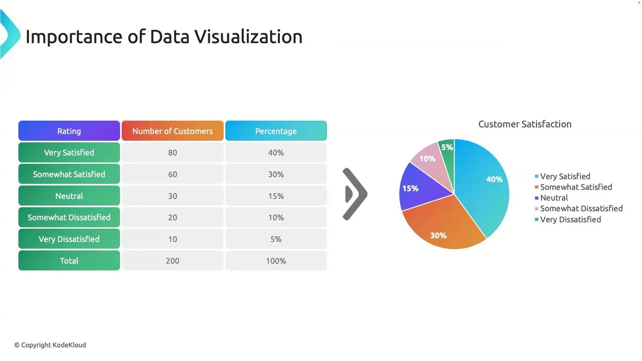
This example underlines the importance of data visualization for converting raw data into actionable insights that drive decision-making.
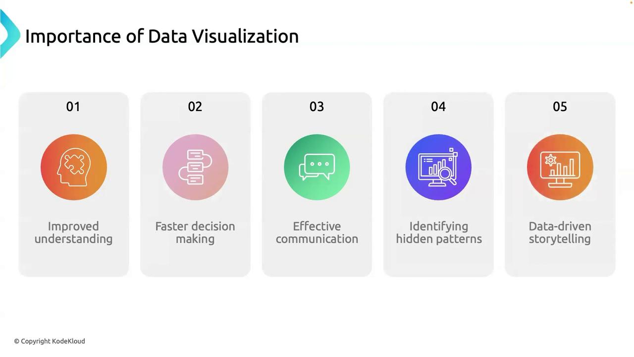
Key Benefits of Data Visualization
Data visualization offers several critical advantages that enhance the way you analyze and understand your data:
Improved Understanding:
Visual representations simplify complex data, making it easier to observe trends, spot outliers, and detect patterns that might not be immediately apparent in raw data tables.Faster Decision-Making:
By presenting data visually, decision-makers can quickly understand the situation and take appropriate action. Detailed dashboards offer real-time insights to help businesses adapt rapidly to changing conditions.Effective Communication:
Visual tools are more effective than text alone for conveying complex ideas. They simplify presentations and help various audiences—from technical teams to stakeholders—grasp key findings quickly.Identification of Hidden Patterns:
Plotting data visually can uncover correlations, trends, and anomalies that traditional analysis might miss. For example, heatmaps can highlight areas of high activity that may need further investigation.Data-Driven Storytelling:
Integrating data with visual elements allows you to construct compelling narratives that emphasize key insights and guide strategic decision-making.
The diagram below summarizes these five benefits of data visualization:
Summary
In summary, Kibana and data visualization are essential tools in modern data analysis. They not only enhance understanding and facilitate faster decision-making but also improve communication, reveal hidden patterns, and support persuasive, data-driven narratives.
With this foundation, you're ready to dive deeper into Kibana's features and discover how to unlock the full potential of your data.
Thank you for joining this lesson, and see you in the next session!
Watch Video
Watch video content