Basic Charts
Basic charts in Kibana provide simple yet effective ways to visually represent your data. They are ideal for comparing metrics across different dimensions and spotting trends at a glance.Table Visualization
Tables organize data into rows and columns, allowing for detailed inspection and analysis. In software engineering, tables are commonly used to list error logs, user activities, or server metrics. For instance, you can display the number of web server requests per minute along with details such as IP addresses, response types, and status codes.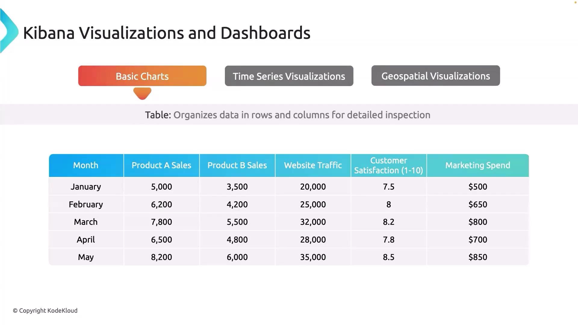
Area Chart
Area charts are excellent for visualizing trends over time, with the area below the line filled to emphasize the magnitude. They are particularly useful for monitoring performance metrics such as CPU and memory usage in real time. For example, an area chart can show how memory utilization increases during peak hours, helping to detect when additional resources might be needed.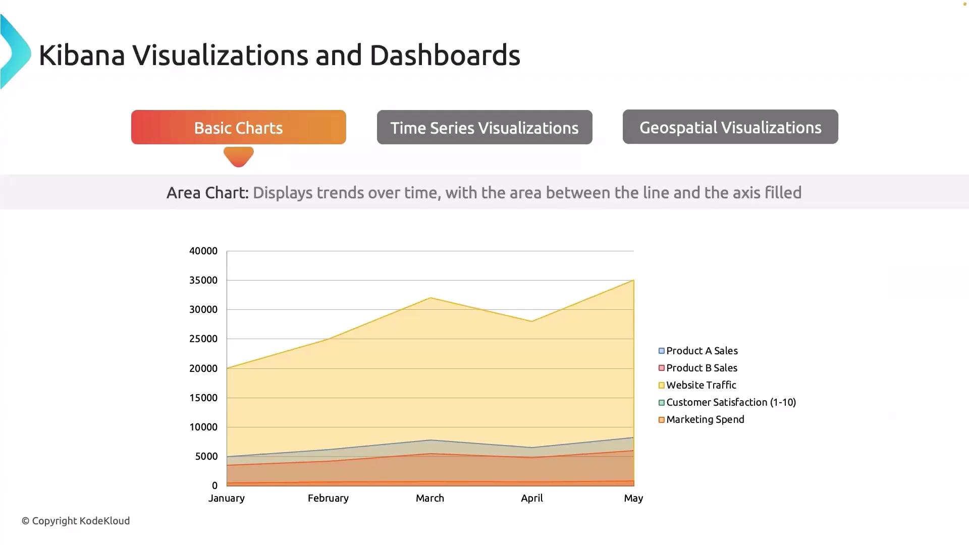
Bar Chart
Bar charts enable easy comparison across different categories. They are ideal when you need to compare values such as error rates across various services or track the number of bugs in different software versions, helping you quickly identify which version performs more reliably.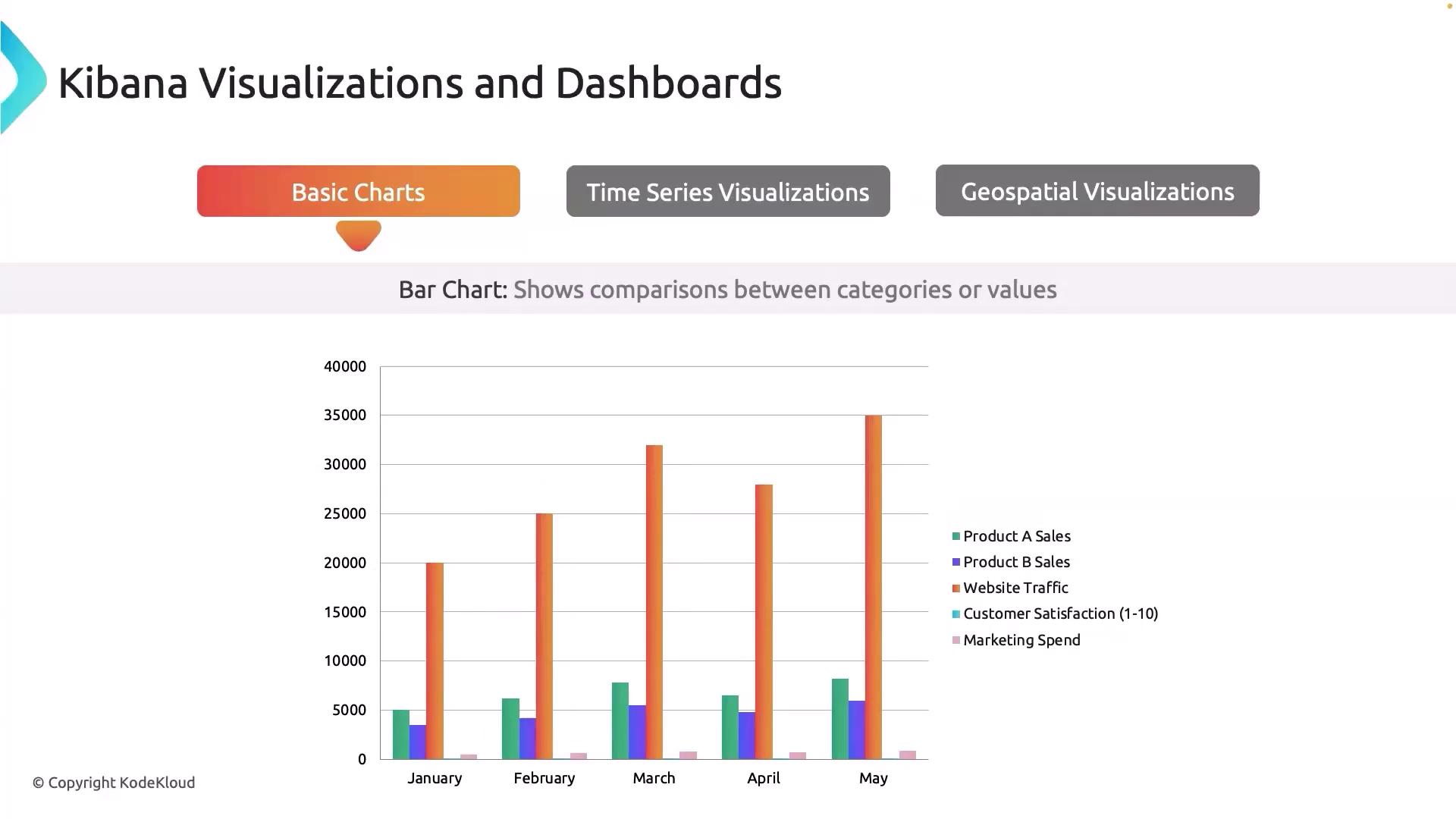
Line Chart
Line charts are essential for tracking changes in metrics over time. They are particularly useful for monitoring system uptime or application response times. For instance, a line chart can reveal fluctuations in database query latency throughout the day, highlighting periods of high load or potential performance issues.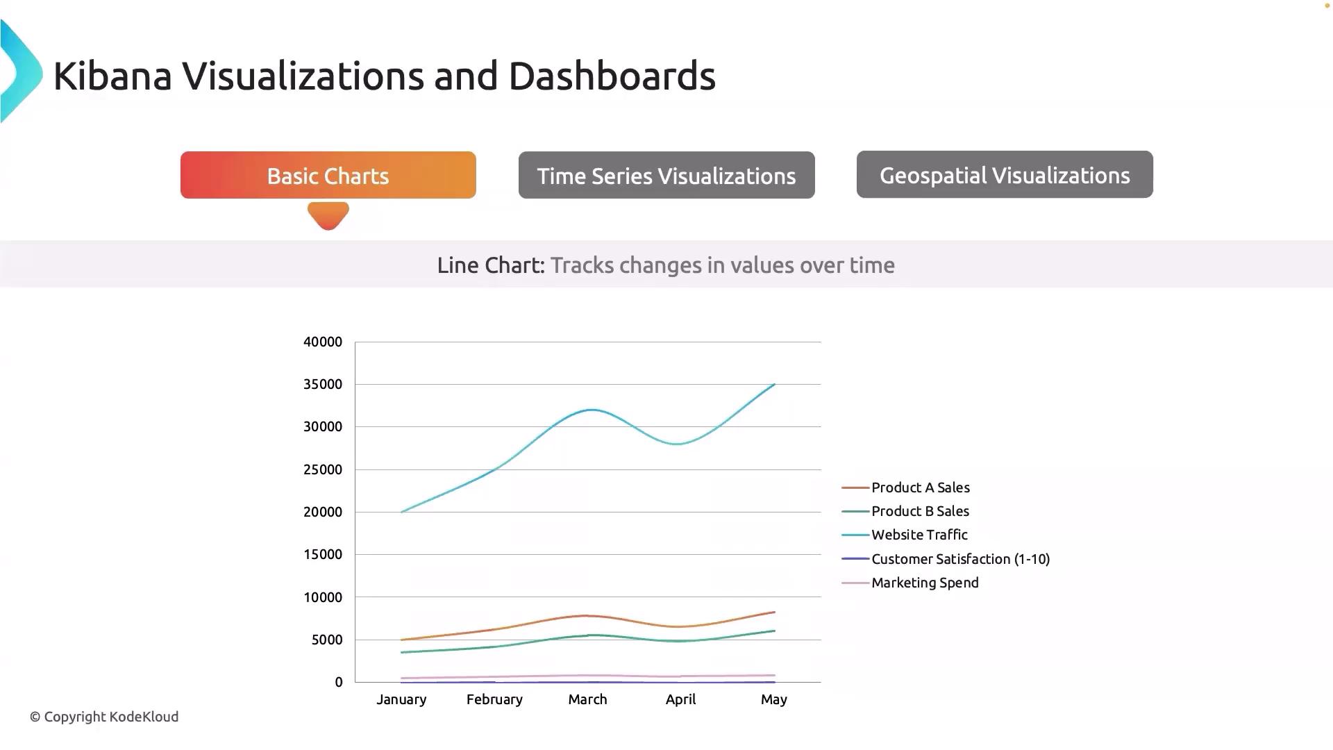
Scatter Plot
Scatter plots are used to investigate the relationship between two variables. By plotting metrics such as CPU usage against response time, you can quickly determine if higher CPU utilization correlates with slower response times, providing valuable insights into system performance and resource allocation.Pie Chart
Pie charts visually depict proportions within a whole. They are beneficial for showing how resources are distributed across different services or departments. For example, a pie chart can illustrate the percentage of total disk space used by each department, offering a clear view of resource allocation.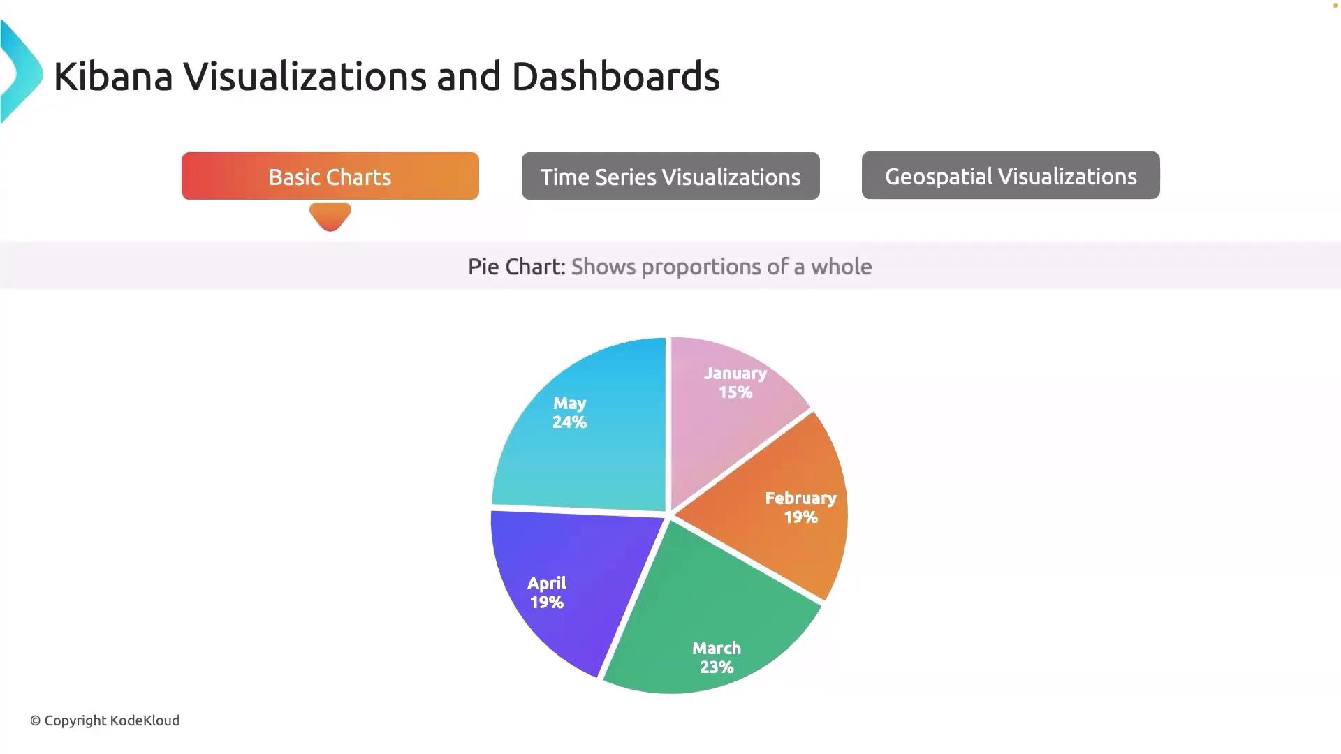
Utilize multiple chart types within a single dashboard to gain a comprehensive overview of your data. Combining visualizations can reveal hidden insights and support quicker decision-making.
Time Series Visualization
Time series visualization (often referred to as TSVB) is tailored for analyzing data trends, seasonality, and anomalies over time. This tool allows you to perform complex aggregations on your metrics and is particularly useful for monitoring server health indicators like CPU and memory usage. A key element in time series analysis is the gauge visualization, which displays a single value on a circular scale. This is ideal for observing performance metrics—for example, showing the current system load as a percentage of maximum capacity.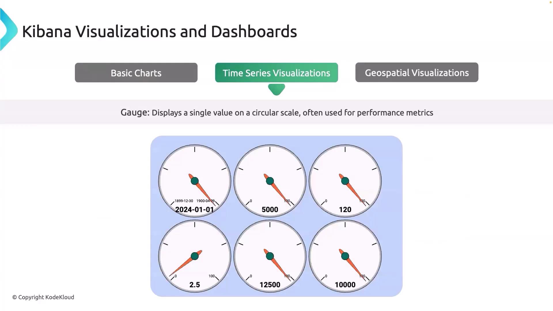
Geospatial Visualization
Geospatial visualization in Kibana is designed to map data geographically, making it exceptionally useful for examining user distribution or server locations. By using a region map, you can visualize where your application users are located across the globe, which helps identify key regions and potential areas for expansion. For example, a regional map may show heavy traffic from the USA and Japan while indicating normal levels in Europe, thereby assisting in targeted marketing and resource allocation.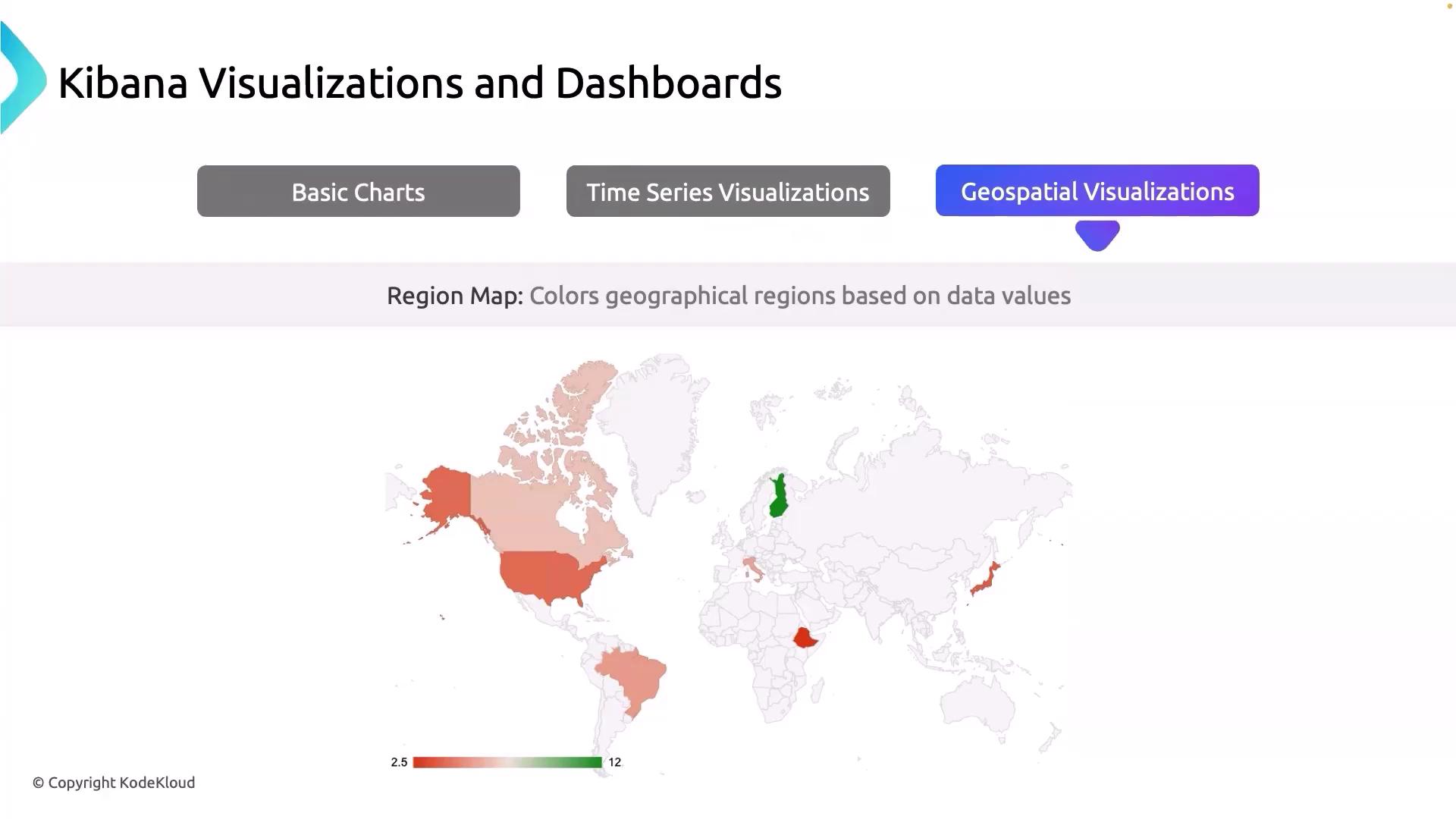
Geospatial visualizations are not only great for mapping data distributions but also for identifying regional performance issues and opportunities for scaling your infrastructure.