How to Create a CloudWatch Dashboard
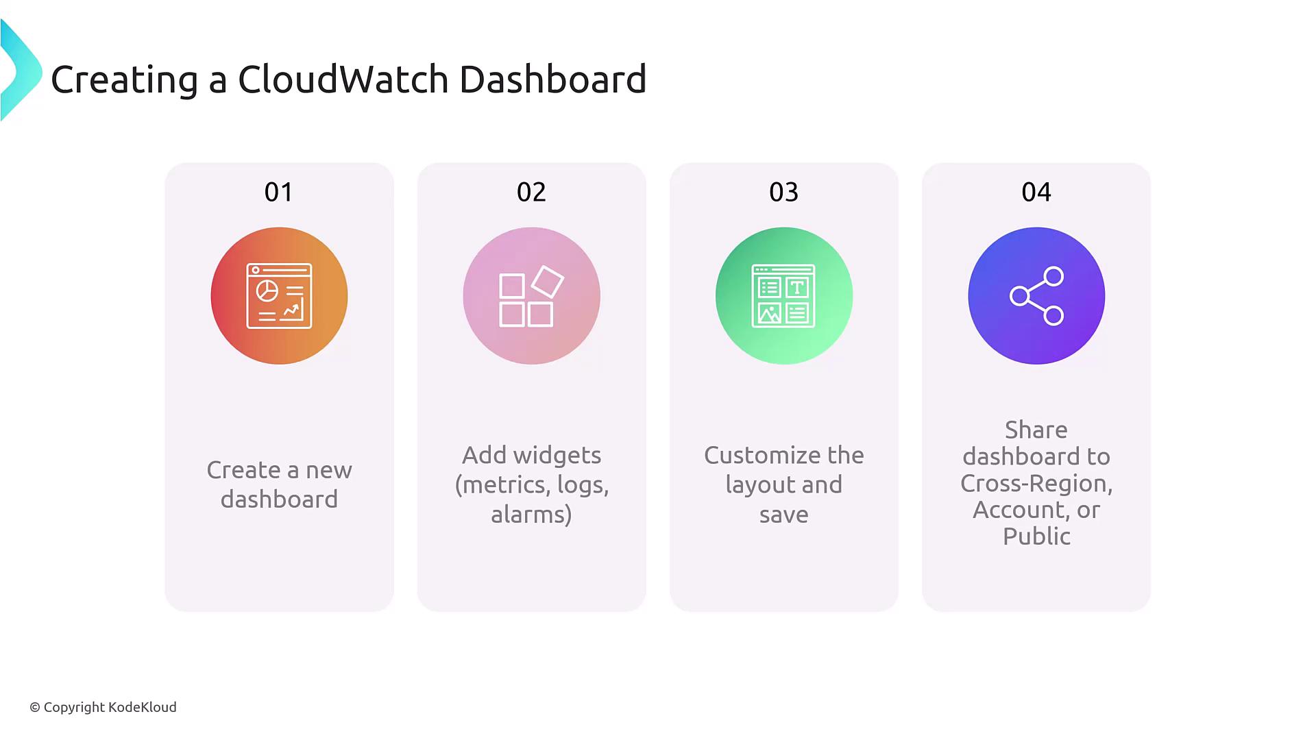
Creating a CloudWatch dashboard is a straightforward process. Follow these steps to get started:- Navigate to the CloudWatch console.
- Click “Create dashboard” and input a unique dashboard name.
- Select from a variety of widget types, such as metric widgets, alarm widgets, or log widgets.
- Choose the visualization format—line charts, pie charts, graphs, etc.—and arrange your widgets in a logical layout.
- Optionally, configure the dashboard for public sharing or integrate metrics from additional AWS accounts.
Widget Types in CloudWatch
Understanding the different widget types available in CloudWatch dashboards is crucial, particularly if you’re preparing for certification or managing a robust monitoring environment. While there are 13 widget types in total, the most commonly used include:- Metric Widgets
- Log Widgets
- Alarm Widgets
- Text/Image Widgets
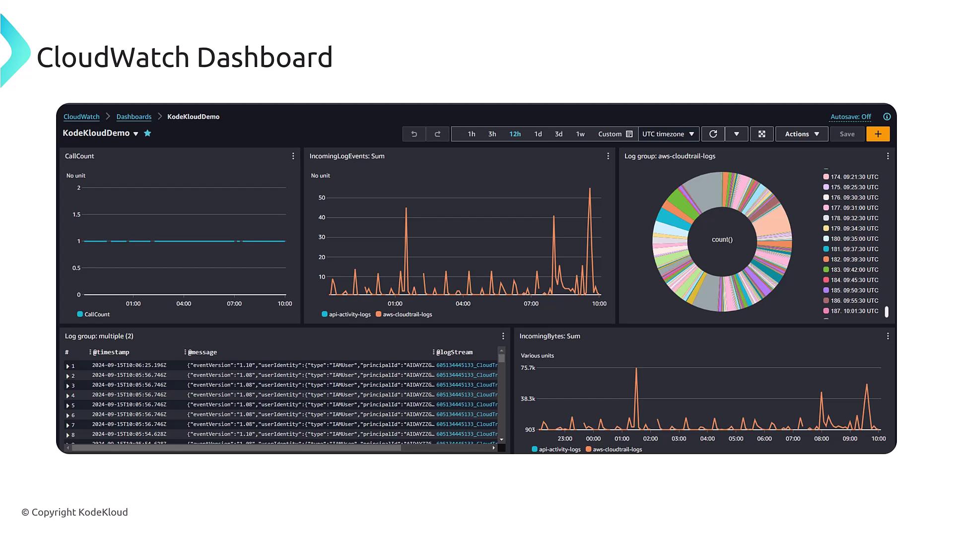
Dashboard Example and Use Cases
Imagine a dashboard configured with multiple widgets displaying diverse metrics and logs. In the upper right-hand corner, metrics for network in/out traffic highlight deviations from normal patterns. This can be particularly useful when monitoring CPU utilization, log streams, and other critical data for troubleshooting purposes. For example, you might have initiated a sample application with the following commands:Regularly refreshing the dashboard layout based on operational changes ensures that your visualizations remain relevant and actionable.
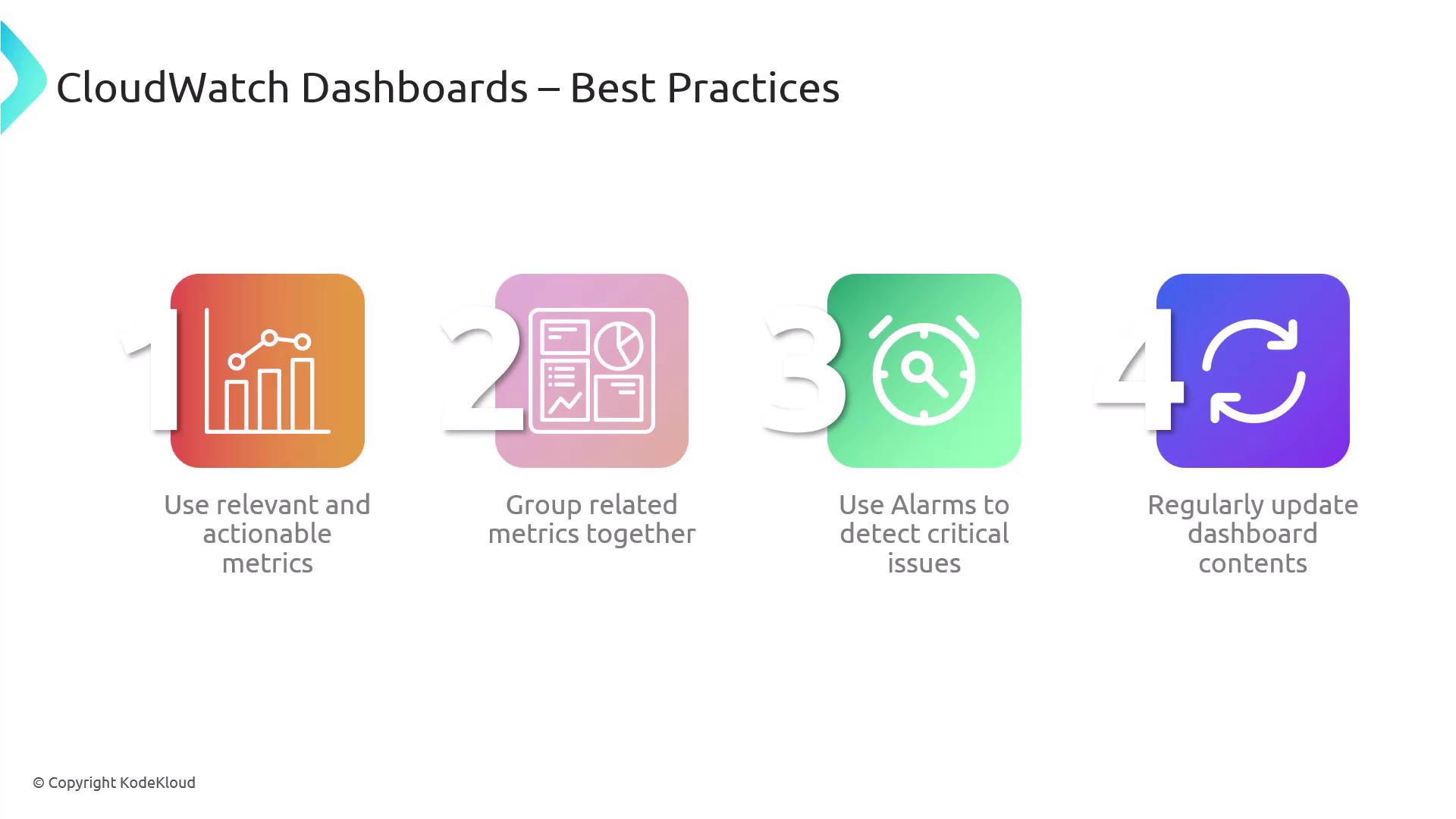
Best Practices for CloudWatch Dashboards
To maximize the effectiveness of your dashboards, keep these best practices in mind:- Use Relevant Metrics: Ensure each widget focuses on actionable, relevant data. Group related metrics, like the average CPU utilization across multiple servers, for a more holistic view.
- Configure Alarms for Critical Issues: Appropriately set up alarms to alert you to any significant deviations or potential issues.
- Regular Updates: Continually update your dashboard components (especially if using static images or documentation) to reflect current system performance and operational practices.