EFK Stack: Enterprise-Grade Logging and Monitoring

Deploying E Commerce Application on K8s

Conditional Appearance on Kibana Dashboards

Welcome to this guide on how to enhance your Kibana Dashboard by using conditional appearance. In this tutorial, you'll learn how to modify the visual styling of a dashboard element based on specific conditions, making it easier to spot critical issues at a glance.

Imagine a scenario where you track the Out-of-Stock count on your dashboard. Suppose the dashboard shows 450 events in the last 60 minutes—450 potential lost orders due to out-of-stock conditions. To immediately draw attention to such concerning figures, you can set up the dashboard to change the color of the record count when the number of events exceeds a certain threshold, such as 400.

Note

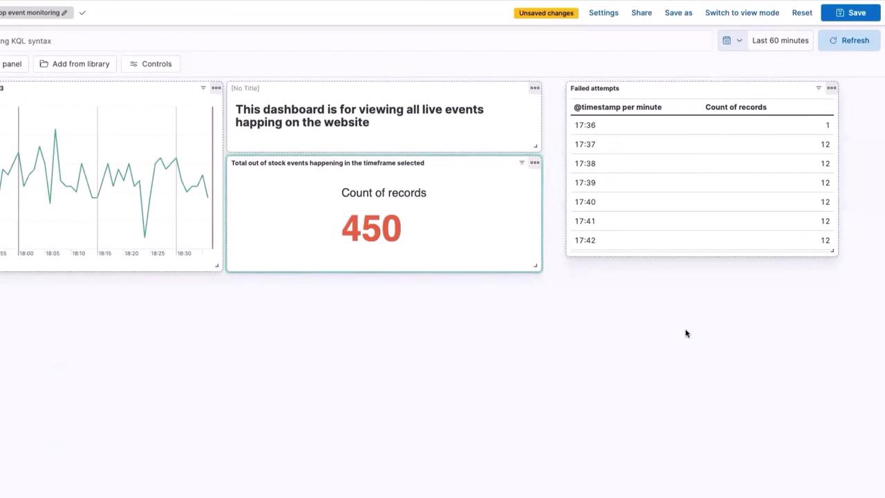
In this demo, if the total Out-of-Stock events exceed 400 within a 60-minute window, the record count will automatically display in red.

Setting Up Conditional Appearance

Follow these steps to configure the conditional appearance for your dashboard:

  1. Open your Dashboard and click on Edit Filters.
  2. Select Count of Records and navigate to the Color by Value section.
  3. Choose the Text option and click on Edit Colors.
  4. Remove the existing color options.
  5. Add a new rule: if the value is greater than 400, change the text color to red.
  6. Close the settings panel and save your changes.

Once these steps are completed, your dashboard will display the record count in red whenever the number of events exceeds the threshold. In our example, since there were 450 Out-of-Stock events in the last 60 minutes, the count is highlighted in red:

The image shows a dashboard for monitoring live events on a website, featuring a line graph, a count of 450 records, and a table of failed attempts with timestamps.

Testing the Conditional Appearance

To further illustrate the conditional formatting feature, try adjusting the time frame on your dashboard. For example, if you change the time frame to include only the last 30 minutes and click Update, the record count (224 in this case) remains in the default black color because the count does not surpass the 400 threshold:

The image shows a dashboard for monitoring live events on a website, featuring a line graph, a count of records (224), and a table of failed attempts with timestamps.

Warning

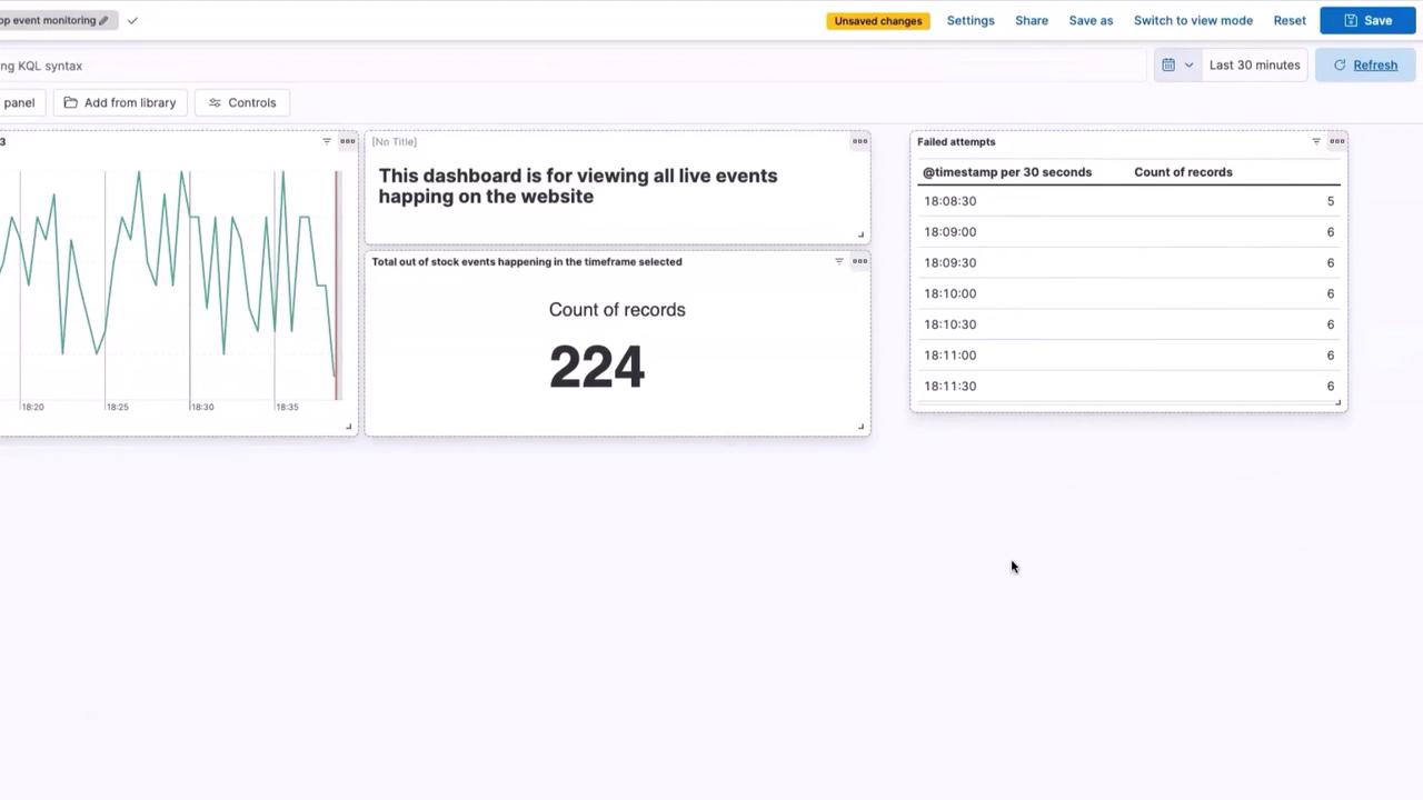
Be sure to verify that the event thresholds match the operational requirements of your monitoring setup to ensure that alerts are both meaningful and actionable.

Benefits of Conditional Appearance

Implementing conditional formatting on your live dashboards offers several advantages:

BenefitDescription
Immediate Visual AlertsQuickly spot critical issues by highlighting panels that exceed defined thresholds.
Enhanced MonitoringFocus attention on potential problem areas, making it easier to address issues promptly.
Improved Decision-MakingProvide a clear visual representation of data trends, leading to more informed operational decisions.

By leveraging these benefits, you can monitor your application more effectively and ensure that significant changes are immediately noticeable.

That concludes our tutorial on configuring conditional appearance on Kibana Dashboards. Thank you for reading, and stay tuned for more insights on optimizing your data visualization experience!

Watch Video

Watch video content

Practice Lab

Practice lab

Previous
Dashboarding with KQL in Kibana