This guide covers creating dashboards in Kibana using KQL, including filtering logs, visualizations, and comparing KQL with the Lens method.
Welcome to this guide on creating insightful dashboards in Kibana using KQL (Kibana Query Language). In this article, we’ll walk you through filtering logs, creating visualizations, and combining these elements into an effective dashboard. We also compare KQL with the Lens method, enabling you to identify patterns in your logs quickly.
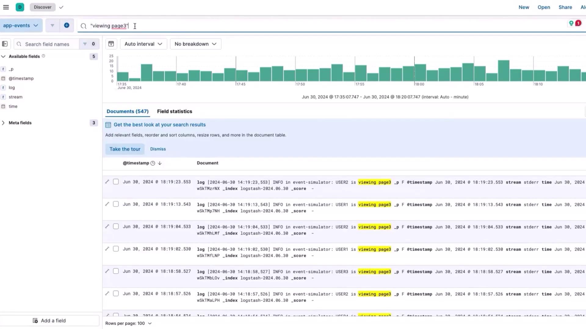
Begin by filtering logs to analyze users viewing page 3. In the Kibana UI, where your logs are listed, enter the query "page 3" in the search bar. Using double quotes searches for the exact phrase, ensuring only relevant entries are displayed.
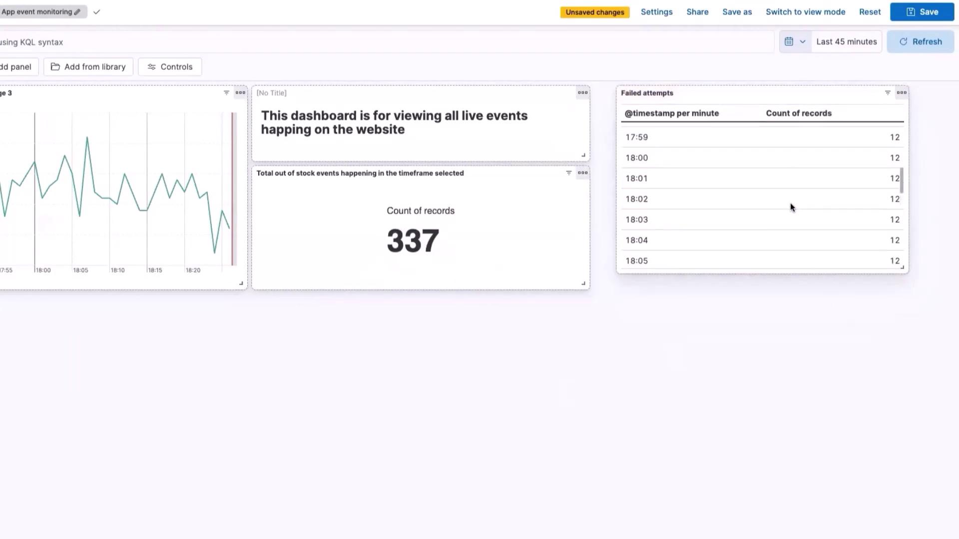
Once you verify the filtered results, click Save and assign a name such as “live, page 3 view.” This saves your query, keeping the dashboard focused solely on page 3 logs.Next, click the button that takes you to the dashboard view. Here, you will see a visualization of log counts over various time intervals specifically related to page 3 views. The graph illustrates the trend in record counts.
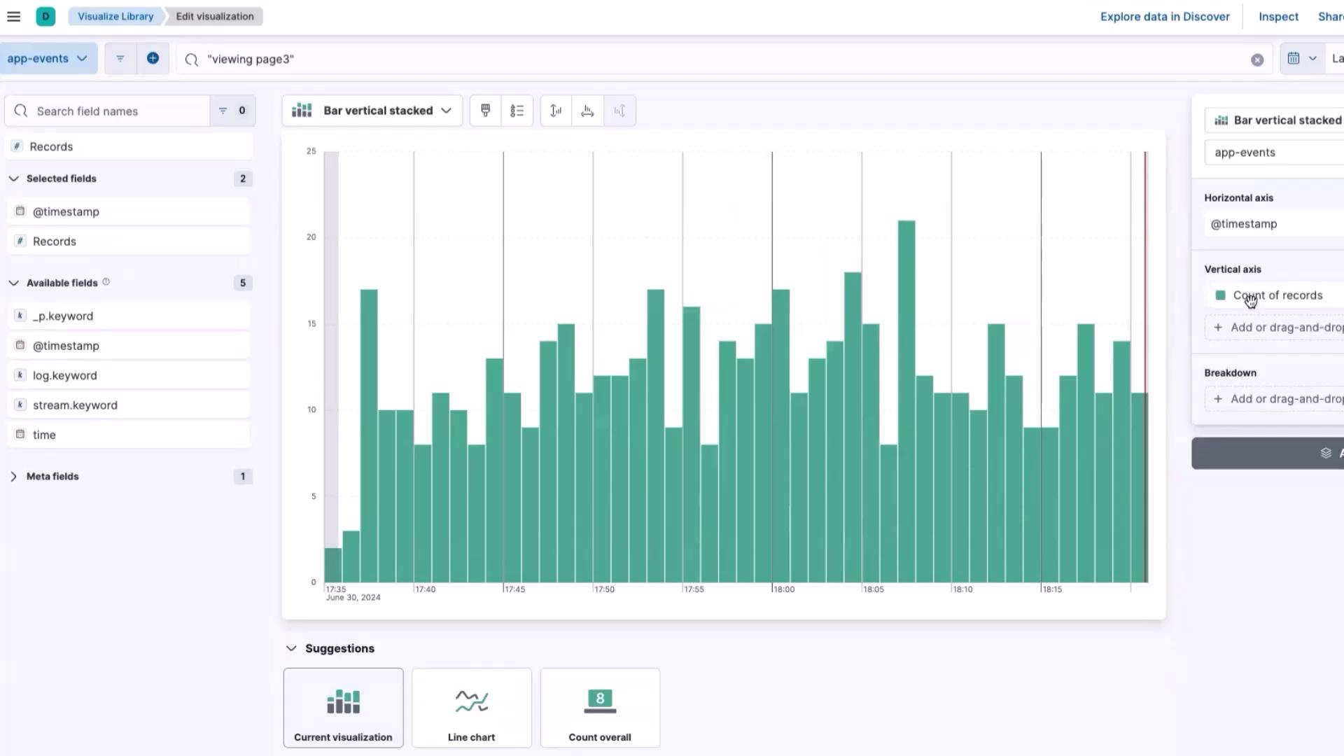
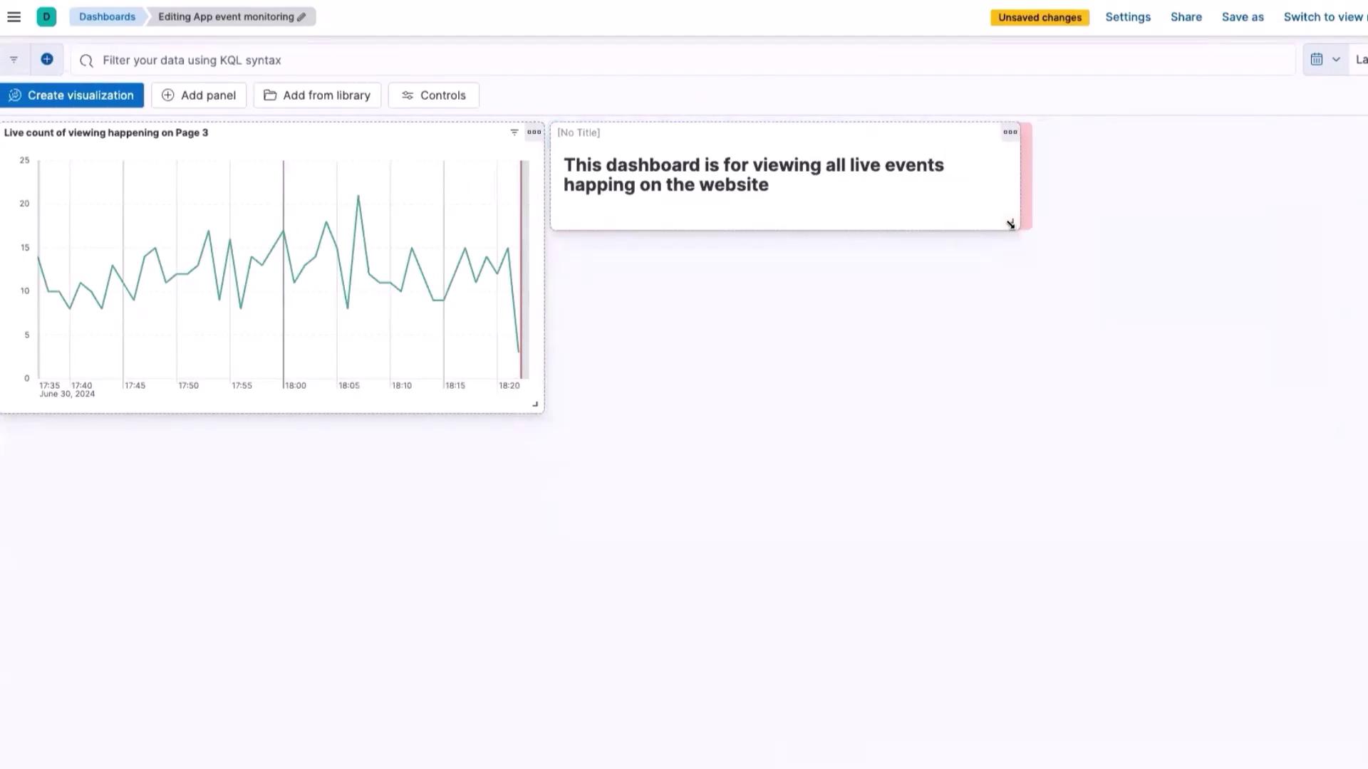
To enhance the visualization, consider switching from a vertical bar chart to a line chart for improved trend analysis. Select the line chart option from the suggestions at the bottom. When satisfied with the new visualization, click Save and name it “live count of viewing happening on page 3.” Since you don’t yet have a dashboard, choose view to proceed with creating one.Your new dashboard now displays the visualization. You can adjust its size for optimal clarity, then click Save. Name your dashboard (for example, “app event monitoring”) and confirm the changes.For additional context, add a text panel to the dashboard. Click on the panel options, select Text, and in the markdown editor, enter a description such as:“This dashboard is for viewing all live events happening on the website.”After updating the text panel, click Update and then Save and Return. Your dashboard now includes this explanatory text.
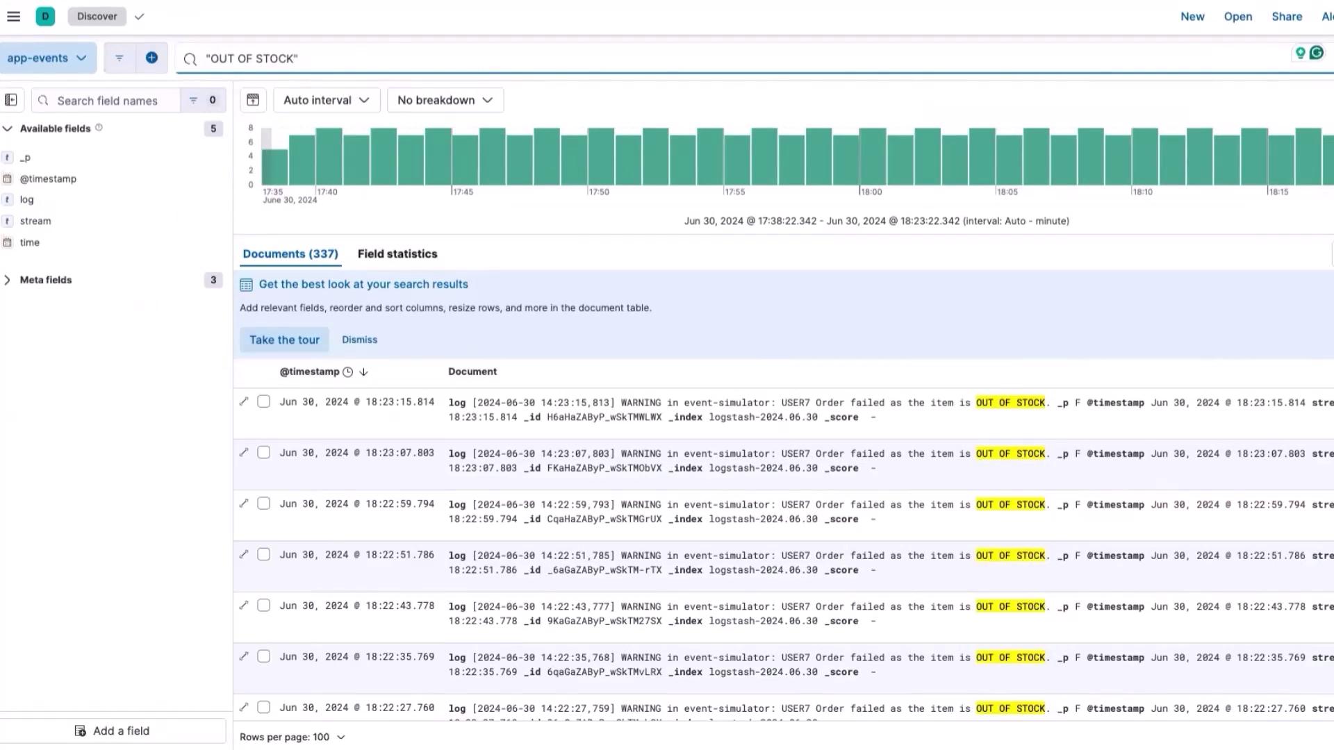
Switch to Kibana’s Discover section (ensuring you are in Discover mode) and search for “out-of-stock” to analyze product availability. The search automatically applies a visualization filter (using a lens button) to display out-of-stock trends.
This visualization displays the current out-of-stock values along with their counts. For instance, if the counter indicates 334 events, you can use this number in your dashboard to highlight inventory issues over your selected time frame. Save this visualization and add it to your “app event monitoring” dashboard, renaming it to “total out of stock events happening in the time frame selected.” Finally, click Save and go to Dashboard to view the updated dashboard.
Return to Discover mode to monitor failed login attempts. Apply a filter for failed attempts by clicking the corresponding button, which takes you to a tabular dashboard view. Change the visualization type to a table format to display the number of failed logins per timestamp.Once the table view is configured, the dashboard will display the total count of failed login records. Save this visualization as “failed attempt” and add it to your dashboard. You can reposition the panel for better visibility.
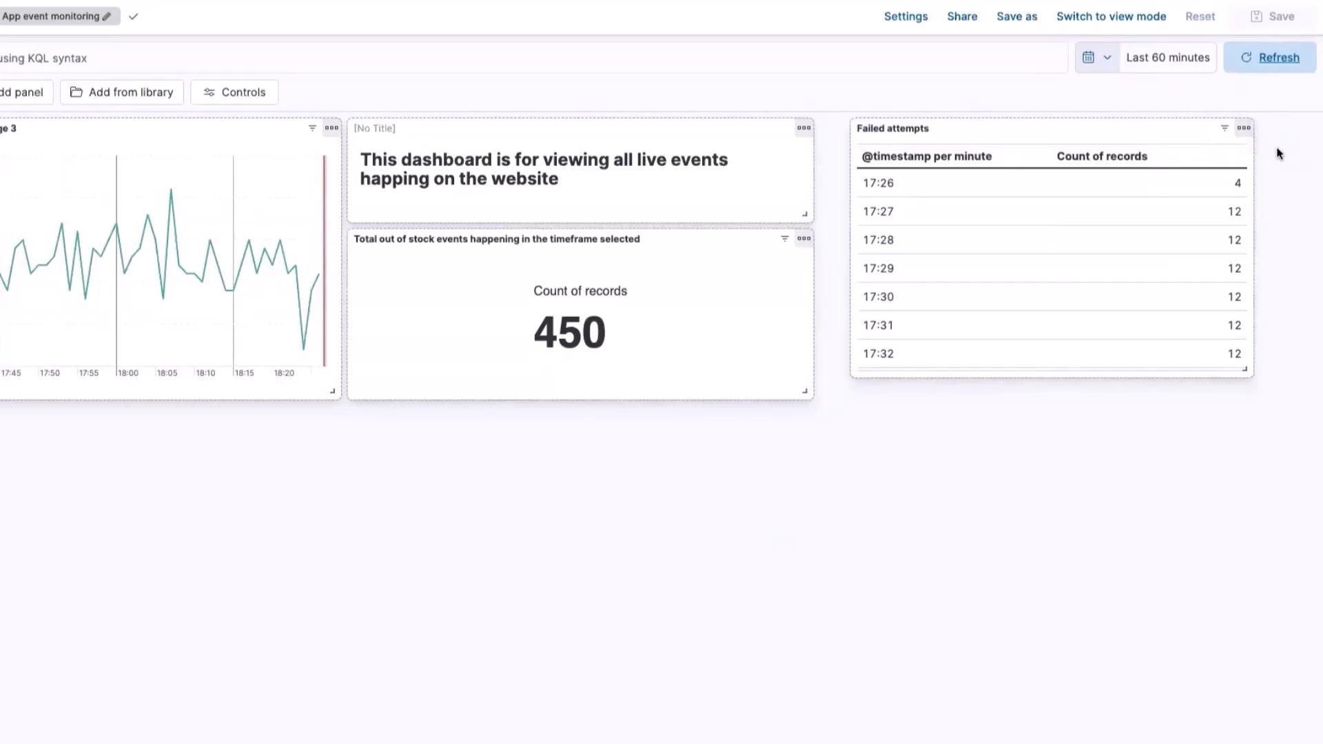
To adjust the time frame, update the settings from the last 45 minutes to the last 60 minutes and click Update.
If you are analyzing data for a shorter period (e.g., 20-30 minutes), the counts might be lower. In this lab, the analysis spans over 60 minutes, which explains the higher numbers.
These dashboards provide valuable insights into user behavior and system performance, making it easier to communicate findings to both product managers and engineering teams. For example:
A significant number of out-of-stock events can trigger inventory management actions.
Frequent views on page 3 (such as in a groceries application) could indicate a need for scaling associated systems.
Numerous failed login attempts may signal potential backend load issues that require further investigation.
This article demonstrated how to build dashboards in Kibana using KQL with a straightforward, SQL-like syntax. Thank you for reading, and we look forward to sharing more insights in our upcoming lessons.