What Is Activity Traceability?
Activity traceability records the full journey of your project, enabling you to:- Identify and resolve bottlenecks
- Optimize resource allocation
- Improve team collaboration
- Minimize errors and rework
Effective traceability gives you end-to-end visibility into your Azure DevOps pipelines, helping you make data-driven decisions at every stage.
Dashboards: Your Project Control Center
Azure DevOps dashboards provide real-time insights into one or more projects. You can fully customize them with widgets that display the metrics your team cares about most—whether it’s deployment health, build success rates, or code coverage.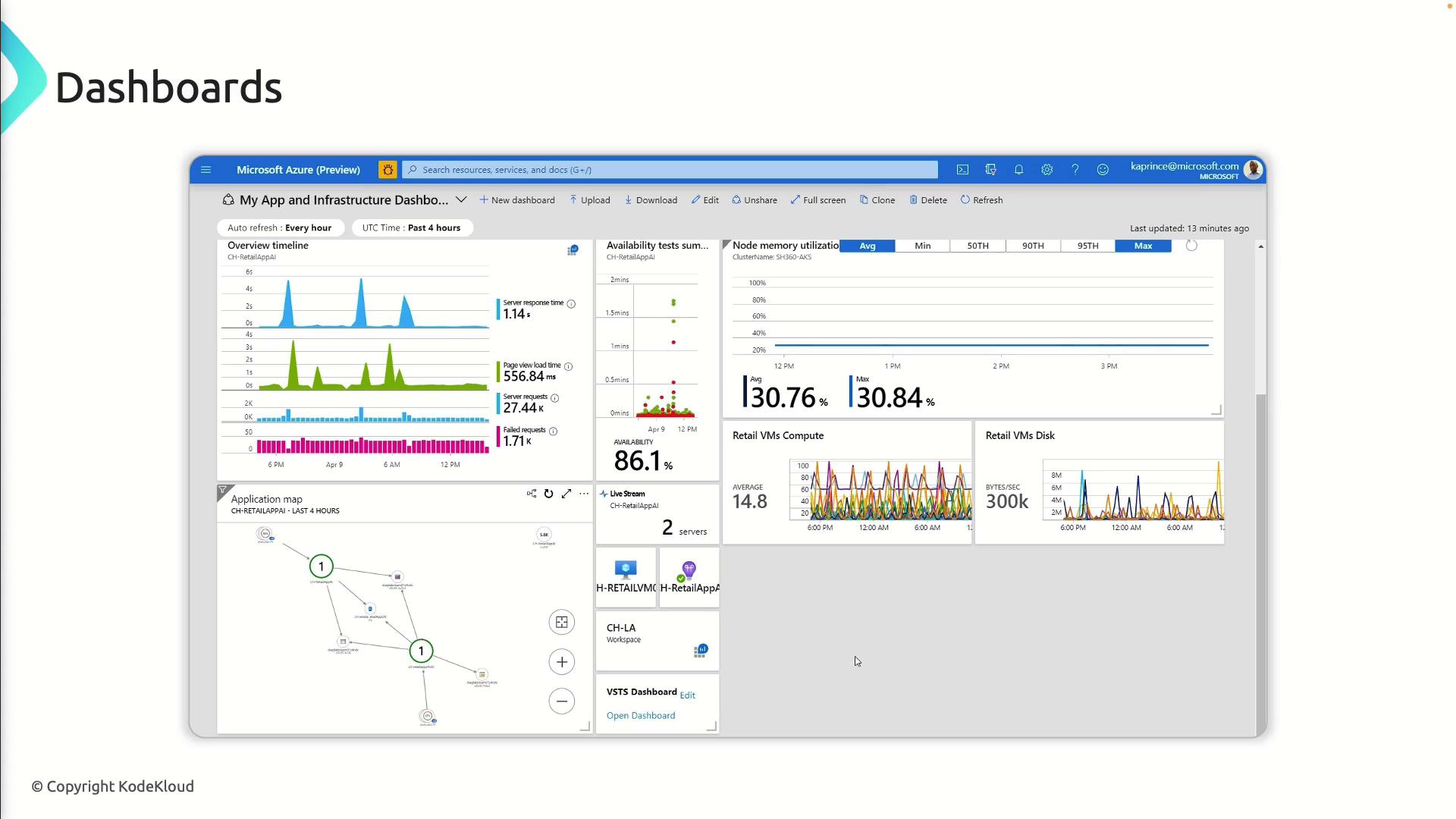
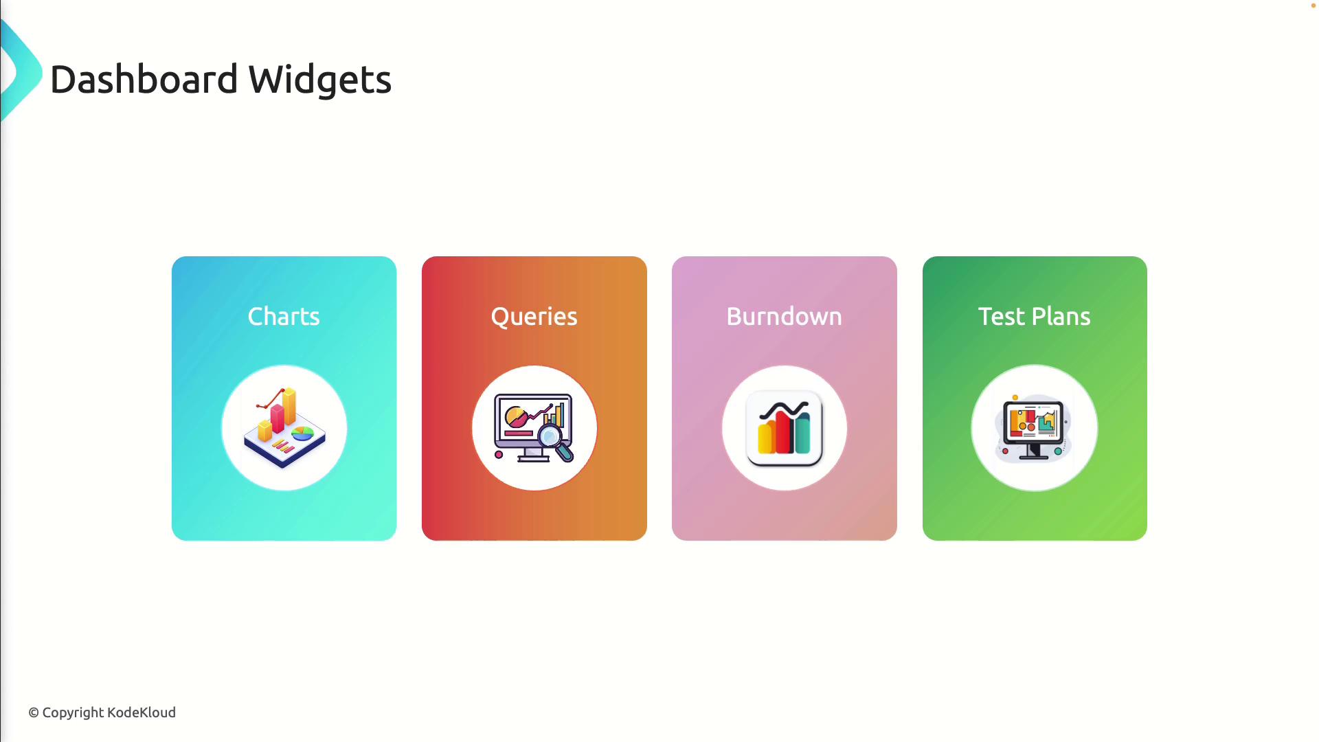
Widgets: Building Blocks of Dashboards
Widgets are modular components you add to dashboards. Here’s a quick overview:| Widget Type | Purpose | Example Use Case |
|---|---|---|
| Charts | Visualize trends, metrics, and KPIs | Display build duration over time to spot regressions |
| Queries | Filter and list work items | Show all active bugs assigned to a sprint |
| Burndown charts | Track sprint progress against estimated work | Monitor completed vs. remaining story points each day |
| Test plan | Report test outcomes and coverage | Highlight pass/fail rates across different test suites |
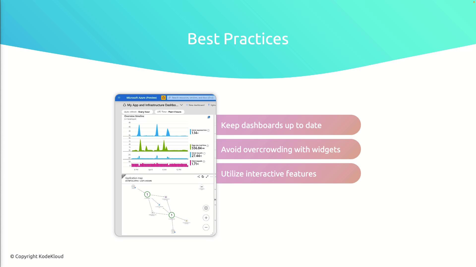
Best Practices for Effective Dashboards
Follow these guidelines to get the most out of your dashboards:- Keep widgets up to date: Audit and refresh them as priorities change.
- Avoid clutter: Focus on critical metrics to prevent information overload.
- Leverage interactivity: Enable drill-downs or click-through charts for deeper analysis.
- Schedule reviews: Retire outdated widgets and introduce new ones during sprint retrospectives.
Overcrowding your dashboard can hide key metrics. Aim for clarity by limiting widgets to those that drive action.