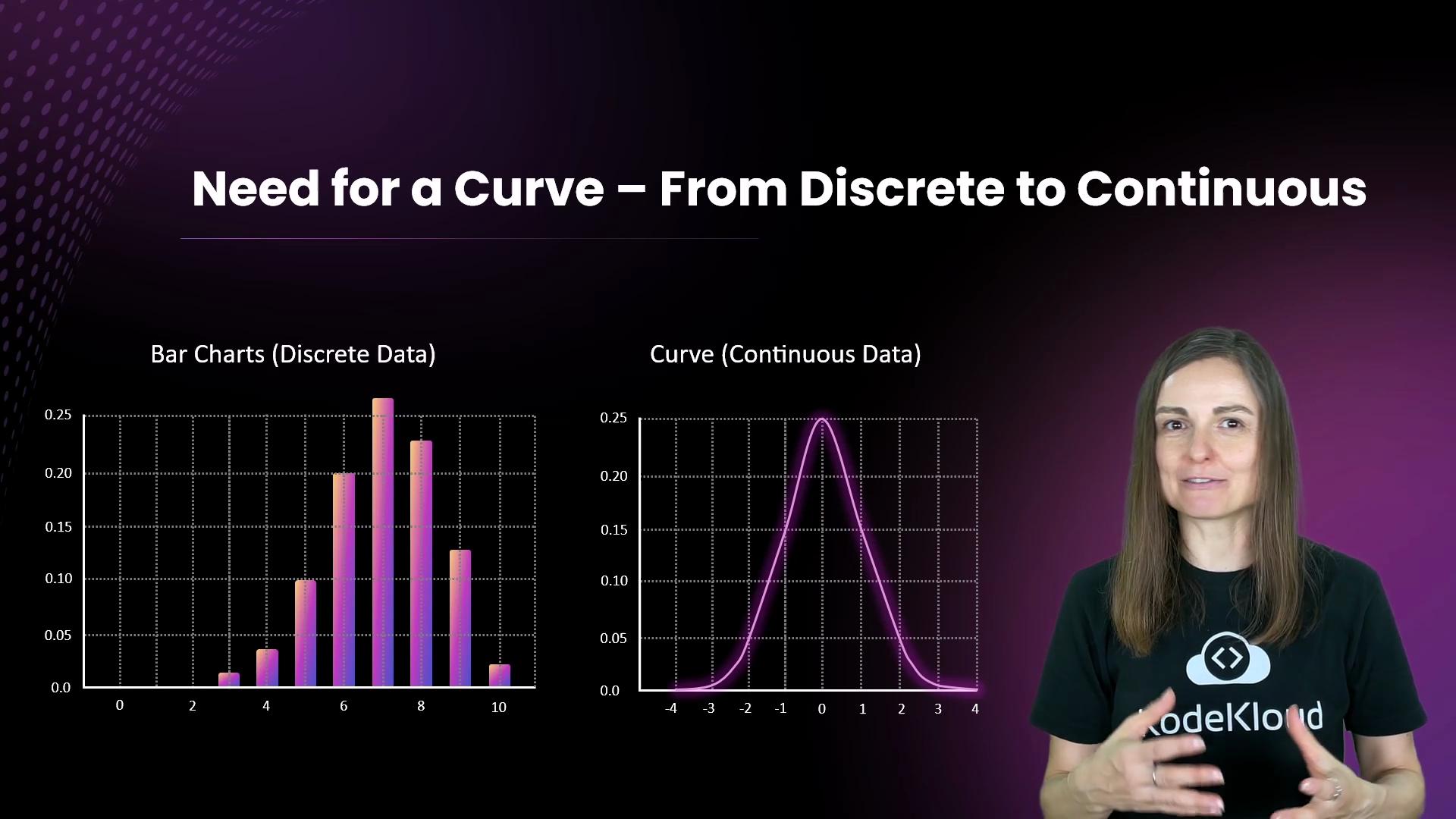
We use bar charts for discrete data — values that take distinct steps, like coin flips or counts of rainy days. For continuous quantities (temperature, height, sensor readings), a smooth curve (a probability density function) better represents how values are distributed because those variables can take any value within a range.
The image compares bar charts representing discrete data with a curve representing continuous data, featuring a person standing beside them.
Continuous-variable probabilities are expressed as areas under the curve. For truly continuous variables the probability of any single exact value is effectively zero — we always compute probabilities over intervals (for example, 15–16°C).
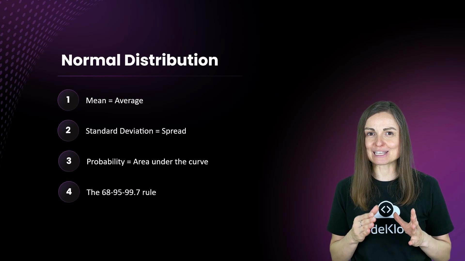
What you usually see as a smooth, symmetric bell curve is the normal distribution (also called the Gaussian distribution). It models how many natural and social phenomena cluster around an average. Important properties:
  • The curve is centered at the mean (µ).
  • The spread is governed by the standard deviation (σ).
  • The total area under the curve equals 1, so areas correspond to probabilities.
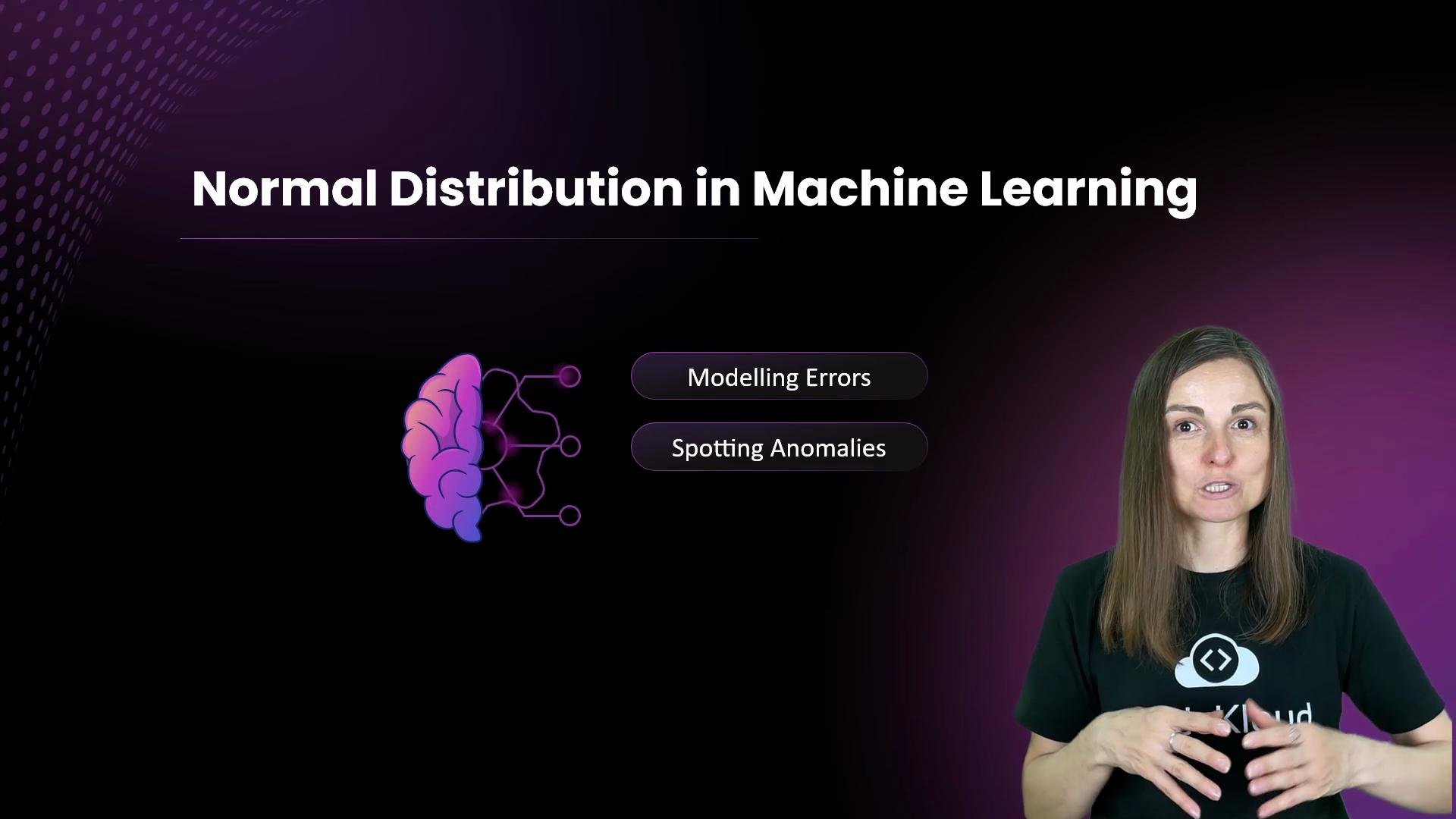
The image is a presentation slide about "Normal Distribution in Machine Learning" with a depiction of a brain, and buttons labeled "Modelling Errors" and "Spotting Anomalies." There is a person speaking next to the slide.
Mean and standard deviation together determine how “typical” values look. Consider temperature with mean µ = 15°C:
  • A small σ produces a tall, narrow curve: most days are close to 15°C.
  • A large σ produces a wider, flatter curve: greater day-to-day variation.
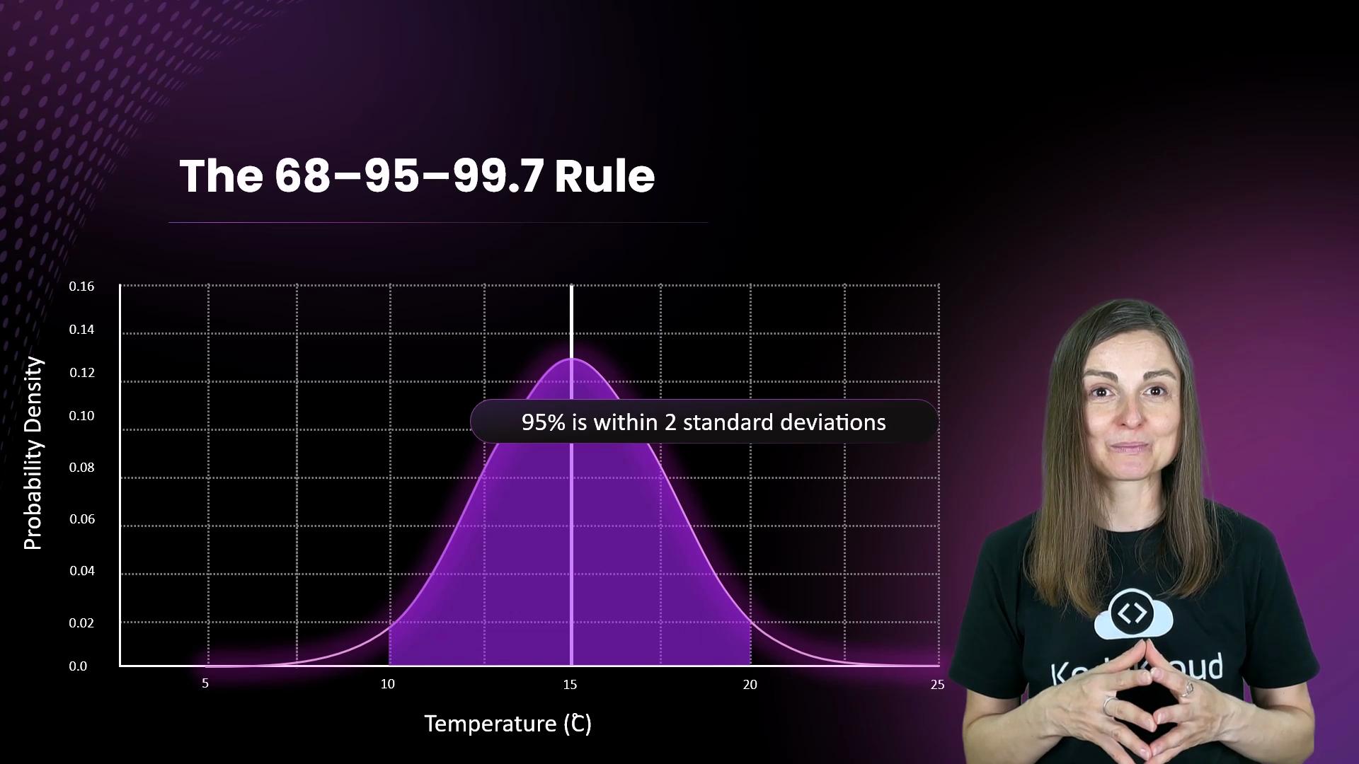
Imagine San Diego in January, Switzerland in April, and Death Valley in November all sharing mean 15°C. You wouldn’t pack the same clothes for each because their standard deviations differ — that spread is exactly what σ measures. Great question, Cody — that spread is what standard deviation quantifies. You can compute probabilities with the normal curve by shading the area between two values. A very useful shortcut is the 68–95–99.7 rule:
RuleInterval around meanApproximate probabilityExample (µ = 15°C, σ = 5°C)
68%±1σ~68%10°C to 20°C
95%±2σ~95%5°C to 25°C
99.7%±3σ~99.7%0°C to 30°C
The image shows a bell curve displaying the probability density of temperature, illustrating the 68-95-99.7 rule, with a caption noting that 95% is within 2 standard deviations. There is also a person presenting the graph in the corner.
Concretely, with µ = 15°C and σ = 5°C:
  • ±1σ: 10°C to 20°C (about 68% of days)
  • ±2σ: 5°C to 25°C (about 95% of days)
  • ±3σ: 0°C to 30°C (about 99.7% of days)
Applications in machine learning and data science
  • Language models: After the prompt “I love”, the model assigns probabilities across many possible next tokens. Common continuations lie near the distribution center; rare continuations are in the tails. Sampling from that distribution produces fluent text; adjusting a sampling “temperature” rescales the distribution to control diversity.
  • Generative models: When generating images, models sample latent or feature values from learned distributions. Sampling near the center yields realistic results; sampling from the tails tends to produce odd or unlikely outputs.
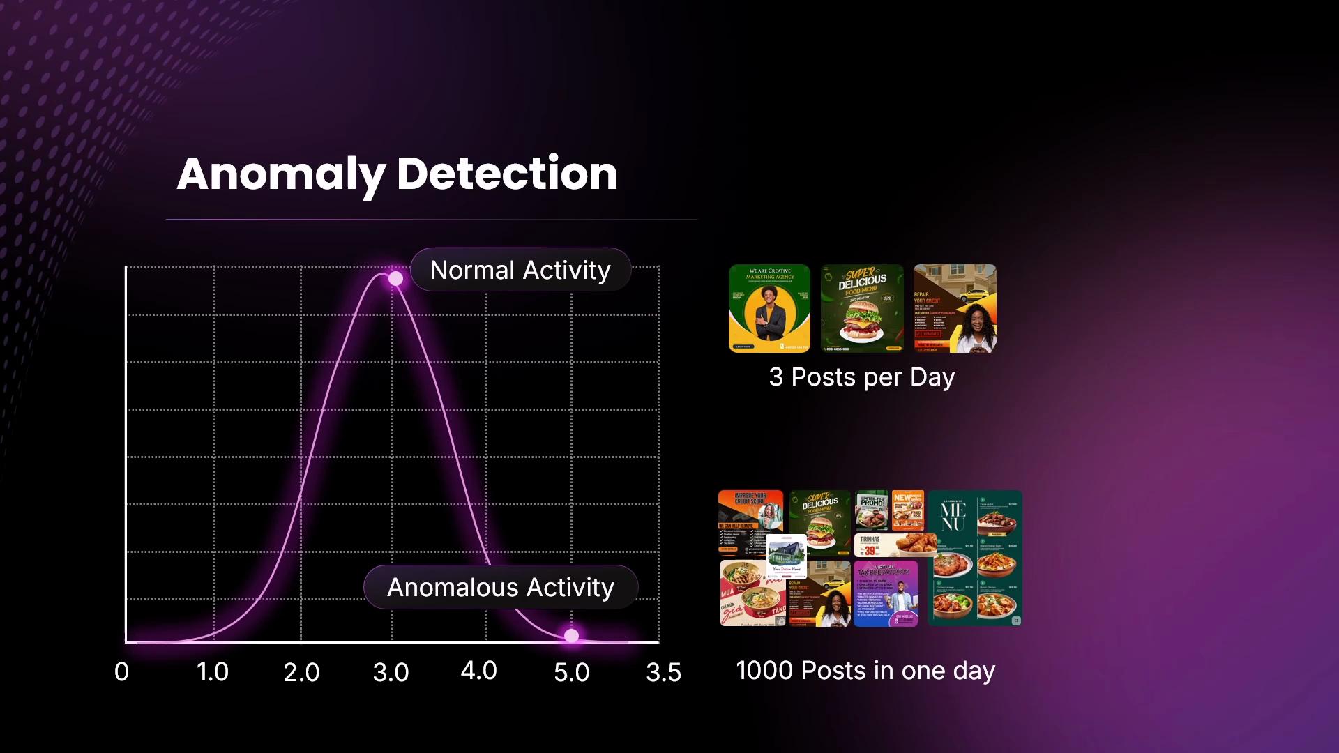
  • Anomaly detection: A normal model defines “typical” behaviour. Observations far in the tails (for example, posting 1,000 times in a day when µ ≈ 3 posts/day) are flagged as anomalies for investigation.
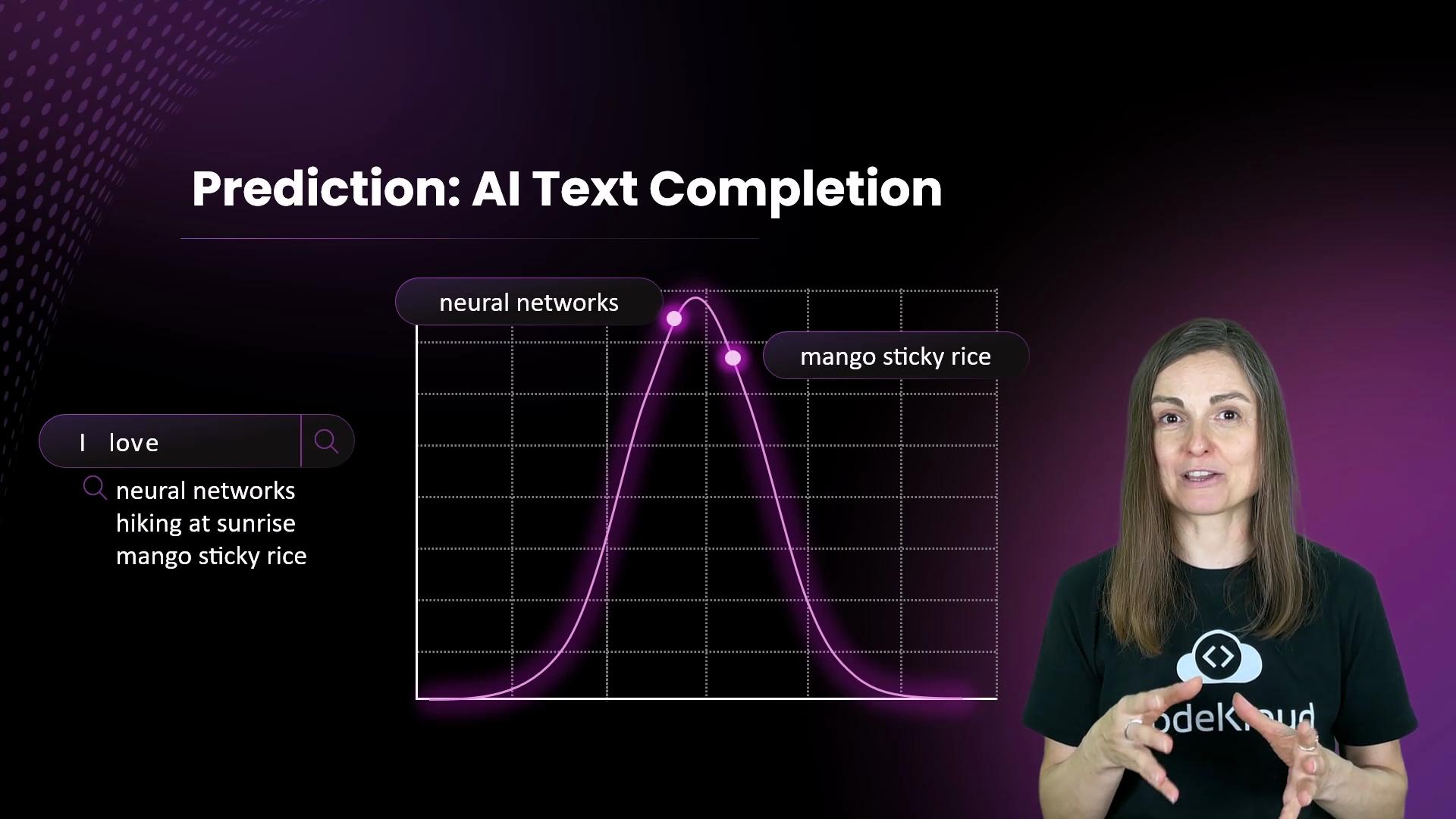
The image shows an AI text completion demonstration with a graph predicting the text "I love" followed by "neural networks" and "mango sticky rice," with a person speaking in the foreground.
The same intuition powers anomaly detection and fraud detection: model typical behaviour with a distribution, then treat extreme tail events as suspicious.
The image shows a graph indicating "Anomaly Detection" with a normal activity curve and examples of social media posting frequency—three posts per day as normal activity and 1000 posts in one day as anomalous activity.
Why this matters in practice
  • Predict likely outcomes by integrating areas under the density.
  • Detect unusual or risky events by measuring how far an observation lies in the tail.
  • Generate realistic synthetic data by sampling from central regions of learned distributions.
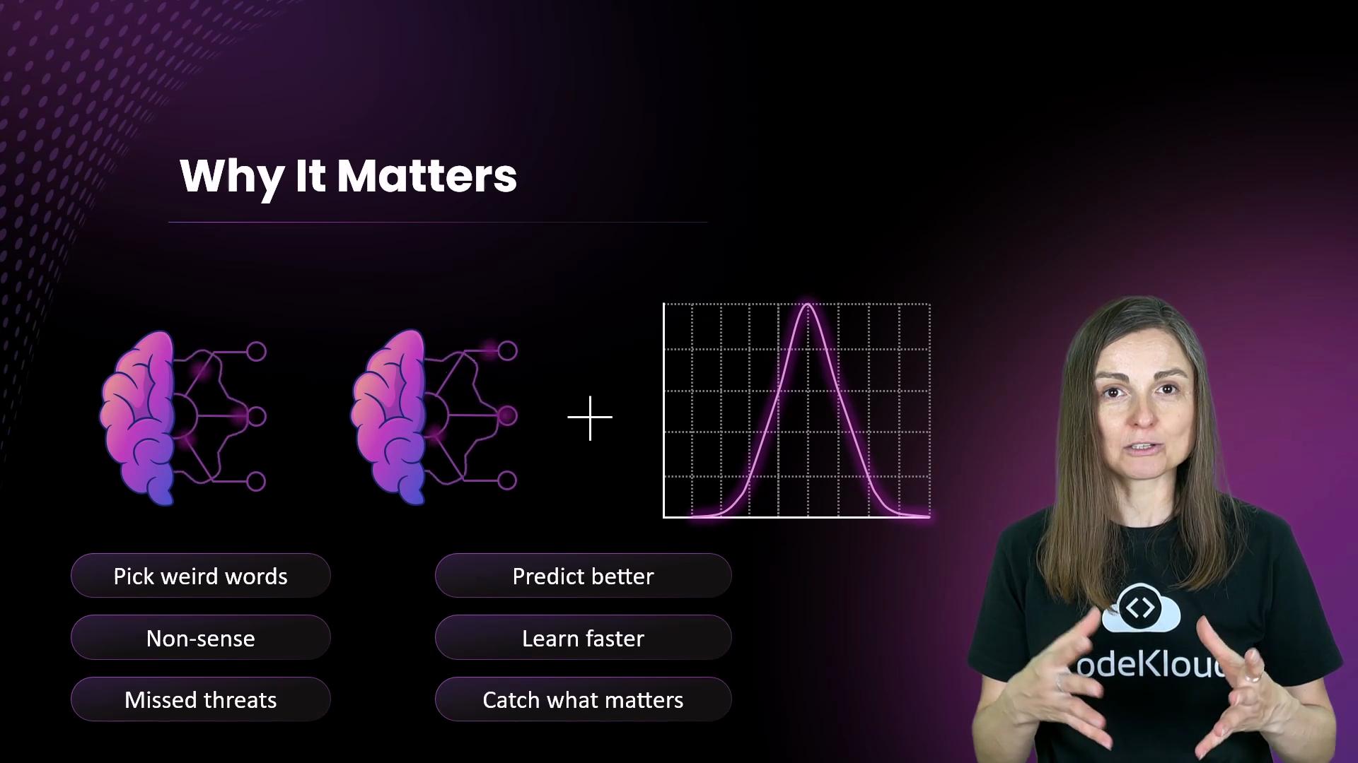
The image features a presentation slide titled "Why It Matters," showing illustrations of a brain and a graph, alongside a speaker. Bullet points list benefits such as "Predict better" and "Learn faster."
Summary The normal distribution is a compact, powerful model: the mean locates the centre, the standard deviation measures spread, and areas under the curve translate directly into probabilities. It forms the backbone of many statistical methods and practical machine learning techniques.
The image shows a slide on "Normal Distribution" with key points about mean, standard deviation, probability, and the 68-95-99.7 rule, alongside a person gesturing.
Not all data are perfectly normal. Always visualise your data (histograms, Q-Q plots) and run appropriate normality checks before assuming a normal model — many real-world datasets only approximate normality or are clearly non-normal.
Links and further reading

Watch Video