This article explores visualization tools in Prometheus for transforming raw metric data into insightful graphs, tables, and dashboards to identify trends and patterns.
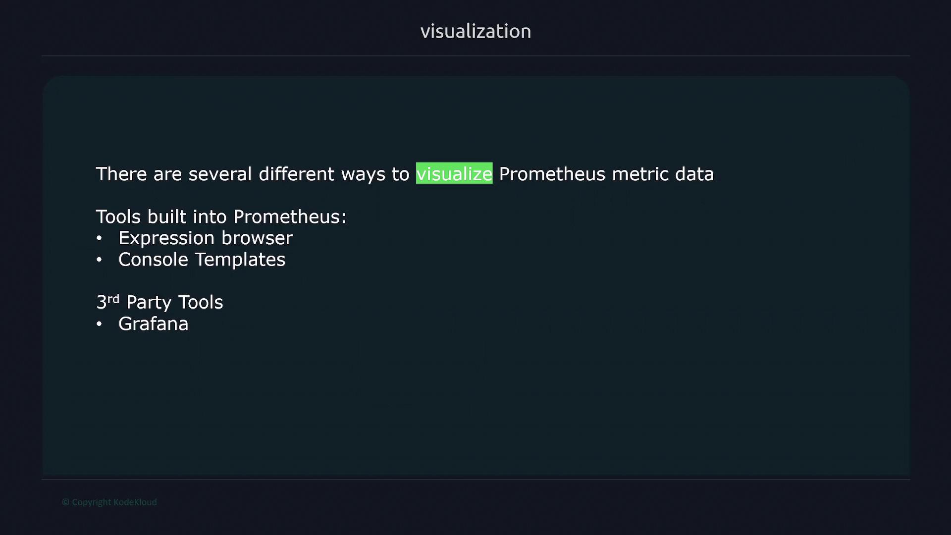
In this article, we dive into the powerful visualization tools provided by Prometheus. These built-in features allow you to transform raw metric data into insightful graphs, tables, and dashboards, making it easier to identify trends and patterns that might otherwise be overlooked.Visualizing your data is essential because humans are naturally inclined to process information visually. By using tools that present metrics in an intuitive format, you can quickly gain insights into system performance and potential issues.One of the primary visualization tools included with Prometheus is the expression browser. This built-in feature enables you to rapidly explore and query metric data, providing a straightforward method for data investigation.Below is an illustration that outlines various visualization methods available with Prometheus. It highlights both native tools—such as the Expression Browser and Console Templates—and popular third-party alternatives:
Another powerful built-in feature is console templates. These allow you to craft custom mini web pages that showcase preconfigured graphs, offering tailored visualization options for your specific monitoring needs.For those requiring even more advanced visualization capabilities, third-party tools like Grafana are highly recommended. Exclusively designed for robust data visualization, Grafana provides extensive support for Prometheus data, along with deep customization possibilities. This enables you to design comprehensive dashboards that offer a complete view of the metrics critical to your system’s performance.
For more details on configuring Prometheus and integrating it with these visualization tools, visit the Prometheus Documentation.