

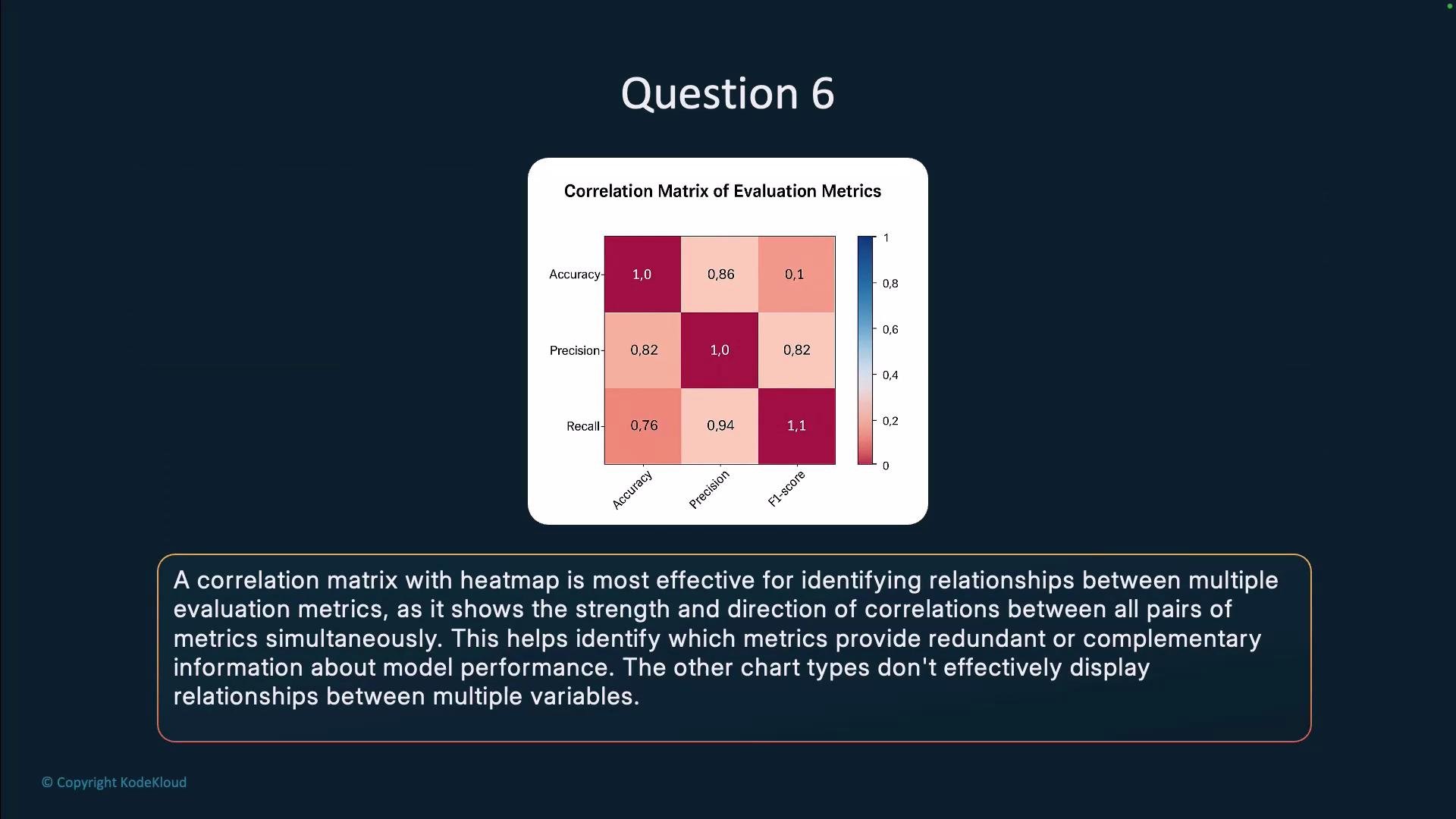
- Shows every pairwise relationship at once so global patterns and outliers are immediately visible.
- Uses color intensity (and optional numeric annotations) to convey both magnitude and sign of correlations.
- Supports clustering or reordering of metrics to reveal groups of similarly behaving metrics.
- Helps decide which metrics are redundant and which combinations give a fuller view of LLM performance.
- Pie chart: illustrates part-to-whole composition, not pairwise relationships between metrics.
- Waterfall chart: highlights incremental contributions to a total value, not correlations.
- Area chart: suited for trends or stacked contributions over time, not for displaying pairwise correlation structure.
Links and references
Use a correlation matrix with a heat map to quickly identify redundant or complementary evaluation metrics when comparing LLM performance. Consider clustering or reordering metrics to surface meaningful groups and improve interpretability.