

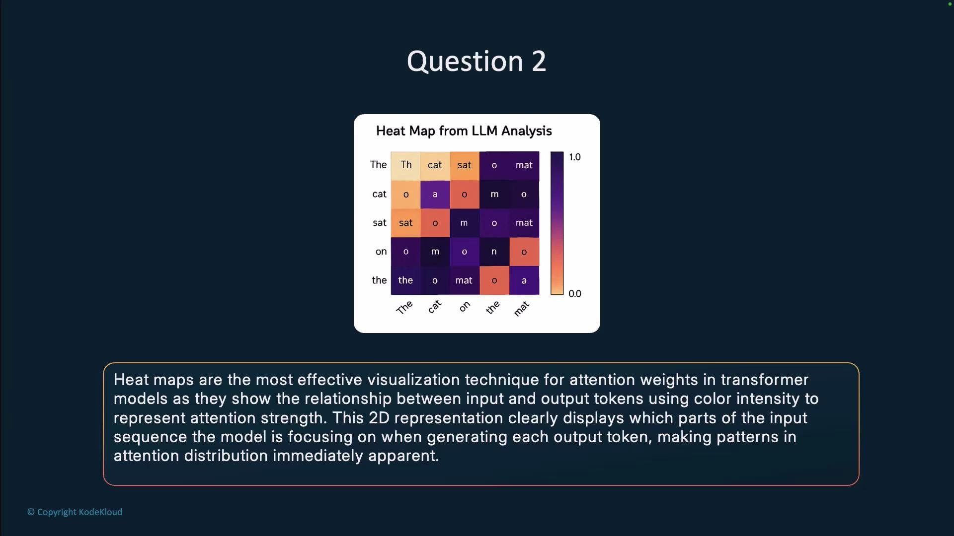
- Axes correspond naturally to token positions: one axis for queries (output tokens) and one for keys/values (input tokens).
- Color intensity conveys magnitude (attention weight) at a glance.
- They scale well to full sequence matrices and can visualize per-head or aggregated attention.
- You can add token labels and annotations to link attention patterns to actual text.
Practical notes when plotting attention heat maps
- Transformer attentions are softmax-normalized per query: values usually sum to 1 across keys for each query.
- Visualize a single head, average across heads, or show multiple heads in a grid of heat maps to capture different granularities.
- Distinguish self-attention (within a sequence) from cross-attention (encoder-decoder models) when labeling axes.
- For long sequences, aggregate tokens (e.g., by sentence or span), use hierarchical clustering, or provide interactive zoom to maintain readability.
- Consider normalizing, clipping, or using a perceptually-uniform colormap (e.g.,
viridis) for consistent interpretation.
- Rows represent queries (the token receiving attention); columns represent keys (tokens being attended to).
- Brighter (or more intense) colors denote larger attention weights.
- A focused attention pattern (strong peaks) indicates the model is concentrating on particular tokens; diffuse patterns indicate distributed attention.
- Compare heads and layers to see how attention patterns evolve across the network; compute summary stats (e.g., entropy per query) to quantify concentration.
- Use attention visualizations alongside other interpretability tools (e.g., integrated gradients, ablation studies) to form more robust explanations.
When comparing heads or layers, plot multiple heat maps side-by-side (one per head or per layer) or compute summary statistics (for example, entropy per query) to quantify how concentrated attention is. Interactive viewers (e.g., Plotly) help explore long sequences and multiple heads.
Attention weights are informative but are not a guaranteed causal explanation of model decisions. Interpret attention visualizations cautiously and corroborate findings with additional interpretability methods.
- Hugging Face Transformers documentation
- seaborn: statistical data visualization
- matplotlib: plotting library for Python
- Attention interpretation resources: Vaswani et al., “Attention is All You Need” and follow-up interpretability work on transformer explanations