

- Observe the overall shape of the relationship (e.g., linear, saturating, or nonmonotonic).
- Detect outliers and clusters of observations across context-length values.
- Inspect heteroscedasticity (changes in variance of accuracy across context lengths).
- Identify regions where additional context yields diminishing returns or clear gains.
- Summarize the central tendency using a fitted trendline (linear regression, LOESS/LOWESS smoothing, or a GAM) and optionally plot confidence intervals to show uncertainty.
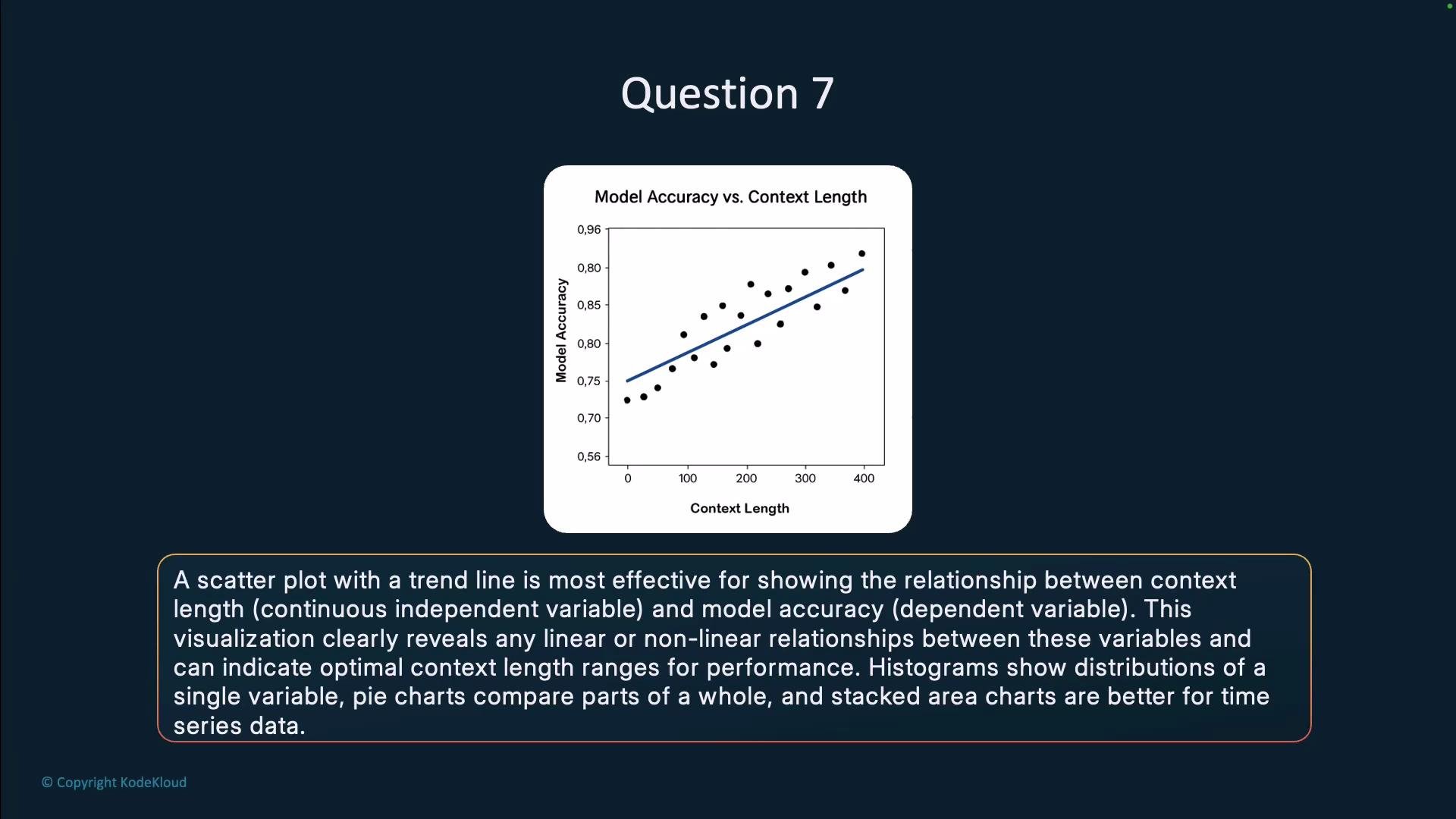
Practical tips for building an effective scatterplot for LLM context-length analysis
- Axis choices: Put context length on the x-axis and model accuracy (or error metric) on the y-axis. Consider log-scaling the x-axis if context lengths span orders of magnitude.
- Trendline selection: Use linear regression for approximate linear relationships; use LOESS/LOWESS or a GAM for nonlinear trends.
- Uncertainty: Overlay confidence bands around the trendline (e.g., 95% CI) to communicate estimate reliability.
- Point encoding: Size or color points by a third variable (e.g., dataset size, prompt type, or model family) to reveal conditional effects.
- Binning: If data are extremely dense, consider hexbin plots or alpha transparency to reduce overplotting.
- Annotation: Label notable outliers or regions (e.g., “diminishing returns beyond 4k tokens”) to guide interpretation.
- Statistical checks: Complement visuals with tests for heteroscedasticity or segmented regression if you suspect regime changes.
Use a scatterplot with an appropriate smoothing or regression curve (choose LOESS/GAM for nonlinear trends) and include confidence intervals to better assess uncertainty around the trend.
- Seaborn scatter + regression examples: https://seaborn.pydata.org/tutorial/regression.html
- Matplotlib scatter plotting: https://matplotlib.org/stable/api/_as_gen/matplotlib.pyplot.scatter.html
- LOESS/LOWESS reference: https://en.wikipedia.org/wiki/Local_regression
- Generalized Additive Models (GAMs): https://en.wikipedia.org/wiki/Generalized_additive_model