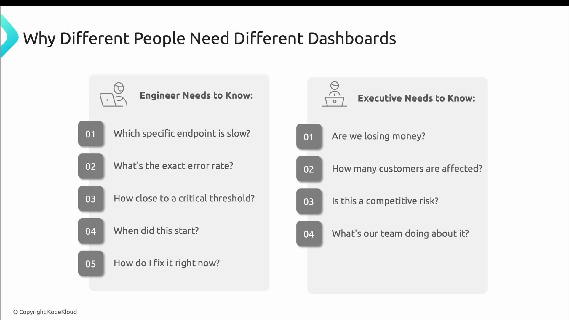
- Engineers need technical detail: which endpoint is slow, what the error rate is, how close the system is to thresholds, when the problem started, and how to fix it now.
- Executives need translated, business-oriented information: are we losing revenue, how many customers are affected, what is the competitive risk, and what is the remediation plan.
- Top: clear status indicators (traffic-light style) for immediate triage.
- Middle: detailed breakdowns such as request rates per endpoint, error rates by status code, and latency percentiles.
- Bottom: diagnostic context like recent deployments, build metadata, and links to logs/traces to help link incidents to changes.
- Instant visual status (red/yellow/green).
- Comparisons against baselines so you know whether a value is normal for this service.
- Exact numbers for precision when diagnosing (percentiles, counts, and error rates).
- Direct drill-down links to logs, traces, and code to take immediate action.
- Use clear status colors (red, yellow, green).
- Show comparisons to normal baselines to surface anomalies.
- Display specific numbers — engineers need precise error rates, latencies, and resource metrics.
- Provide direct drill-downs into logs, traces, and source code.
- How many users are impacted?
- What is the financial risk per hour?
- What is the estimated time to recovery (ETR)?
- What is the remediation plan and its status?
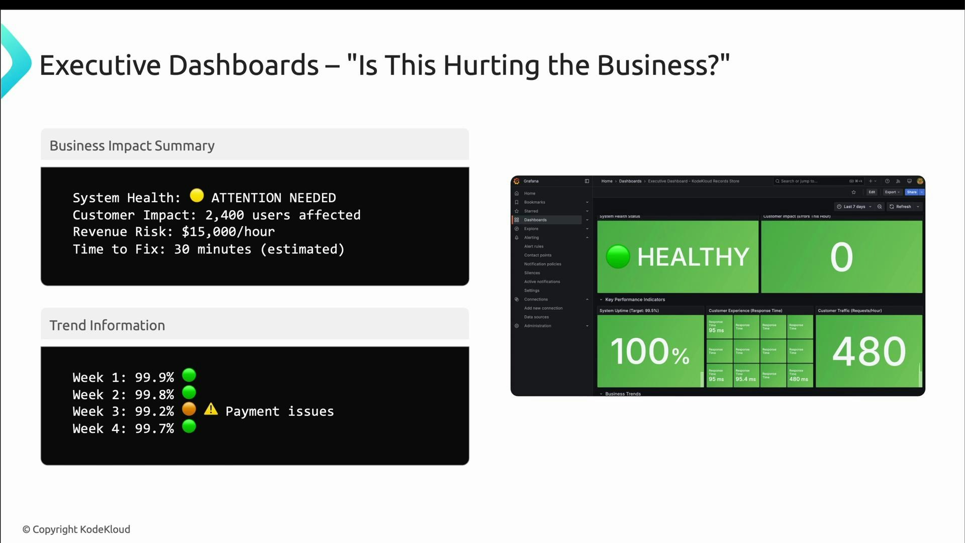
- Translate technical metrics into business impact (customers affected, estimated revenue loss).
- Show week-over-week or month-over-month trends (avoid second-by-second noise).
- Include targets, benchmarks, and context so leaders can assess direction (improving or slipping).
- Make clarity of action explicit: who is working the issue, what the mitigation is, and the expected time to resolution.
- Highlight successes where reliability investments have improved outcomes.
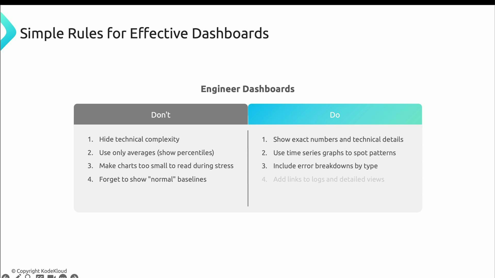
When building dashboards, follow distinct rules for each audience.
For engineering dashboards — don’t:
- Hide technical detail.
- Rely solely on averages (use percentiles).
- Use charts that are too small to read under pressure.
- Omit baselines and comparisons.
- Show exact numbers (error rates, percentiles, counts).
- Use time-series graphs that reveal patterns and trends.
- Include error breakdowns and links to logs/traces.
- Update frequently (every ~30 seconds is reasonable for operational monitoring).
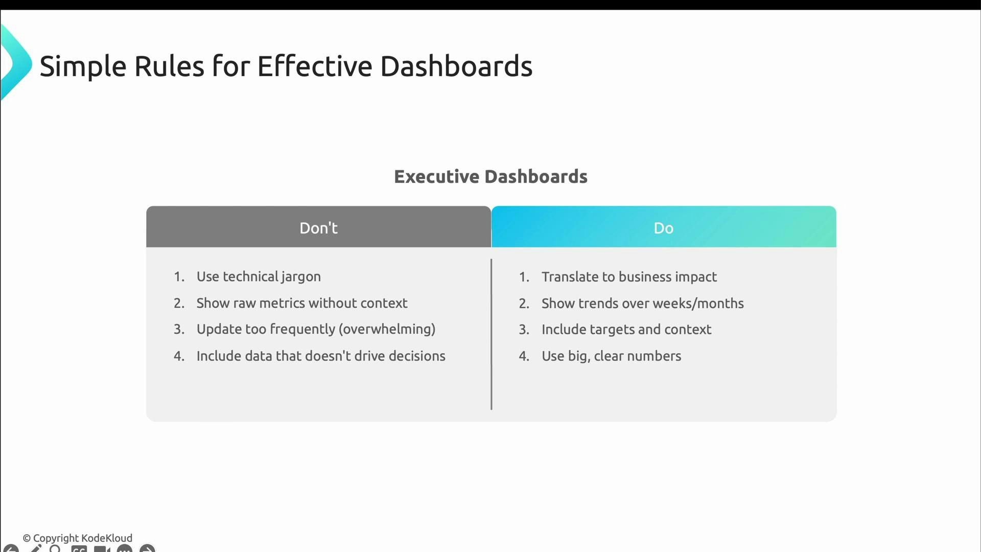
- Overwhelm leaders with technical noise and jargon.
- Flood them with raw metrics that lack business context.
- Update too frequently (seconds-level updates add noise).
- Translate metrics into business impact (customers, revenue).
- Show trends over longer windows (weeks/months).
- Include targets and clear context.
- Use large, clear numbers focused on outcomes rather than implementation details.
Choose the right cadence and level of detail for each audience: operational dashboards should be fast and precise; executive dashboards should be stable and outcome-focused.
- Kubernetes Documentation
- Grafana — dashboard and visualization platform
- Prometheus — metrics and alerting
- OpenTelemetry — traces, metrics, and logs standards
- Designing Data-Intensive Applications (book)