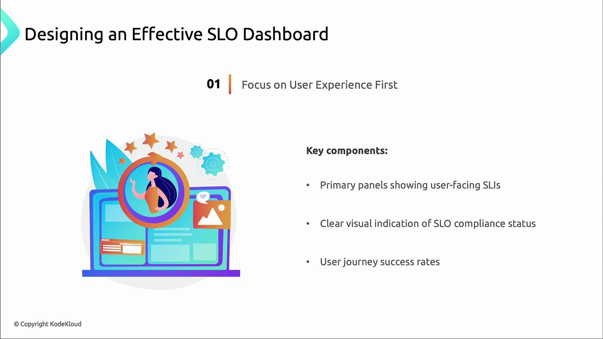
Focus on user experience
Prioritize user-facing SLIs. These are the signals that most directly reflect customer experience and business risk.- Place user-facing SLIs front and center (e.g., checkout success rate, page load P95).
- Show SLI compliance status prominently (Are targets being met?).
- Surface user journey success rates so product and business stakeholders can see health at a glance.
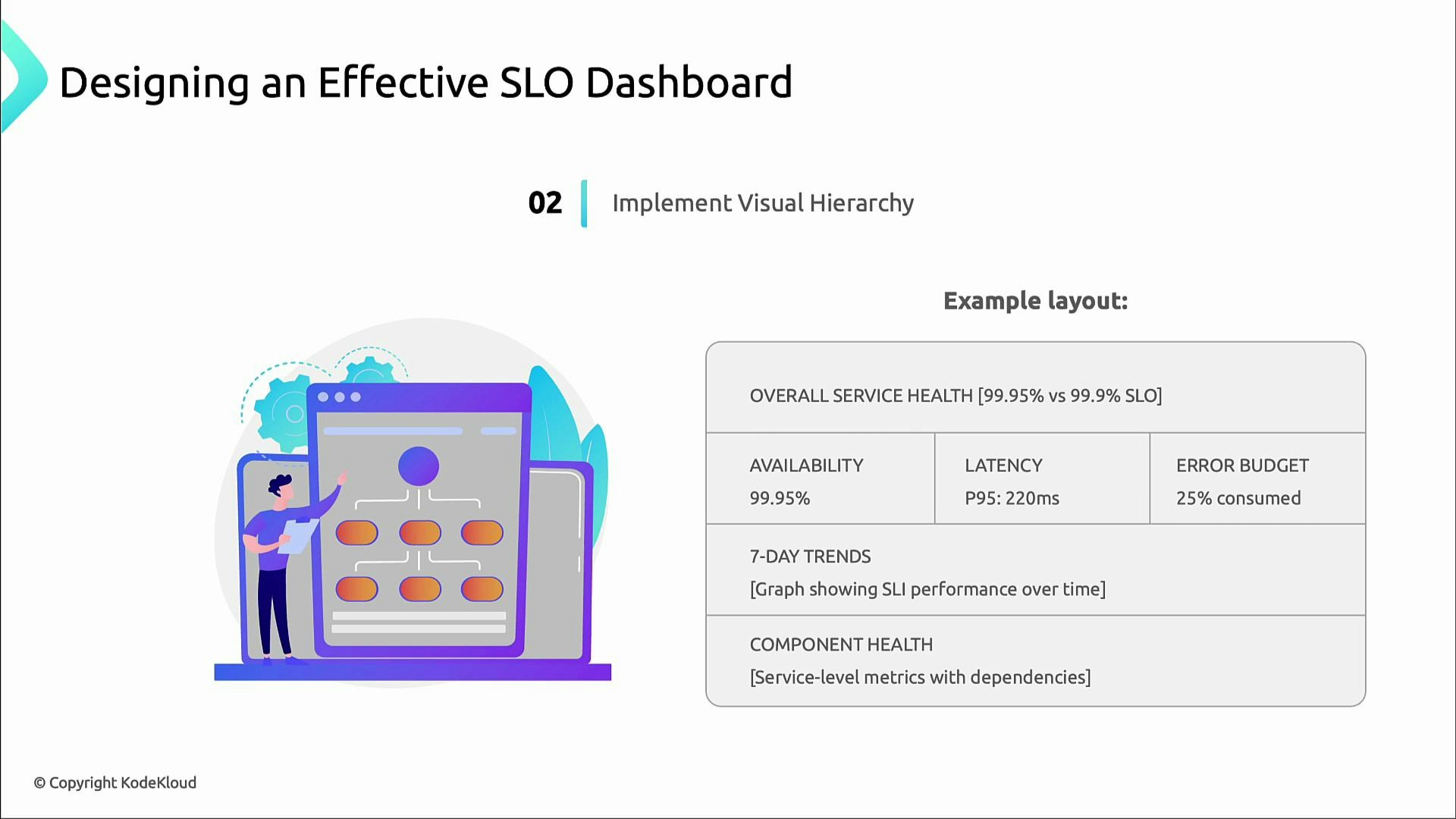
Visual hierarchy — guide attention, reduce noise
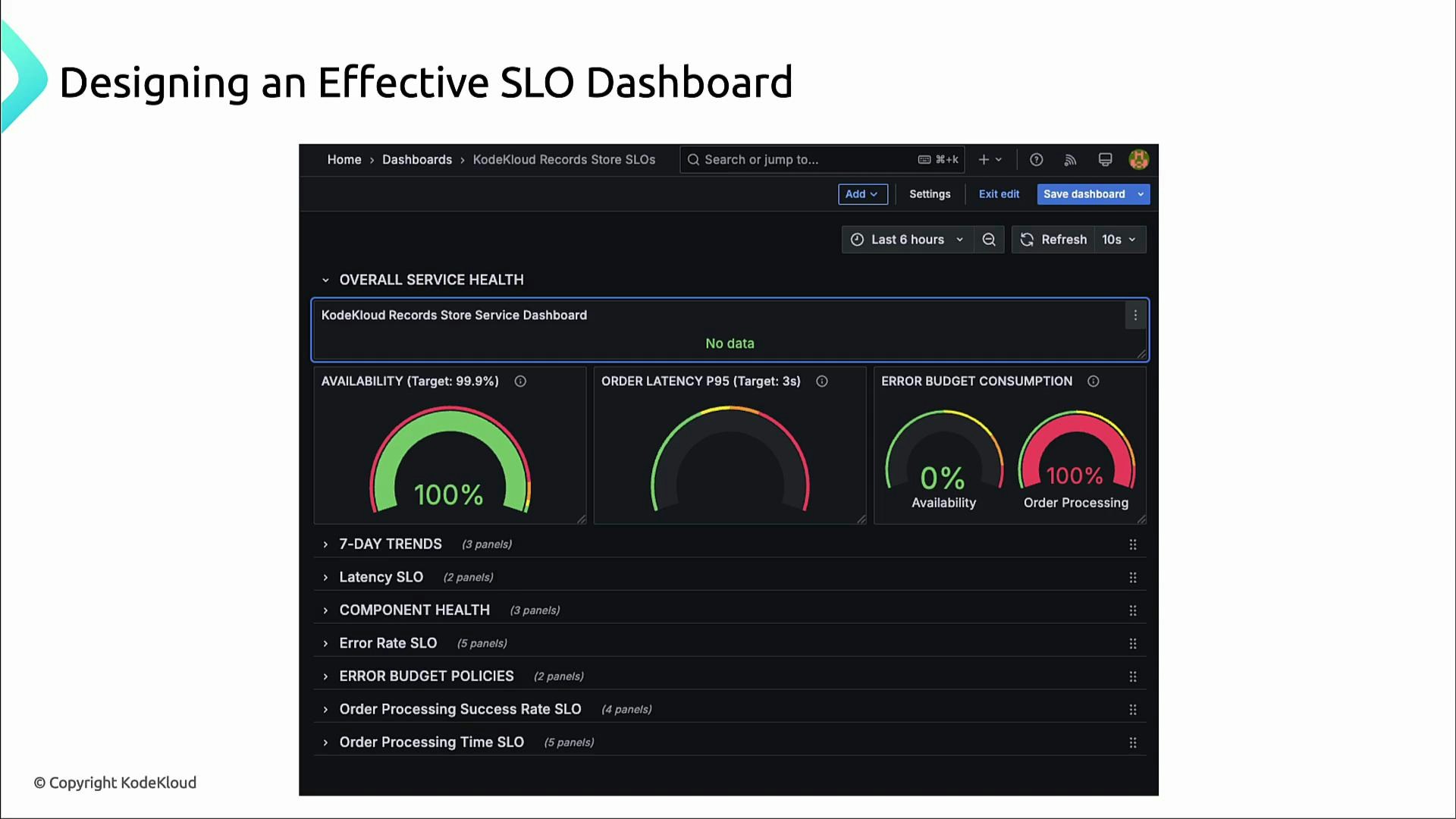
A clear visual hierarchy helps teams triage quickly. Recommended layout (top → bottom):- Highest priority: overall service-health panel (e.g., 99.95%).
- Immediately below: three critical SLOs side-by-side (availability, latency, error budget).
- Under those: short-term trend graphs (7-day or 30-day) to show emerging patterns.
- Bottom: component-level and dependency panels for troubleshooting.
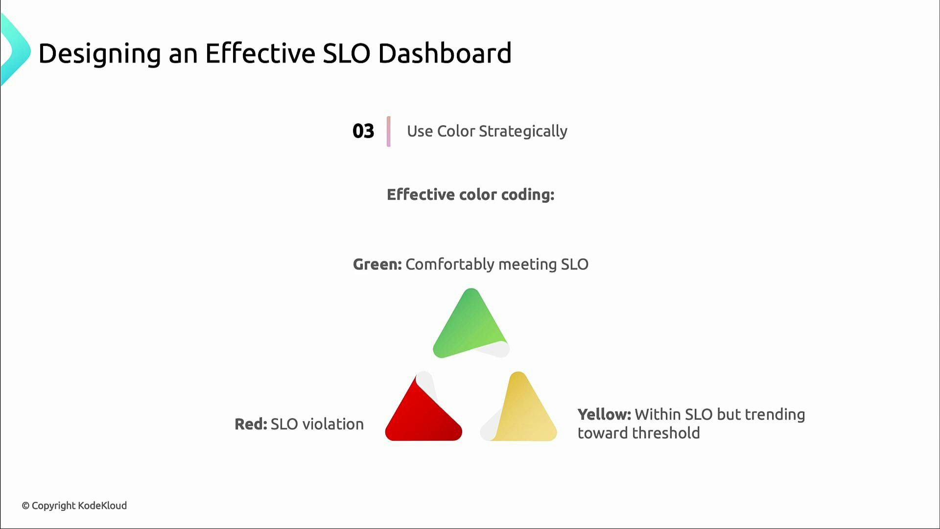
Color coding — consistent and actionable
Use a consistent color system so stakeholders immediately recognize risk levels.
Simple, consistent color cues make dashboards readable at a glance for both technical and non-technical audiences.
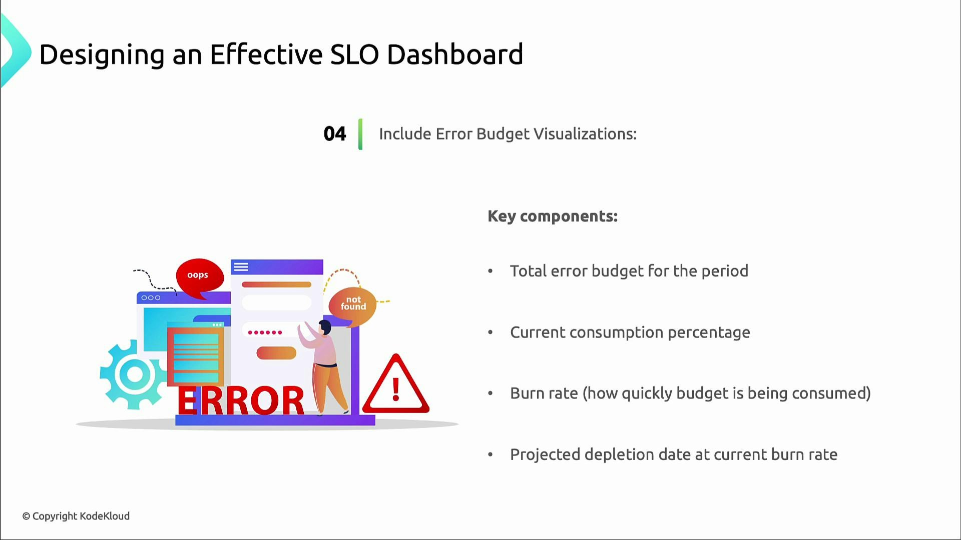
Error budget visualizations — make abstract risk tangible
Error budgets convert SLOs into operational constraints. Show these elements so teams can reason about risk and throttle releases when needed:- Total error budget for the measurement period (e.g., monthly).
- Percentage of budget consumed to date.
- Current burn rate (speed of budget consumption).
- Projected depletion date if the current burn rate continues.
Provide context — labels, windows, and links
Context makes dashboards actionable. Always include:- Clear SLI targets (e.g., “P95 latency ≤ 300 ms”).
- The measurement time window (e.g., 5m, 1h, 7d, 30d).
- Links to incident runbooks and ownership information.
- Quick drill-down paths from a high-level alert into metrics, traces, and logs.
Always label SLI targets and the time window for measurement — ambiguity is the enemy of action.
Concrete example: latency SLI using Prometheus histograms
Example SLI: “95% of orders complete processing within 3 seconds” — i.e., the fraction of requests with latency ≤ 3s. If your system exposes Prometheus histogram metrics following the common pattern (http_request_duration_seconds_bucket and http_request_duration_seconds_count), the following PromQL computes the percentage over a 5‑minute window:- This returns the percentage of /orders requests with latency ≤ 3s over the last 5 minutes.
- Add this expression as a dedicated panel next to availability and error-budget widgets so the team can detect latency regressions and their impact on error budgets.
Dashboard checklist
Use this quick checklist when designing or reviewing SLO dashboards:- Are user-facing SLIs prominently visible?
- Is the visual hierarchy clear (service health → critical SLOs → trends → components)?
- Are SLI targets and time windows labeled?
- Is color usage consistent and understood by stakeholders?
- Are error budget panels present with burn rate and projected depletion?
- Are links to runbooks, owners, and logs available for fast action?