Welcome back. This lesson drills into performance monitoring with practical guidance you can apply to production systems. Performance is not just raw speed — it directly affects reliability, user trust, and revenue. Slow or unpredictable systems frustrate users, cause churn, and often indicate deeper reliability problems. Performance and reliability are tightly coupled; monitoring should reflect both. At Amazon, engineers measured that adding 100 ms of latency correlated with about a 1% drop in sales. At scale this became tens of millions of dollars per year in lost revenue — a clear example of how performance directly maps to business outcomes.
A slide titled "The Performance–Reliability Connection" featuring the Amazon logo and a three-box flow: "100ms latency" → "1% sales lost" → "$10M/year lost." It illustrates the estimated revenue impact of added latency.
When performance and reliability are both high, users are happy and revenue grows. Different combinations produce different business outcomes:
  • High performance + high reliability → strong user satisfaction and growth.
  • High performance + low reliability → intermittent disasters and eroded trust.
  • Low performance + high reliability → stable but slow experience and steady revenue leakage.
  • Low performance + low reliability → business “death spiral.”
A real-world example: the Pokémon GO launch in July 2016 experienced ~50× traffic than expected, overwhelming databases and backends, causing multi-day outages and major revenue impact. That incident shows how performance problems can quickly cascade into reliability failures if capacity and scaling triggers are not in place.
A slide titled "The Performance–Reliability Connection" summarizing the Pokémon GO July 2016 launch failure, showing Problem (50x traffic spike, DB couldn't handle load), Impact (3 days downtime, ~$35M lost revenue) and Lesson (need capacity limits and scaling triggers). The slide includes icons for server errors, distributed load, and scaling.

What traditional monitoring misses

Traditional monitoring often relies on averages and infrastructure metrics that can hide real problems:
  • Averages mask tail behavior (p95/p99).
  • Synthetic tests may not reflect real user workflows.
  • Infrastructure metrics alone (CPU/memory) do not reveal business impact.
  • Alerts that only fire after customers are affected are too late.
Modern observability addresses these blind spots by focusing on user-facing metrics, tail latency, and correlating system indicators to customer impact.

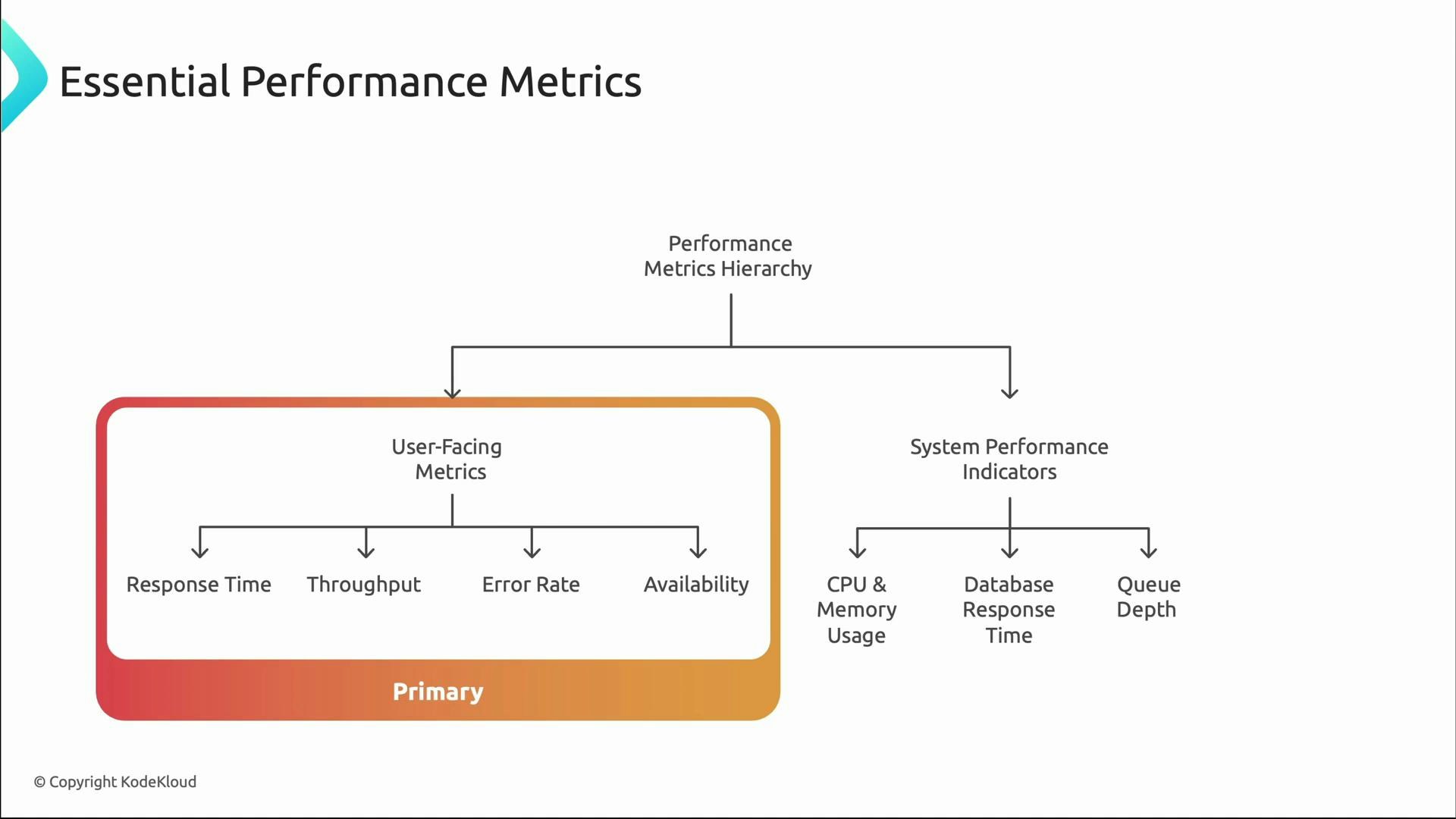
Layered approach to performance monitoring

Think in layers when instrumenting systems:
  • Primary, user-facing metrics: response time, throughput, error rate, availability — these are what customers experience.
  • System performance indicators: CPU, memory, database latency, queue depth — these explain why user-facing metrics behave as they do.
A slide titled "Essential Performance Metrics" showing a performance-metrics hierarchy split into User-Facing Metrics (marked Primary) — Response Time, Throughput, Error Rate, Availability — and System Performance Indicators — CPU & memory usage, database response time, and queue depth.

Why percentiles matter

Averages can be misleading. Consider a system with average latency = 100 ms. That sounds excellent, but if p95 ≈ 2,000 ms and p99 ≈ 5,000 ms, a small subset of users experience severe delays — often high-value users with complex workflows. Tail latencies (p95/p99) are critical for user-facing reliability decisions.
A slide titled "Essential Performance Metrics" showing three cylindrical bars: Average Response Time ~100ms, P95 Response Time ~2,000ms, and P99 Response Time ~5,000ms. Each bar has a short caption about typical user experience, 5% waiting 2+ seconds, and 1% having a terrible experience.
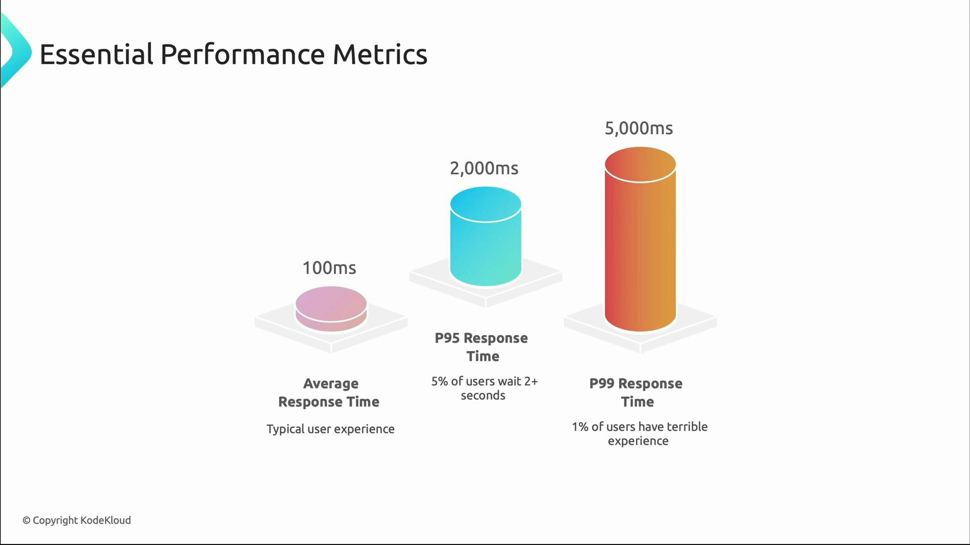
Prioritize p95 and p99 when SLAs, SLOs, or high-value user experiences are critical. Use averages for capacity planning and long-term trends, but let tail metrics drive user-facing reliability decisions.

Finding bottlenecks

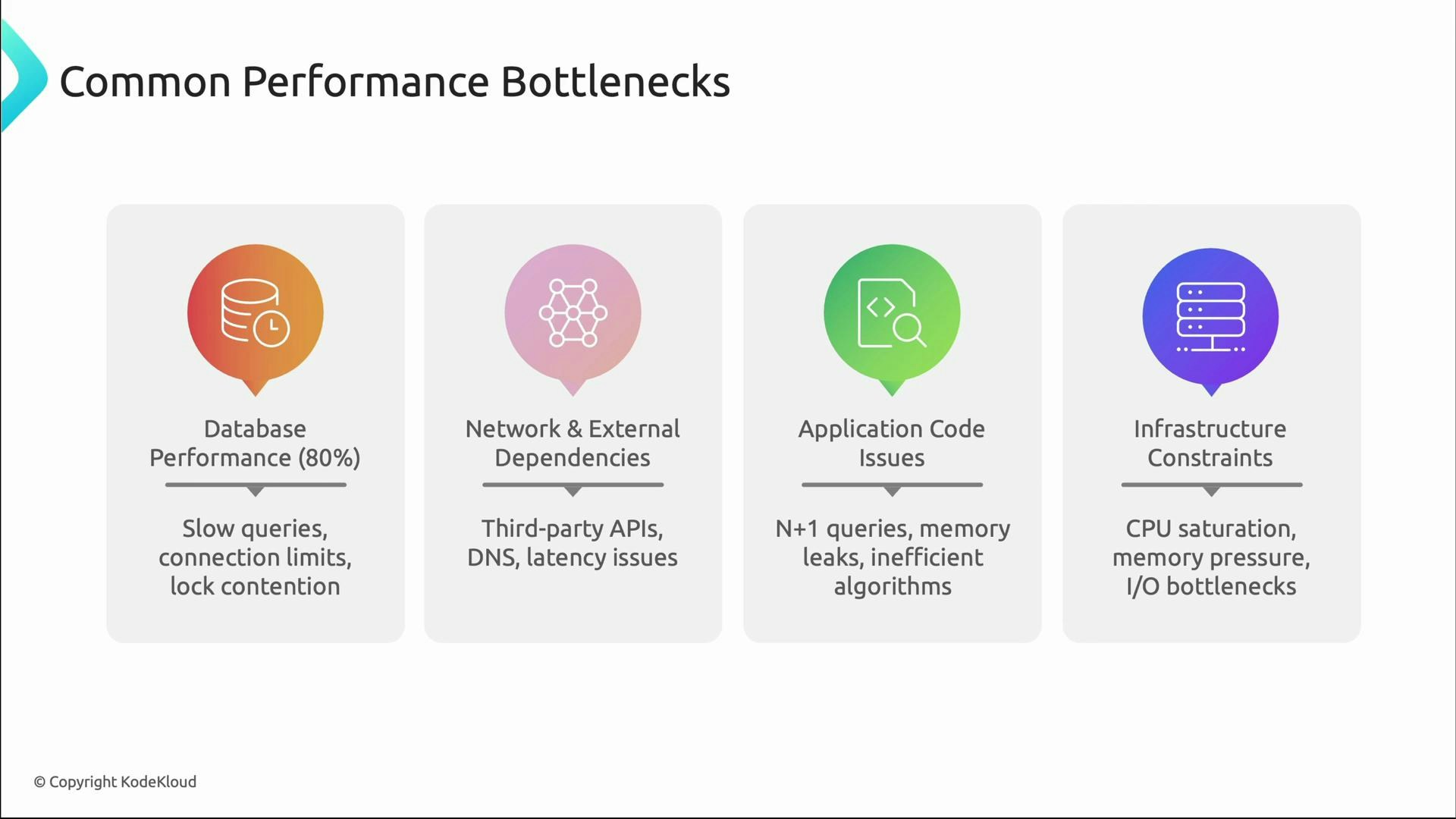
Once you detect slow performance (via p95/p99 or user reports), narrow down the root cause. Common bottlenecks:
  • Database: slow queries, connection pool exhaustion, lock contention, missing indexes.
  • Network & external dependencies: third-party APIs, DNS latency, network saturation.
  • Application code: N+1 queries, inefficient algorithms, memory leaks.
  • Infrastructure saturation: CPU, memory, disk I/O limits.
A presentation slide titled "Common Performance Bottlenecks" showing four categories: Database Performance (80%), Network & External Dependencies, Application Code Issues, and Infrastructure Constraints. Each category includes brief causes like slow queries and lock contention, third‑party API/DNS latency, N+1 queries and memory leaks, and CPU/memory/I/O saturation.
Correlating metric patterns often points quickly to the likely area to investigate:
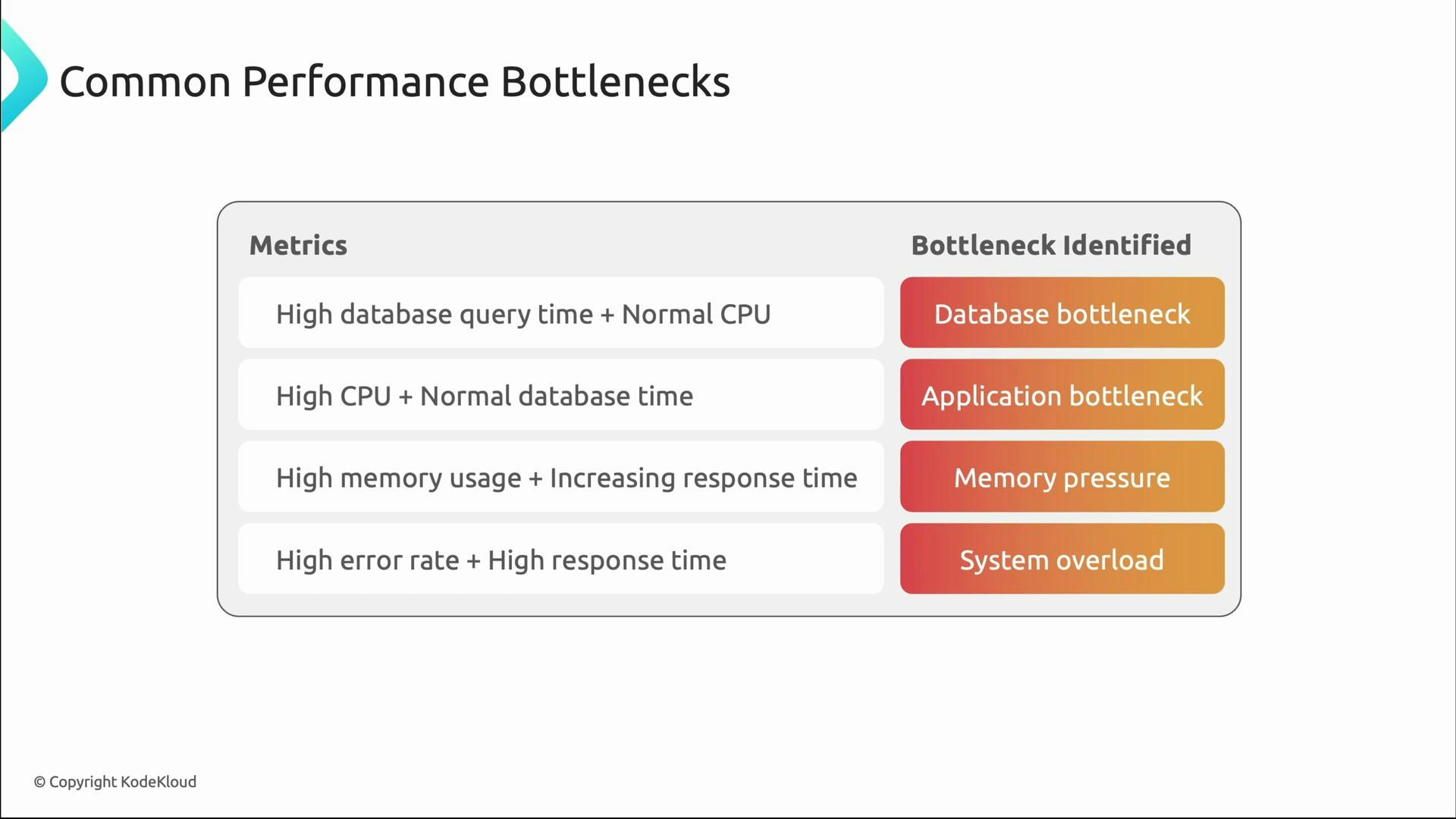
  • High DB query time with normal CPU → database bottleneck.
  • Spiking CPU with stable DB times → CPU-bound application work or inefficient code.
  • Rising memory over time with increasing latency → memory pressure or leaks.
  • High error rates + high latency → overload or cascading failures.
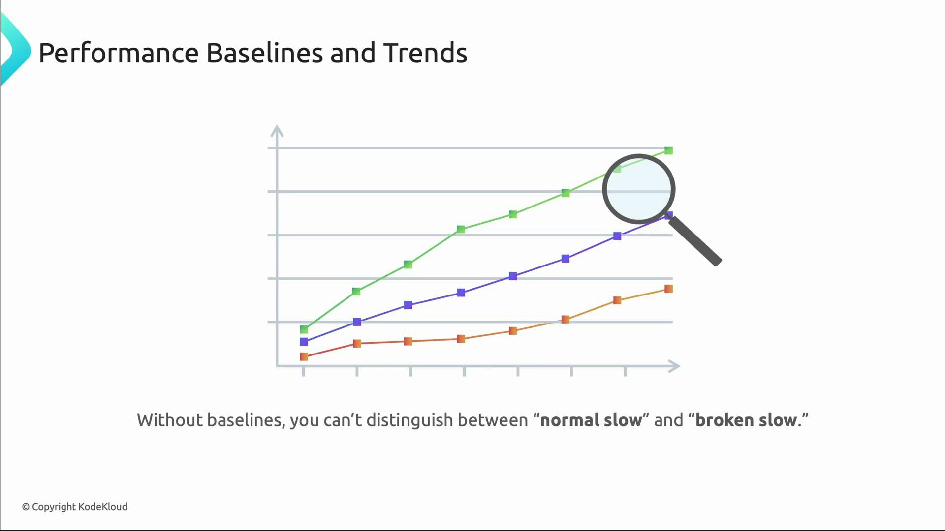
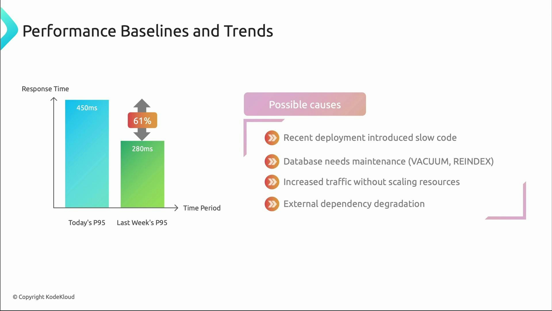
An infographic titled "Common Performance Bottlenecks" listing metric patterns (high DB query time, high CPU, high memory usage, high error rate) alongside their likely causes: database bottleneck, application bottleneck, memory pressure, and system overload.
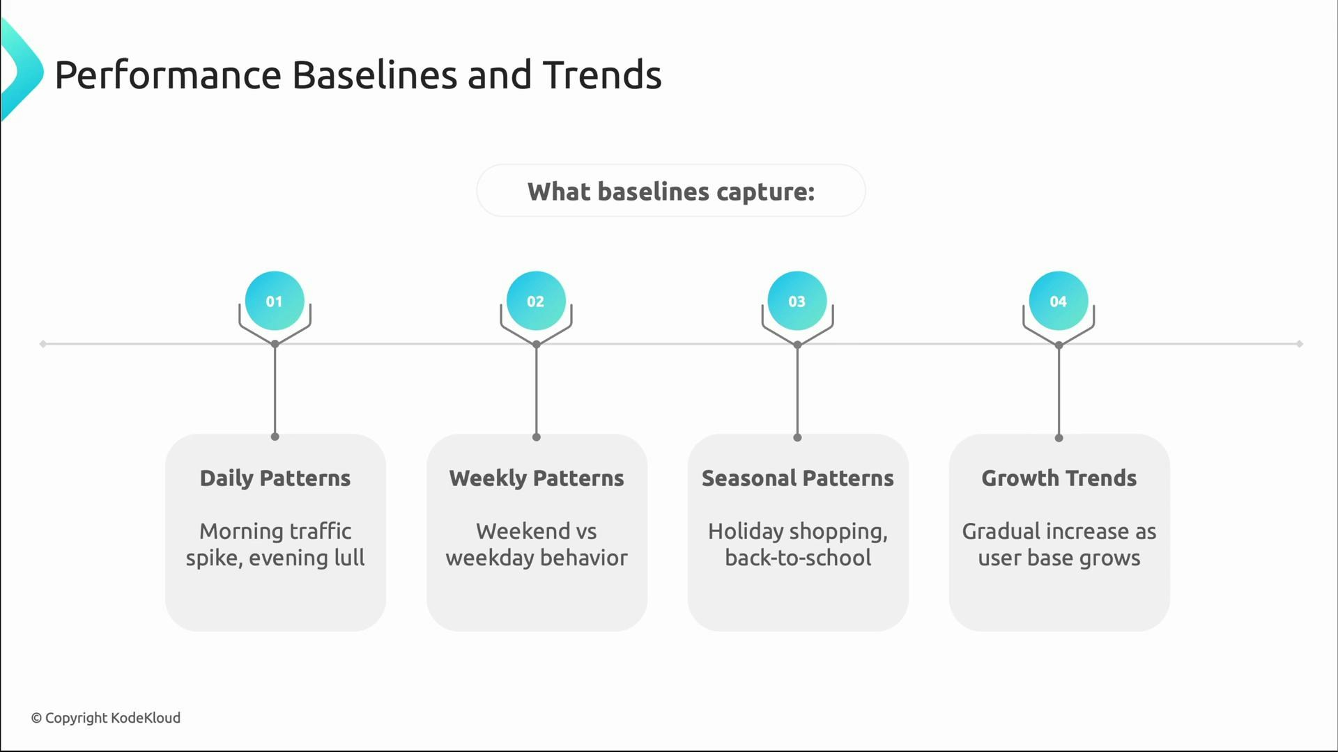
Performance monitoring becomes actionable when you know what “normal” is. Baselines capture typical behavior over different time scales so that deviations are meaningful:
  • Daily patterns: peak login times and evening lull.
  • Weekly patterns: weekday vs weekend differences.
  • Seasonal patterns: holiday shopping or periodic campaigns.
  • Growth trends: gradual changes as user base increases.
A slide titled "Performance Baselines and Trends" showing a line chart with three colored trend lines, a magnifying glass highlighting the top lines, and a caption saying you can't distinguish between "normal slow" and "broken slow" without baselines.
An infographic titled "Performance Baselines and Trends" showing a timeline with four numbered markers. Each marker lists a baseline: Daily Patterns (morning traffic spike, evening lull), Weekly Patterns (weekend vs weekday behavior), Seasonal Patterns (holiday shopping, back-to-school), and Growth Trends (gradual increase as user base grows).
Example: if today’s p95 = 450 ms vs last week’s p95 = 280 ms (≈ 61% increase), that deviation merits investigation. Likely causes include a recent deployment, database maintenance (VACUUM/REINDEX), sudden traffic that missed autoscaling triggers, or external dependency degradation.
A presentation slide titled "Performance Baselines and Trends" showing a bar chart where today's P95 response time rose to 450ms from last week's 280ms (about a 61% increase). To the right is a "Possible causes" list: recent deployment, database maintenance (VACUUM/REINDEX), increased traffic without scaling, and external dependency degradation.

Alerts that reduce noise and improve actionability

Baselines enable smarter alerting. Use a mix of immediate, trend, capacity, and SLO alerts tied to error budgets.
Alert typePurposeExample trigger
Immediate alertsDetect sudden spikesResponse time > 2× baseline
Trend alertsCatch gradual degradation>20% degradation over 24 hours
Capacity alertsWarn before limits are hitConnection pool > 80% used
SLO alertsProtect user promises & error budgetMonthly error budget at risk
A presentation slide titled "Performance Baselines and Trends" showing four colored alert boxes: Immediate Alerts, Trend Alerts, Capacity Alerts, and SLO Alerts. Each box lists trigger conditions (e.g., response time >2x baseline; performance degrading >20% over 24 hours; approaching system limits; monthly error budget at risk).
Practical alerting tips:
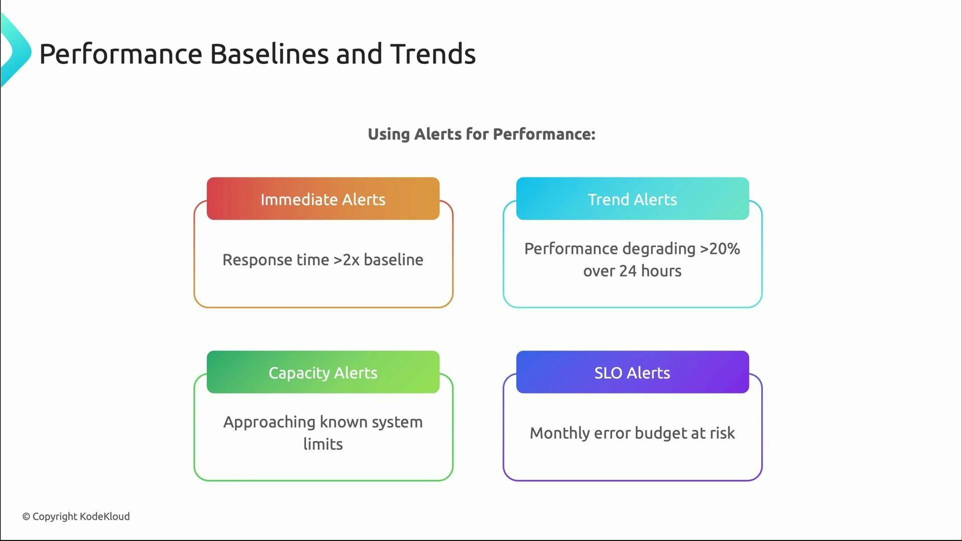
  • Use dynamic thresholds relative to baselines rather than static numbers.
  • Combine multiple signals (latency + error rate + saturation) to reduce false positives.
  • Route alerts based on ownership and runbooks to speed remediation.
  • Tie alerts to SLOs and error budgets to prioritize work.

Quick checklist to shift from reactive to proactive

  • Instrument user-facing metrics (latency, throughput, errors, availability).
  • Track tail latency (p95, p99) in addition to averages.
  • Establish baselines for expected daily/weekly/seasonal patterns.
  • Correlate system metrics to user impact for faster diagnosis.
  • Configure targeted, SLO-driven alerts and maintain runbooks.

Useful references

That concludes this lesson on performance monitoring. Next: advanced visualization and reporting — how to present monitoring data so it’s actionable without overwhelming teams.