

- Align Backstage with your company’s brand and visual identity.
- Improve usability by tuning color contrast, typography, and spacing.
- Provide alternate modes (light/dark) or themed experiences for different audiences.
- Backstage builds on top of Material UI (MUI) and provides additional components and helpers that integrate with MUI.
- You can use any MUI components alongside Backstage components; they are designed to work together.
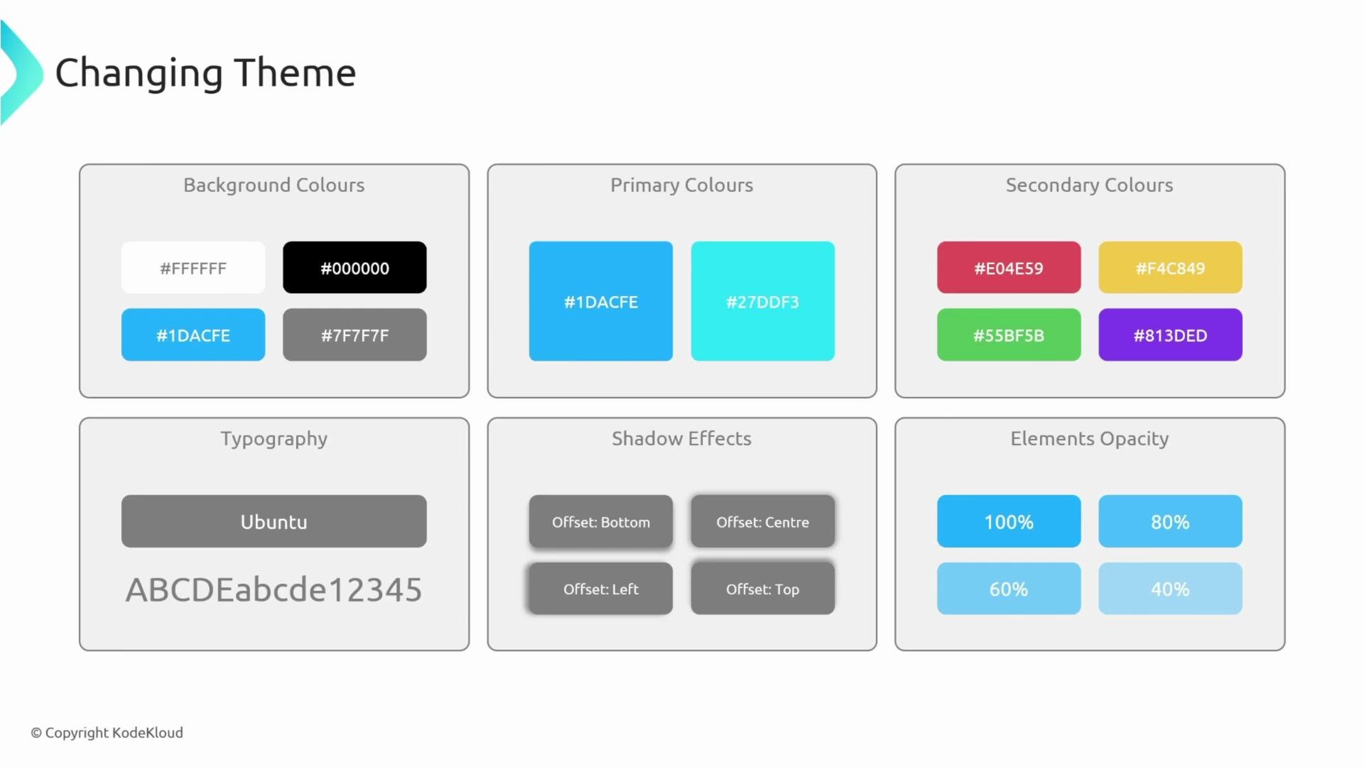
- Colors (primary, secondary, background, surface)
- Brightness / mode (light or dark)
- Typography (font family, sizes, weights)
- Elevation and shadow depth
- Opacity and spacing scale
theme.palette.primary.main or theme.typography.h6, it will adapt to the values you provide.
Where to add a custom theme in a Backstage app
Place front-end customizations under the app package. In a typical Backstage monorepo the frontend package is
packages/app. Create a theme folder in packages/app/src and add your theme files (for example, myTheme.ts).
Example project tree:
packages/app/src/theme/myTheme.ts. Adjust imports and utilities according to your Backstage version.
primary.main and secondary.main to alter the main accent colors used across components. Components that rely on theme.palette.primary.main or theme.palette.secondary.main (buttons, links, highlights) will pick up these values automatically.
- Try to keep contrast and accessibility in mind when choosing colors.
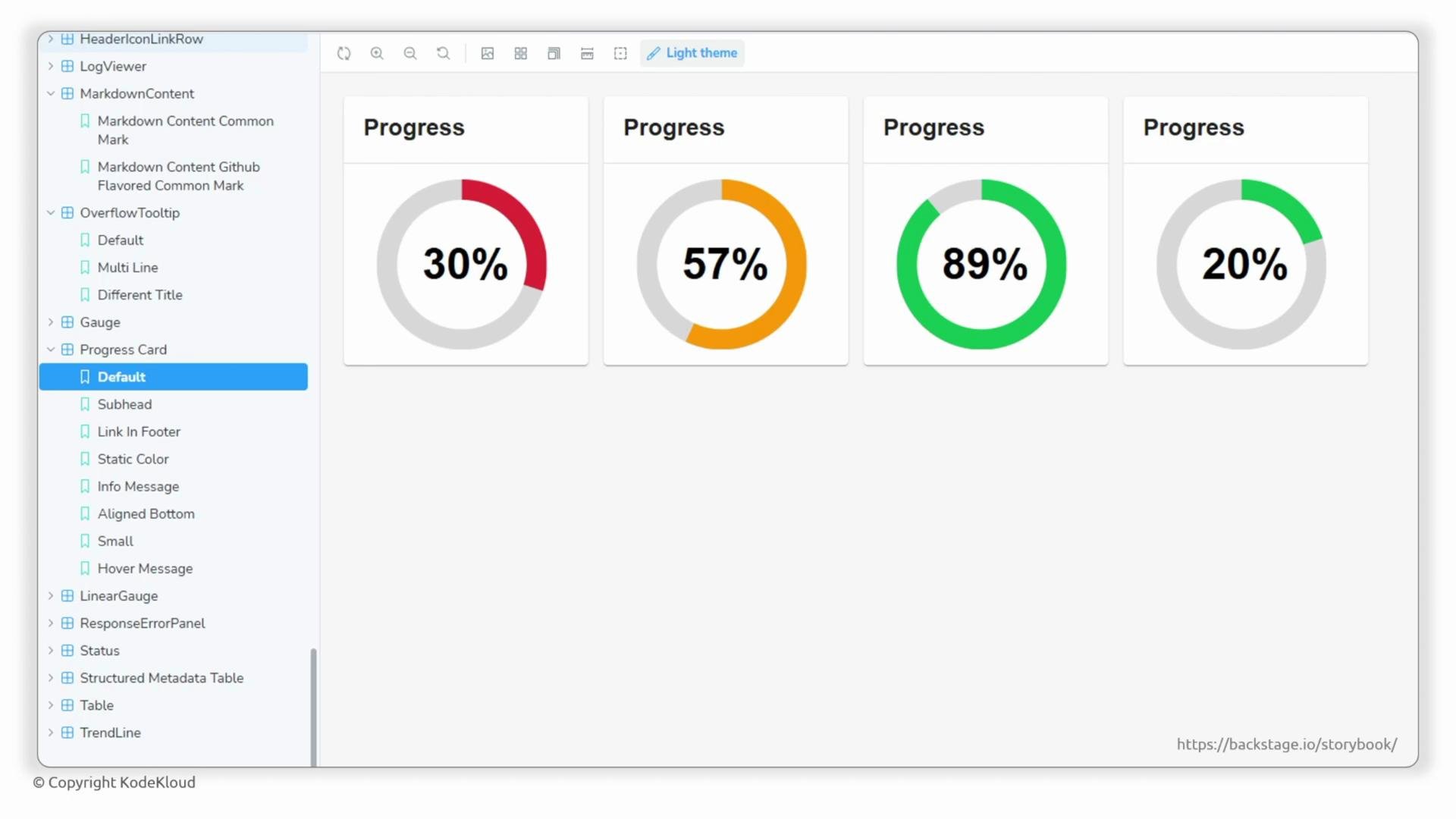
- Use Backstage Storybook to preview components with your theme.
- Backstage’s design system extends Material UI; both are used together.
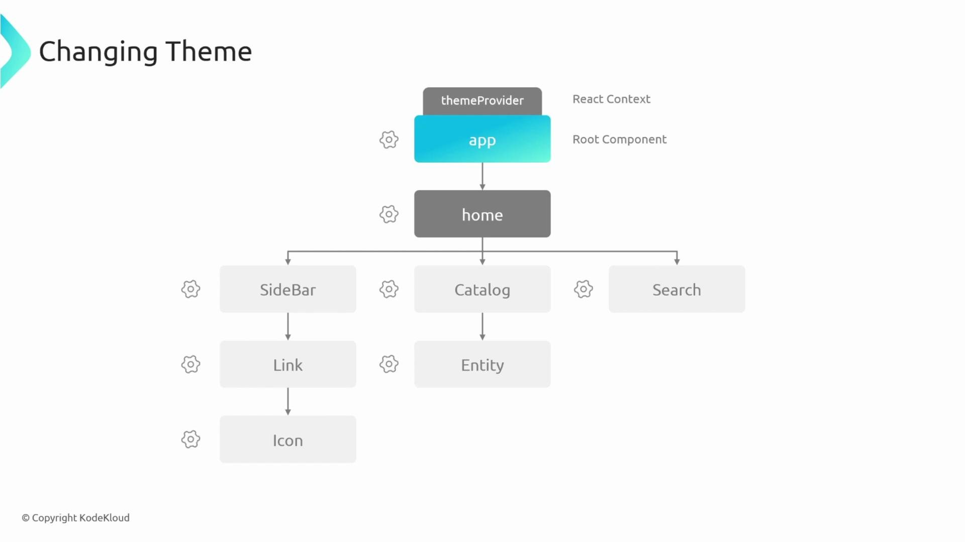
- Theme propagation relies on React context and a ThemeProvider (see MUI docs).
- Backstage Storybook is a useful companion to preview changes and discover components: https://backstage.io/storybook
When overriding fonts or colors, double-check accessibility (contrast ratios) and cross-browser rendering. Large global font overrides can affect layout and third-party components.
Use ThemeProvider (React context) to share your theme across all components. When working with theming, look for keywords like
Material UI, ThemeProvider, and React context.- Backstage Storybook: https://backstage.io/storybook
- Material UI theming docs: https://mui.com/material-ui/customization/theming/
- Backstage theming utilities: check
@backstage/themein your project or Backstage docs for the version-specific helpers