

Theme configuration objects and helpers live in the
@backstage/theme package. For the Prep Course - Certified Backstage Associate (CBA), remember @backstage/theme as the package that contains the theming helpers.What you’ll do (high level)
Where to put the theme file
In a standard Backstage monorepo, theme files belong in the frontend app package. A typical location:packages/app/src/theme/myTheme.ts
Create packages/app/src/theme/myTheme.ts
This file defines and exports theme objects using the Backstage theme helpers. Use createBaseThemeOptions to obtain a compatible base and createUnifiedTheme to produce a theme object consumable by UnifiedThemeProvider.
Example myTheme.ts:
palettes.lightprovides a solid base palette; you can override specific colors likeprimaryandsecondary.navigationcontains Backstage-specific navigation colors and hover states.- You can add typography, spacing, and other overrides as needed.
Register the theme with your application
Open the app entry wherecreateApp is called (commonly packages/app/src/App.tsx) and add theme entries to the themes array. Each theme entry needs:
id— unique identifiertitle— shown in theme pickervariant— e.g.,'light'or'dark'icon— a JSX icon to displayProvider— component that wraps the app withUnifiedThemeProviderand supplies the theme object
App.tsx changes:
- The
Providervalue replaces the default theme provider created by the app when the user chooses that theme. UnifiedThemeProvidermakes the theme object available via React context so all Backstage UI components can consume it.
How it works (APIs at a glance)
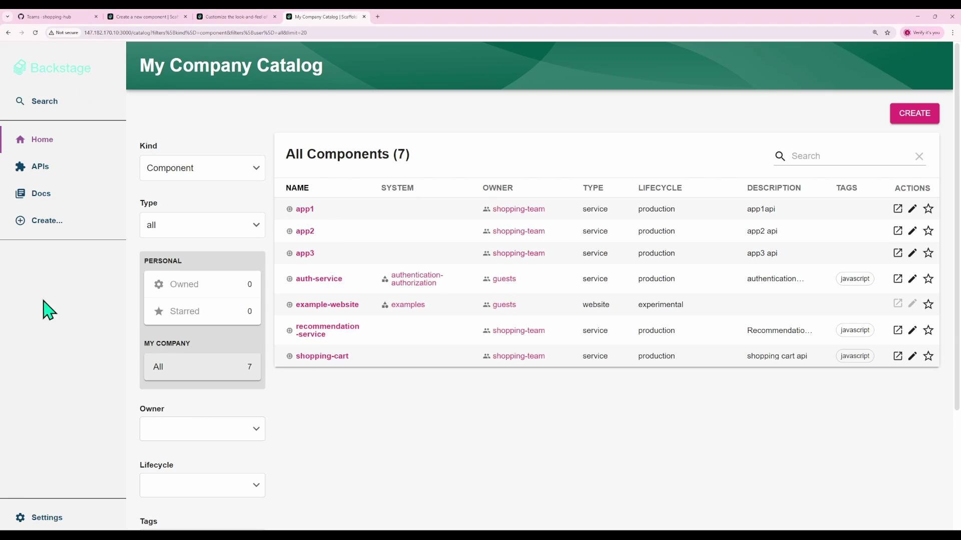
Quick visual
After switching to a theme likefunTheme, the UI reflects your palette and font choices across the catalog, navigation, and pages (primary/secondary colors, navigation highlights, and typography).
Additional tips
- Provide multiple theme variants (light/dark) and let users switch between them in the UI.
- You can tweak many theme properties: typography, spacing, shadows, and fine-grained color values for specific Backstage components.
- During development, the Backstage dev server typically picks up frontend changes without restarting — but sometimes a rebuild or refresh may be required.
- For more details on theming primitives, see the
@backstage/themepackage documentation and the Backstage frontend docs:- https://backstage.io/docs
- https://github.com/backstage/backstage/tree/master/plugins/theme (repository examples)
Summary: create your theme file under the frontend app, export theme objects using
createBaseThemeOptions + createUnifiedTheme, and register them in createApp(...) with a Provider that wraps children with UnifiedThemeProvider.