

- Reload the stored fruit vectors from LanceDB,
- Visualize vectors in 3D and 2D (Red vs Yellow) color-space,
- Run three similarity/distance searches (Cosine similarity, Euclidean distance, Dot product),
- Compare rankings and visualize metric differences.
If you’re following along in a fresh notebook, run each code block sequentially so variables (like
fruit_vectors and mango_query) are available for plotting and metric computation.1) Reload LanceDB and fruit vectors
Run this in a fresh notebook cell to ensure data is present:2) Visualize the vectors (3D and 2D projection)
Plot the fruit vectors in 3D color-space plus a 2D top-down projection (Red vs Yellow). This helps reason about which fruits should be nearest the mango query by color.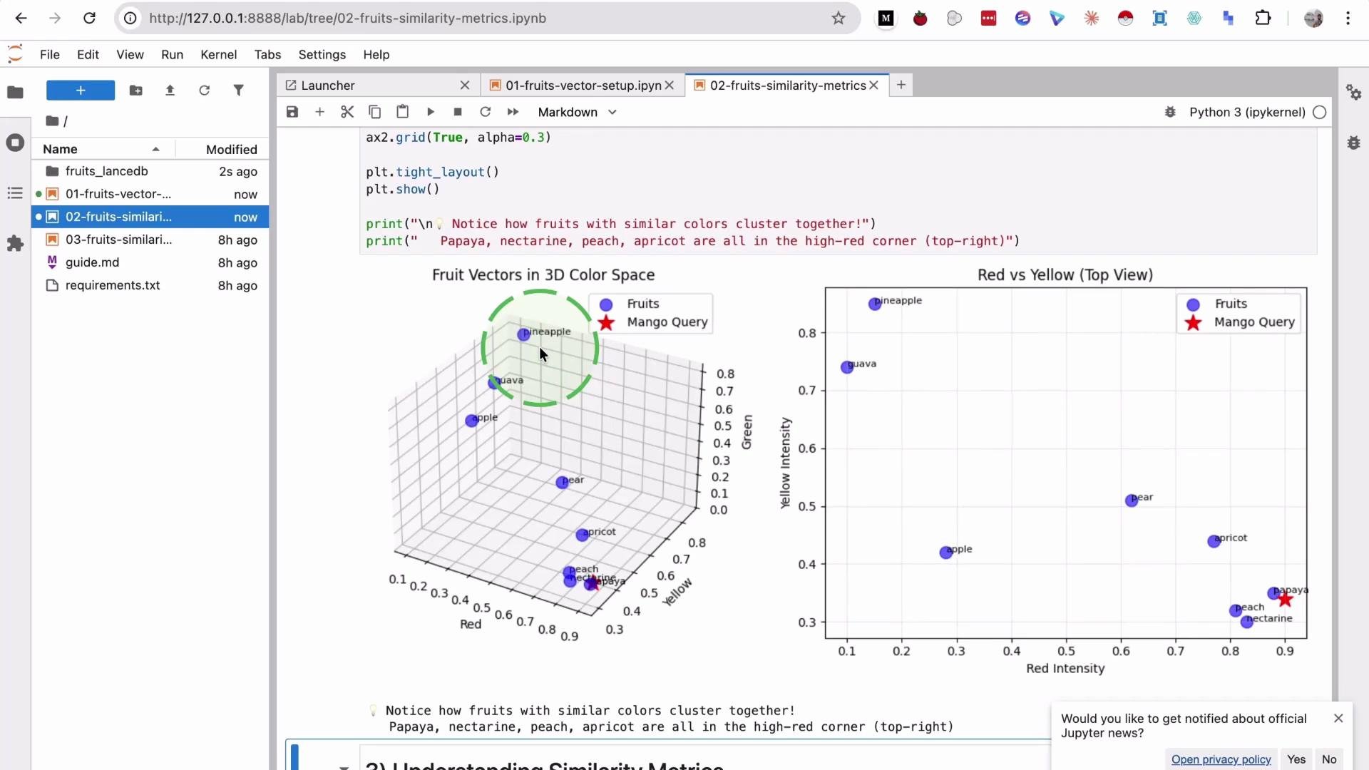
3) Define and compute three similarity/distance metrics
We will compare three commonly used metrics:
Compute each metric and produce sorted rankings:
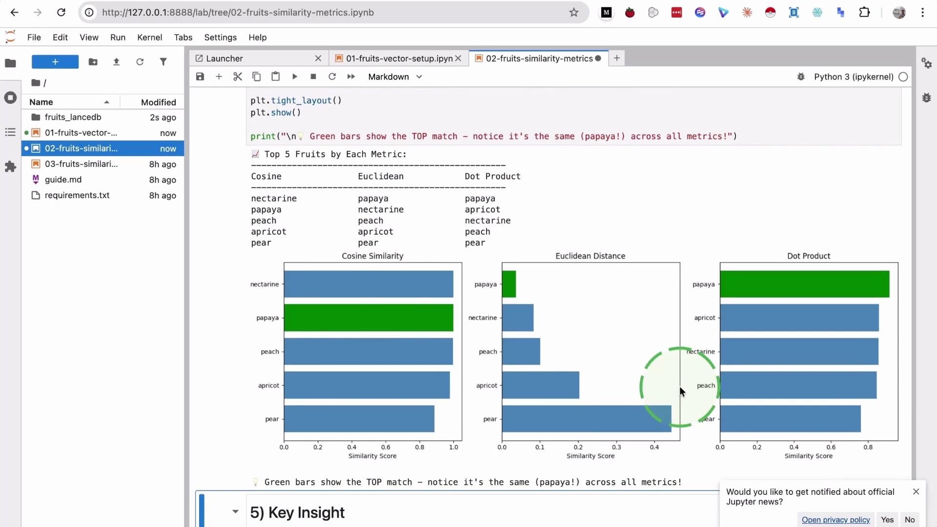
- Cosine top 3: papaya, peach, pear
- Euclidean top 3: papaya, peach, pear
- Dot product top 3: pear, pineapple, peach
4) Visualize metric scores
A bar chart or grouped bar plot makes it easier to compare scores across metrics and highlight how one metric (e.g., dot product) can favor high-magnitude vectors likepear.
Summary and next steps
Similarity search powers recommendation engines and RAG (retrieval-augmented generation). In recommendations it matches queries to products and user embeddings (purchase history); in RAG it retrieves documents that ground generation, making ranking quality critical to final output quality.
- In recommendation systems, a short query like
shoecombined with a user embedding quickly improves relevance (sports vs formal vs ski). - In RAG, better similarity ranking yields more useful supporting documents and better generated answers.
- LanceDB: https://github.com/lancedb/lance
- Sentence-Transformers (for real-world text embeddings): https://www.sbert.net/