

Dashboards
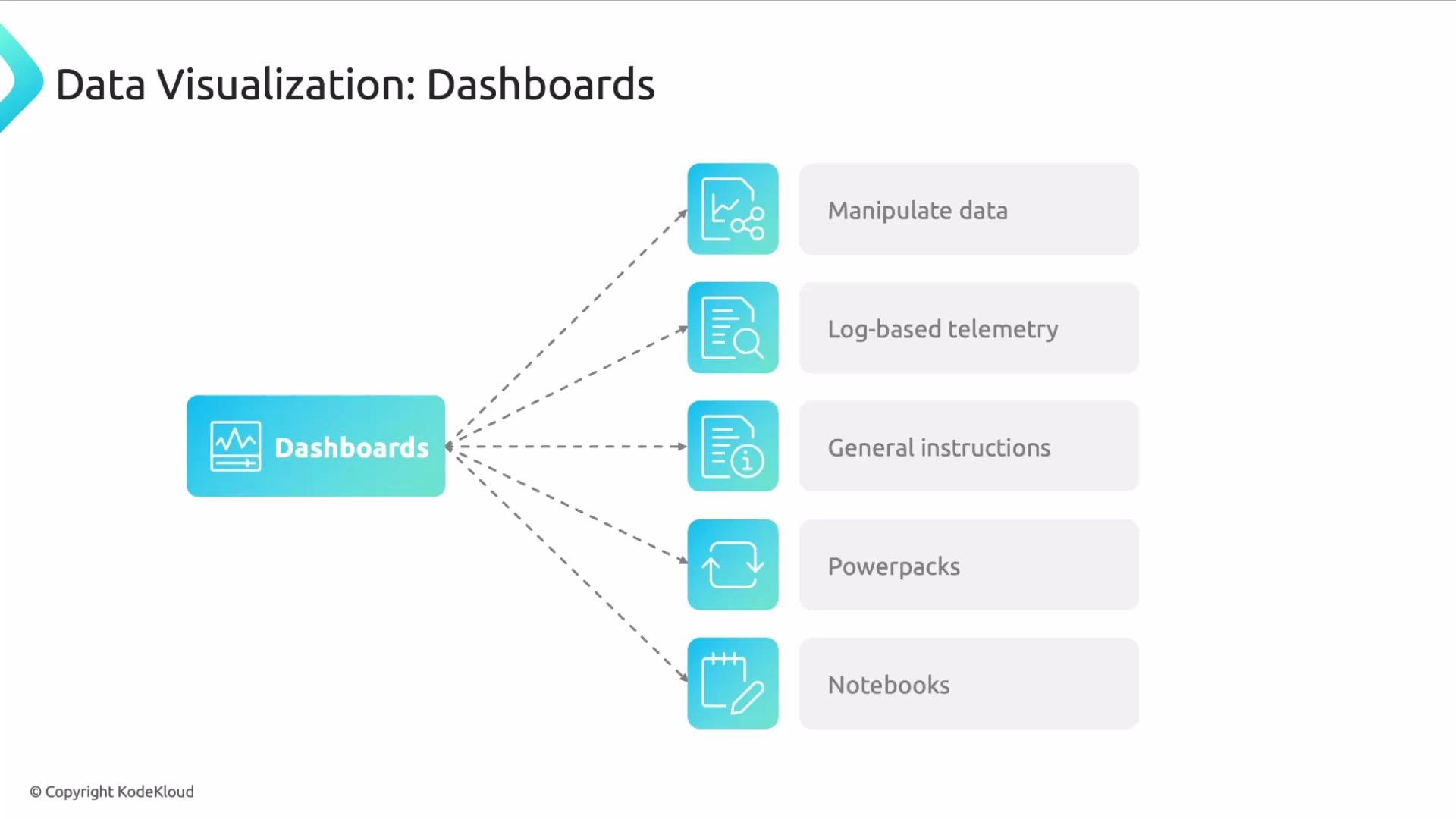
Dashboards are the central surface for presenting everything you need to know about your environment. They can visualize metrics, logs, traces, and profiles, often without requiring you to manipulate raw payloads directly. Use dashboards to:- Transform data with functions and mathematical expressions.
- Aggregate and filter to present focused, role-specific views.
- Create log-based metrics and panels derived from log queries.
- Embed explanatory text, diagrams, and links for onboarding and runbooks.
Live Tail or the Logs Explorer before embedding them in dashboard panels so widgets render reliably. For onboarding and cross-team clarity, add panel descriptions, links to runbooks, and diagrams to reduce ramp-up time.
Datadog Powerpacks let you create templated collections of dashboards and panels that can be shared across teams. A Powerpack is a customizable template: after importing, users only supply environment-specific variables to populate panels and queries.
Notebooks complement dashboards by offering a narrative-friendly, formatted editor that mixes text, images, and live query cells. Notebooks are ideal for postmortems, runbooks, architecture notes, and design documents so operational knowledge remains discoverable during incidents and after-action reviews.
Alerts
Alerts notify you when conditions change and are the primary mechanism for driving action. Datadog supports:- State-change alerts (thresholds, multi-condition).
- Anomaly detection and forecasting (ML-powered).
- Watchdog: automated ML-based monitoring that surfaces anomalous behavior without hand-crafted rules.
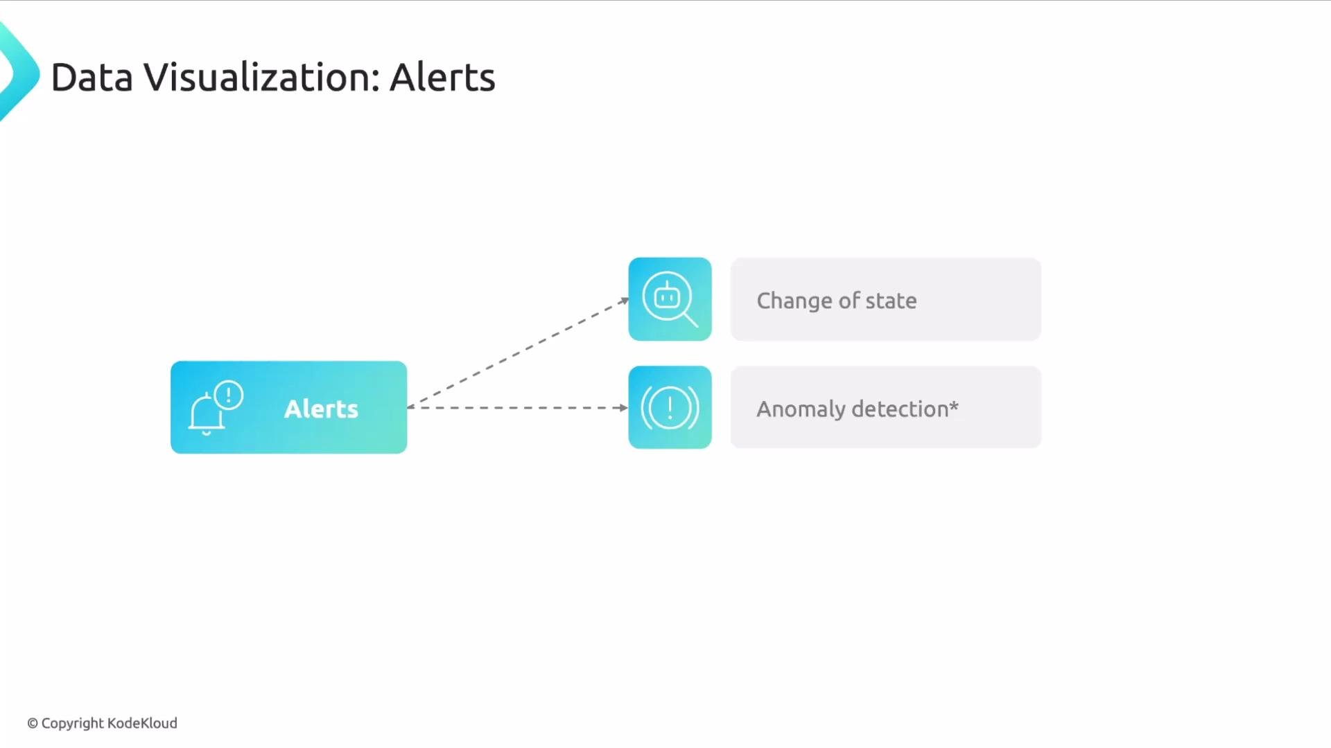
Use ML-powered anomaly detection (Watchdog) to catch unusual patterns you may not anticipate with static thresholds. Combine it with state-change alerts for clear, actionable notifications.
Logs
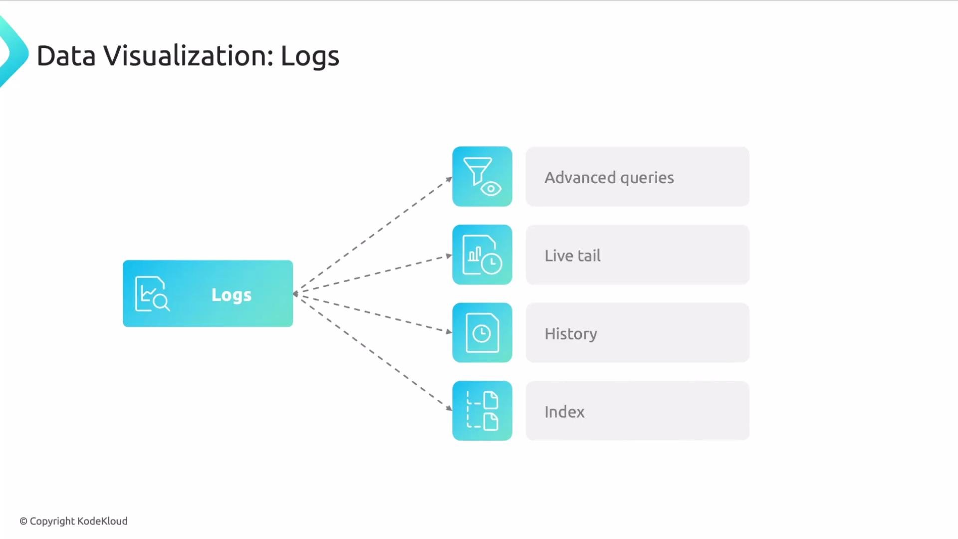
Logs hold rich operational context and can feed dashboards, metrics, and alerts. Datadog logging features let you:- Inspect live traffic with
Live Tail. - Search by fields, phrases, or numeric values in the Logs Explorer.
- Group and aggregate logs by common fields (for example:
endpoint,status_code,service). - Segregate logs into indexes to improve query performance, enforce retention, and manage access control.
Best Practices and Engineering Considerations
- Prefer precomputed or
log-based metricsfor frequently used time-series panels to reduce dashboard latency and cost. - Describe panels: include intent, expected behavior, and links to runbooks or Notebooks so newcomers can act quickly.
- Guard against alert fatigue: tune thresholds, use multi-condition alerts, and periodically review alert value and signal-to-noise ratio.
- Investigate noisy signals at their root cause instead of adding superficial filters. Persistent noise often indicates engineering or design issues.
- Make every panel purposeful: dashboards should deliver visibility and actionable context, not just visual appeal.
Querying your entire log dataset directly from dashboard panels can lead to higher latencies and unexpected cost spikes. Prefer precomputed log-based metrics or indexed queries for high-traffic dashboards.
Links and References
- Datadog Dashboards: https://docs.datadoghq.com/dashboards/
- Datadog Logs: https://docs.datadoghq.com/logs/
- Datadog Notebooks: https://docs.datadoghq.com/notebooks/
- Datadog Watchdog & Anomaly Detection: https://docs.datadoghq.com/monitors/monitor_types/watchdog/