

Metrics overview
From the left panel, click Metrics to open the Metrics overview. The top section provides a platform-level snapshot of metric sources, the configurable processing pipeline, and an overview of ingested metrics (agents, integrations, API).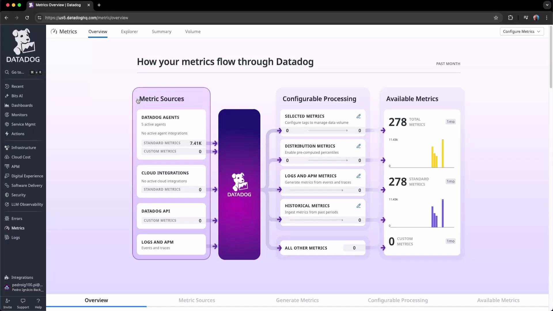
Standard vs custom metrics
Standard metrics are typically collected by Datadog agents or integrations and usually do not incur additional per-metric costs. Custom metrics (user-created or high-cardinality metrics) can increase billing, so controlling which tags and metrics you emit is important for cost management and platform health.Pay attention to tag cardinality: reducing unnecessary high-cardinality tags (for example, unique container IDs) helps control custom metric growth and platform costs.
Metrics by source
Scroll down to see a breakdown of metrics by source: Kubernetes, APM, profiling, CSM, and others. This view helps you identify where your metrics originate and prioritize optimizations (for example, convert high-cardinality custom metrics to aggregated forms).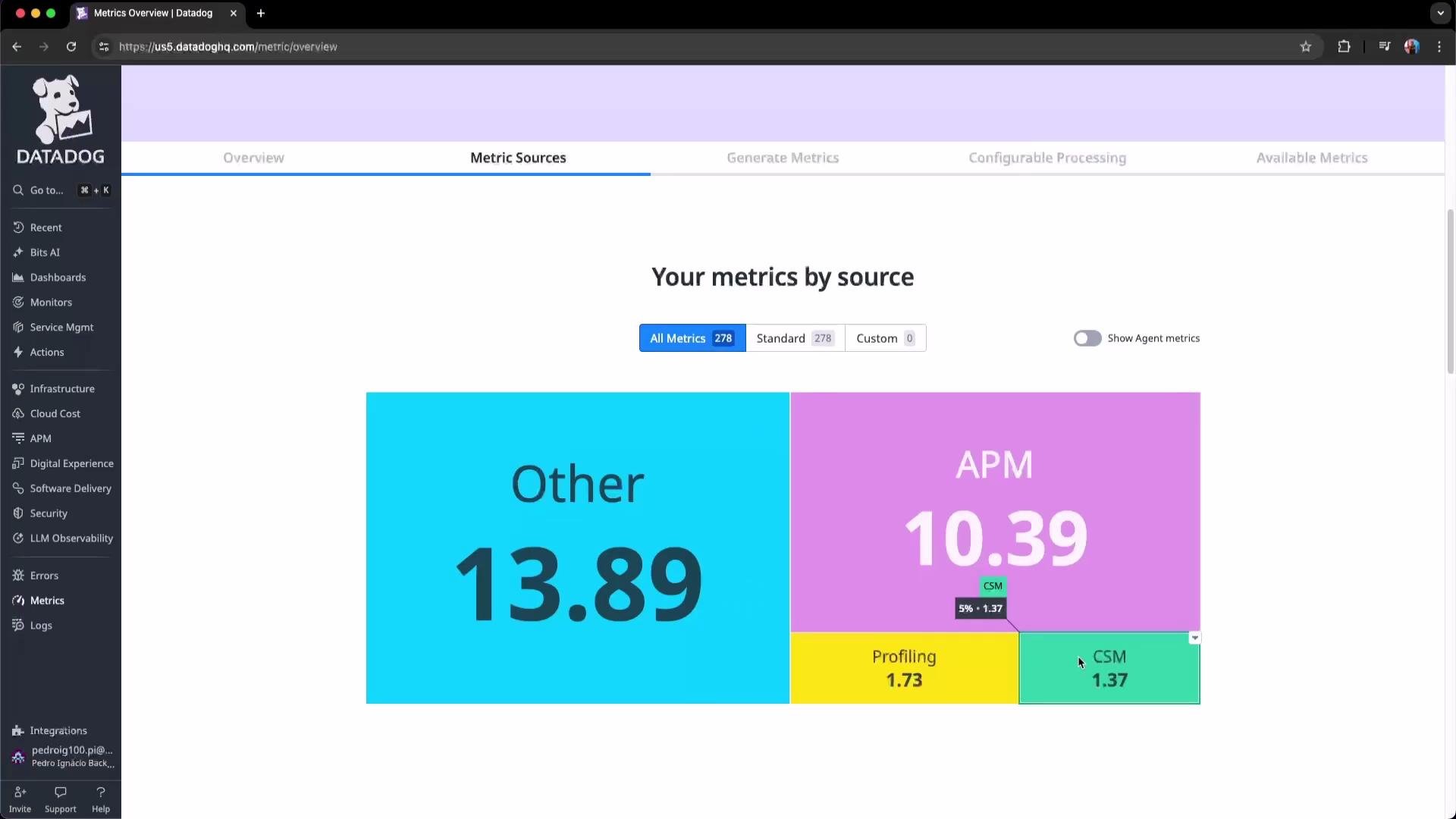
Metric tagging and cost management
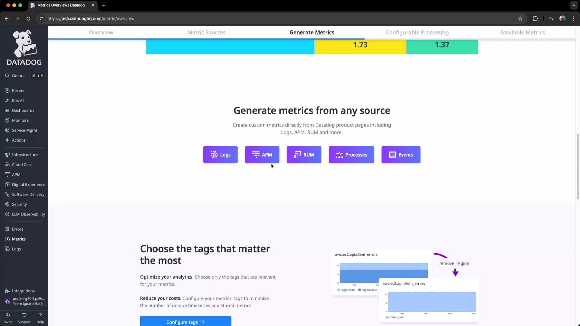
Datadog alerts you to tag growth because many metrics are created with default tags. Excessive tag cardinality increases ingestion and indexing volume. Where appropriate, remove low-value tags (especially on custom metrics) and prefer higher-level aggregation tags likekube_namespace, kube_deployment, or service.
Before removing tags, verify Related Assets (dashboards, monitors, alerts) that depend on them — deleting tags can break visualizations and alerts that rely on those tag dimensions.
Metrics Summary
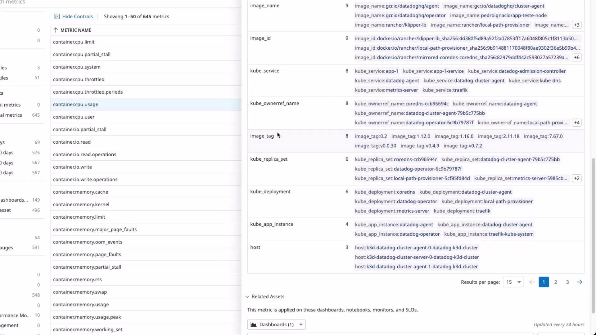
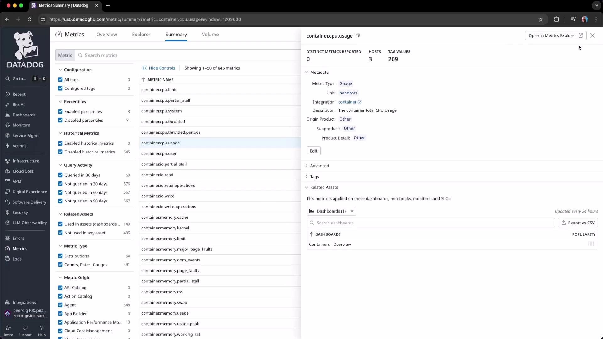
Click Summary in the left panel to list all metrics ingested within a chosen time window (this example uses the past two weeks). Selecting a metric reveals its type, unit, description, historical points, and associated tags.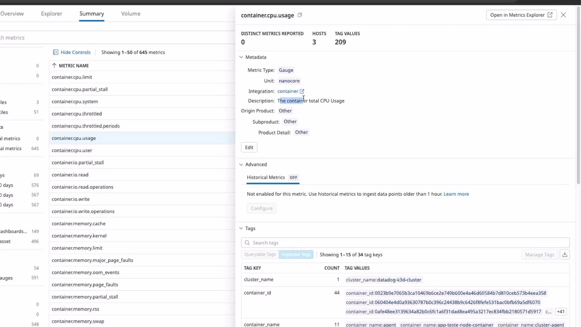
container.cpu.usage metric in this demo is a gauge measured in nanocores and labeled as container total CPU usage. The tags panel lists all tags attached to the metric — e.g., container_id indicates how many distinct container IDs reported during the selected interval (44 distinct IDs in this example). Clicking the tag count expands the list of values.
Metrics Explorer
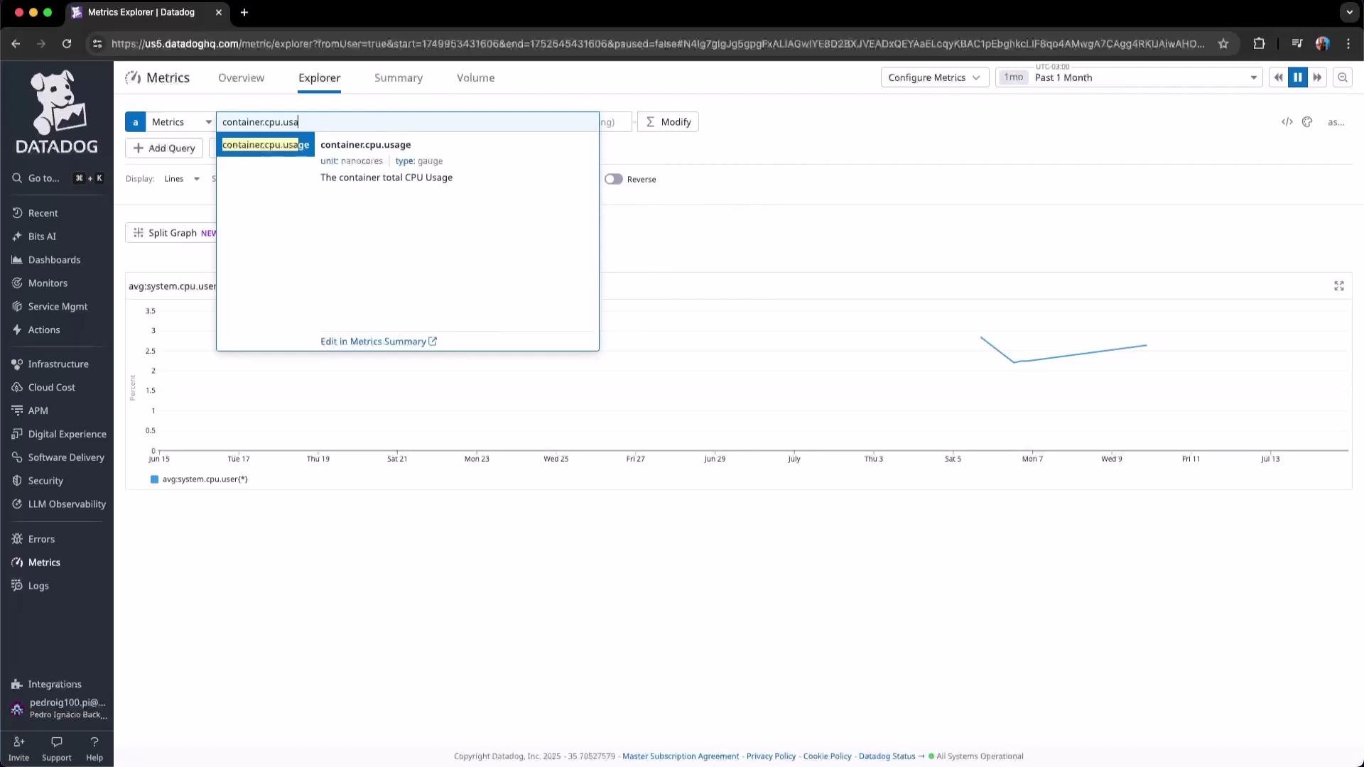
Open Explorer to build and preview metric queries interactively. Search for metrics likecontainer.cpu.usage, set the desired time range (e.g., past month), and experiment with functions and groupings to understand behavior over time.
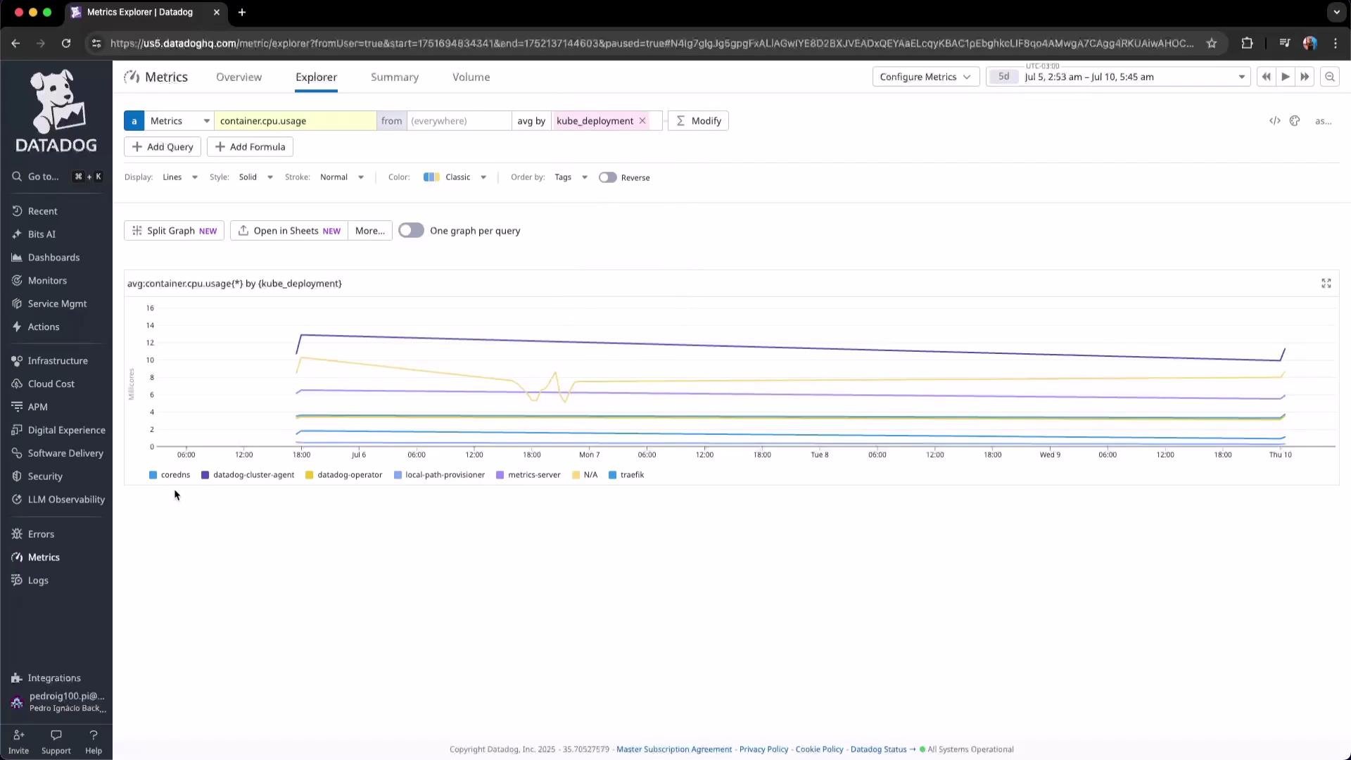
kube_deployment to compare CPU usage across deployments instead of individual containers. This produces cleaner, more actionable dashboards and reduces noise from high-cardinality dimensions.
Kubernetes metrics
Datadog collects standard Kubernetes metrics (pod counts, container restarts, node metrics, etc.). Use these metrics to evaluate cluster stability and resource utilization. Note that aggregation functions (avg, sum) change the displayed context — switching from average to sum reveals total counts across the cluster.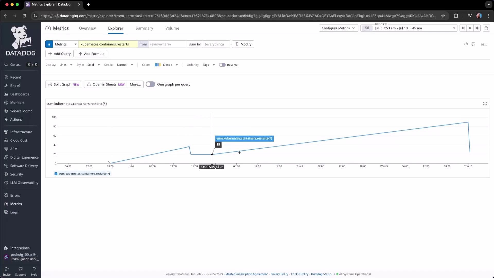
Volume and cost monitoring
Monitor metric volume with the Volume Overview to track estimated indexed and ingested custom metrics over time. This helps teams spot spikes in metric creation and make targeted changes to avoid unexpected billing.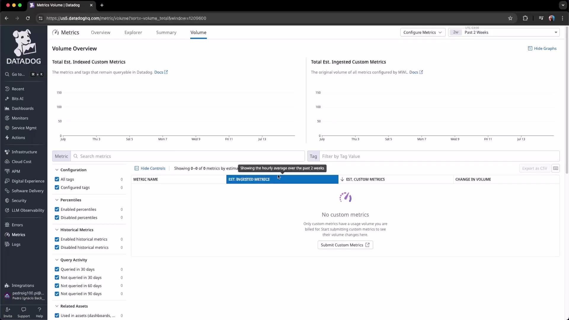
Logs
Open Logs Explorer, set a time range (for example, past 15 days), then review the timeline and log counts. Click a log to inspect raw content and the parsed fields available for filtering. Example log message from the timeline: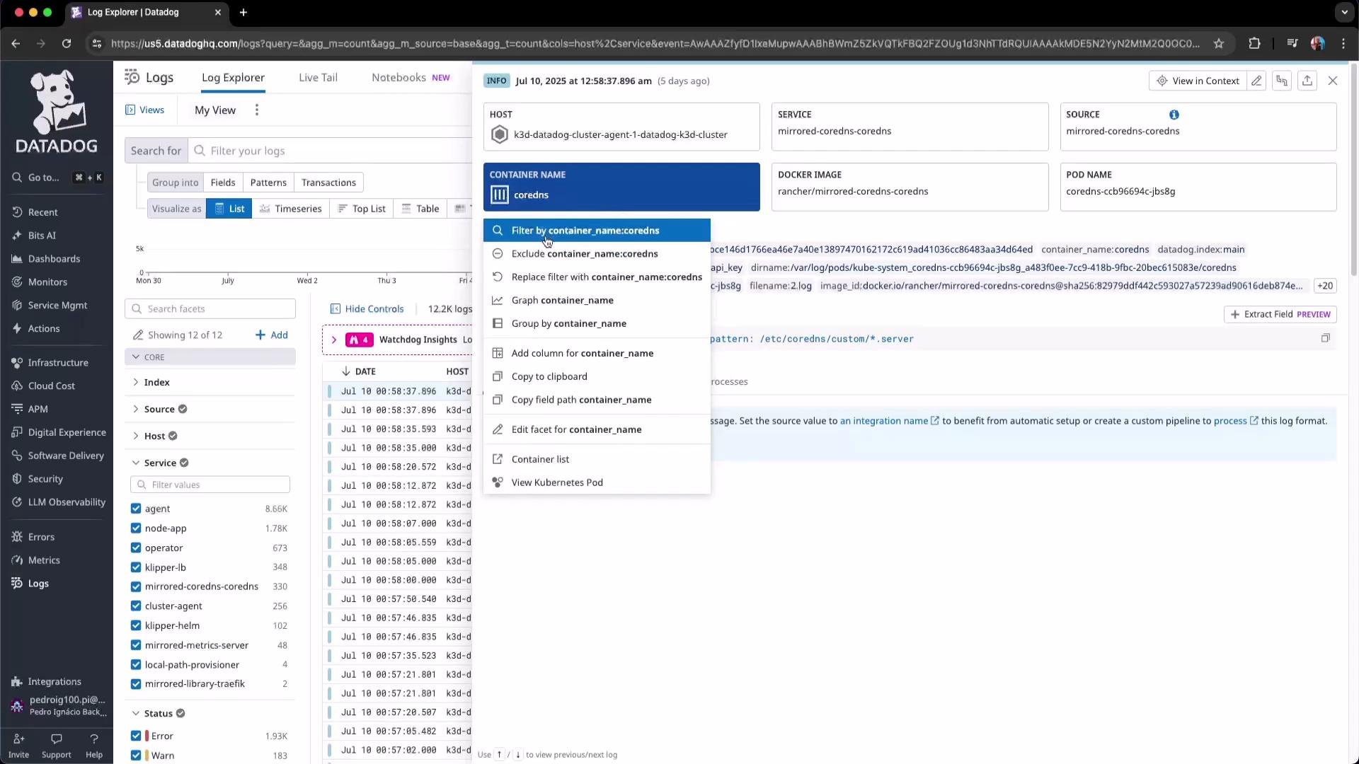
container_name, kube_deployment, kube_namespace, and cluster_name to filter and isolate issues. Datadog’s search supports natural-language and AI-assisted query generation to speed up filter creation.
APM (Application Performance Monitoring)
Under APM → Services (Software Catalog) Datadog lists instrumented services. Select a service to view traffic, error rates, latency, and suggested SLOs or monitoring actions. You can also link to source code and commits (for example, GitHub) to improve traceability between telemetry and code changes.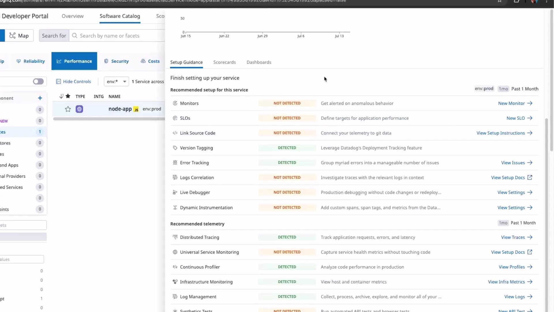
Trace Explorer and flame graphs
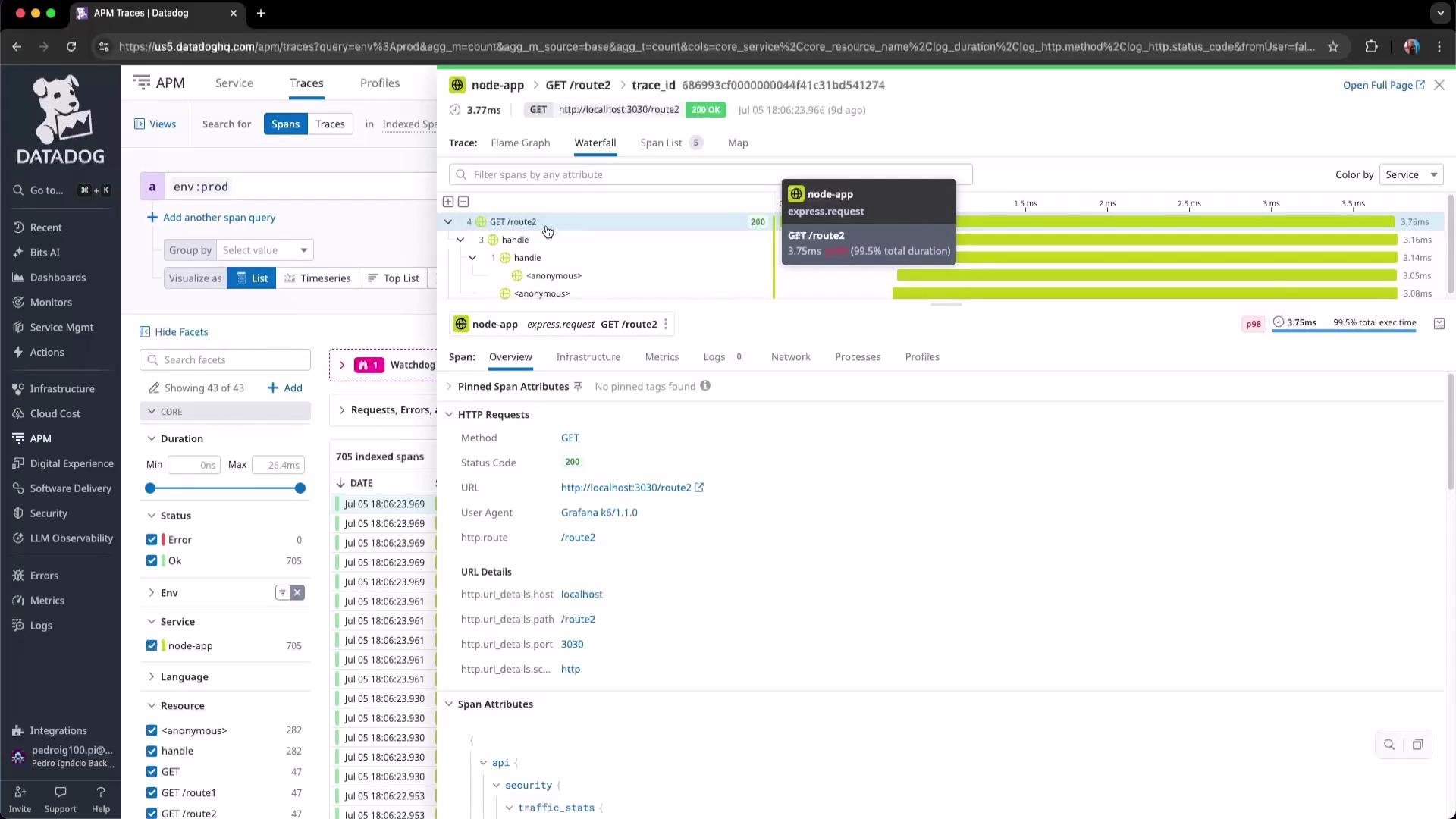
Use Trace Explorer to view traces across a selected window. Clicking a trace shows spans, a flame graph (time spent per operation), and a waterfall view for parent/child relationships and latency breakdown.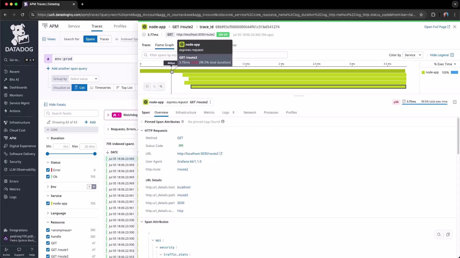
GET /route2 trace shows spans with duration, HTTP attributes, and additional metadata.
Dashboards and Infrastructure
Dashboards consolidate metrics, logs, traces, and synthetics to provide a unified observability view. The Infrastructure section includes explorers like Kubernetes Explorer for cluster-level troubleshooting and capacity planning.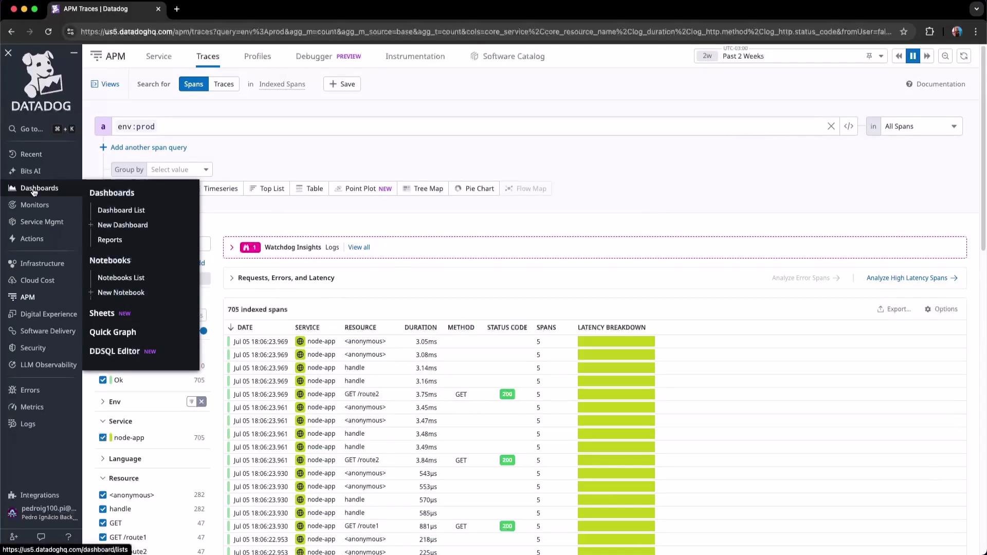
Kubernetes Explorer
Kubernetes Explorer delivers a consolidated view of workloads (Deployments, ReplicaSets, CronJobs), autoscaling status (HPA/VPA), CRDs, storage controllers (CSI), and networking policies. Use it to investigate pod health, HPA behavior, network issues, and resource utilization. If the cluster is offline, the explorer will display no data; when active it surfaces the telemetry you need for debugging and capacity decisions.Quick reference — Telemetry types and common tasks
Conclusion
What you learned in this lesson:- How to navigate the Metrics overview and the difference between standard and custom metrics.
- Inspecting metric details, tags, and related assets in Metrics Summary.
- Querying, grouping, and visualizing metrics in Metrics Explorer to reduce noise and improve dashboards.
- Monitoring metric volume with Volume Overview to manage costs.
- Using Logs Explorer to filter and troubleshoot application logs.
- Navigating APM traces, flame graphs, and Trace Explorer to locate latency sources.
- Leveraging Kubernetes Explorer for cluster-level visibility and capacity planning.
Links and references
- Datadog Metrics documentation: https://docs.datadoghq.com/metrics/
- Datadog Logs documentation: https://docs.datadoghq.com/logs/
- Datadog APM documentation: https://docs.datadoghq.com/tracing/
- Kubernetes Basics: https://kubernetes.io/docs/concepts/overview/what-is-kubernetes/