

- The expression browser — a lightweight web UI for running PromQL queries and viewing instant or range vectors as simple graphs or tables.
- Console templates — small custom web pages (HTML + Go templates) that embed pre-defined graphs and queries for status pages or operator dashboards.
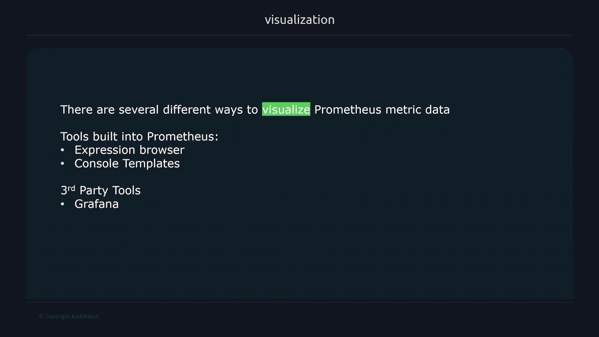
Use the expression browser for quick ad-hoc exploration and PromQL testing. Use console templates for small, static status pages. For collaborative, feature-rich dashboards and long-term visibility, choose a dedicated visualization tool like Grafana.
Built-in visualization options (quick reference)
-
Expression browser
- Use case: ad-hoc queries, quick PromQL experimentation, debugging.
- Output: instant or range vectors shown as simple line graphs or tables.
- Where: available on the Prometheus web UI (usually
http://<prometheus-host>:9090/graph).
-
Console templates
- Use case: small, static HTML status pages or internal operator dashboards.
- Output: custom HTML pages that include canned queries and graphs rendered from Prometheus data.
- Where: configured via Prometheus’
consolesandconsole_librariessettings.
When to use each option
-
Use the expression browser when you need to:
- Validate PromQL expressions rapidly.
- Inspect raw metric behavior over a short time window.
- Debug alerting rules and check series labels.
-
Use console templates when you want to:
- Publish a simple, static operational page with a few important graphs.
- Bundle queries and visualization for a specific service without deploying an external tool.
-
Use Grafana (or similar) when you need:
- Rich, reusable dashboards with templating and variables.
- Team collaboration, sharing, and role-based access.
- Long-term UX, alerting, and cross-data-source correlation.
Quick PromQL example
Try this simple query in the expression browser to see a rate over 5 minutes for an HTTP server:Comparison: built-in vs dedicated dashboards
Links and references
- Prometheus documentation — https://prometheus.io/docs/
- PromQL basics — https://prometheus.io/docs/prometheus/latest/querying/basics/
- Grafana official site — https://grafana.com/
- Grafana course (example) — https://learn.kodekloud.com/user/courses/grafana-assistant