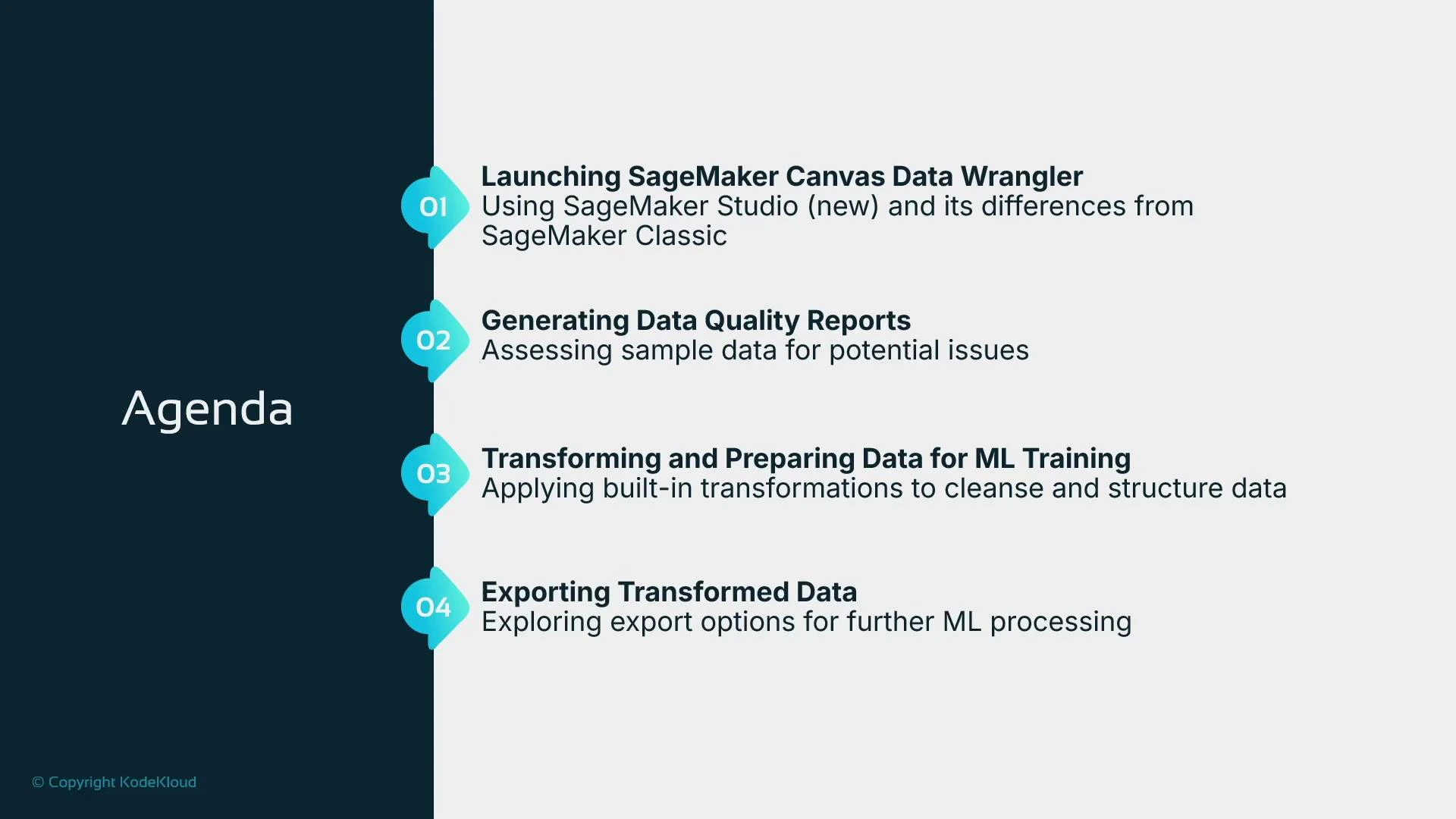
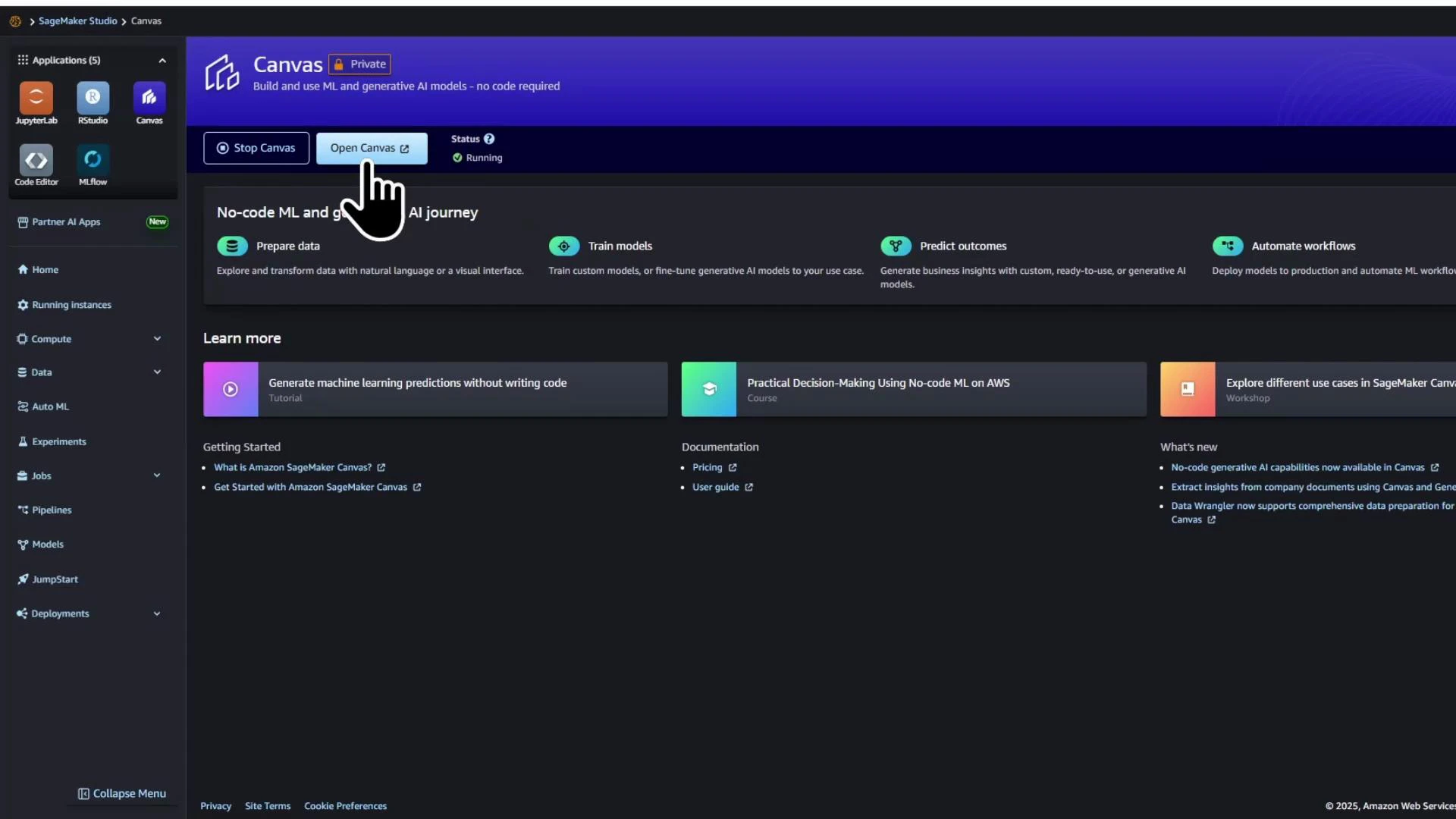
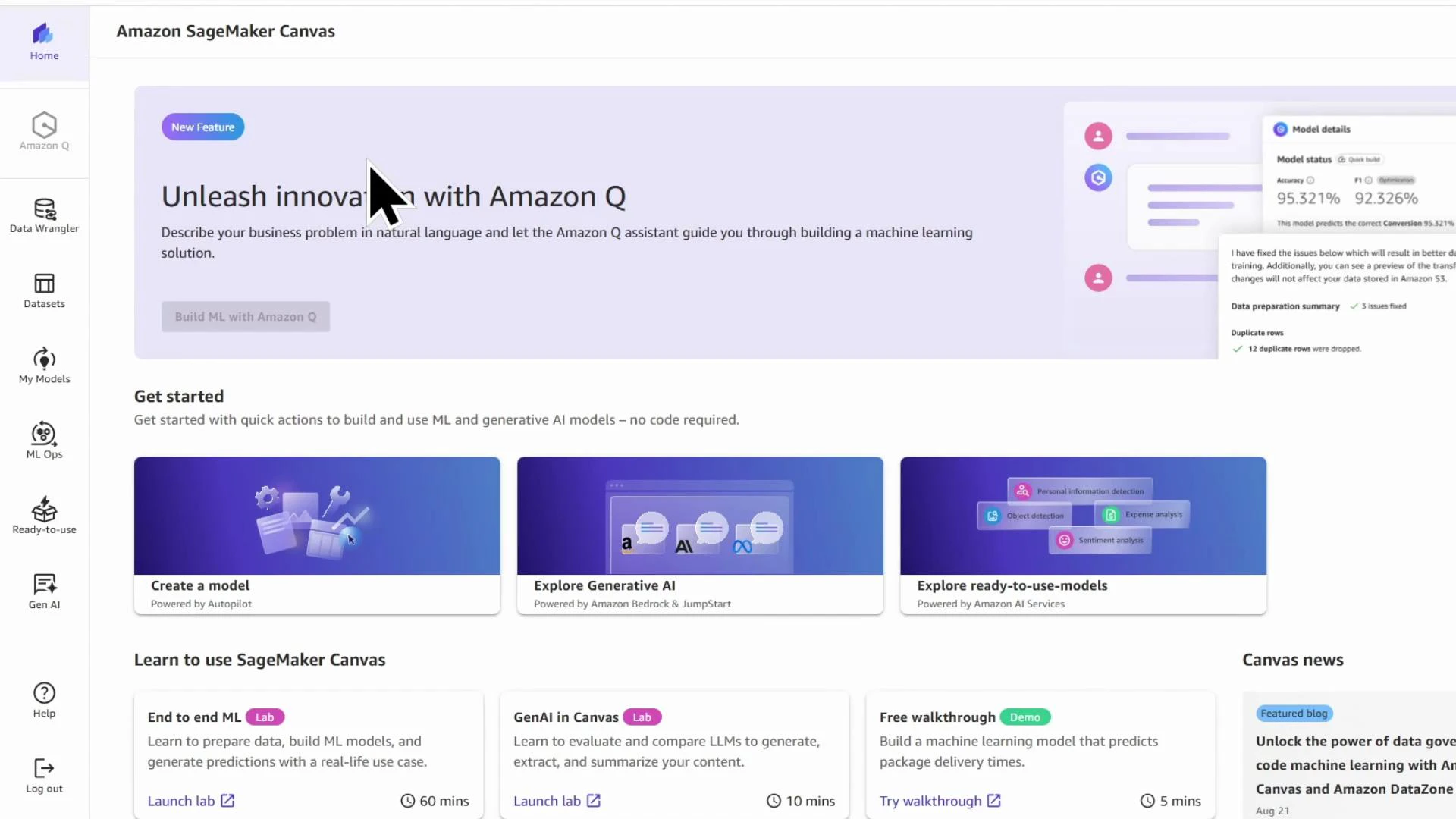
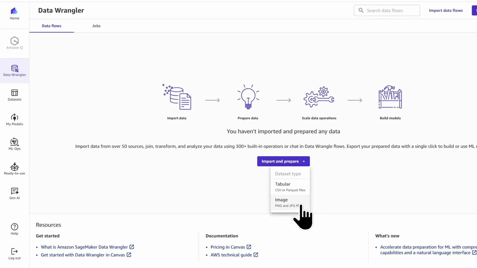
- Launching SageMaker Canvas and opening Data Wrangler
- Generating a Data Quality and Insights (DQI) report to guide preprocessing
- Applying common transforms (drop columns, impute missing values, scale numeric features, encode categorical variables)
- Exporting the cleaned dataset (for example, to Amazon S3)
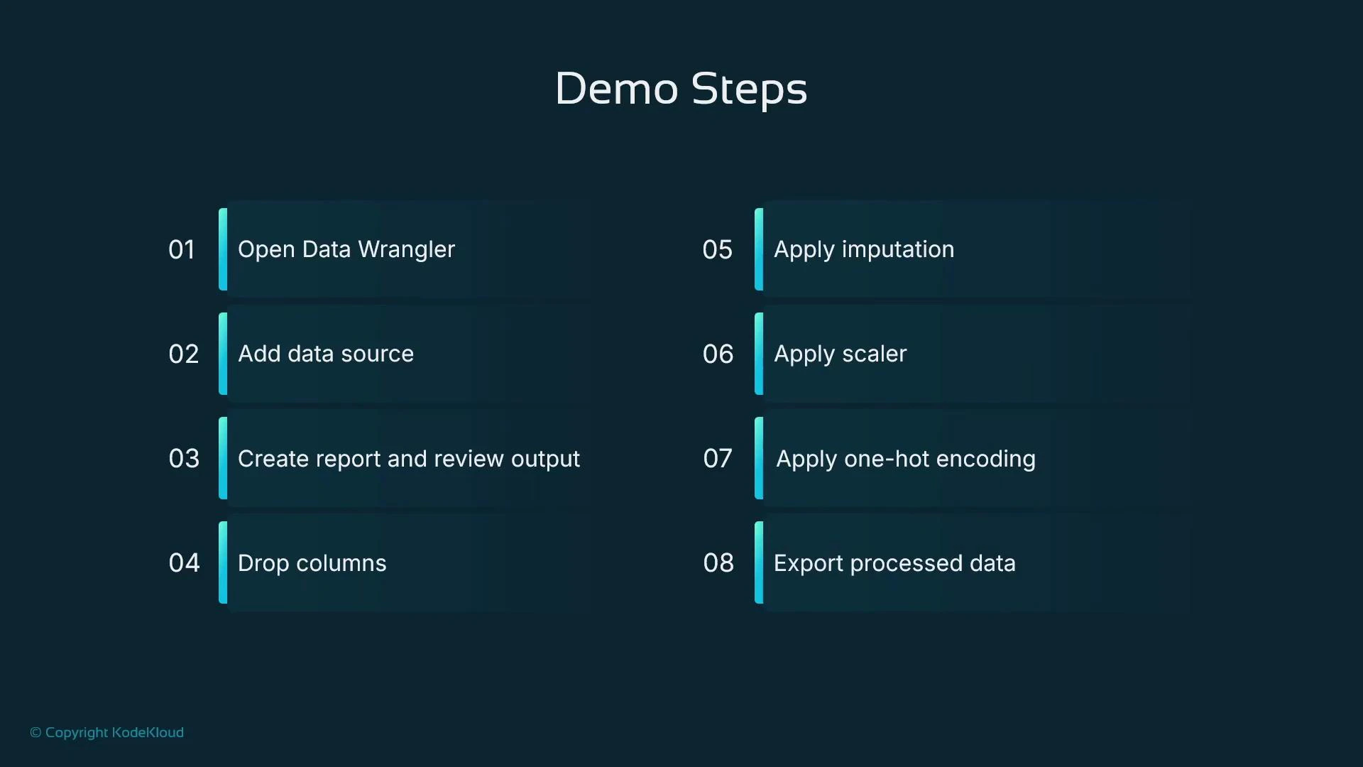
- Open Data Wrangler through SageMaker Canvas.
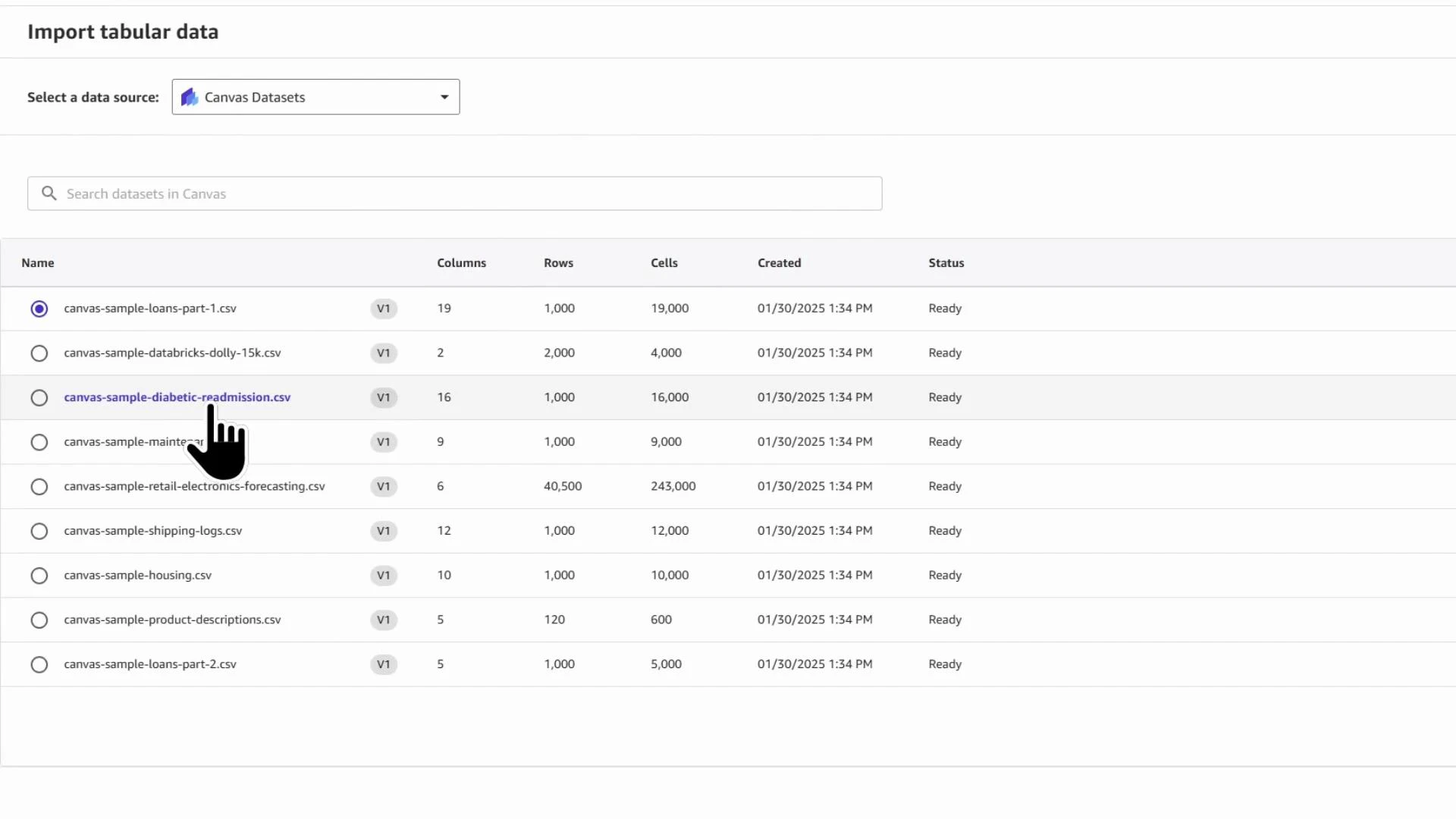
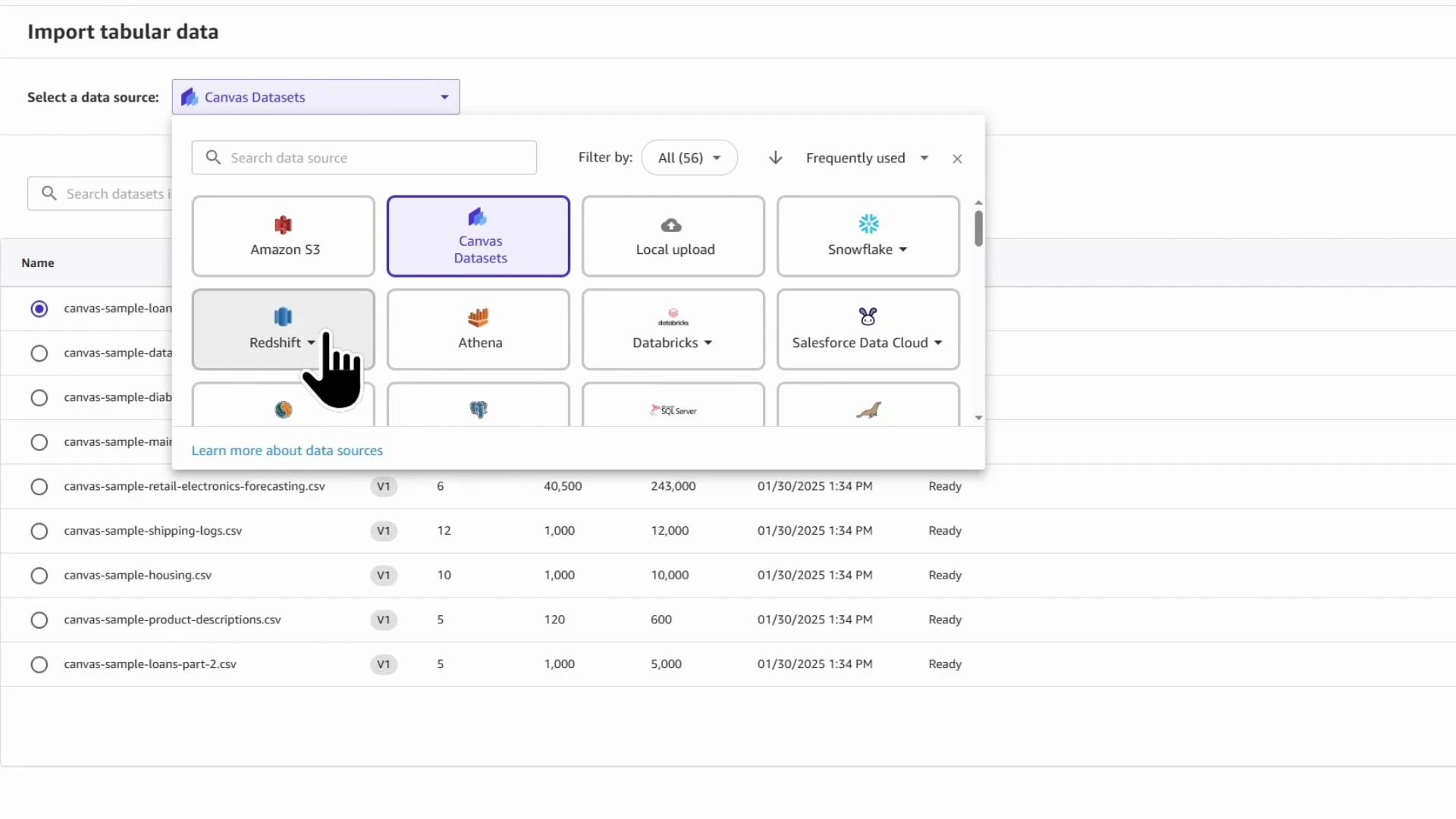
- Add a data source (we use a London housing prices CSV).
- Generate a DQI report to identify issues and recommended transforms.
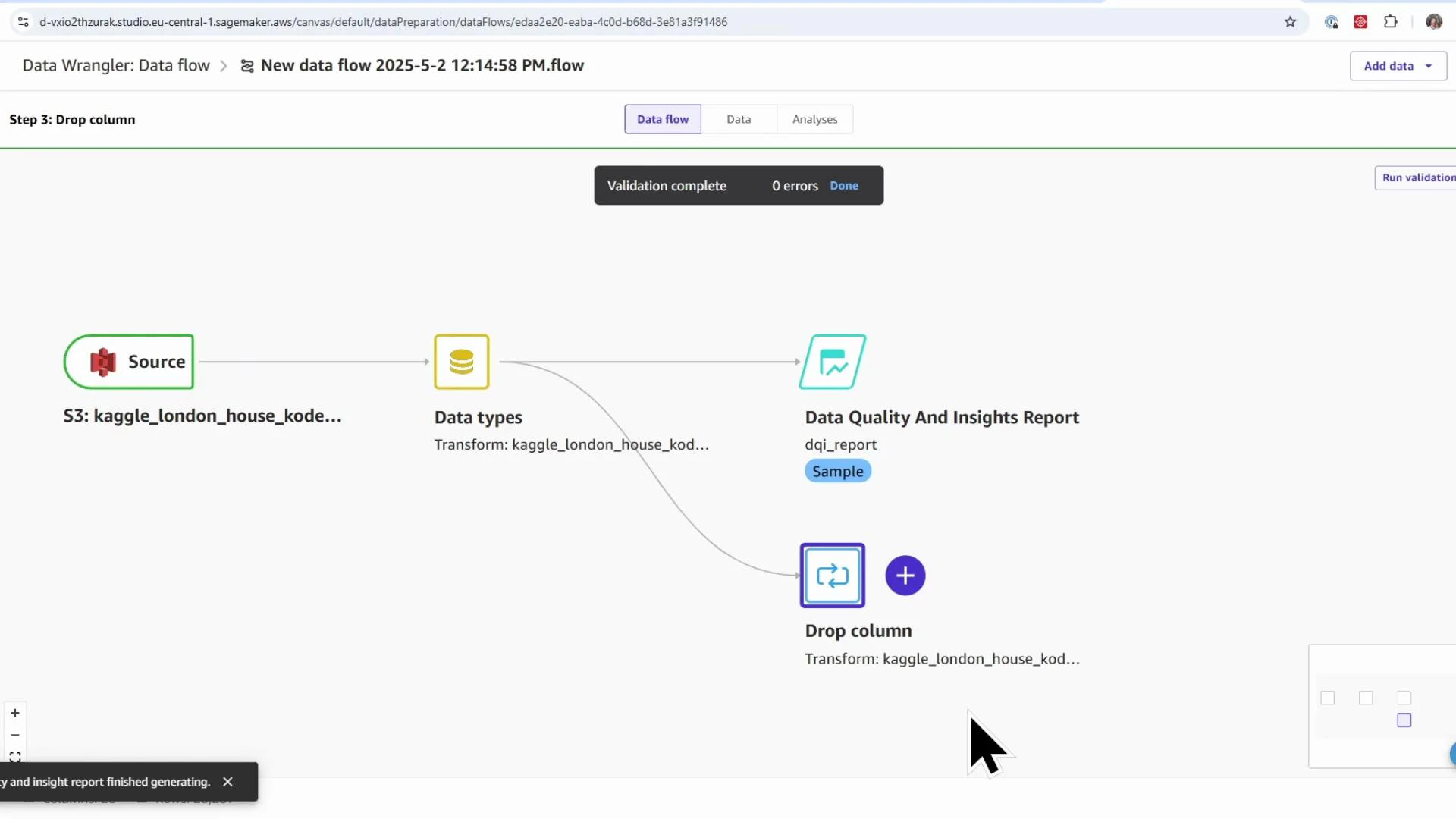
- Build a data flow to drop irrelevant or leaking columns, impute missing values, scale numeric features, and encode categorical features.
- Export the processed dataset (S3 or Canvas model builder).
SageMaker Canvas is billed while the managed instance is running (per minute). The instance cost is roughly $2 per hour (approximate). Stop the Canvas instance when not in use to avoid unintended charges.
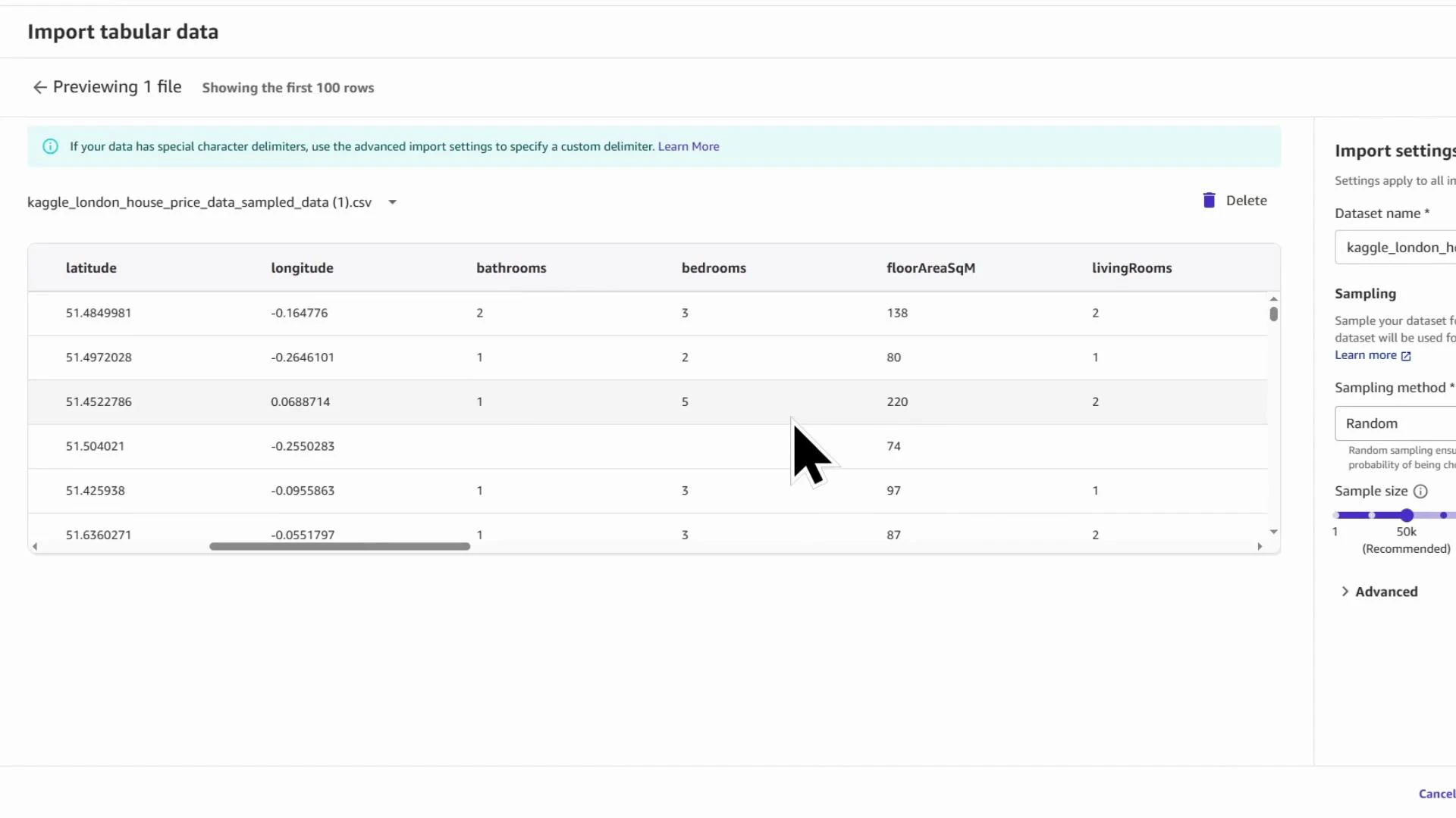
Kaggle_London_house_price_data_KodeKloud. For faster exploration you can import a random sample instead of the full file — this speeds DQI report generation and interactive debugging. In the demo we import a sample of 50,000 rows.
Importing a sampled subset is a practical way to iterate quickly. Use sampled data to test transforms and generate insights; then re-run transforms on the full dataset when you’re ready to export.
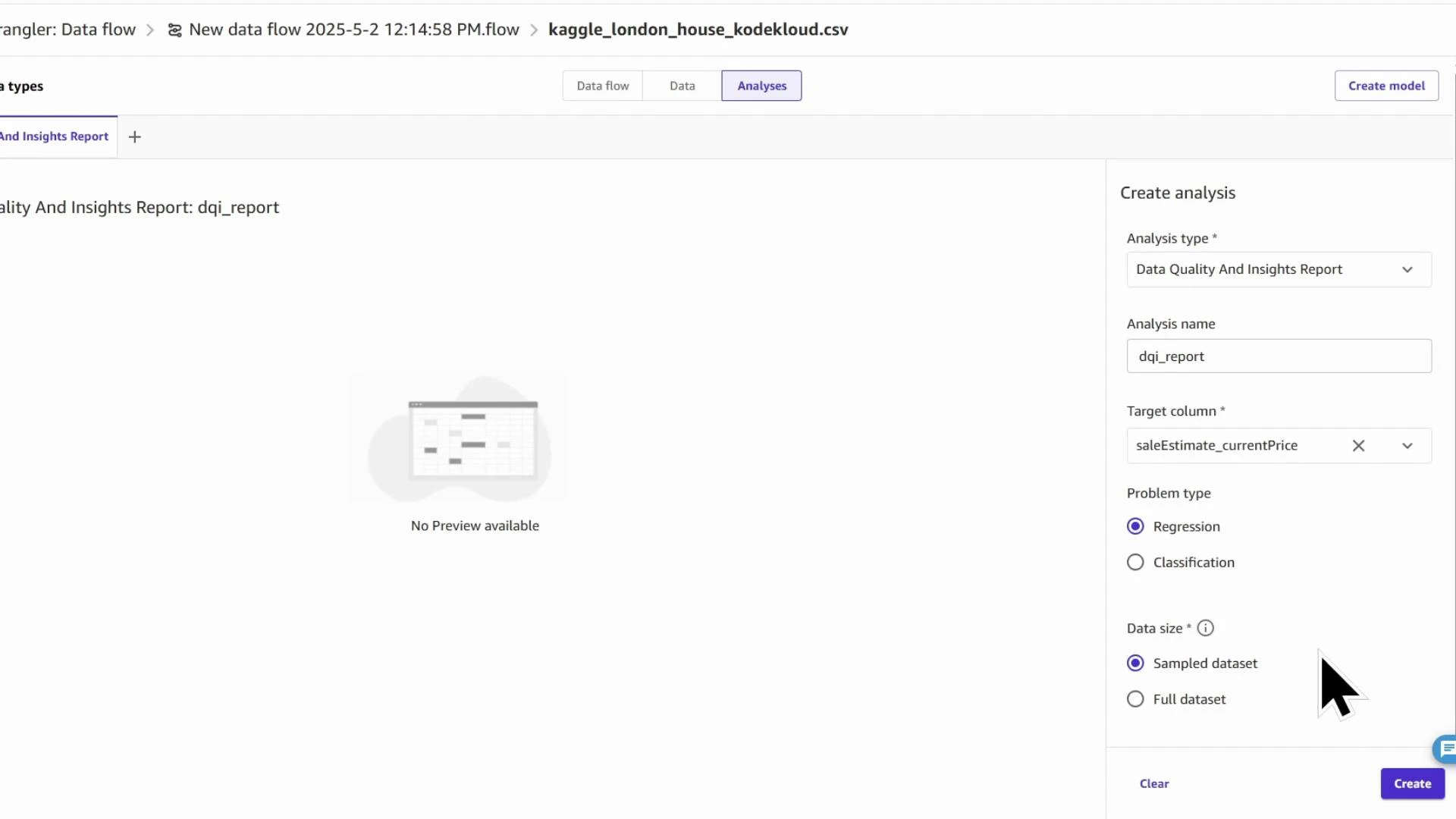
DQI_report). Choose the target column (saleEstimate_currentPrice) and the problem type (Regression). You can run the report against the sampled dataset for speed or the full dataset for completeness.
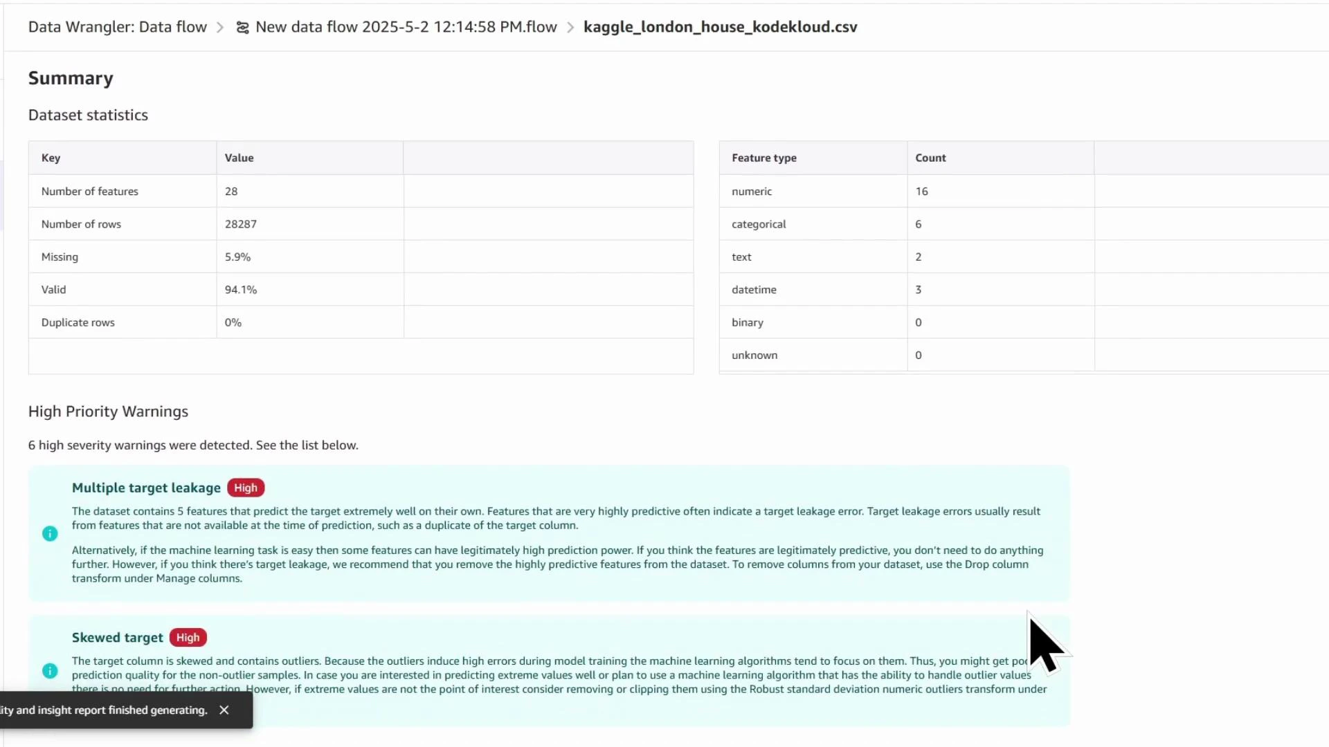
- Dataset-level statistics (row count, missing %, duplicates)
- Feature counts by type (numeric, categorical, datetime)
- Per-feature statistics (mean, median, min/max, skew)
- Missing value and outlier detection, anomaly scores
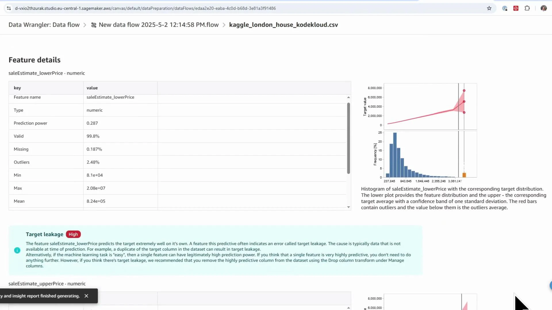
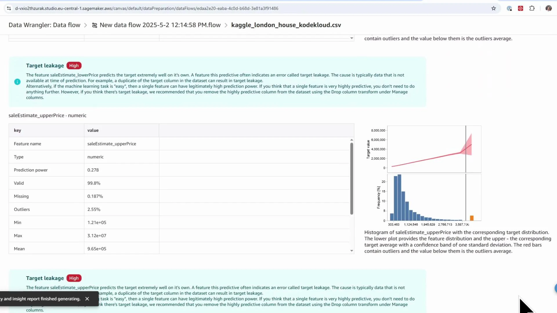
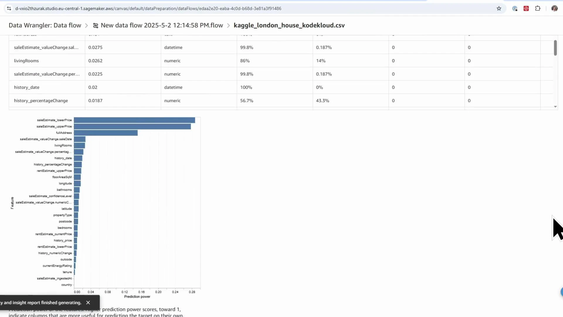
- Feature predictive power and target leakage warnings
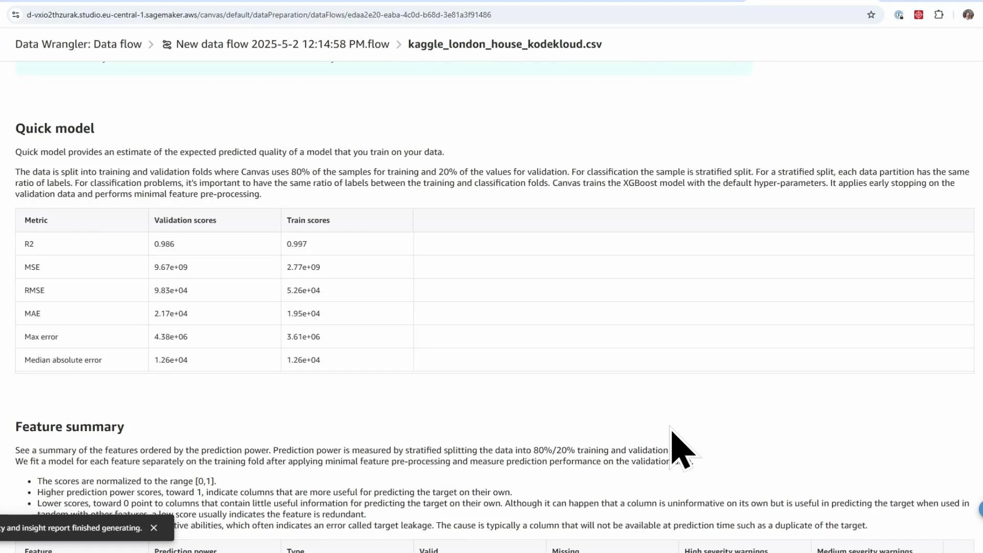
- Quick-model estimates (validation scores such as MSE, RMSE for baselining)
- Potential target leakage: columns that directly or indirectly reveal the target (e.g., saleEstimate_lowerPrice and saleEstimate_upperPrice). These must be removed.
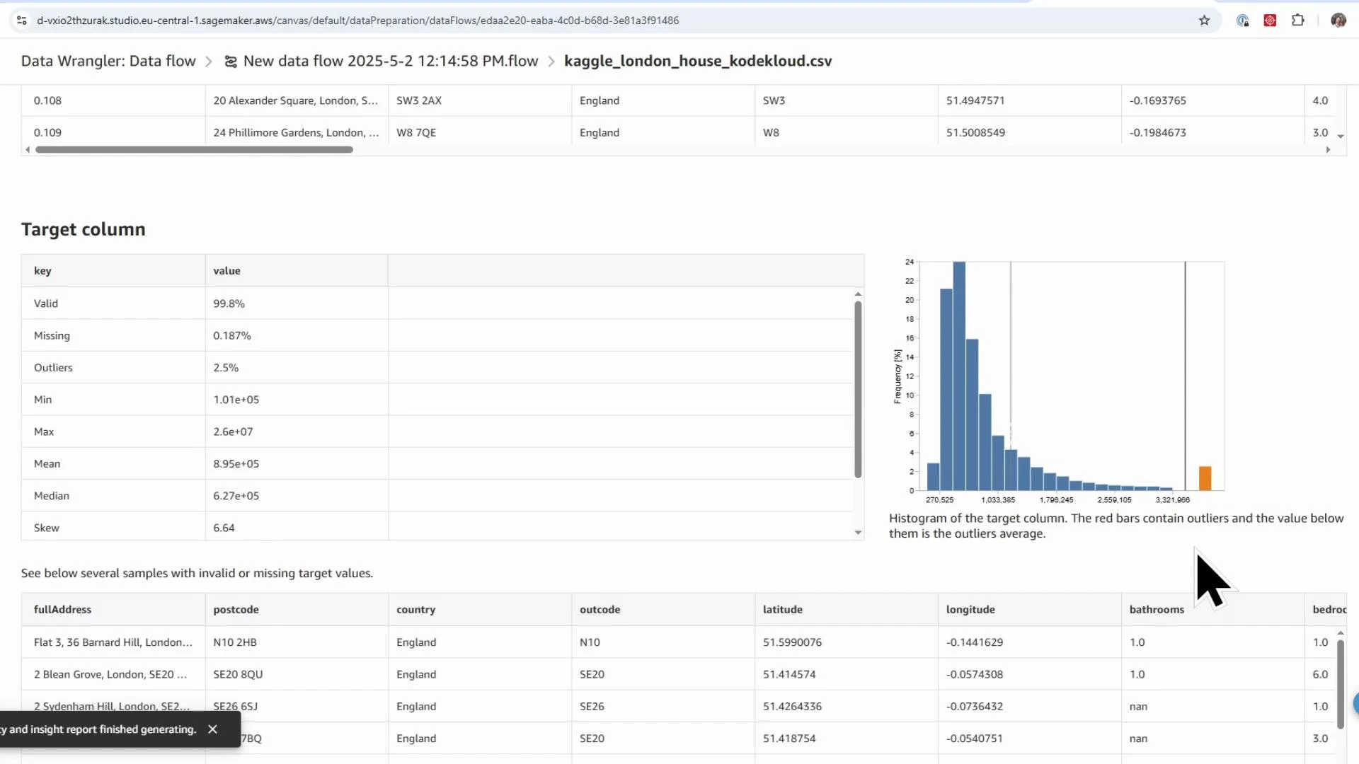
- Skew and outliers in the target distribution — consider log transforms or robust metrics.
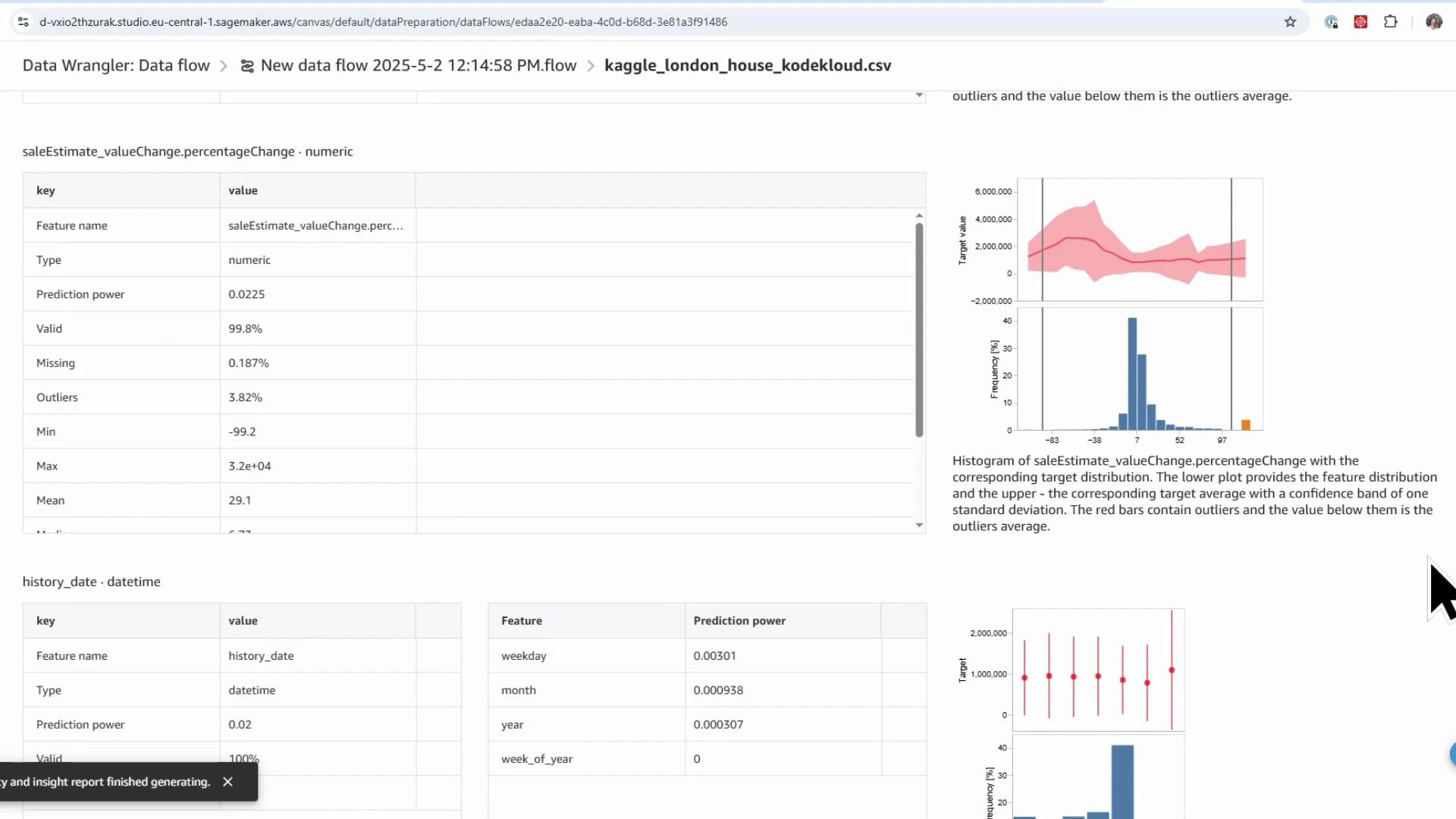
- Missingness in features such as
livingRooms(≈14% missing) indicating imputation is needed.
saleEstimate_lowerPrice, saleEstimate_upperPrice) before training.
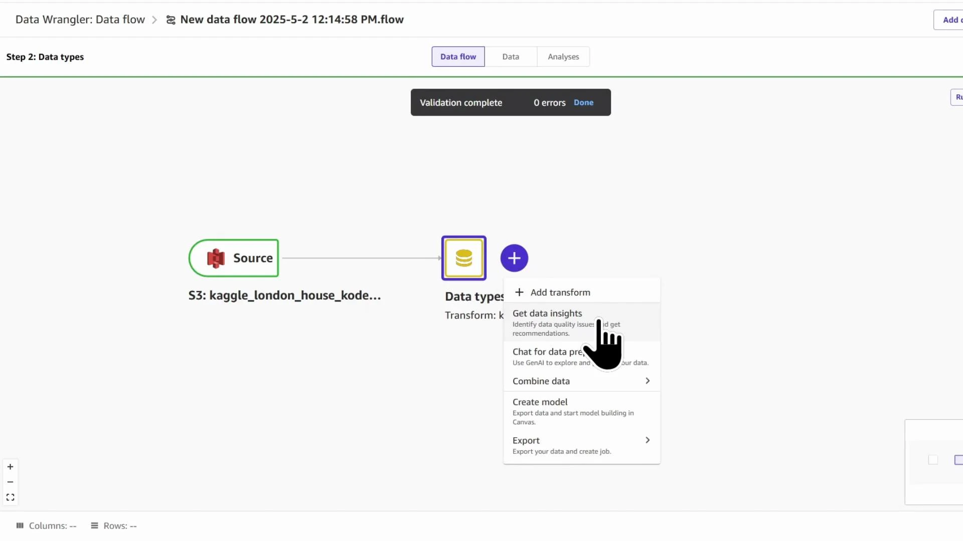
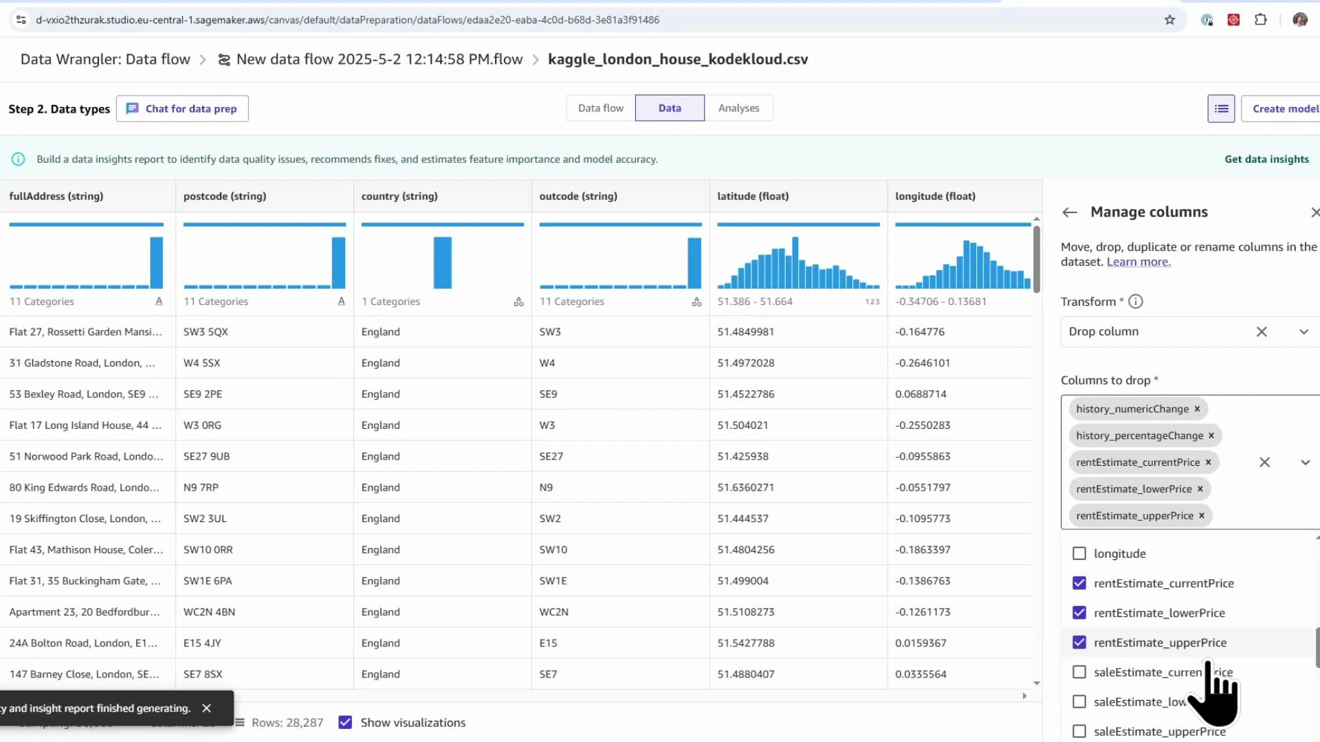
- Click the blue plus (+) after the Data types node → Add transform.
- Search for “drop” → choose “Manage columns: move, drop, duplicate or rename columns” → select Drop column.
- Remove columns that leak the target (e.g.,
saleEstimate_lowerPrice,saleEstimate_upperPrice), rental-specific columns, historical-change fields, and confidence metrics. - Click Add to insert the Drop column transform into the flow.
- Add transform → search “impute” → choose Handle missing.
- Select the column (e.g.,
livingRooms). - Pick an imputation strategy: mean, approximate median, mode, etc. Median-based strategies are robust to outliers; mean can be influenced by extreme values. For this demo, use approximate median.
- Add the transform and validate the updated distribution.
- Add transform → Process numeric.
- Choose a scaler (StandardScaler, RobustScaler, MinMaxScaler, MaxAbs). These correspond to standard scikit-learn scalers.
- Example: use MinMaxScaler for
floorAreaSqMto bring values into a normalized range. - Commit the transform and verify the numeric ranges.
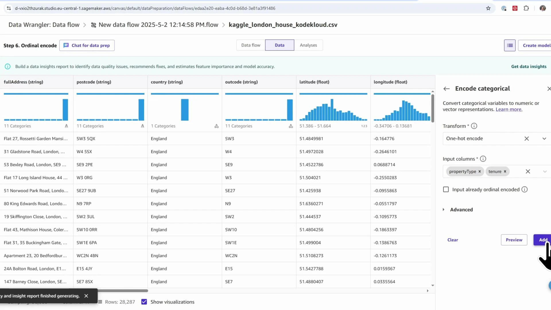
- Add transform → search “encode” → choose Encode categorical.
- Encoding options: ordinal, one-hot, similarity encoding.
- Use ordinal encoding for ordered categories (e.g., energy rating A→B→C).
- Use one-hot encoding for nominal categories (e.g.,
propertyType,tenure).
- Select columns to encode and add the transformations.
| Transform Type | Purpose | When to use |
|---|---|---|
| Drop columns | Remove irrelevant or leaking features | Remove target-leakage columns, identifiers, or high-cardinality nuisance fields |
| Handle missing | Impute missing values | Use median/mode/mean based on distribution and outliers |
| Process numeric (scaling) | Normalize or scale numeric features | Use when features have different ranges or to speed model convergence |
| Encode categorical | Convert categorical to numeric | One-hot for nominal, ordinal for ordered categories |
- Launching SageMaker Canvas and opening Data Wrangler
- Creating a Data Quality and Insights (DQI) report to surface data issues and feature importance
- Applying common transforms: drop columns, impute missing values, scale numeric features, and encode categorical features
- Validating each step and exporting the final ML-ready dataset
- SageMaker Canvas overview: https://docs.aws.amazon.com/sagemaker/latest/dg/canvas.html
- SageMaker Data Wrangler: https://docs.aws.amazon.com/sagemaker/latest/dg/data-wrangler.html
- Amazon S3: https://aws.amazon.com/s3/