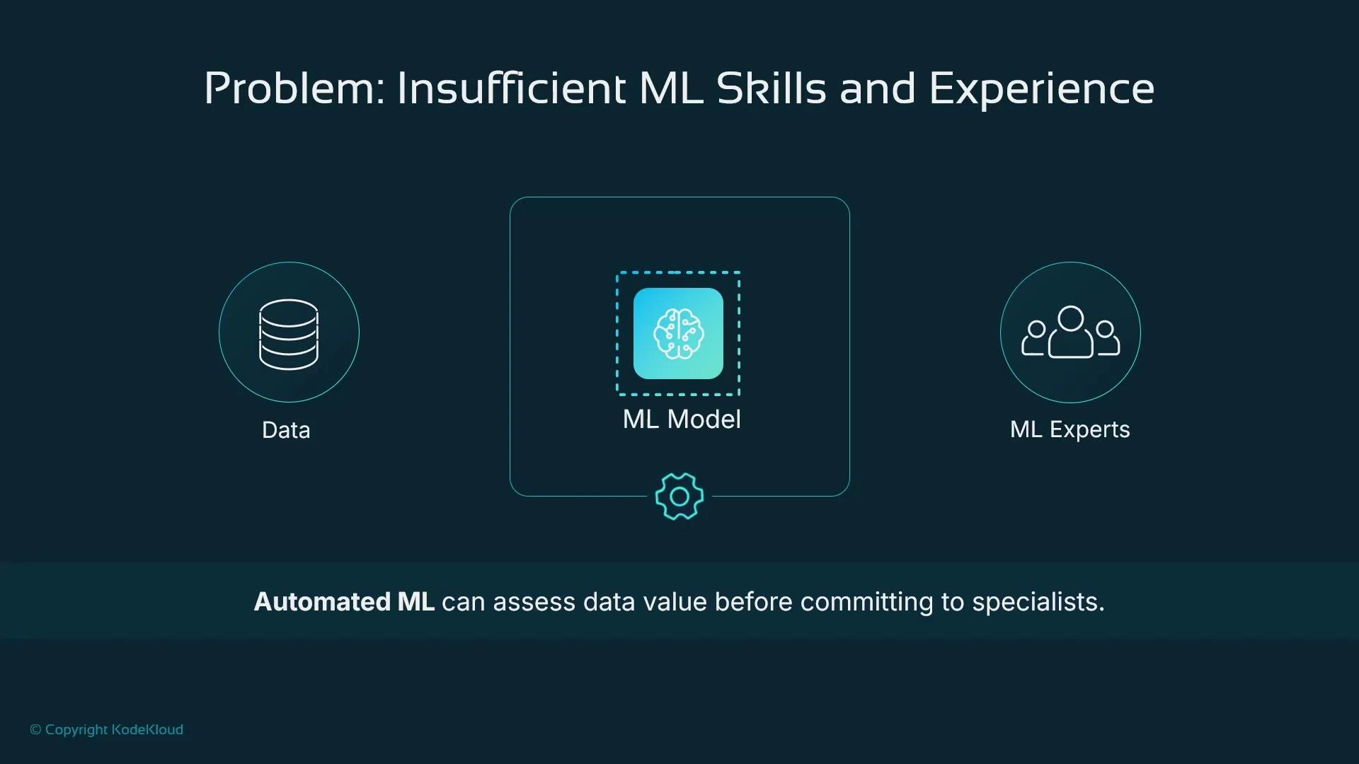
- Building an ML model typically requires sourcing and cleaning data, choosing and tuning algorithms, and deploying an inference service. Those steps often demand ML engineers and data scientists.
- If you need a quick answer about whether your dataset contains predictive signal, hiring specialists first can be costly and time-consuming.
- Low-code tools like SageMaker Canvas let non-specialists run exploratory data analysis, prepare data, and train models to validate dataset value quickly — perfect for POCs and business case validation.
SageMaker Canvas is designed to accelerate proof-of-concept experiments: import tabular data, run AutoML, and host predictions without writing code. It’s ideal for validating whether your data has predictive value before investing in full-scale ML development.
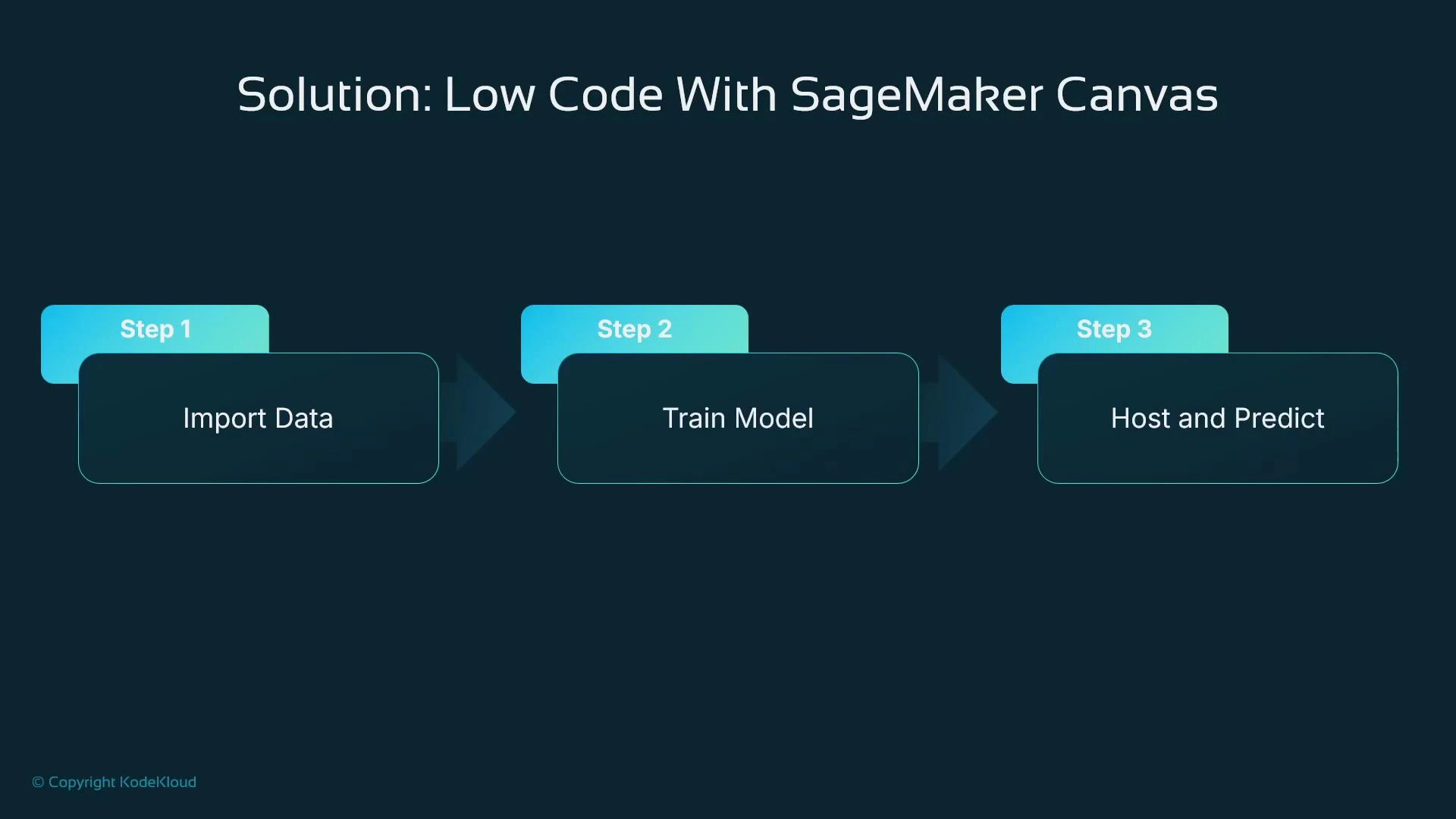
- Import data into SageMaker Canvas (from local files or S3).
- Prepare and inspect data using integrated Data Wrangler.
- Train a model with Canvas AutoML.
- Host the trained model to get predictions.
- Rapid proof-of-concept for tabular regression, classification, or forecasting tasks.
- Teams with limited ML or Python experience that need to validate datasets quickly.
- Fast iteration and demoing to stakeholders before committing to custom ML engineering work.
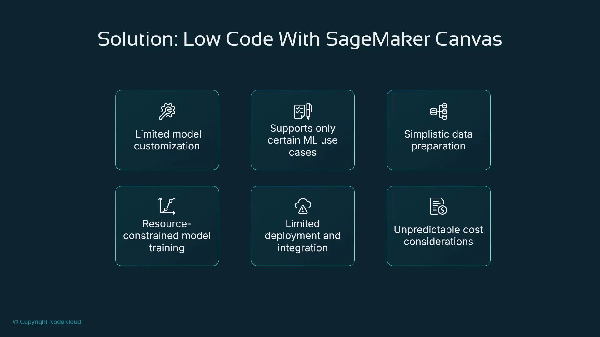
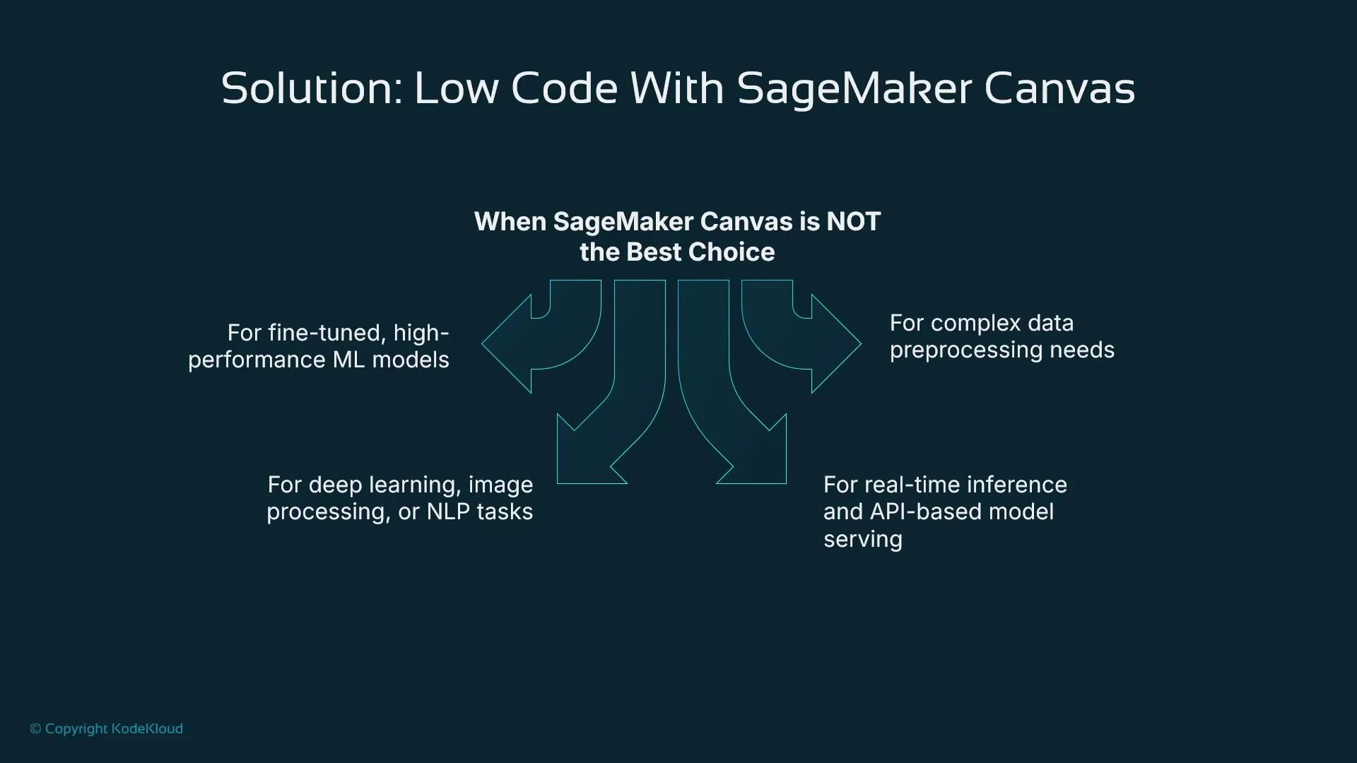
- Production-grade, fine-tuned, or highly specialized ML workloads (deep learning, advanced NLP, image recognition).
- Complex preprocessing or custom feature engineering requiring arbitrary program logic.
- Real-time, low-latency API serving or advanced deployment topologies that need fine-grained control.
| Resource | Best Use Case | Pros | Cons |
|---|---|---|---|
| SageMaker Canvas + Data Wrangler | Rapid POCs for tabular data | Low-code, fast insights, integrated AutoML and hosting | Limited algorithm choices, less hyperparameter control, constrained compute/configuration |
| Programmatic SageMaker (Jupyter/SageMaker SDK/Custom Jobs) | Production / custom models / deep learning | Full control, custom training, broad algorithm support | Requires coding, ML expertise, longer development time |
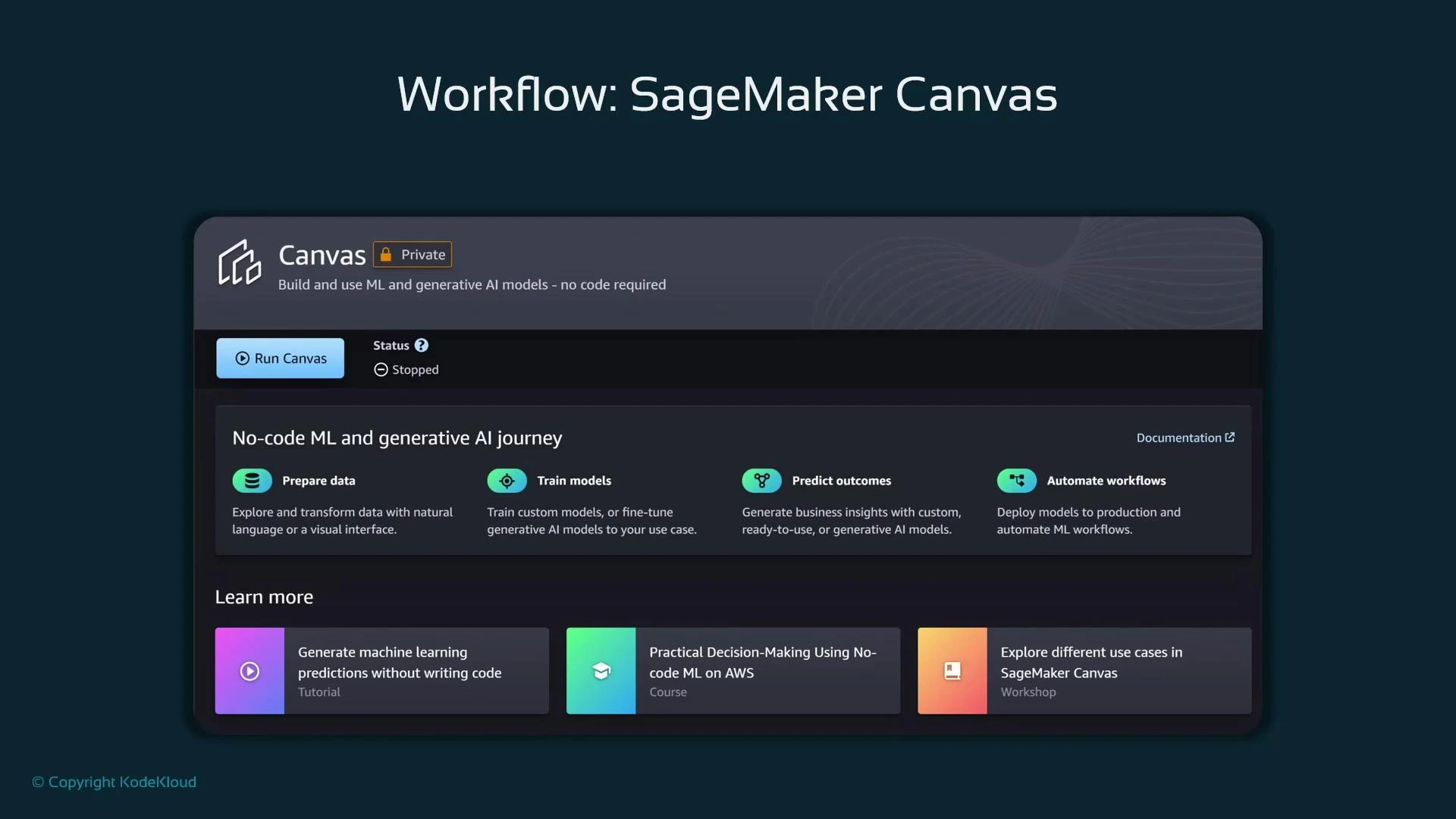
- Canvas offers a separate browser-based UI (launched from SageMaker Studio’s Applications) tailored for non-programmatic workflows.
- Canvas integrates Data Wrangler for low-code preprocessing and AutoML for model training.
- Models trained in Canvas can be deployed as SageMaker endpoints, but deployment options are simpler than fully custom SageMaker setups.
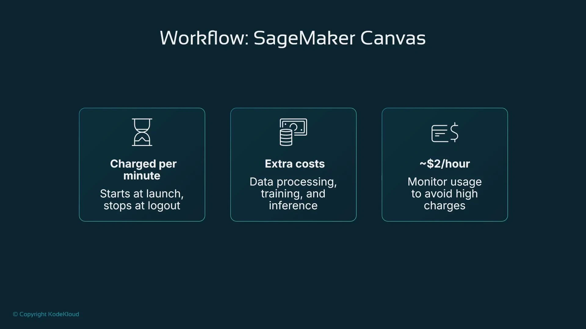
- Monitor costs: Canvas is billed for runtime, training, and hosting — stop runtimes when not in use.
- From the new SageMaker Studio UI, open the Applications panel and click Run Canvas.
- Ensure your Studio user profile has the SageMaker Canvas application enabled.
- Canvas launches in a separate browser tab and runs as a managed runtime (start/stop). Billing starts when the runtime is active.
SageMaker Canvas is billed while the runtime is active, and additional charges apply for data processing (training) and hosting (inference). Canvas can be billed per minute (often starting around $2/hour for the runtime in many regions) plus processing costs — so stop the runtime when you’re finished to avoid unexpected bills.
- The Canvas runtime starts charging when launched and continues until stopped; training and hosting add separate charges.
- Monitor runtime time and training resource usage to avoid surprises.
- For repeated experiments, consider batching work and stopping the runtime between sessions.
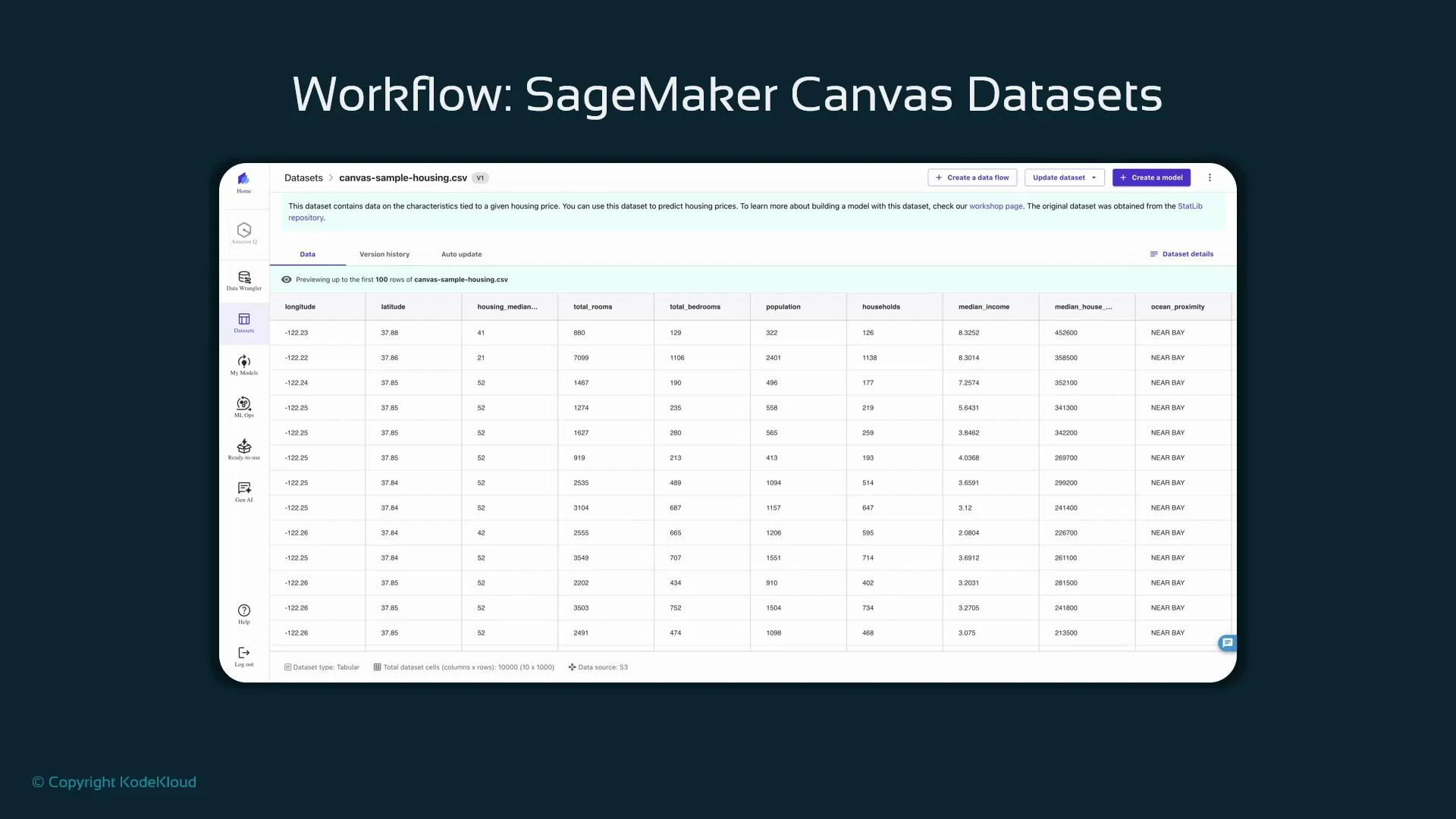
- Open the left navigation and select “Datasets” to view sample datasets or import from S3.
- Datasets show metadata (type: tabular), storage (S3), and dimensions (rows/columns).
- Use the preview to inspect columns and sample rows before importing a dataset into a Canvas flow.
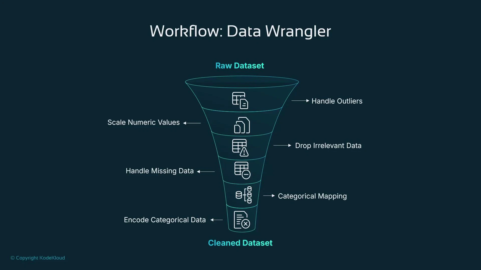
- Canvas includes SageMaker Data Wrangler, a visual tool to build ordered transformations (a data flow) that replace many typical Pandas/Scikit-learn steps.
- You create a sequence of components (transformations) where the output of one step feeds the next — no code required.
- Typical transformations include:
- Outlier handling (IQR trimming)
- Scaling numeric features
- Dropping irrelevant columns
- Imputation for missing values (mean/mode, etc.)
- Categorical mapping and normalization
- Encoding (one-hot, ordinal)
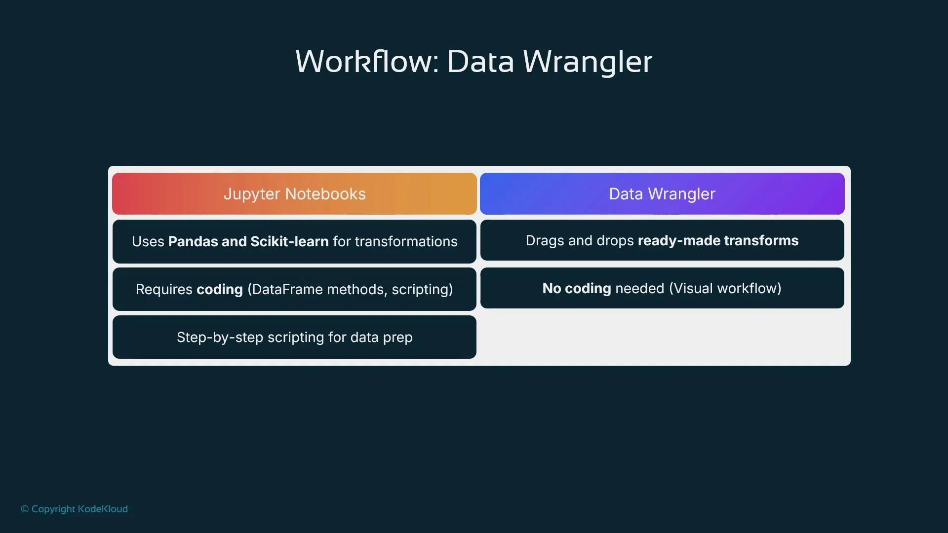
| Approach | Best For | Flexibility | Requires Coding |
|---|---|---|---|
| Jupyter Notebooks + Pandas/Scikit-learn | Custom preprocessing, advanced feature engineering, research | Very high | Yes |
| Data Wrangler (Canvas) | Rapid visual transformations and standard preprocessing | Moderate (prebuilt transforms) | No |
- Notebooks let you implement any logic (custom transforms, advanced pipelines), while Data Wrangler accelerates common preprocessing without code.
- Use Data Wrangler to prototype and then migrate complex or production workflows to programmatic pipelines when necessary.
- From Canvas left navigation, open Data Wrangler and create a new data flow.
- Select the dataset as the flow source. Data Wrangler infers data types for each column; confirm or adjust types as needed.
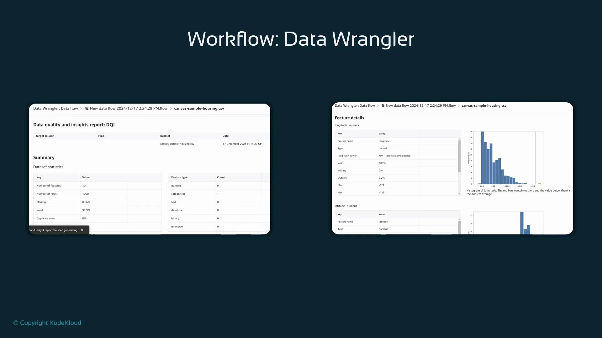
- Generate a Data Quality and Insights (DQI) report: click the plus icon next to data types and choose “Get data insights”.
- When prompted, select the target column (the feature you want to predict, e.g., house price).
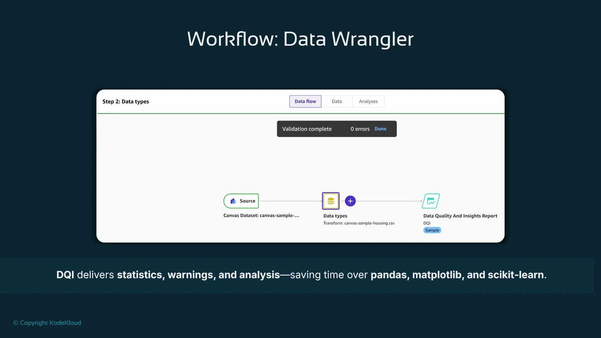
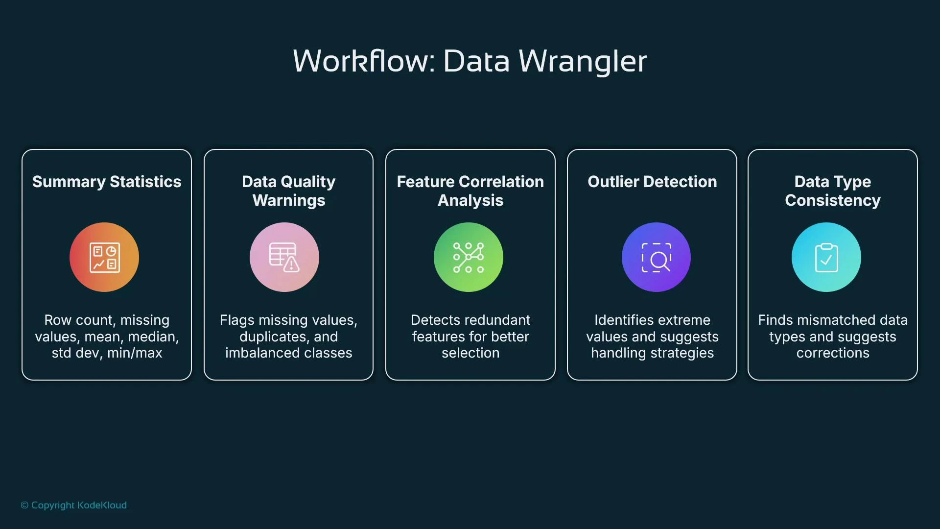
- Summary statistics: number of features, rows, column data types, missing-value counts, and numeric summaries (min/max/mean/median).
- Data quality warnings: duplicate rows, columns with many nulls, inconsistent typing.
- Correlation analysis: highlights strongly correlated features and suggests dropping redundant columns.
- Outlier detection: flags extreme values and recommends transformations.
- Feature inspection charts: histograms, distributions for numeric features, and frequency charts for categorical variables.
- A cleaned, consistent dataset ready for AutoML training in Canvas.
- Suggested imputations and transformations applied visually.
- Identification of duplicate rows, class imbalance, and column-type inconsistencies.
- Correlation and outlier insights to guide feature selection and transformation.